Holiday Place Setting & A Deep Dive into Monoline and Stencil Fonts
Project Overview:
The holidays are upon us and it’s time for many laser cutters to be working on their laser cut place settings (Oh wait you didn’t know that’s a laser owner requirement?). In all honestly, I’ve seen a lot of nice place settings lately and one of the most commonly asked questions on the posts is always “what font is that?”. In this post, I’m going to use the project of creating a place setting as a way of explaining what to look for in stencil fonts, monoline fonts, and script fonts. I’ll also be talking about how to adjust the fonts, and why I’ve chosen the selections I have as good choices for laser cutting. Finally, I’ll show you how to adjust some of these typefaces so that they work for different needs.
GET THE FONTS
Download the Font Showcase file to see the fonts used in this post. None of the fonts are live or usable in the file, it is just for reference. I made an effort to use as many free fonts as possible but some of them are paid fonts, which are listed below. For the free fonts, it’s as simple as searching for the name and multiple free download options will appear.
Samantha Upright*
Hello Hana
Dear Agatha
*This is an affiliate link, it’s also the absolute cheapest I could find for this normally pricey font family.
Monoline What?
So I’m going to be discussing three main types of fonts in this post. I was previously a graphic design professor and still work as a designer so it’s easy for me to forget that not everyone is using the same vocabulary as me. This is what I mean (in my own words) when I use the following terms:
Monoline Font – A monoline typeface is designed to look like the letters or words are created with a single pen stroke. They are often connected and have a smooth flow. The reason I’m addressing monoline fonts is that they can be great for scoring, but they are tricky to find. If you’d like an in depth look at monoline fonts and how to score them on the laser check out this post: Monoline Type
Script Font – a typeface that flows like it was handwritten. The letters almost always connect where the pen would move from one letter to the next
Flourish – a fancy, decorative stroke added to a letterform. It is added onto a letter, by that I mean it’s extra and does not change the base structure or understanding of that letter. A flourish is often at the start or end of a letter – it is essentially the first or last dramatic, decorative stroke of the pen.
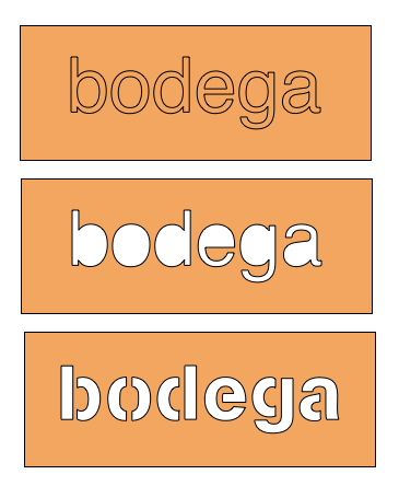
Stencil Font – When I am referring to a stencil font, I am referring to a font that has open counters – meaning the insides of the letters (like the letter O) are open to the outside.
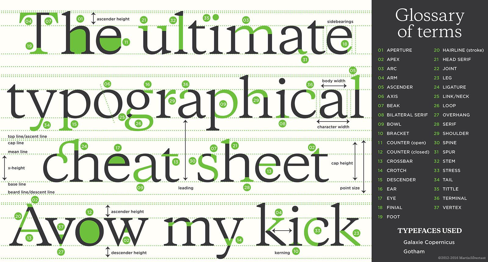
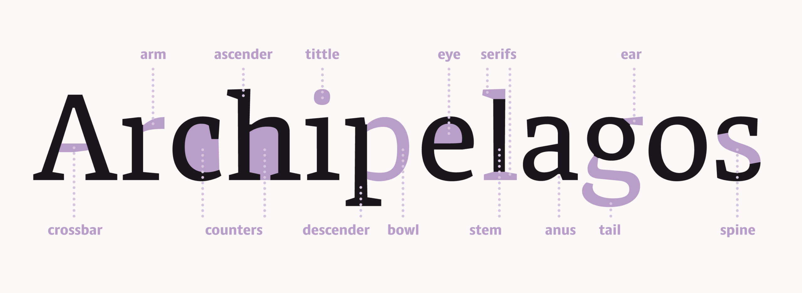
If you’d like to get more in depth check out this type glossary or at least scan the graphics below.
DIVE INTO THE FONTS
Below you can watch my video as I walk you through the fonts I’ve chosen and explain what to look for. I will also cover how to adjust and refine type so that you get the best results when cutting. For more on Monoline Type check out the linked post.
KEY NOTES
It’s always easier for me to explain myself in a video, so forgive me if it gets longwinded (it will). Here are some key notes from the above video, but remember I can go more in depth when I’m talking through it with visuals so I suggest you give it a watch before proceeding, it really is the heart of this post.
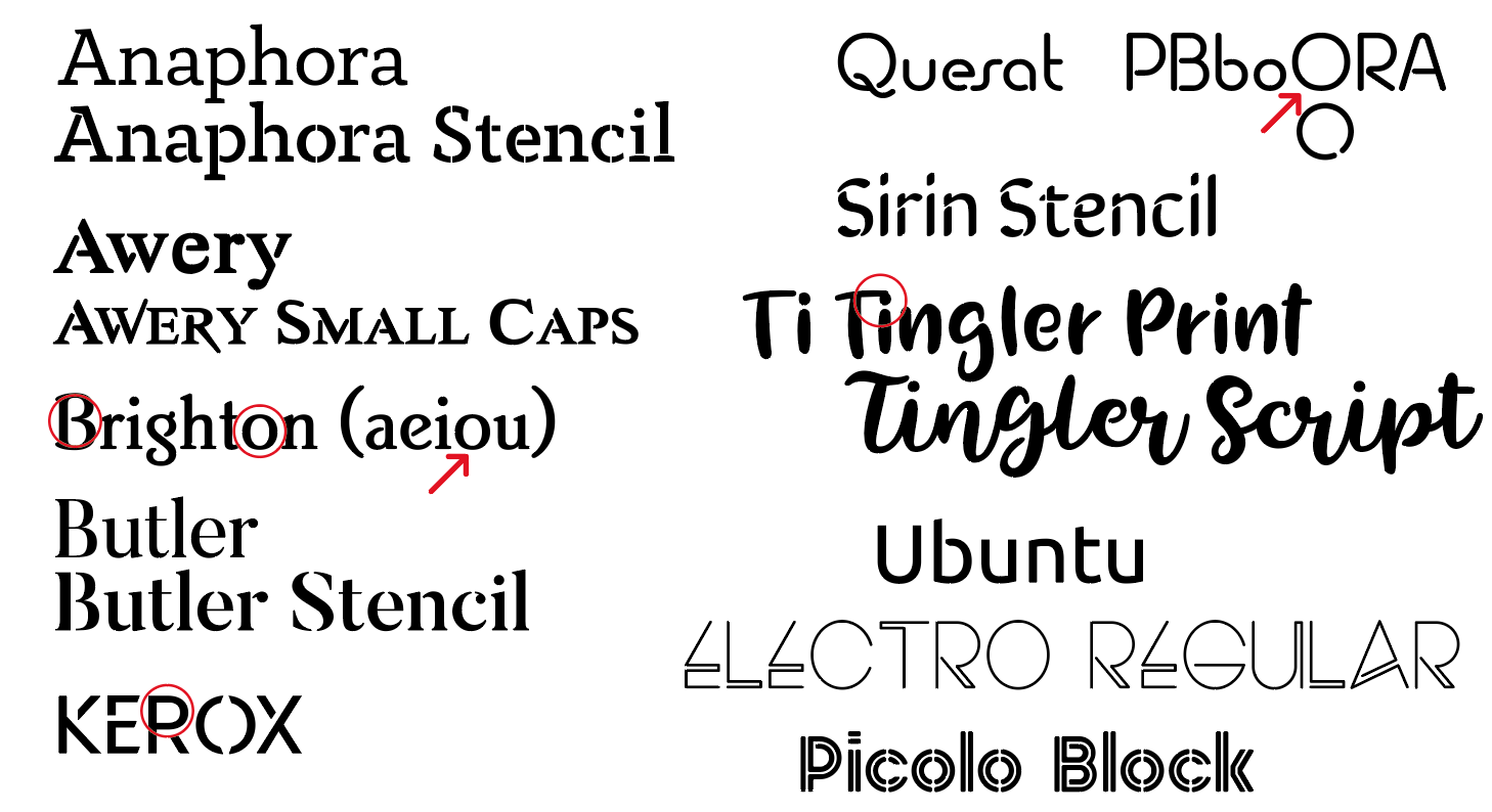
WHY STENCILS?
For cutting out individual words which will stand on their own, a script font will work fine, but what if you want to cut out a word in a larger sign? You run into the issue of the counters falling out. For this reason we need to look for stencil fonts. Personally, I hate the look of the classic, blocky stencil font, so I made an effort to find typefaces with open counters that weren’t so…obvious. If you want to turn a typeface you’re already using into a classic stencil font check out this post by Tiffany Tseng
The main letters you will want to check when using a stencil font are:
Aa, Bb, e, g, Oo, Pp, Qq, R
The lowercase K will also sometimes have a closed counter.
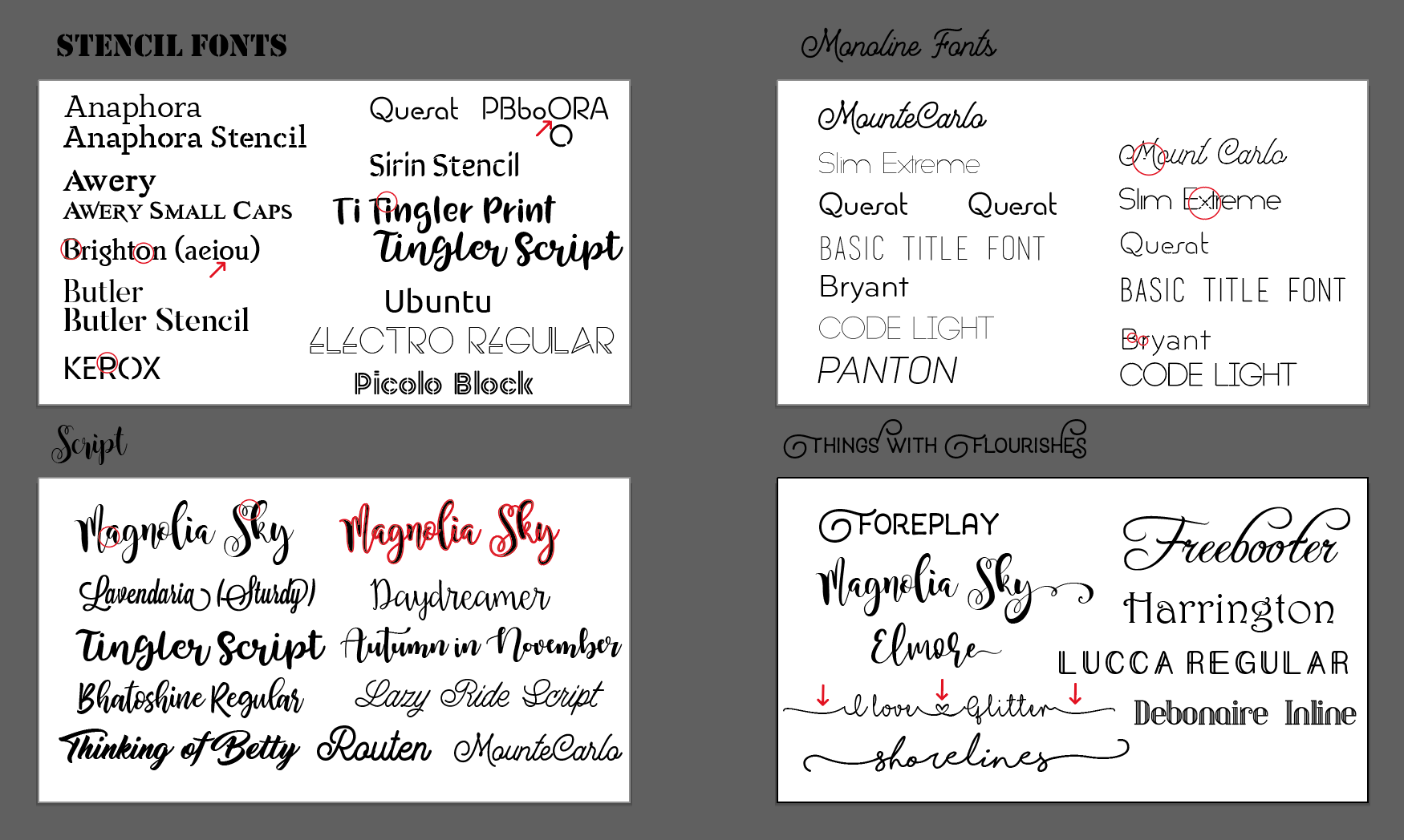
Stencil Fonts
Here are the stencil fonts featured in this post. There are many more and as stated in the video a few of these still need to be adjusted to work correctly. Yeah those last two (Electro and Picolo Block) are kind of weird, but they show that sometimes if you think outside of the box you’ll find something that technically works.
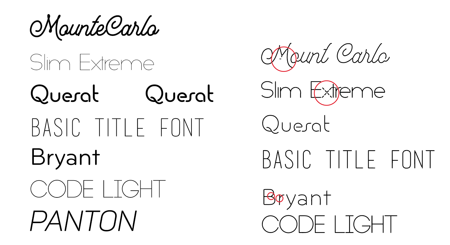
Monoline Fonts
With the exception of Dear Agatha (mentioned in video but not shown as it’s a paid font I don’t have yet) none of these are TRUE monoline fonts. If you set them to outlines the Glowforge will still score the outer shape. However, most will work well if you rasterize them and then Image Trace them as lineart.
Remember to learn more about monolin type and about how to use a script to automate some of this check out this post.
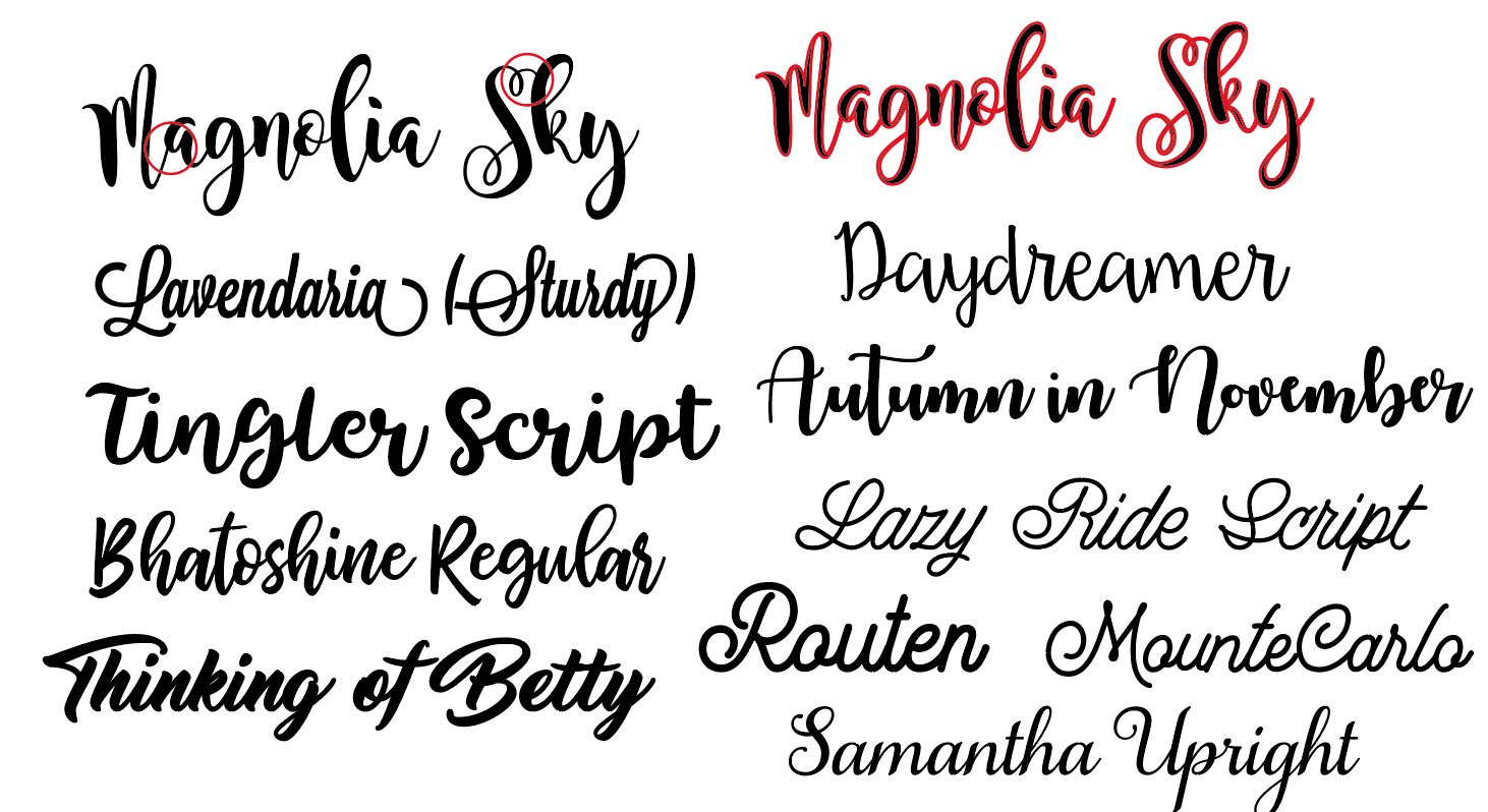
Script Fonts
Many of these fonts have the added advantage of automatically connecting uppercase and lowercase letters which saves you a lot of work. Some fonts however like Bhatoshine or MounteCarlo do not but are easy to adjust. Some of these will require thickening before cutting out depending on how large or small your cut is.
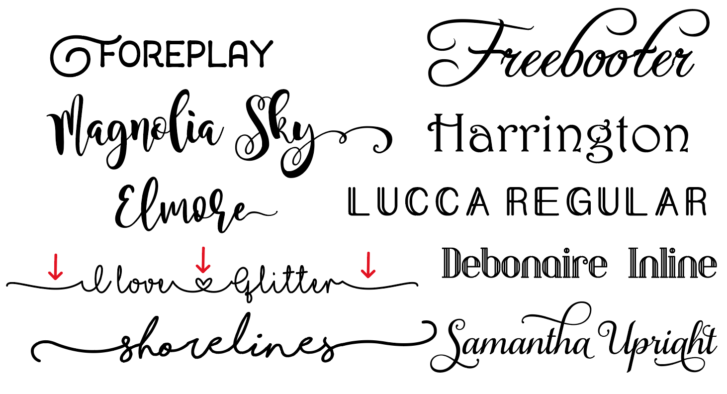
Fonts with Flourishes (etc.)
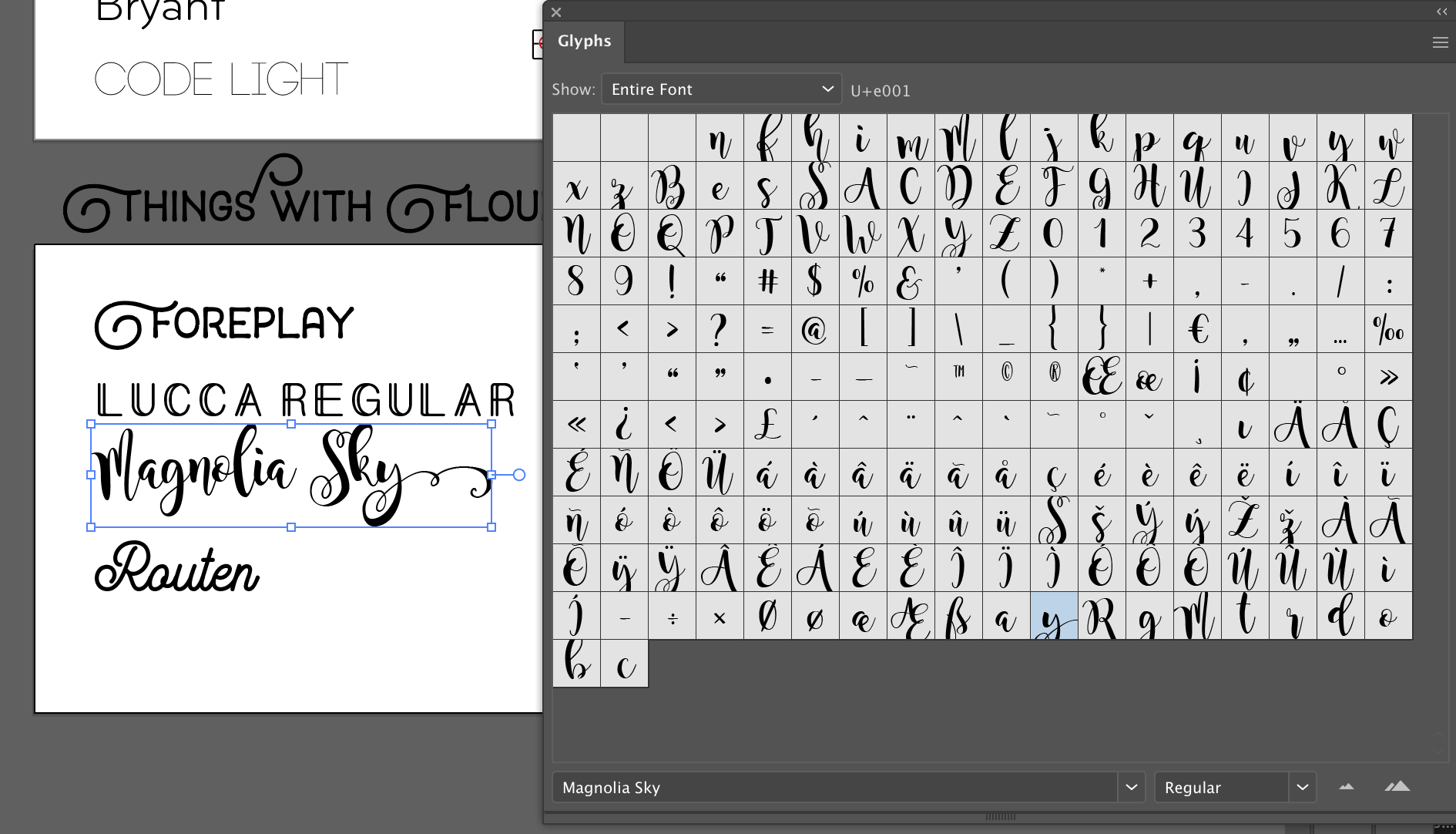
These fonts are fonts that include fun alternate characters. Go into the glyphs panel (shown below) to find these hidden characters. Harrington, Lucca, and Debonaire are just included because they are fun. Dear Hana is another great font with long tails that works for place settings.
CREATING THE PLACE SETTINGS
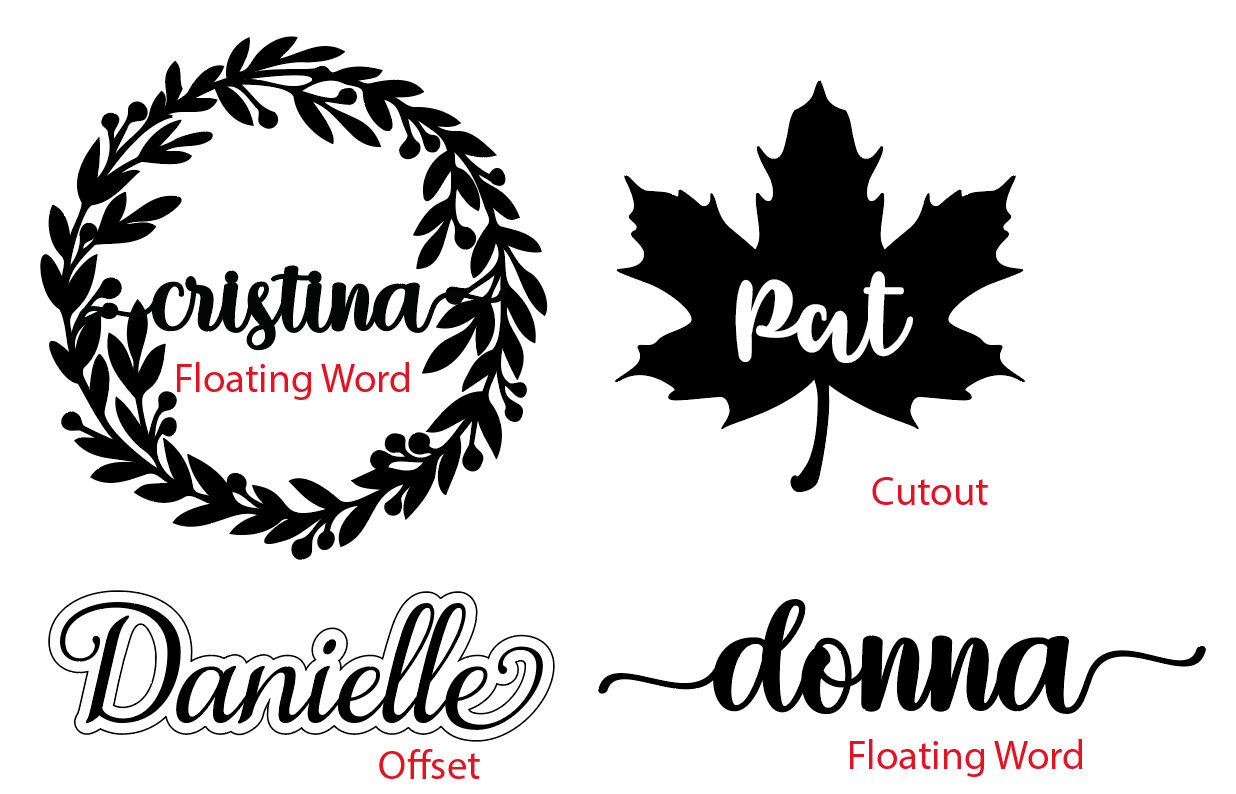
Below I created three of the most common types of place settings – the free floating word, the cutout space word, and the offset word (well that’s how I’m describing them). Watch the video to get more details on how I created these place setting designs.
WATCH THE VIDEO ON ADOBE ILLUSTRATOR TECHNIQUES
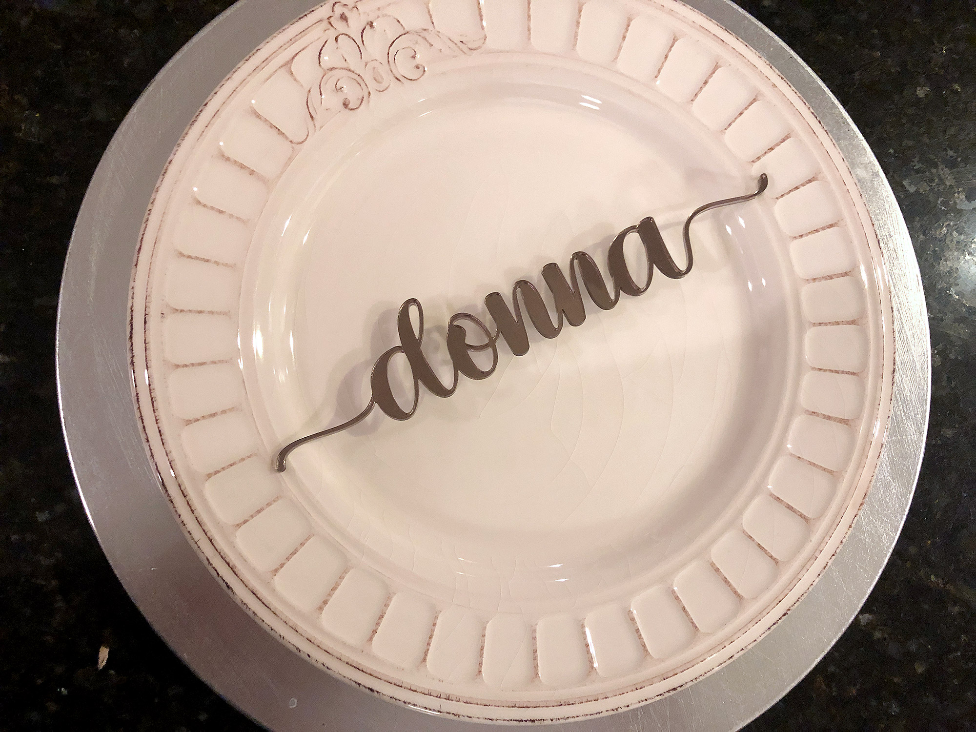
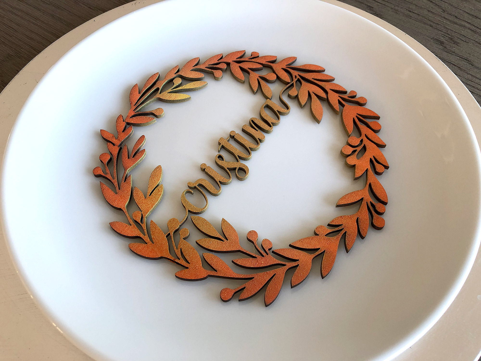
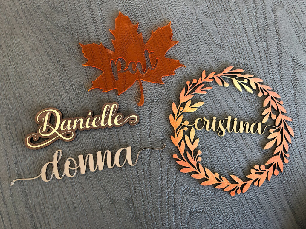
Freefloating Word (Hello Hana – Font)– In this, the entire word is connected as one piece and floats freely. You may have to connect the dots in your lowercase i’s or any capital letters. You can often get around this by using all lowercase letters with your script font. I am not a fan of just omitting the dot over the “i” and so I strongly recommend finding a way to connect it.
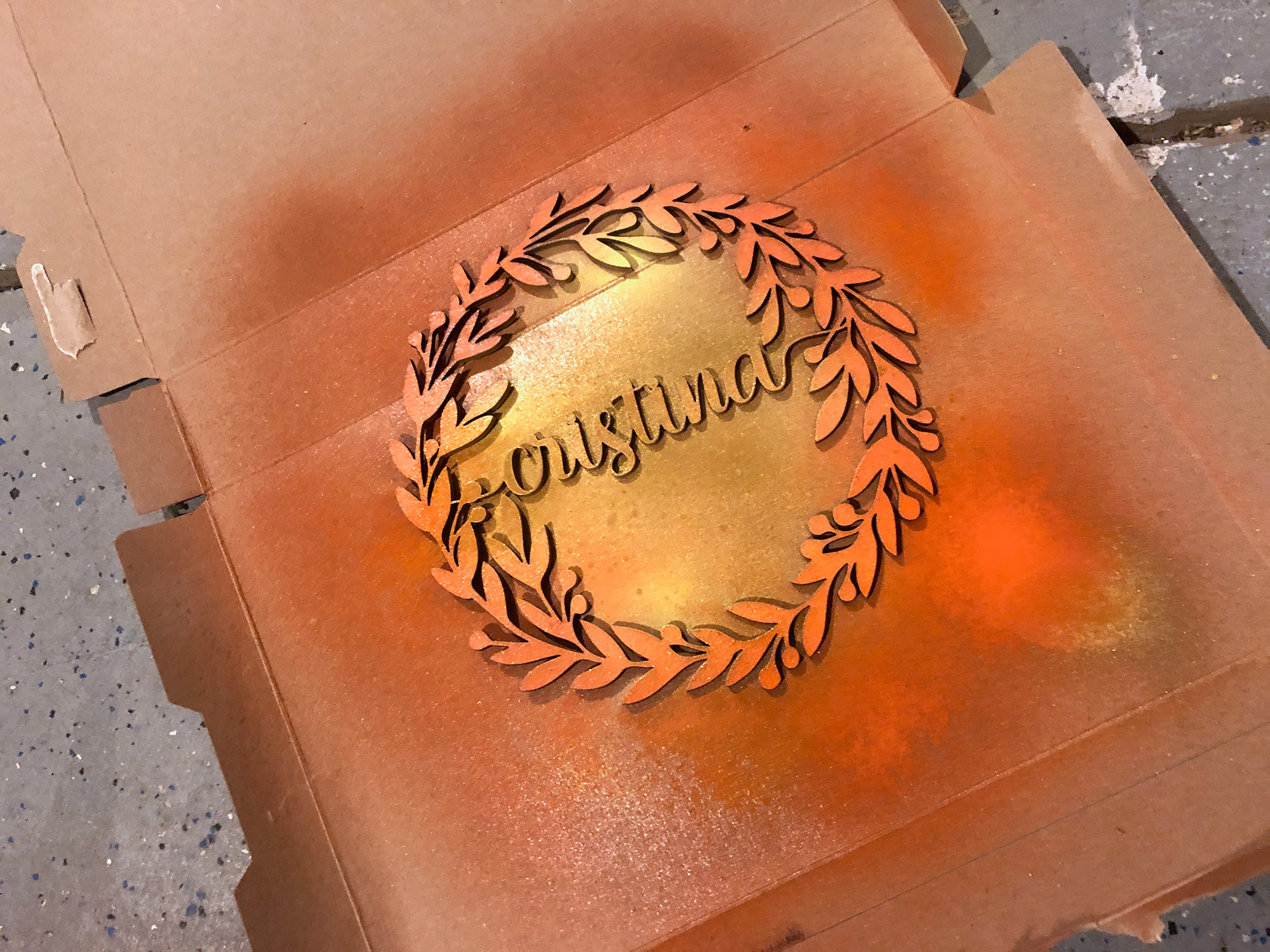
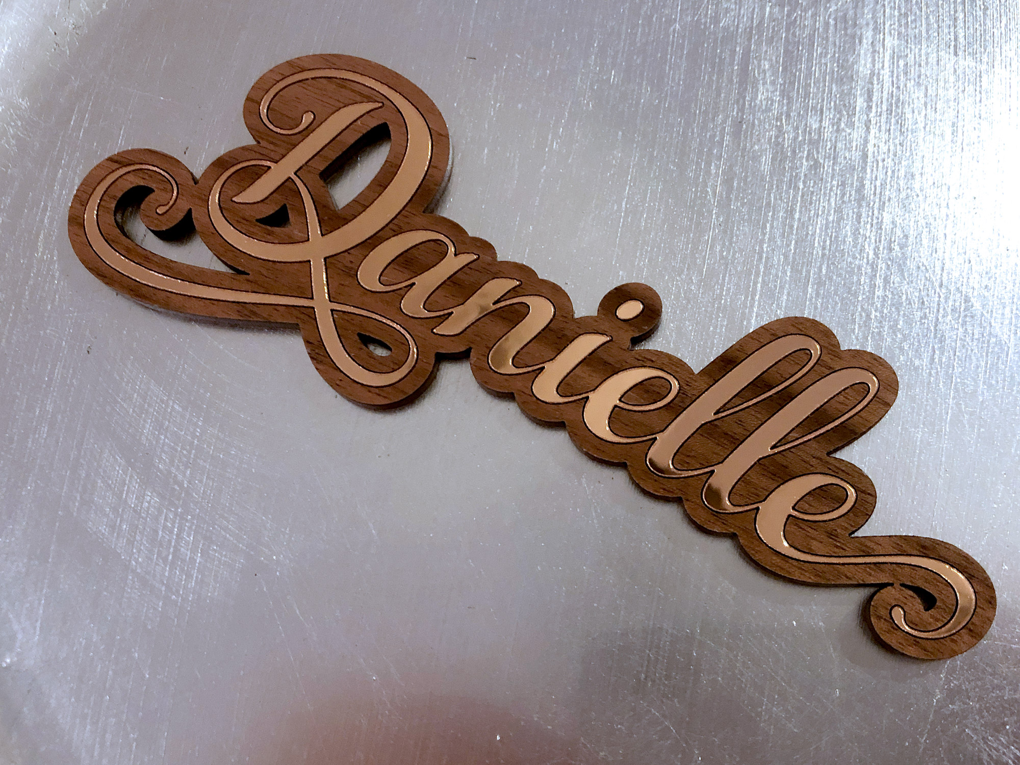
The basics of making this are to type out your word, select any unique ligatures or flourishes from the glyphs panel and then set it to outlines. From there you can move any separated letters over and use the pathfinder to connect them. It’s hard to see, but the name below is a gorgeous bronze mirror acrylic. For the larger wreath design I just did some light coats of spray paint, hitting different areas of the design for some additional interest.
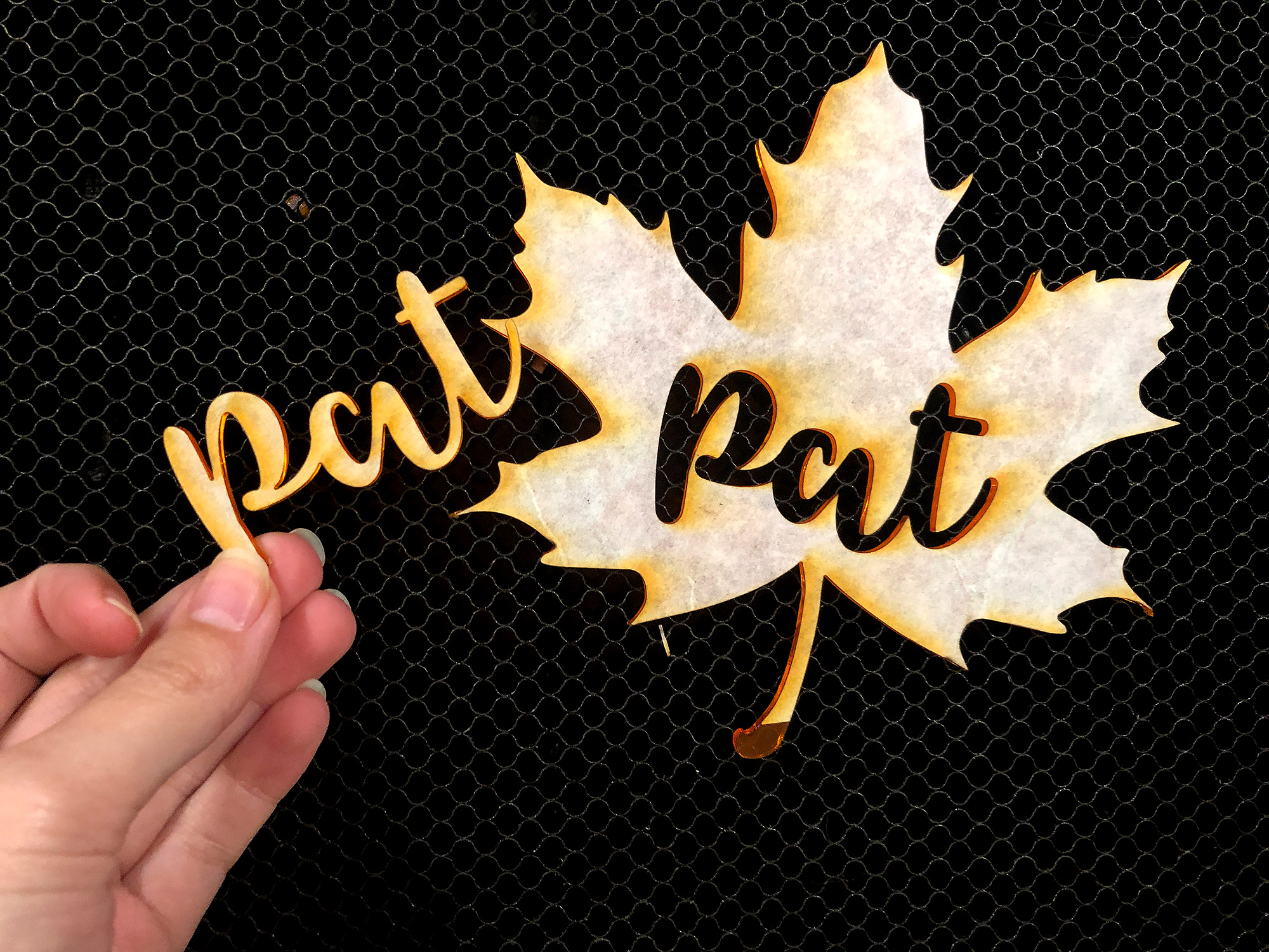
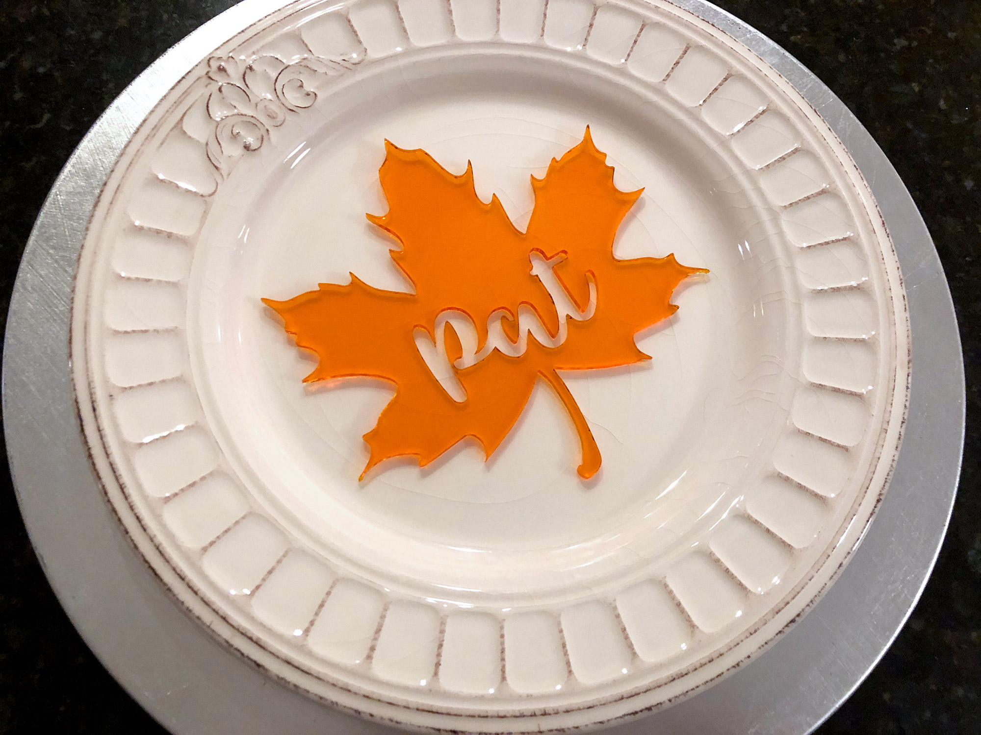
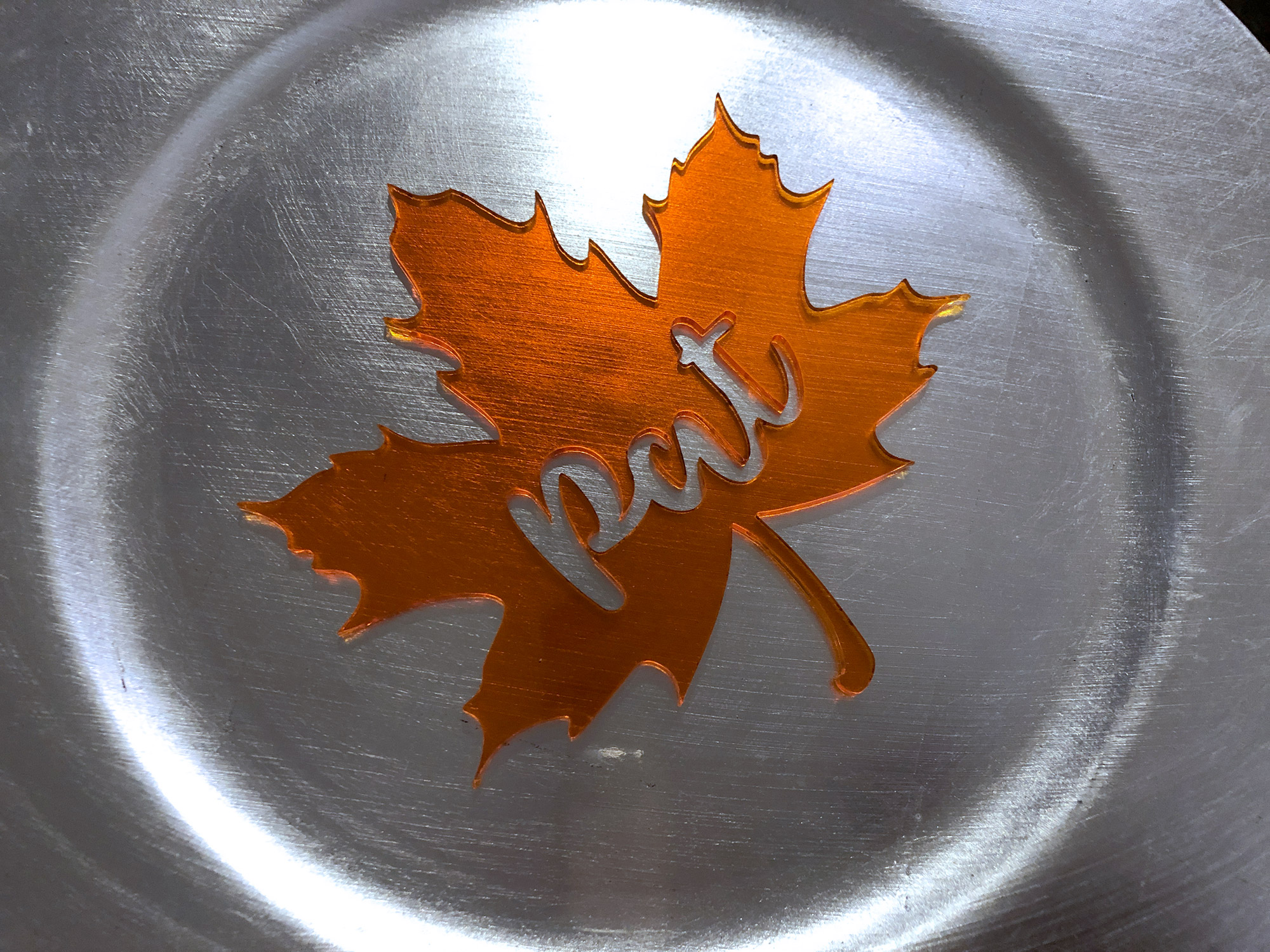
Cutout Word (Tingler Script – Font) – Here is whee you see the necessity of a good script font. If you find a font that’s almost perfect but has just one or two letters that don’t have open counters you can use the eraser tool to remove a little chunk of the letter after you set it to outlines.
With a cutout word the only adjusting you might need to do is to open up any counters that aren’t already open. The sample below was cut from clear orange acrylic.
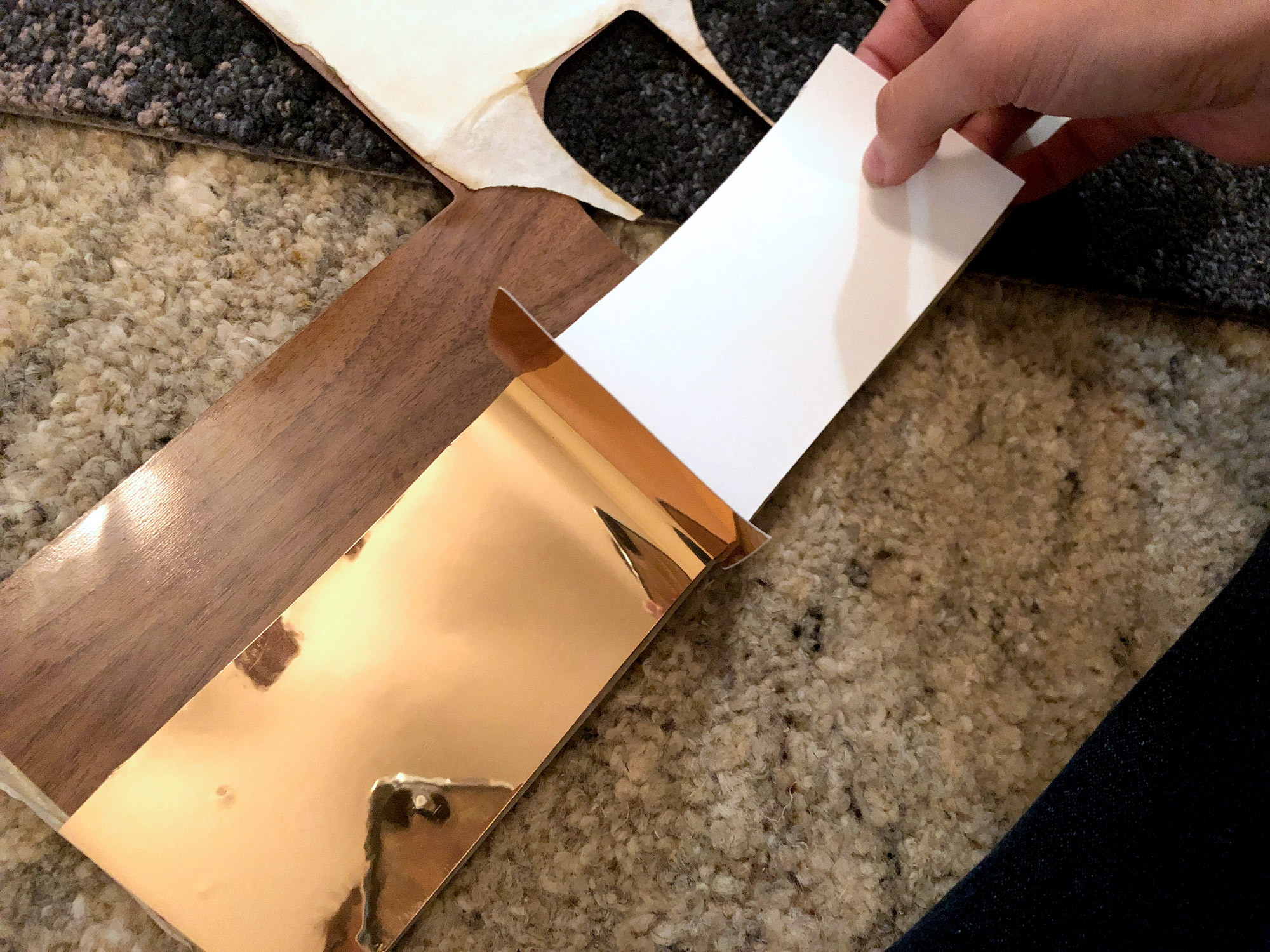
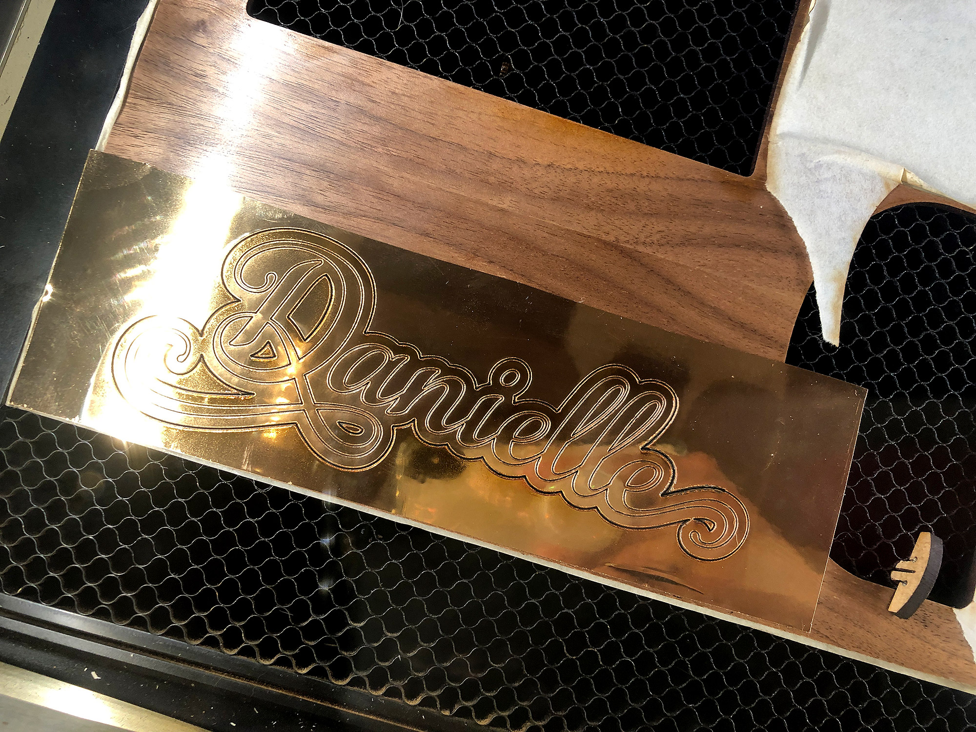
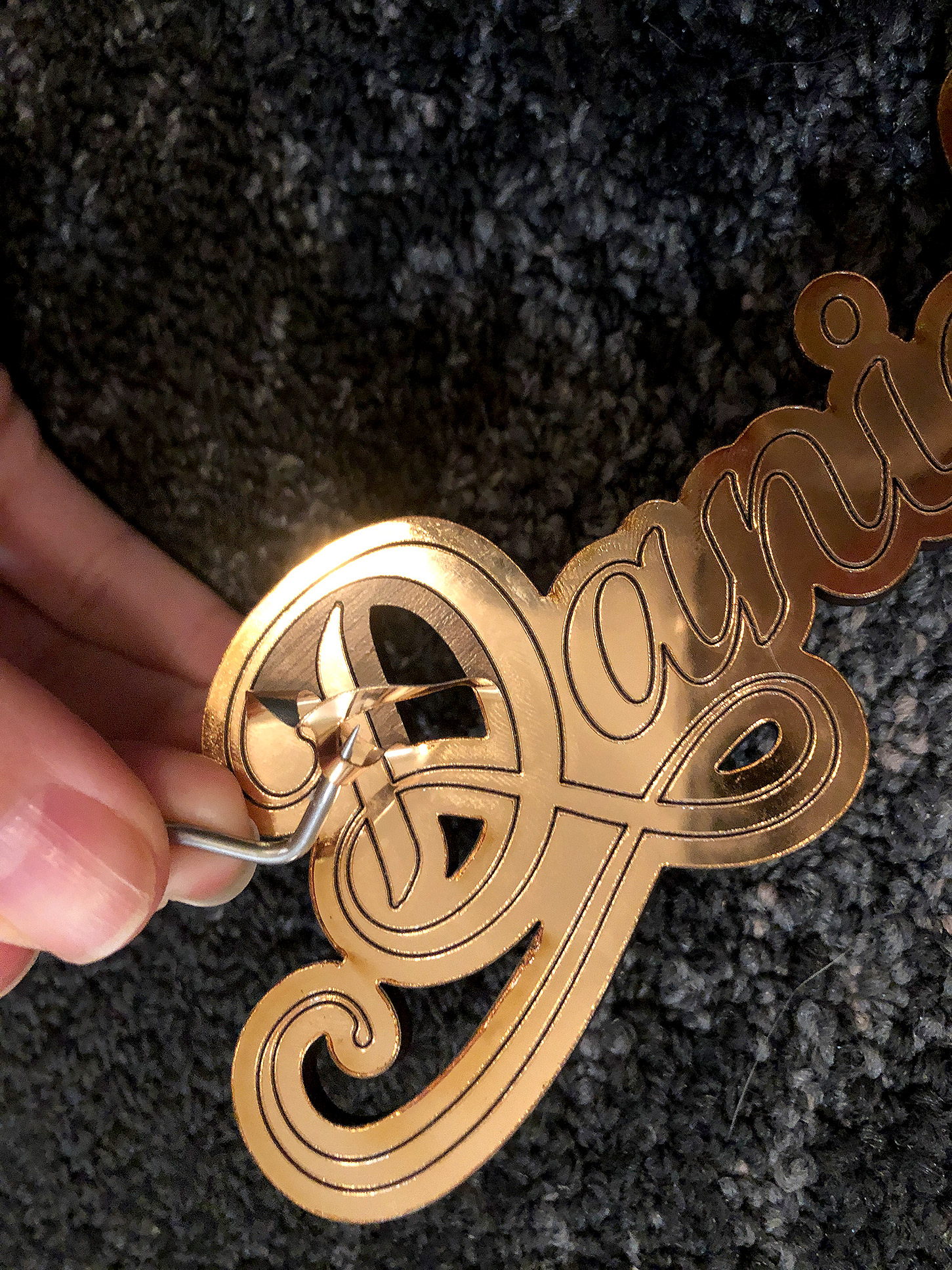
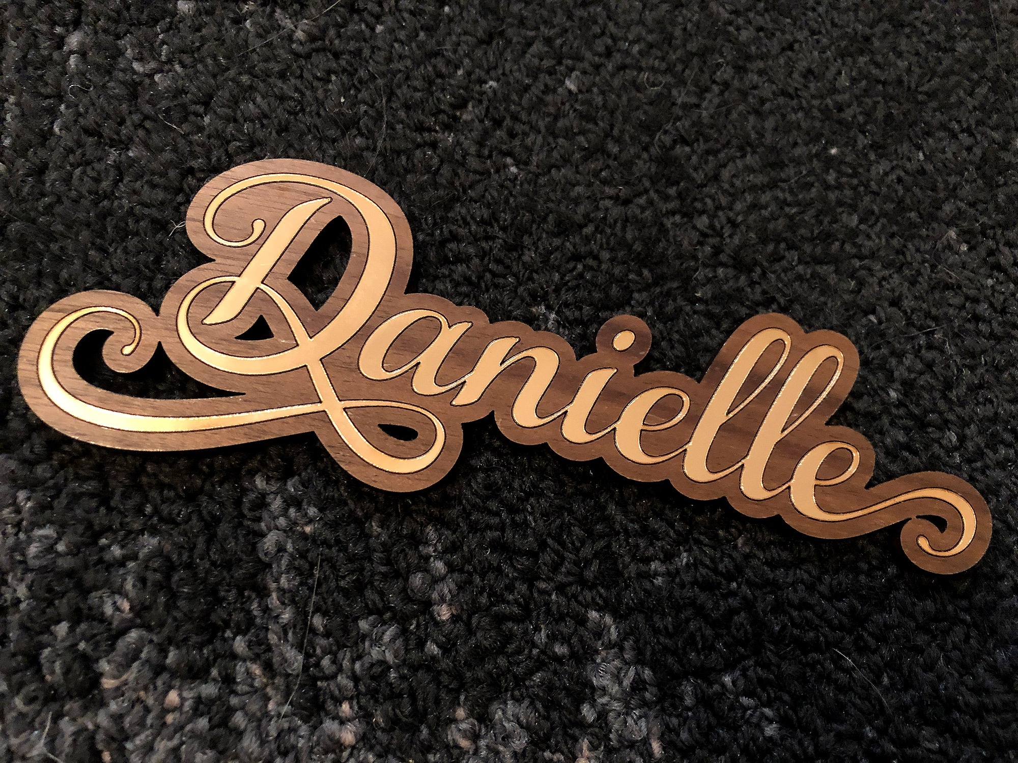
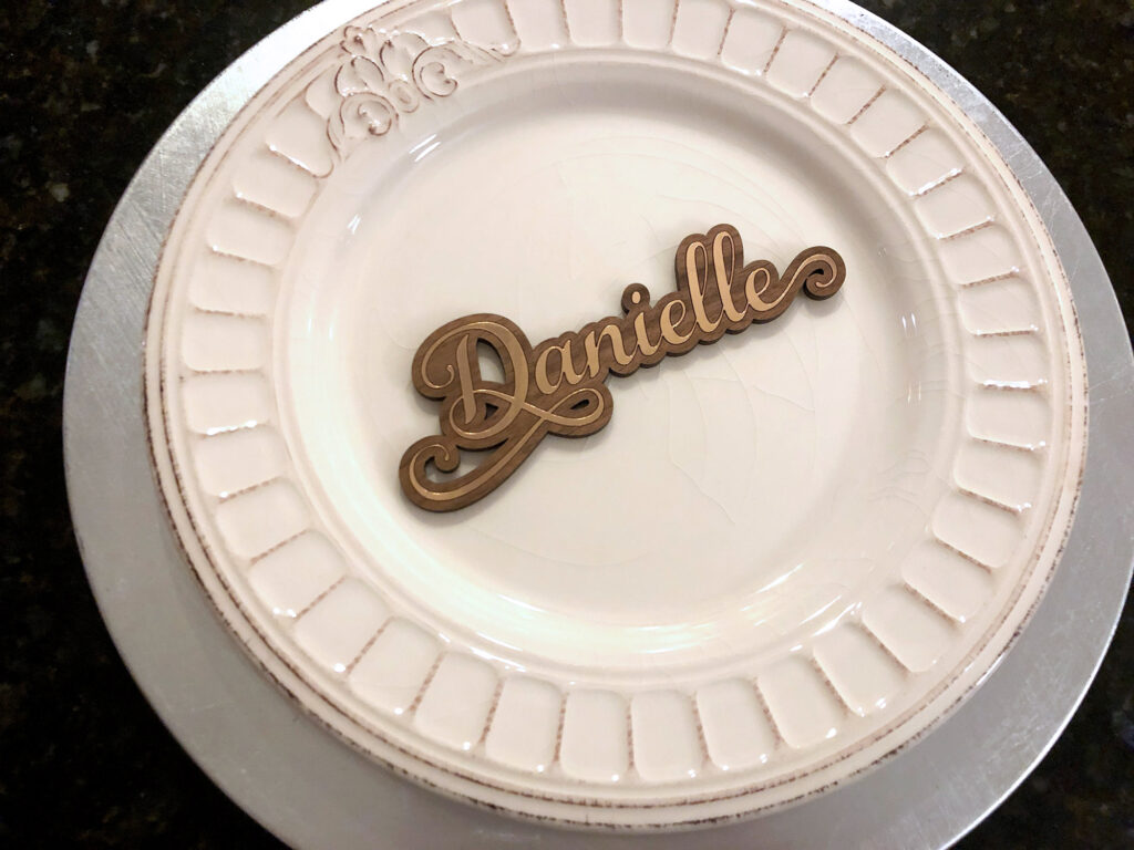
Offset Word (Samantha Italic – Font)– Let’s assume you have a font you HAVE to use, but it wont work as either a stencil font, or a connected script. No worries, you can create an offset and engrave it. This method takes the longest to make because engraving is slower than cutting, but it will work for any font. For my example below I applied laser gold foil. I then scored the inner word and weeded (peeled away) the excess. The example below was applied to proofgrade walnut plywood.
See my All That Glitters Post to learn more.
THIRSTY FOR MORE?
Check out my video on how to work with free stock art for the Glowforge. This video will show you how to work with basic typographic designs and both cutting and engraving. Yeah it’s kind of a long one, but you made it all the way here didn’t you?
NAVIGATE POSTS
Helpful Links
Latest Posts
Posts by Category
Explore Posts By Tags
Acrylic Adobe Illustrator Alcohol Ink Baby Room Beginner Post Book Binding BuyTheFile Christmas Felt freefiles Gifts Gilding Glowforge Holiday Jewelry Journal Kaleidoscope LED Notebook Resin Rubber Stamp Settings Sign Stamping Yupo
Get Your Own Glowforge Laser
If you have found this post helpful and would like to purchase a Glowforge of your own you can receive a discount using my referral link when you are ready to purchase:
Sign Up to Blog Newsletter
CONCLUSIONS
Hopefully this post will inspire you to create some dynamic place settings for your holiday meal (or if you’re a real glutton for punishment a major event with like…a ton of people).
Where to Get the Materials:
Some of these are Amazon affiliate links, so feel free to skip them if you’re not into that. As an Amazon Associate, I earn from qualifying purchases, but they do not cost you any extra:
Get 50% off your first Wish.com order with my code: mfvjgnw | I buy lots of odds and ends here, so if you need some small item and don’t mind waiting, this can be a fun shop to check out.
Get the Samantha Upright Font Here (This is a referral link)
Obligatory Glowforge Discount Code Plug
If you found this post helpful and you plan to buy a Glowforge you can use my code (https://glowforge.us/r/QHDONFXB) for a discount of $100 off the Basic, $250 of the Plus, or $500 of the Pro:
Sign Up for Blog Posts Updates
And finally, if you’d like to be updated on posts like these in the future you can sign up for my email list. You will only receive an email if there is new content, and only once weekly in that case: