
BOOK & PRINT
TRADITIONAL BOOK ARTS include printmaking, bookbinding, gilding, water marbling, and paper making. I have tried my hand at many different aspects of book design and construction. I find that books are perhaps the holistic way to combine my many artistic interests including illustration, typography, and traditional craft.
LITHOGRAPHS
ABOUT THE PROCESS
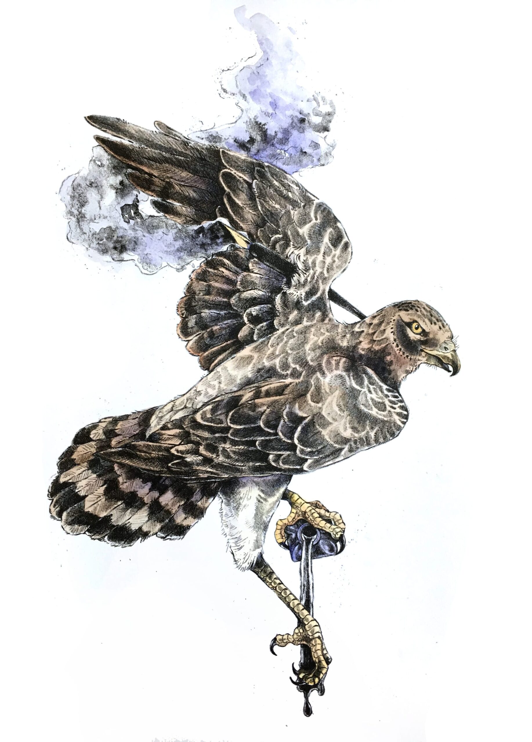
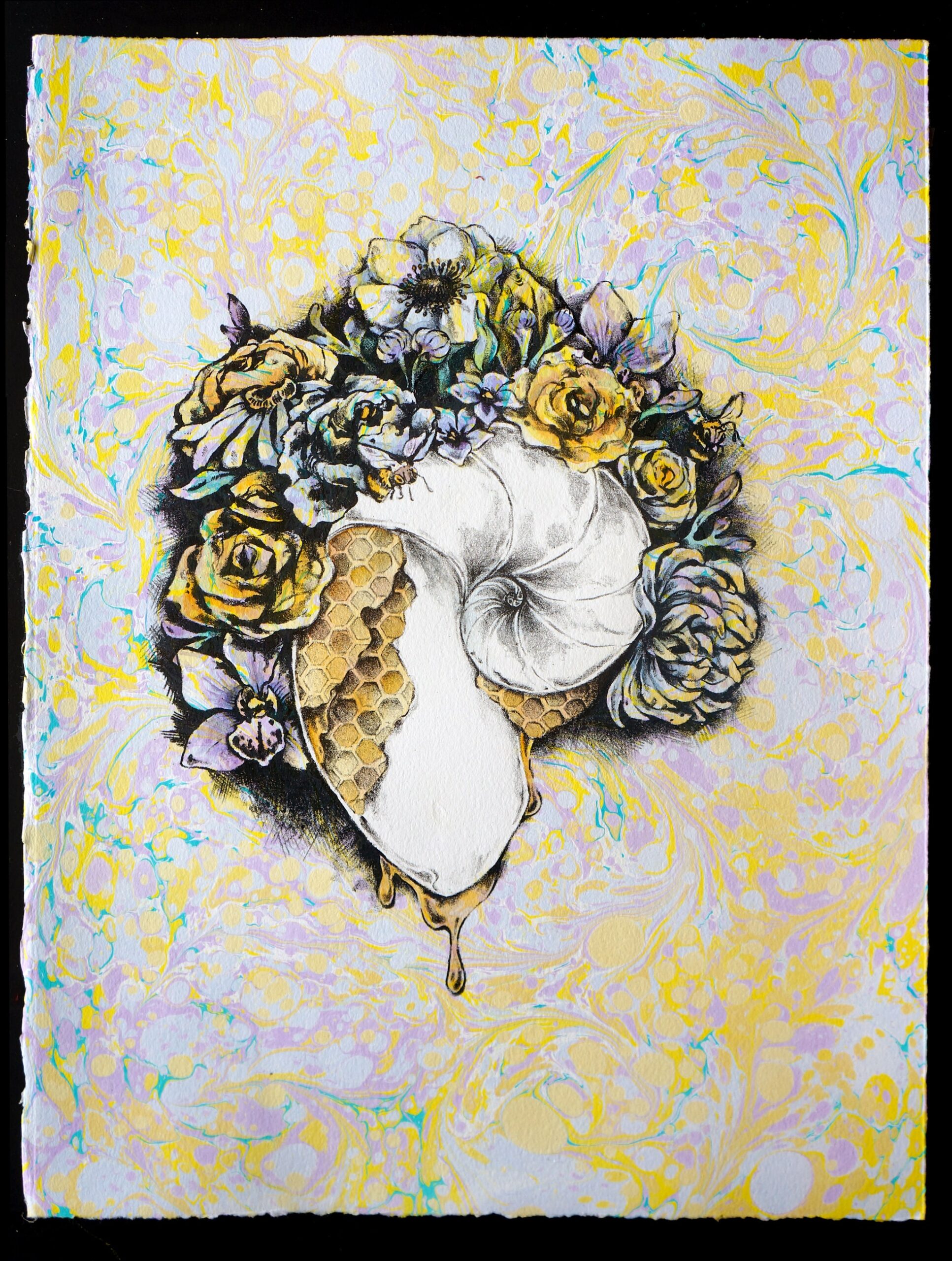
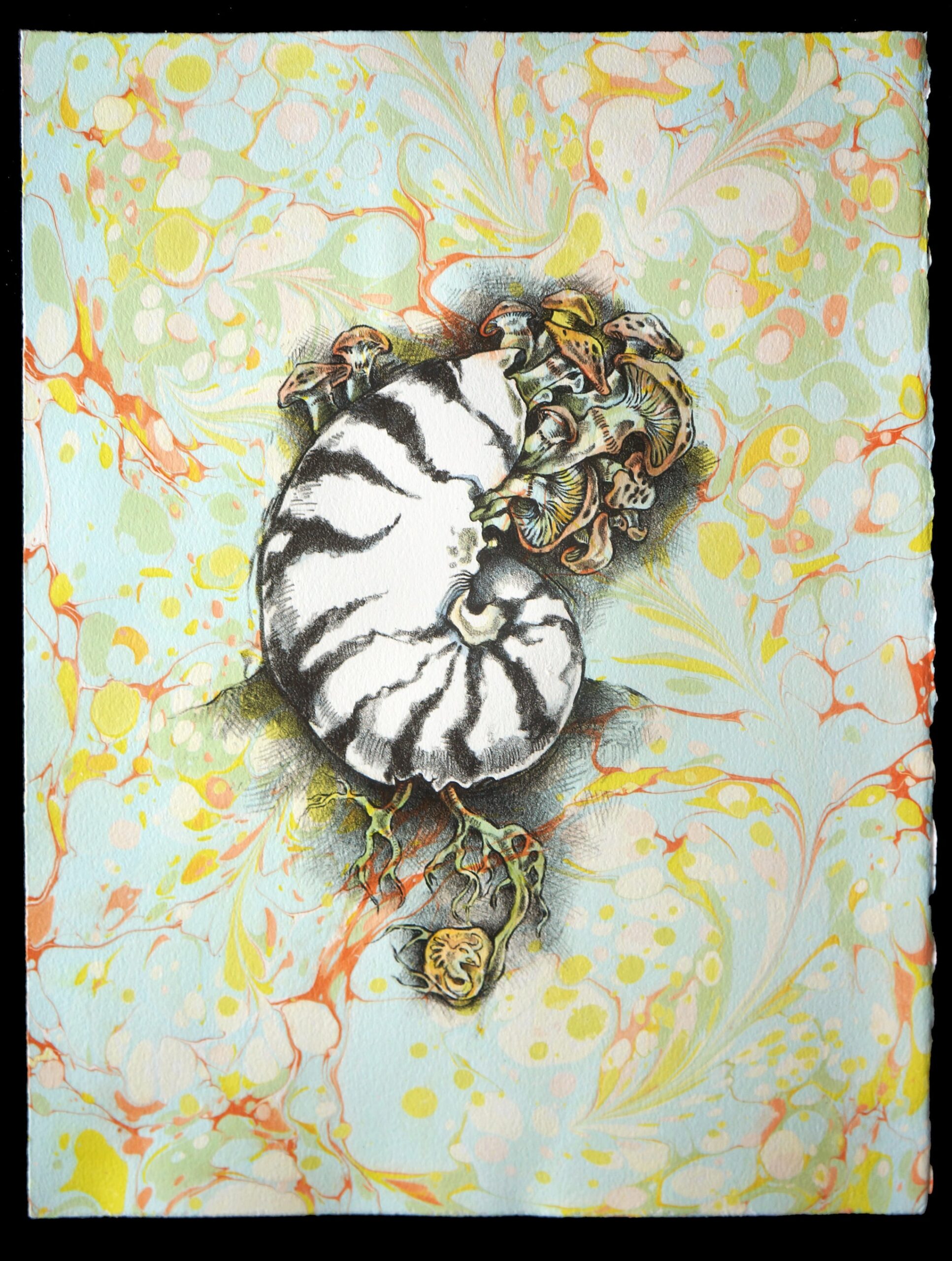
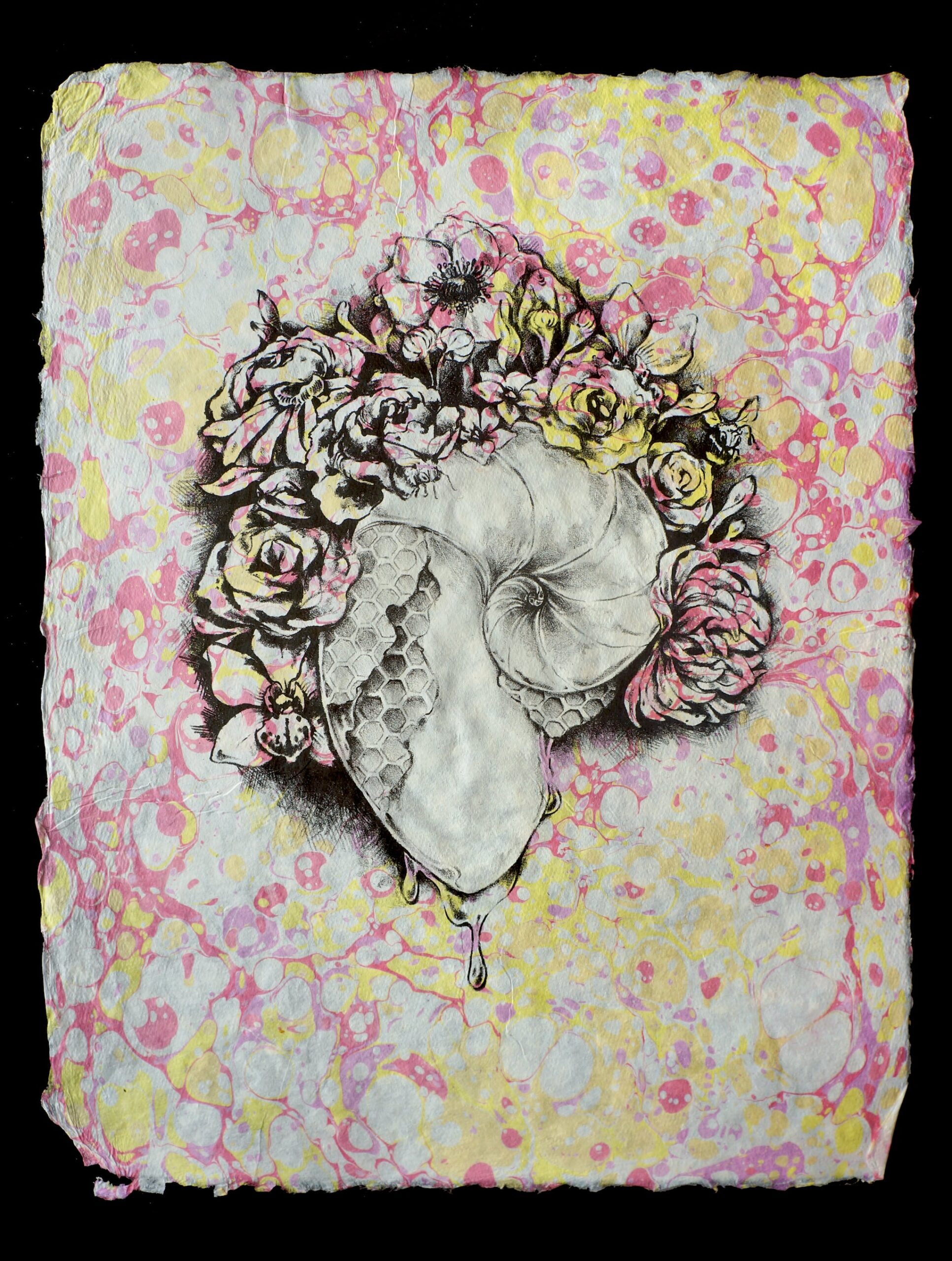
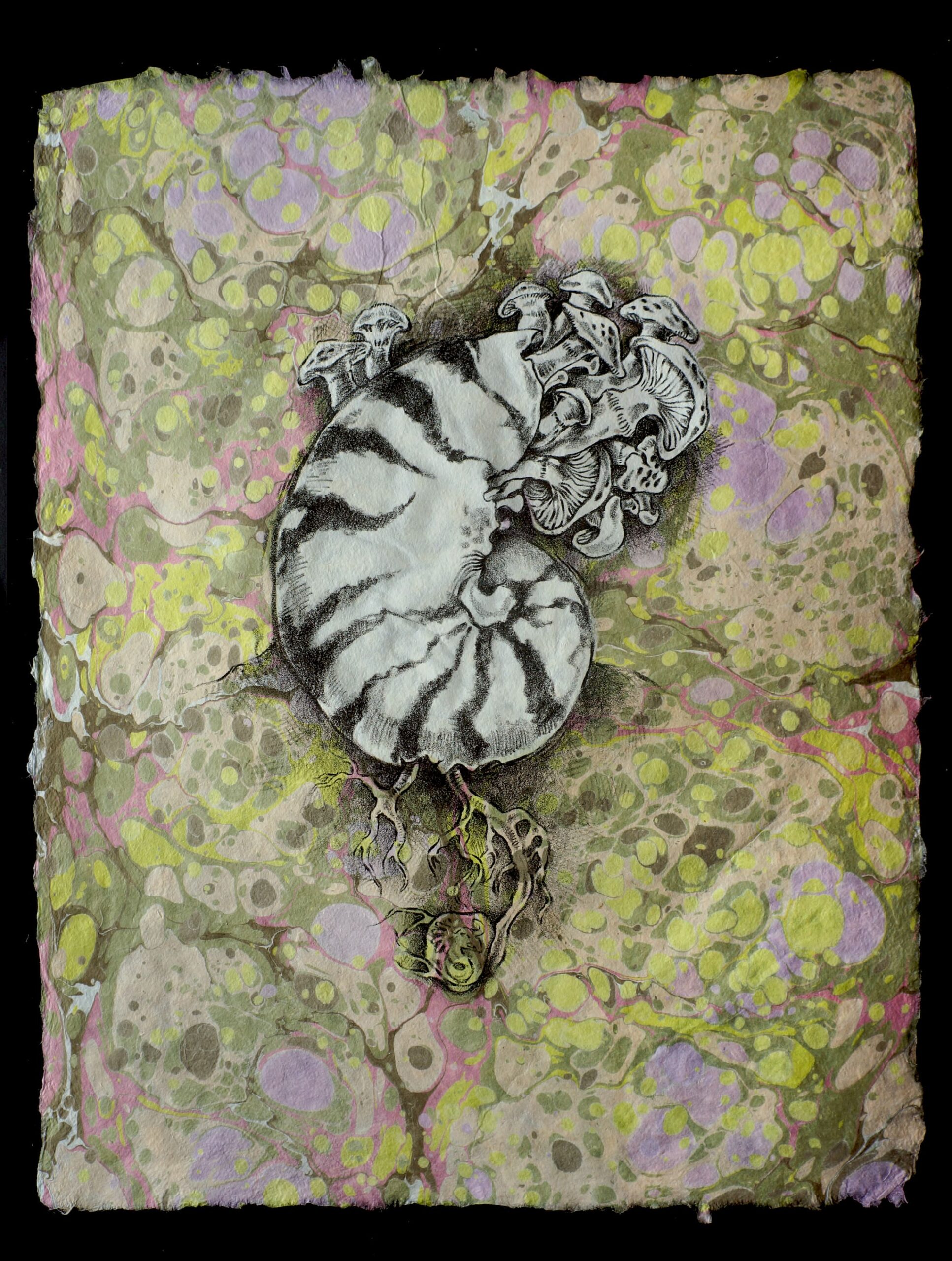
Lithography feels like the printmaking method most connected to expressive drawing. For me, it feels like a more direct translation from a sketch than most of the relief techniques I enjoy. I have practiced both plate and stone lithography and have experimented with layered prints that employ masking and traditional water marbling.
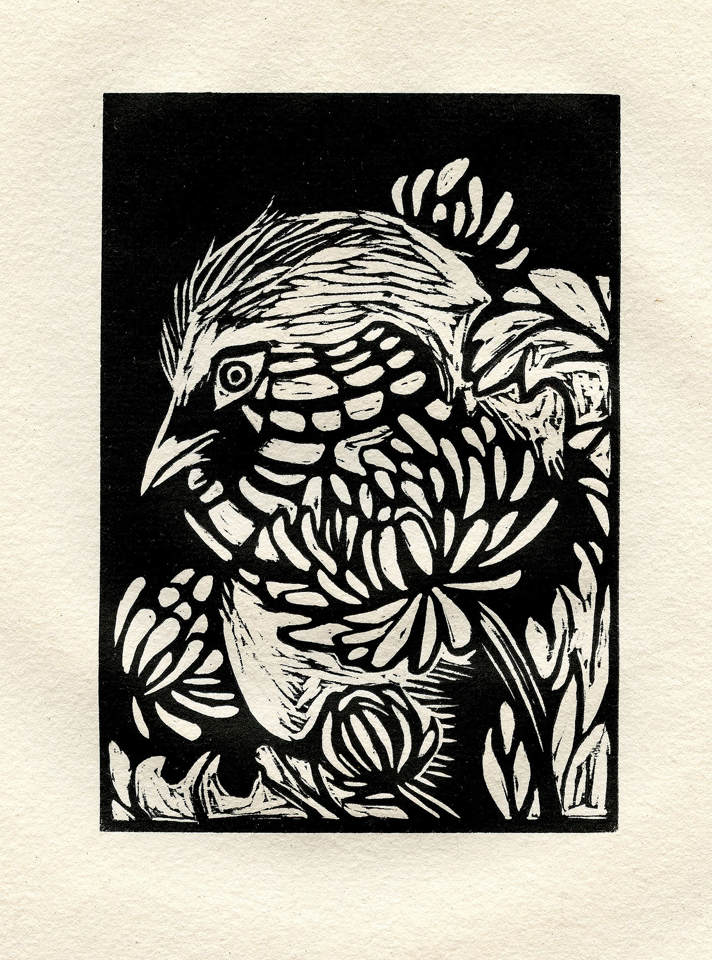
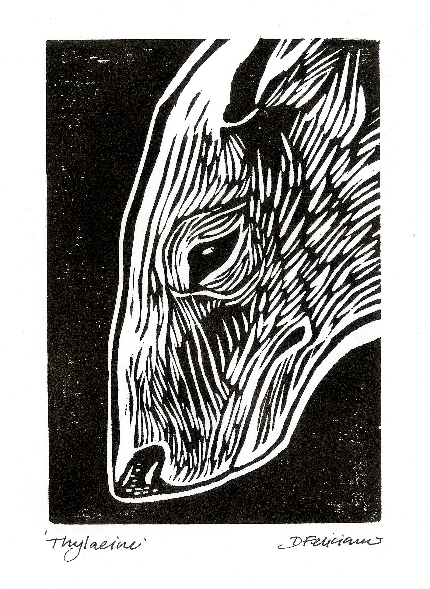
RELIEF PRINT
ABOUT THE PROCESS
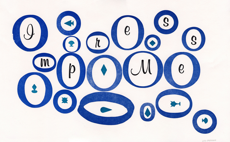
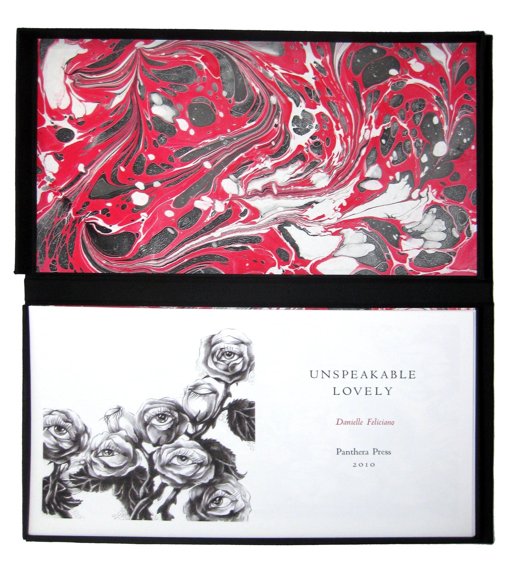
I have worked in many types of relief print but primarily wood cut and letterpress. My letterpress training began in 2010 and in that same year I began commercial work under the moniker Panthera Press. My private press primarily produces custom stationery such as wedding invites, but when I have time I like to experiment with more conceptual prints.
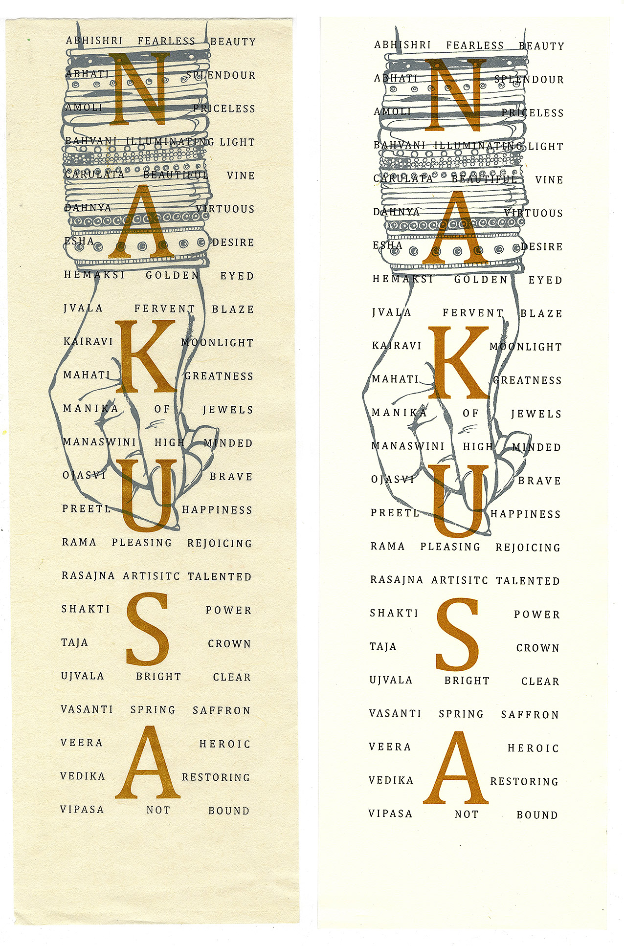
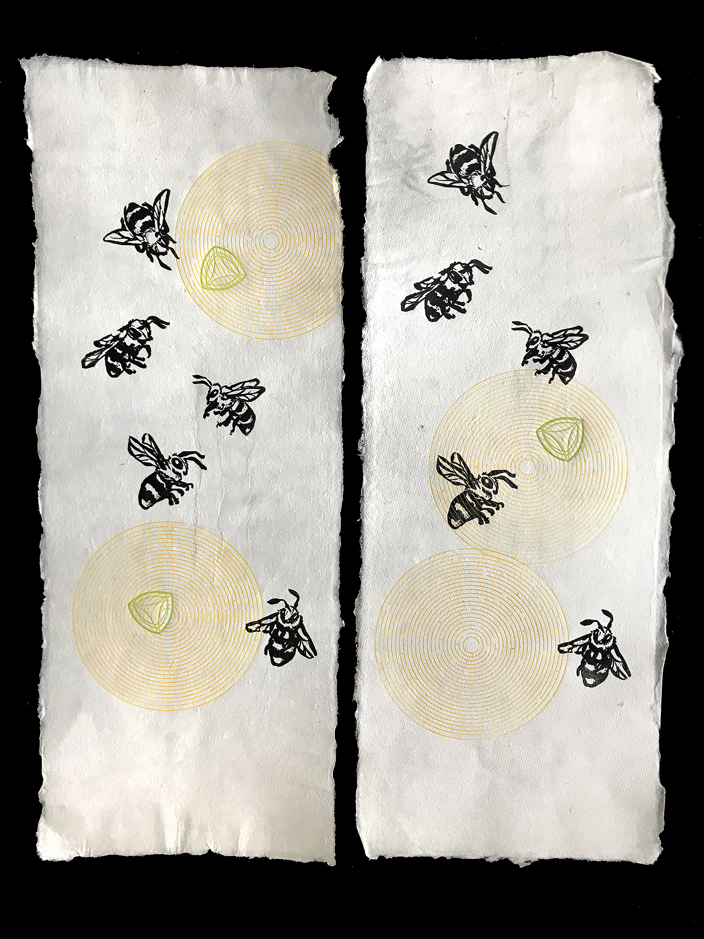
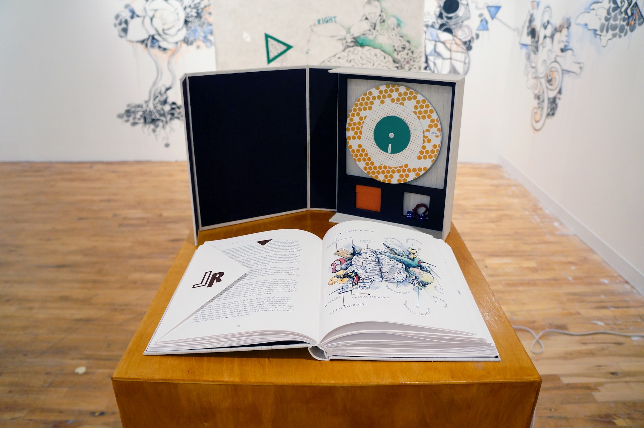
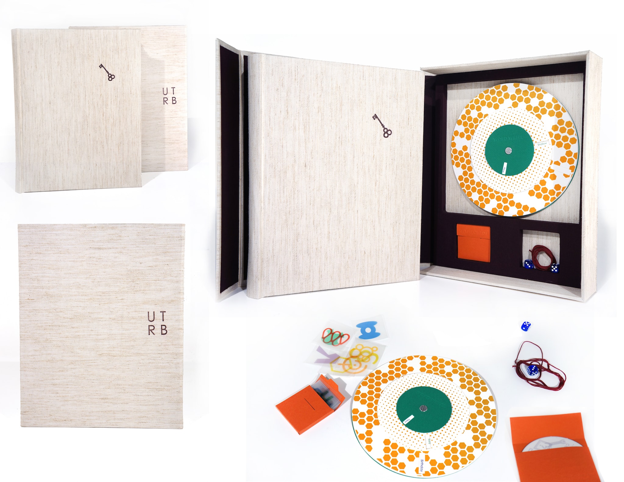
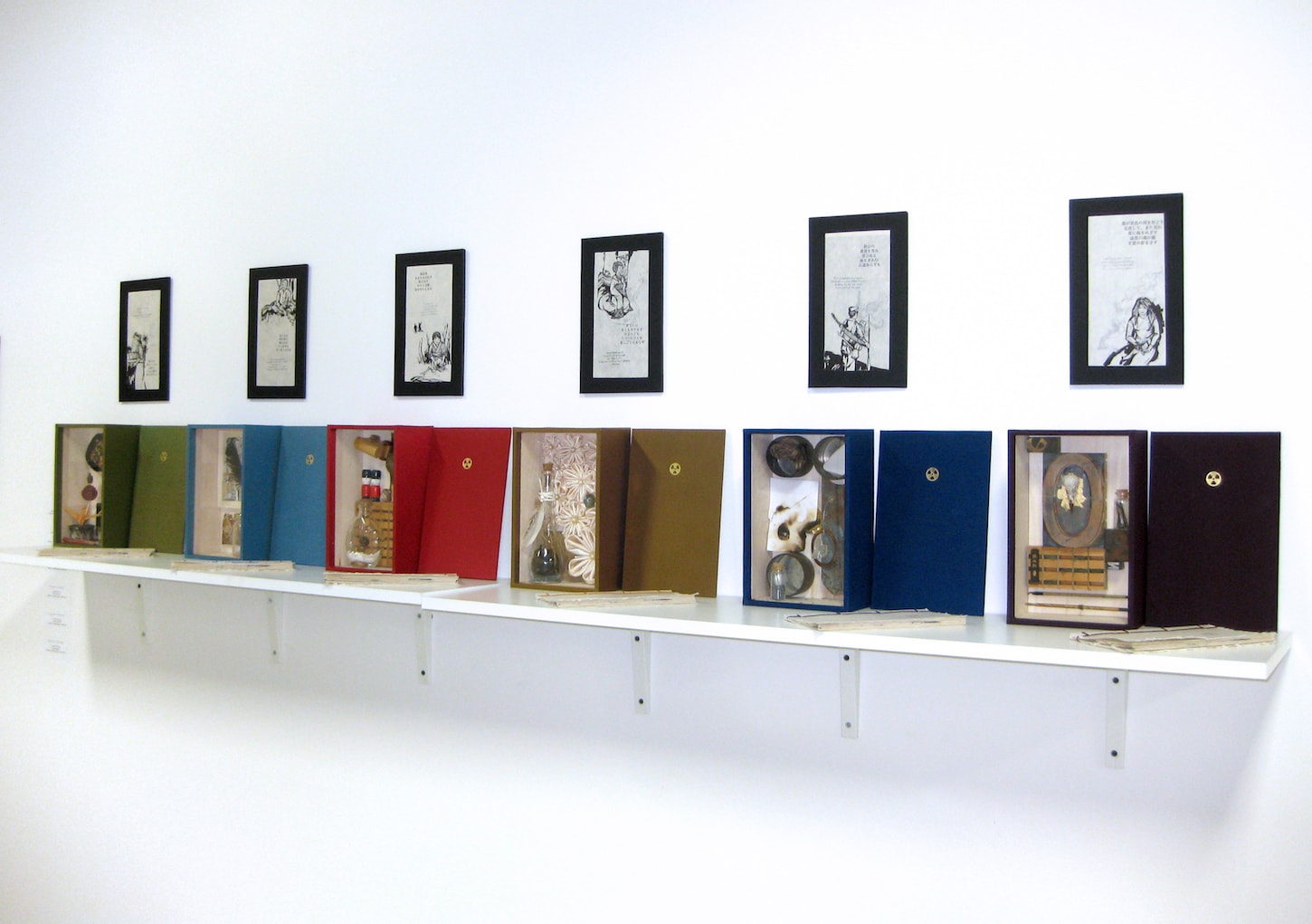
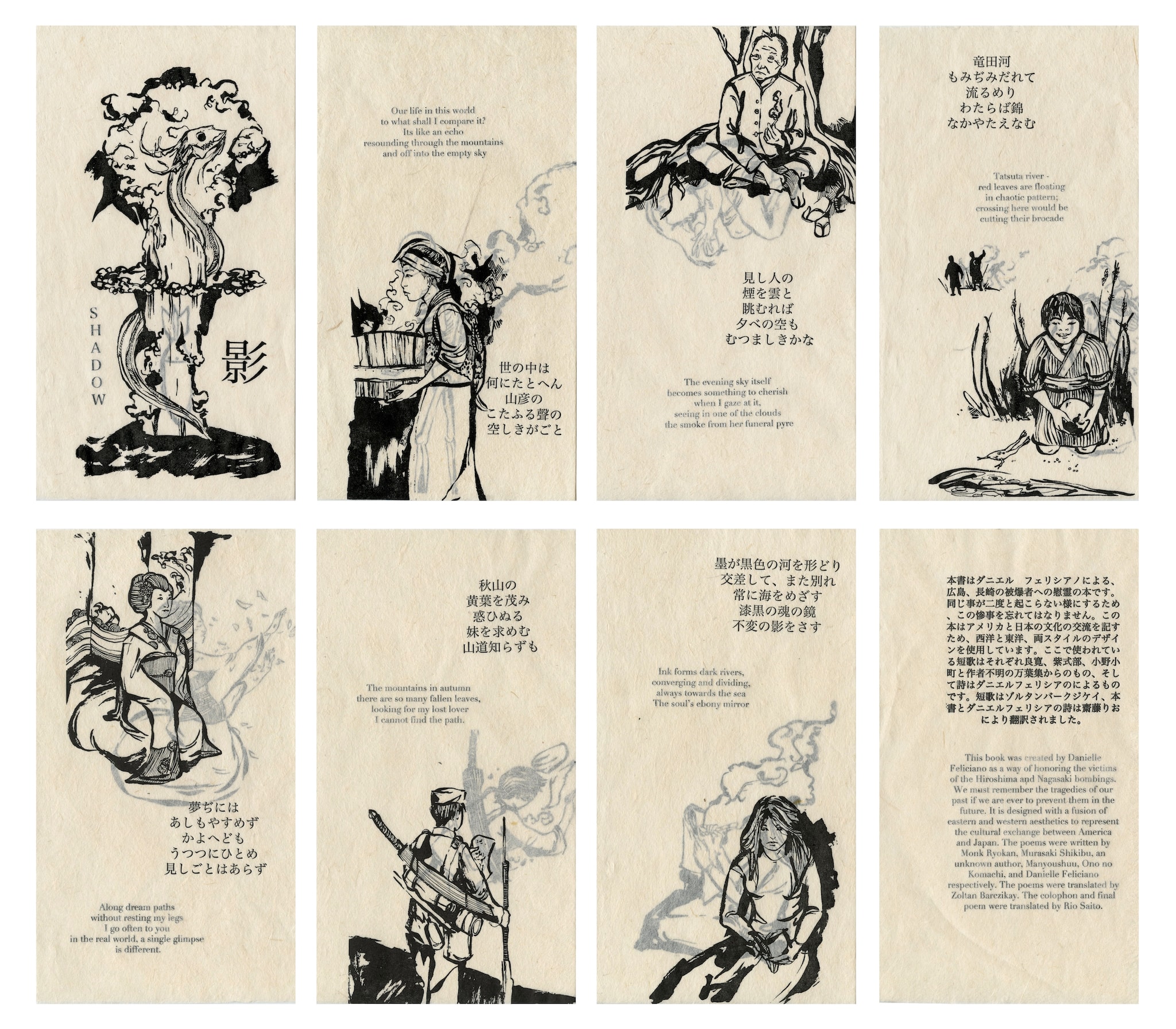
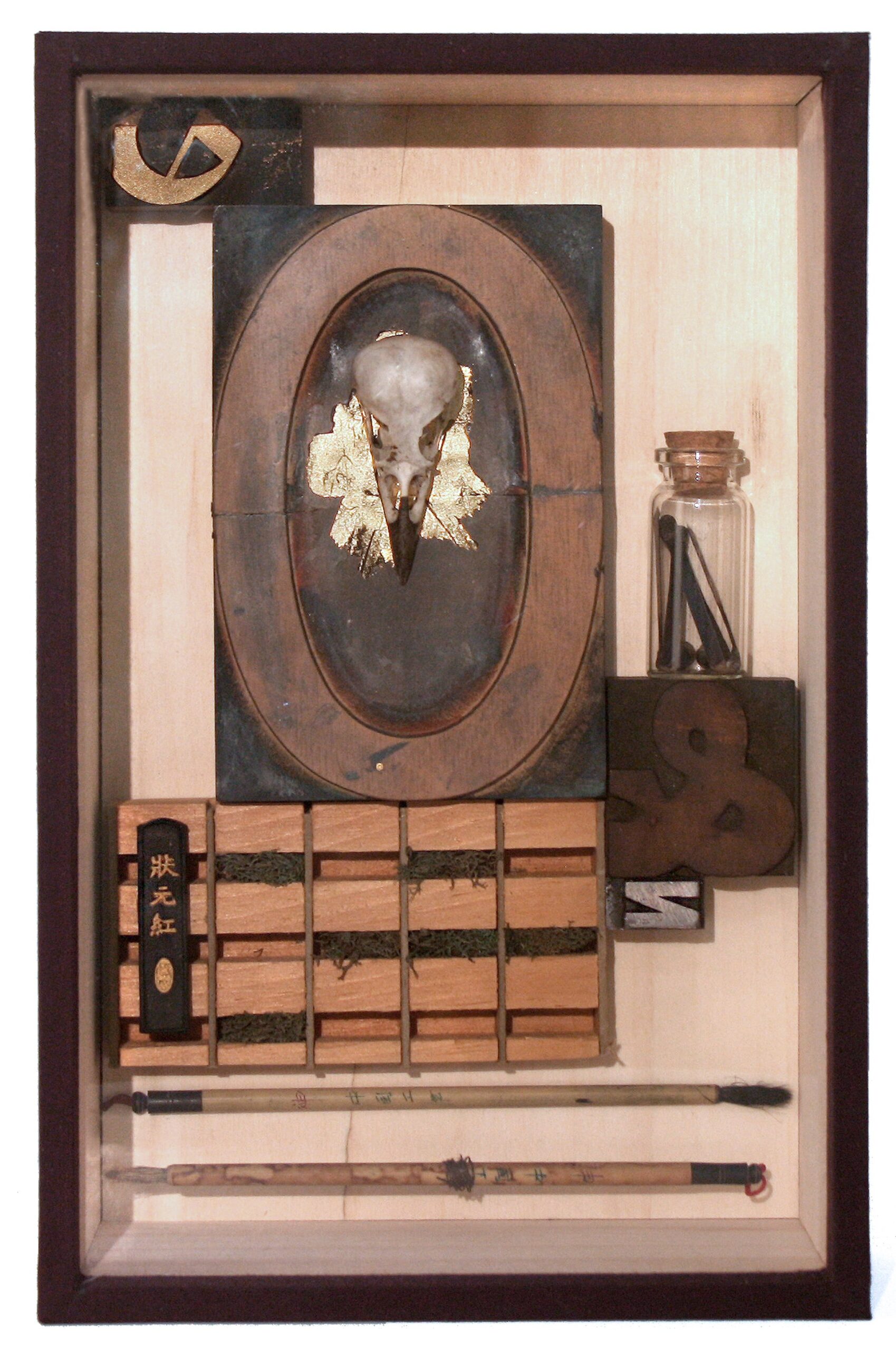
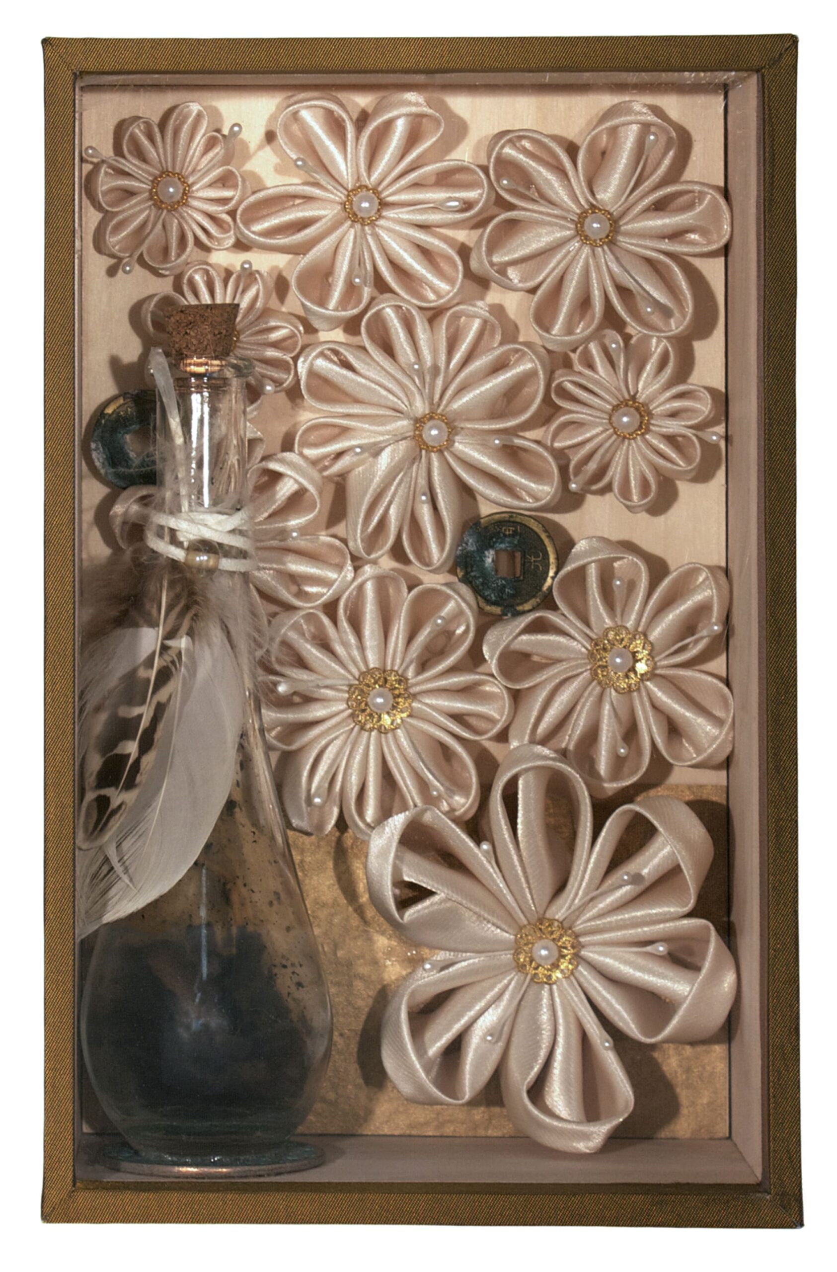
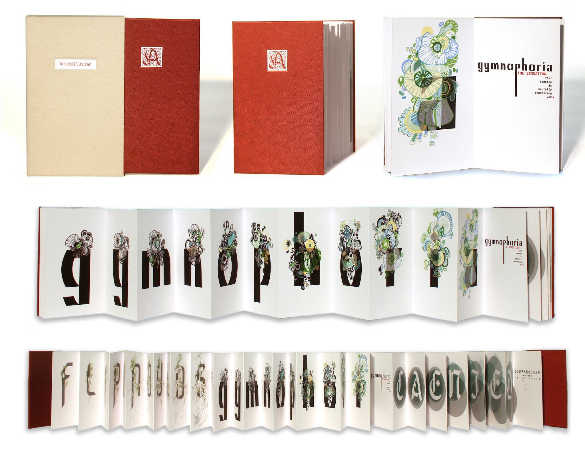
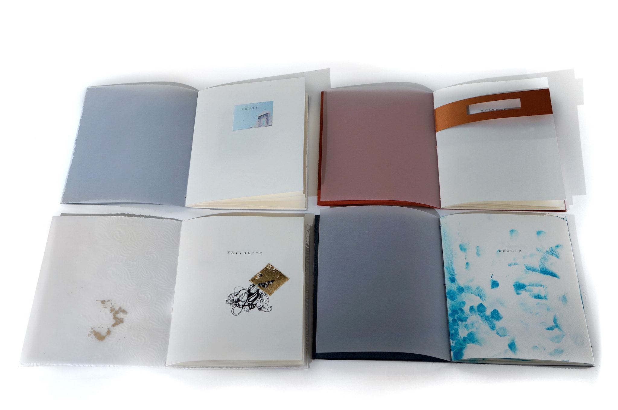
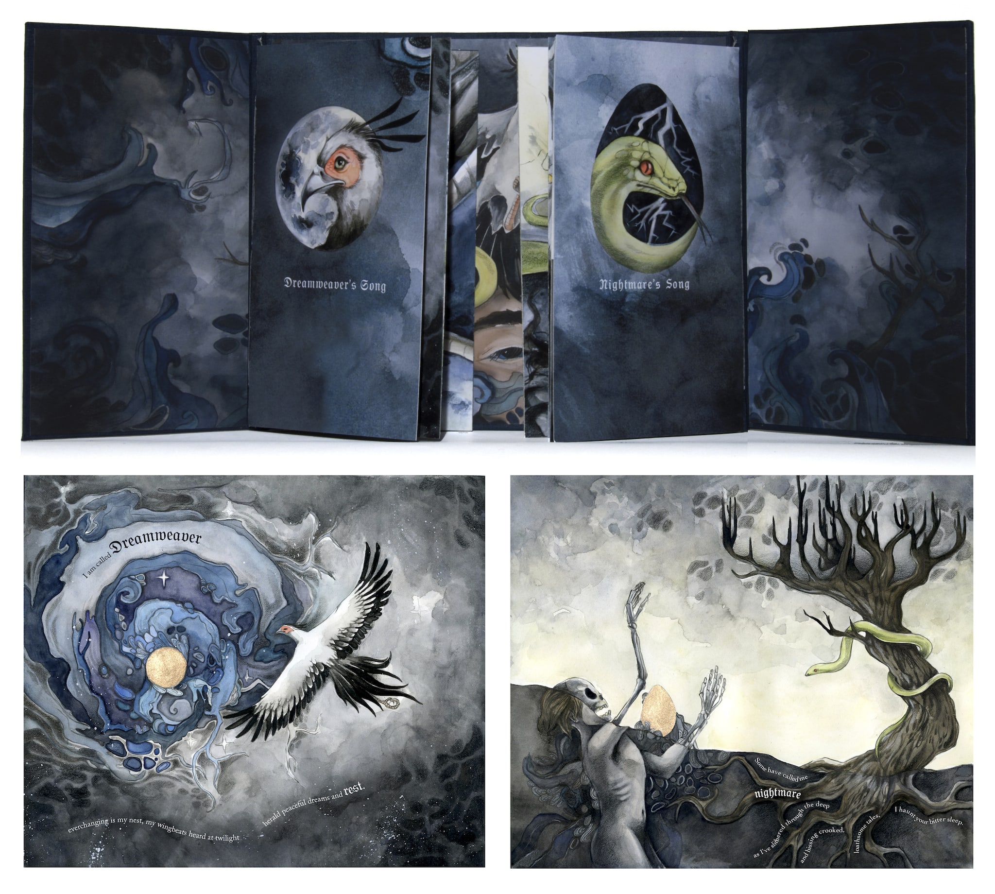
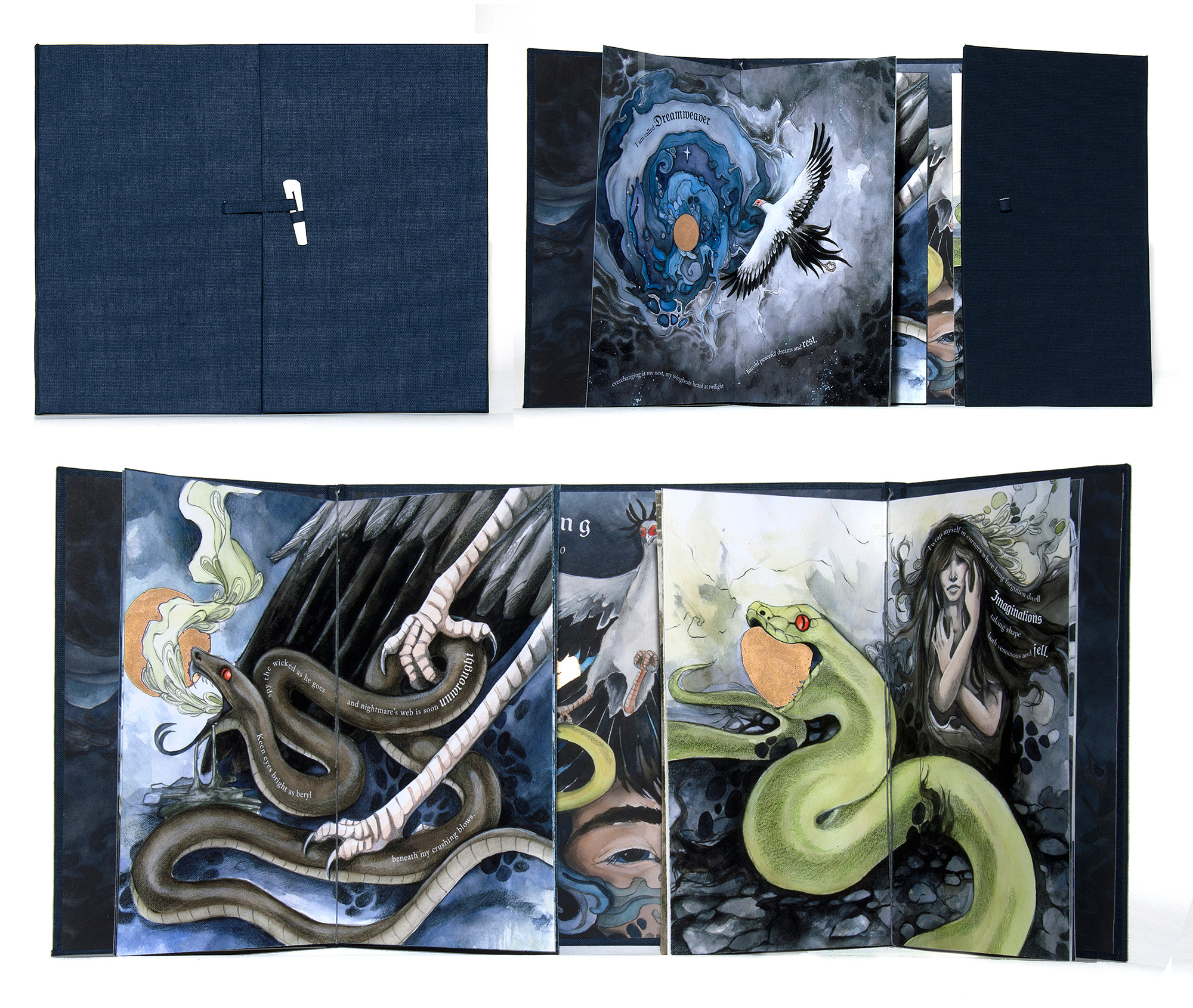
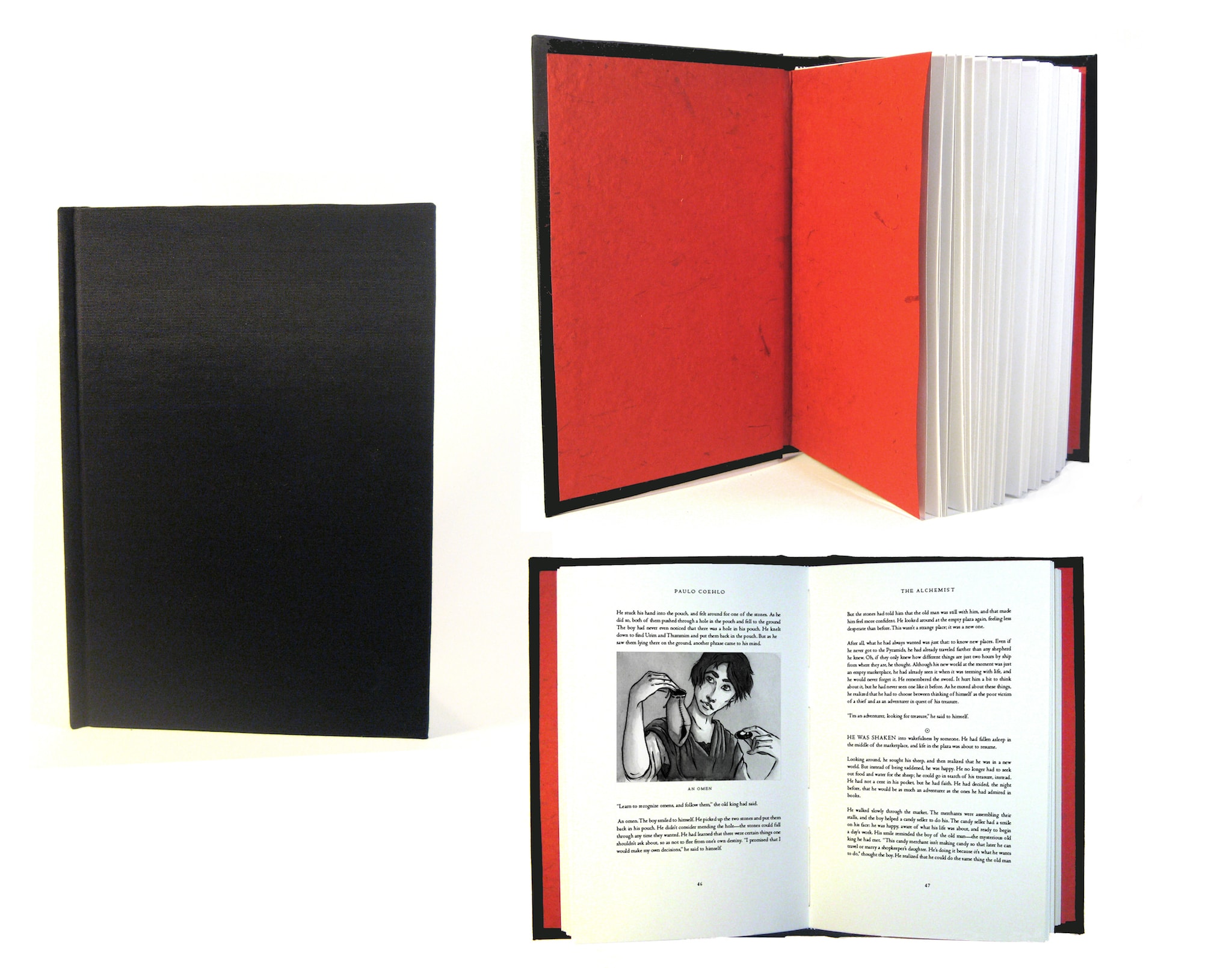
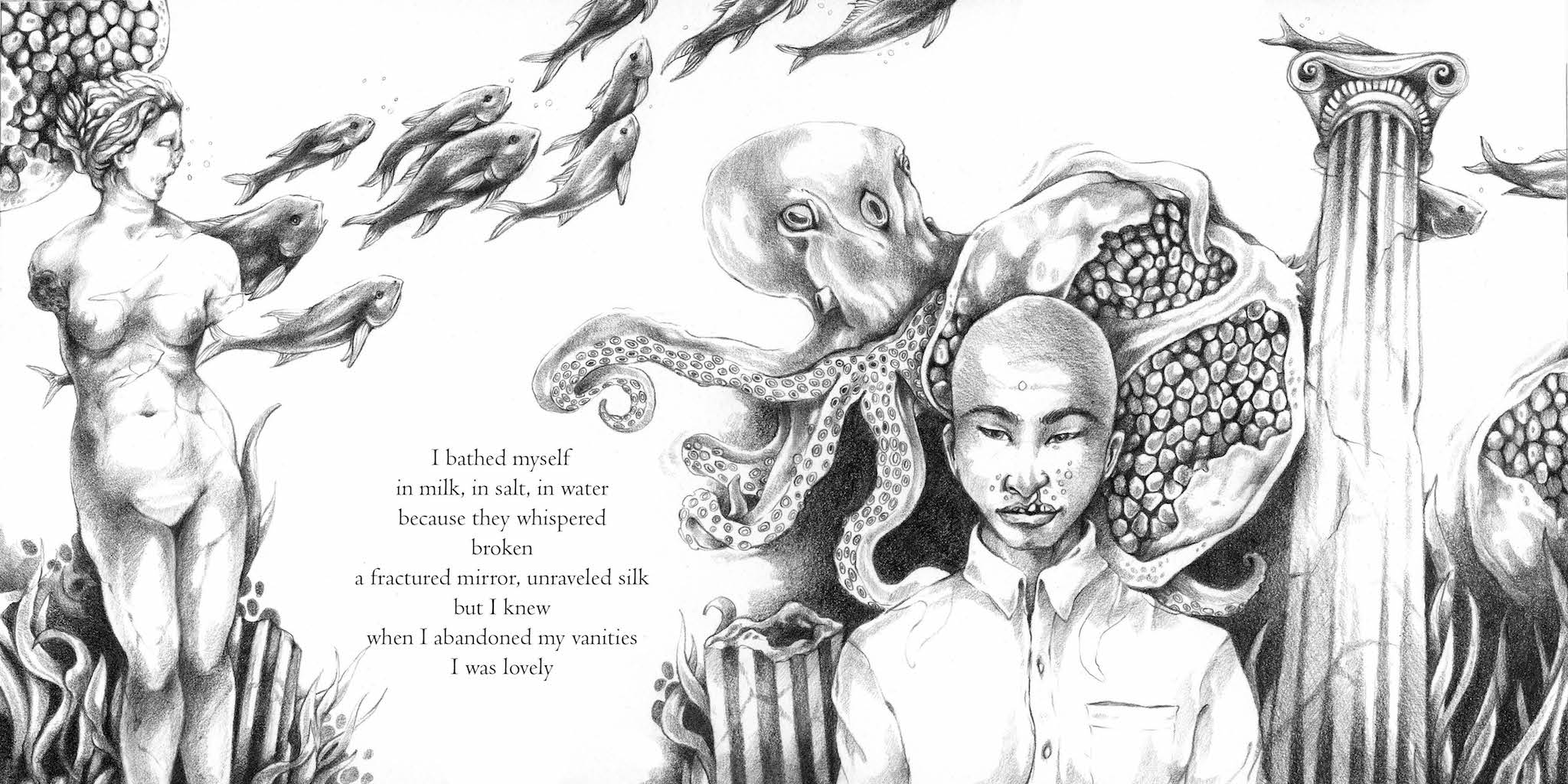
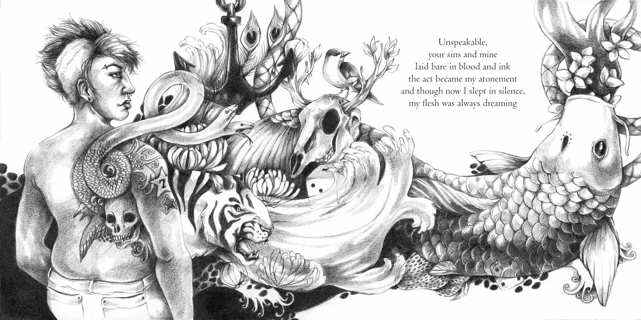
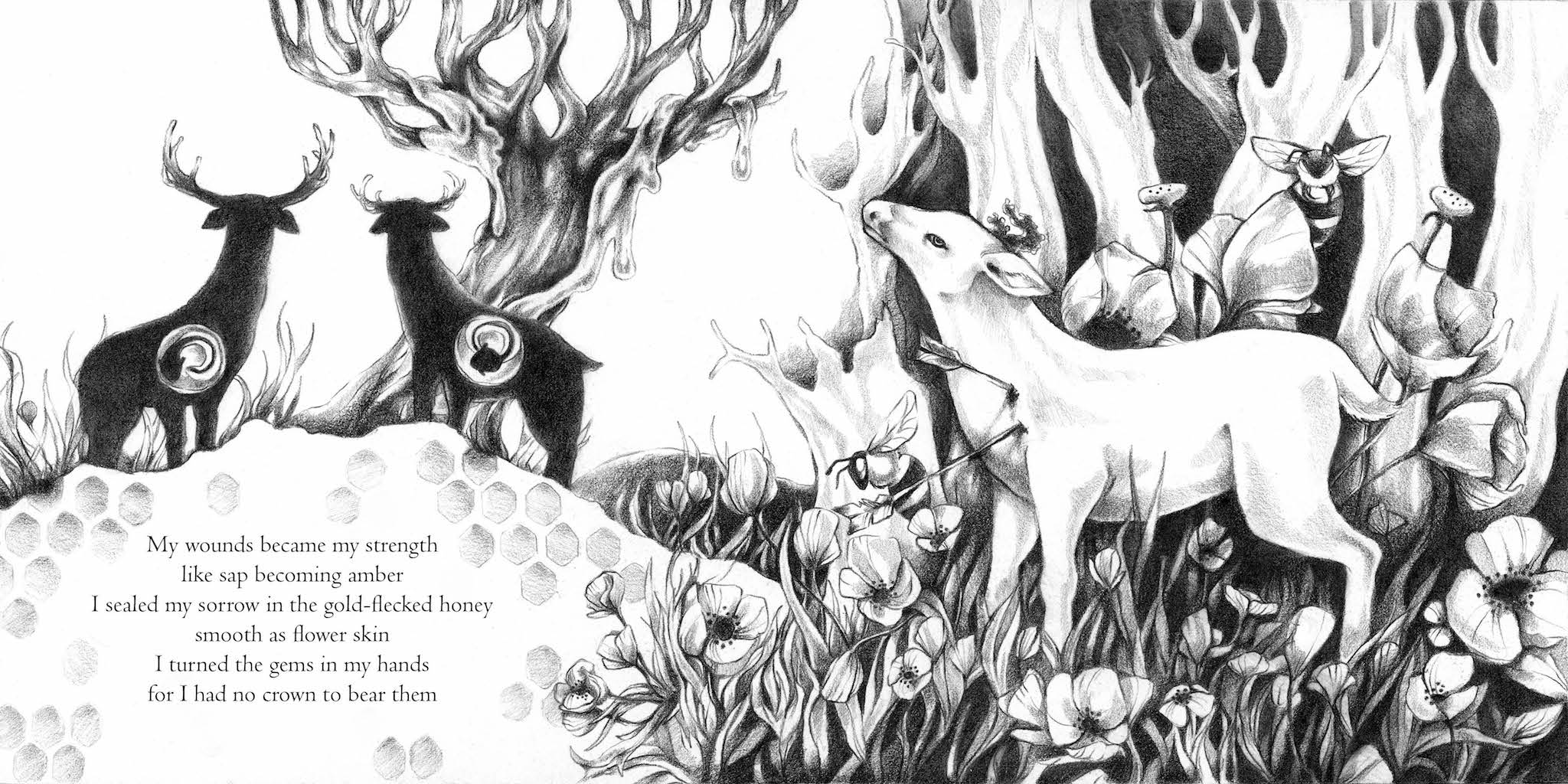
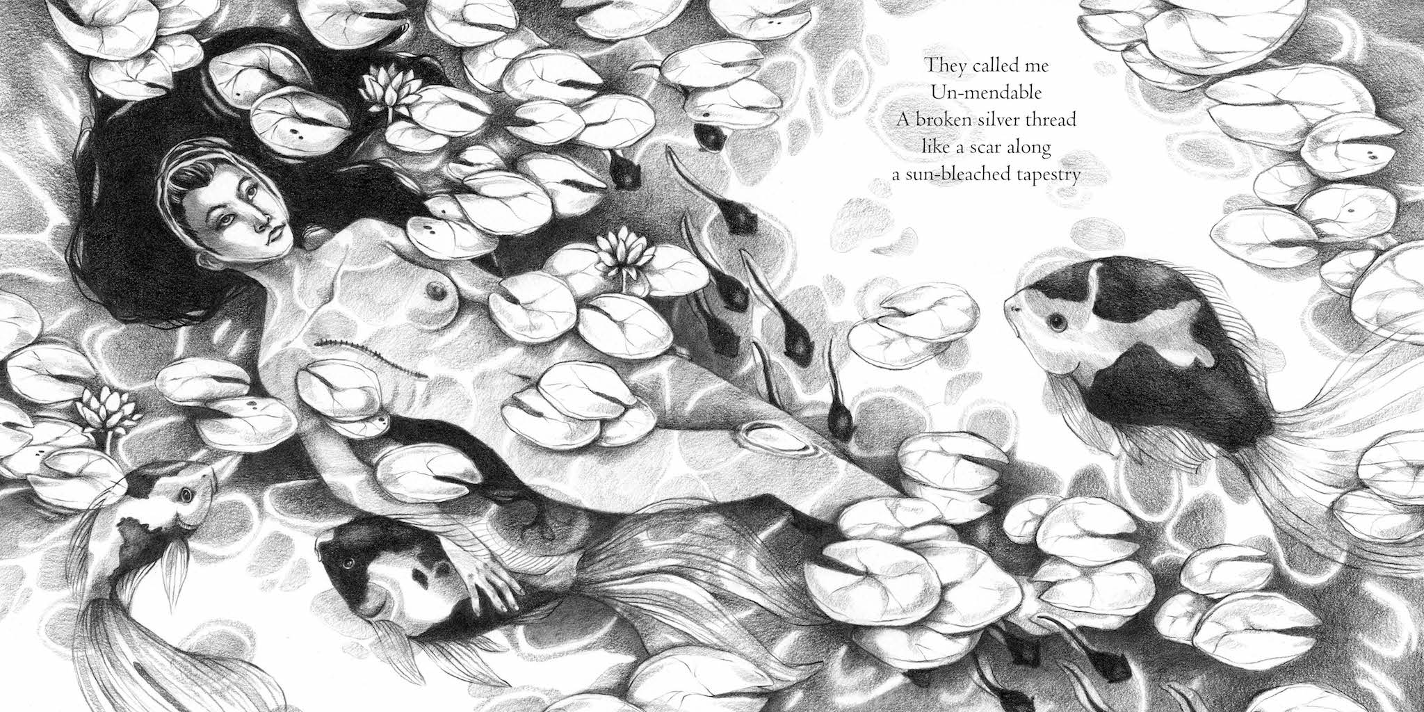
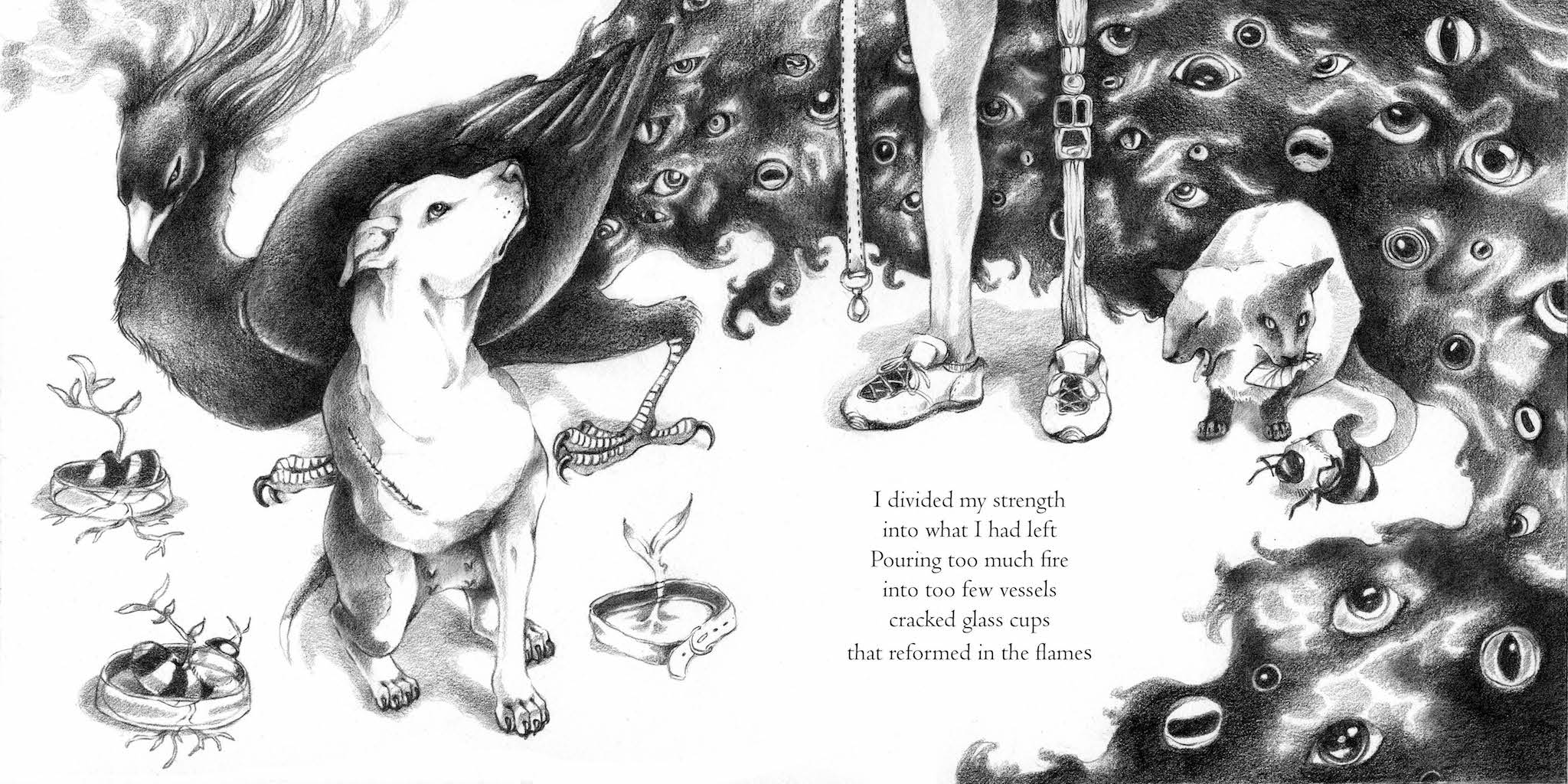
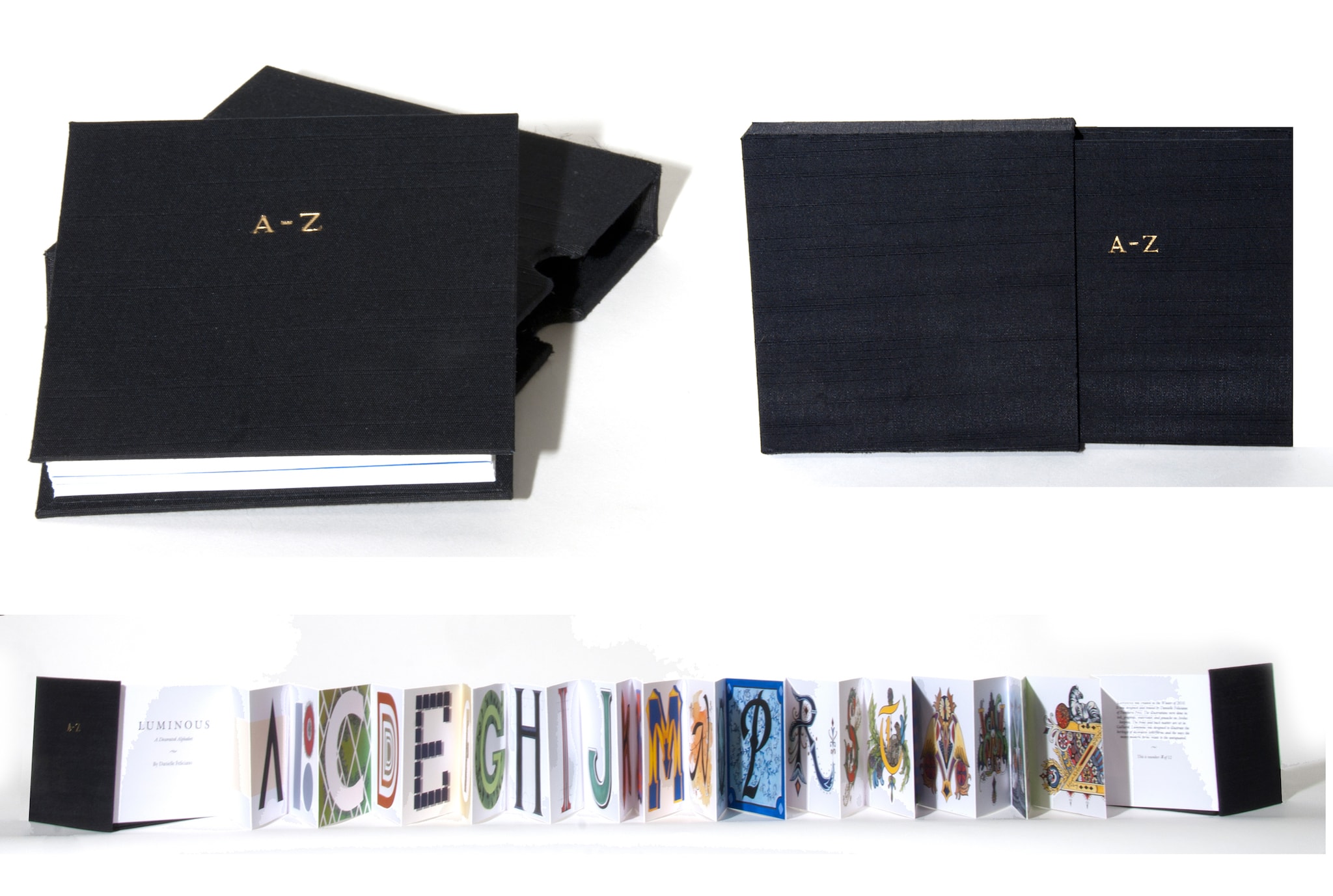
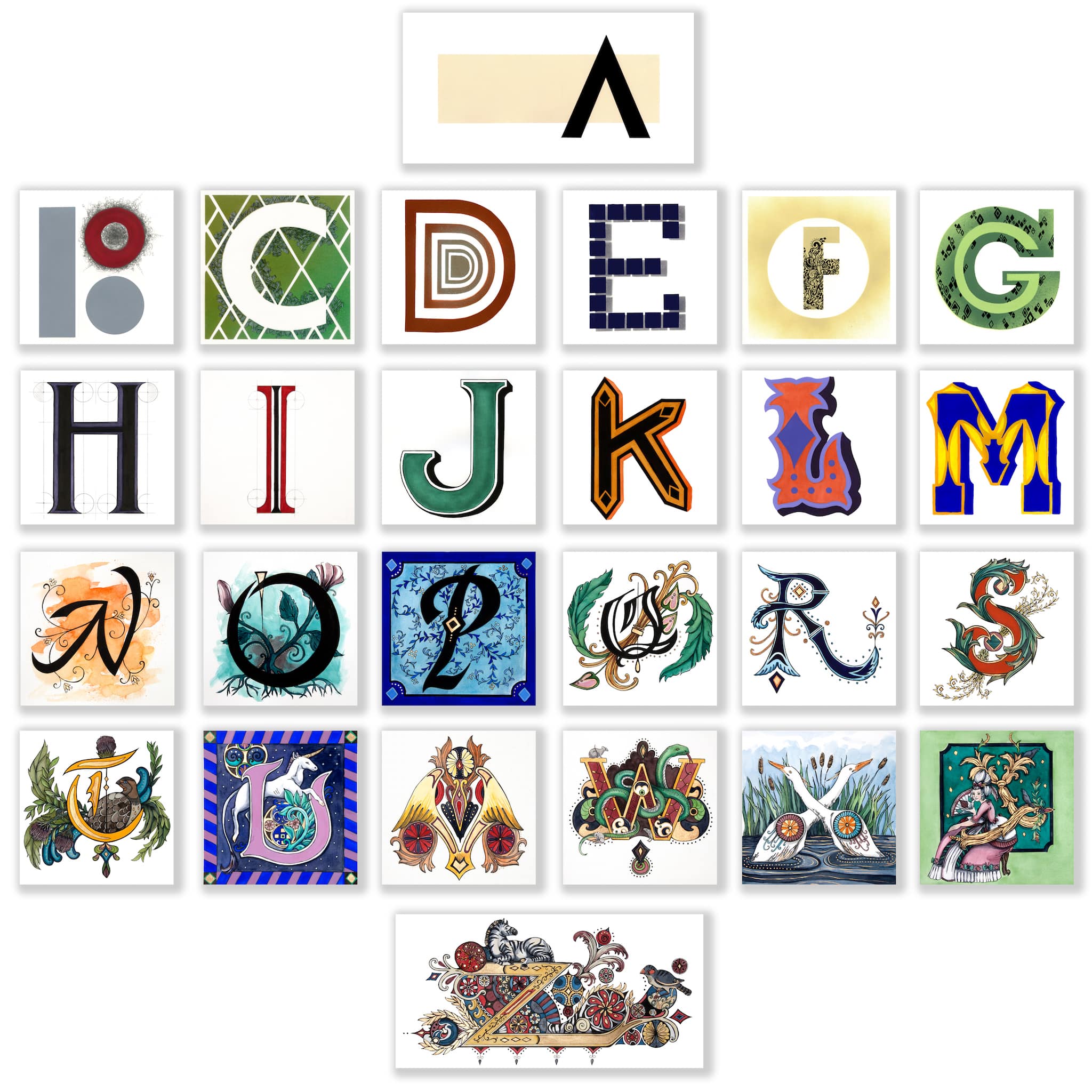
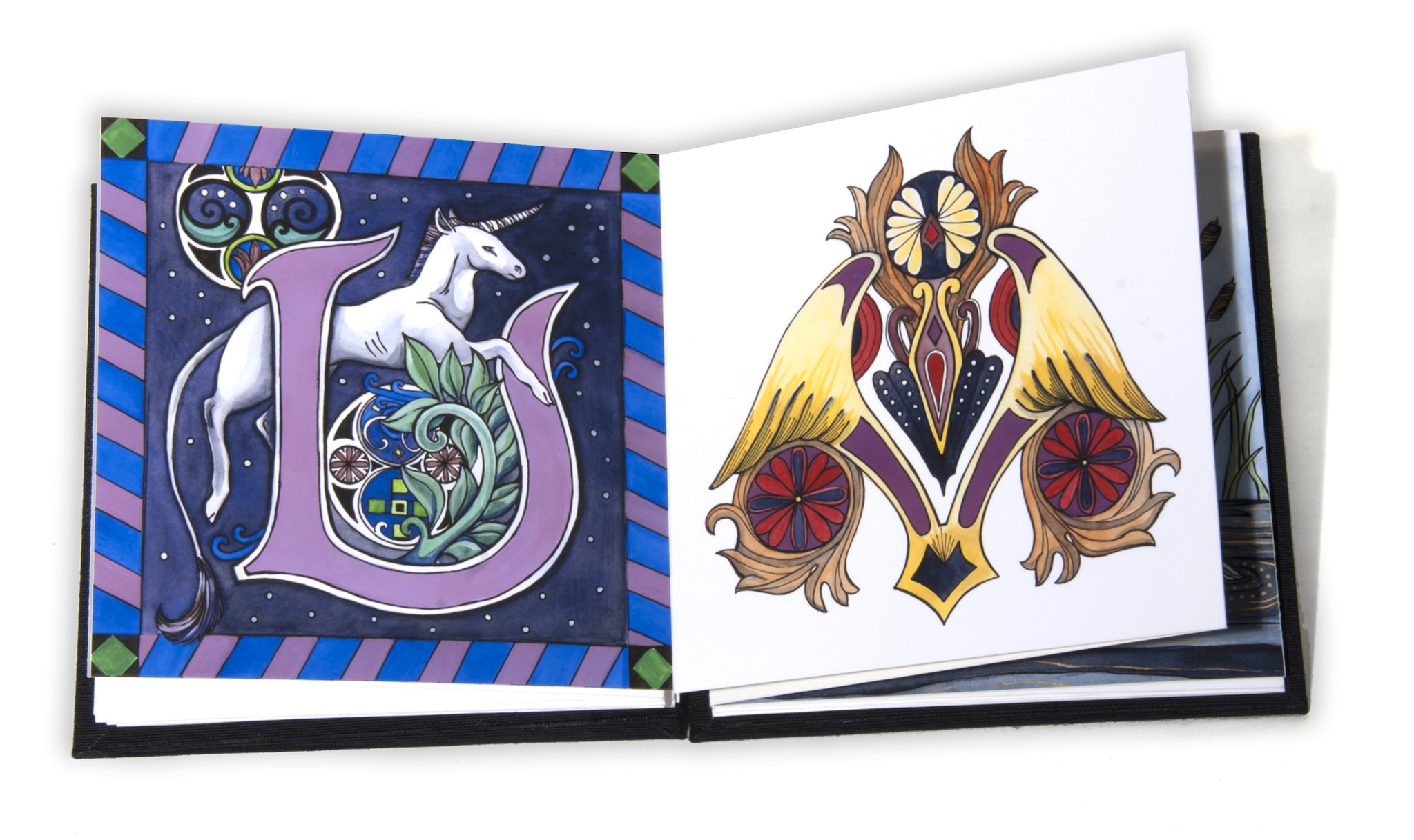
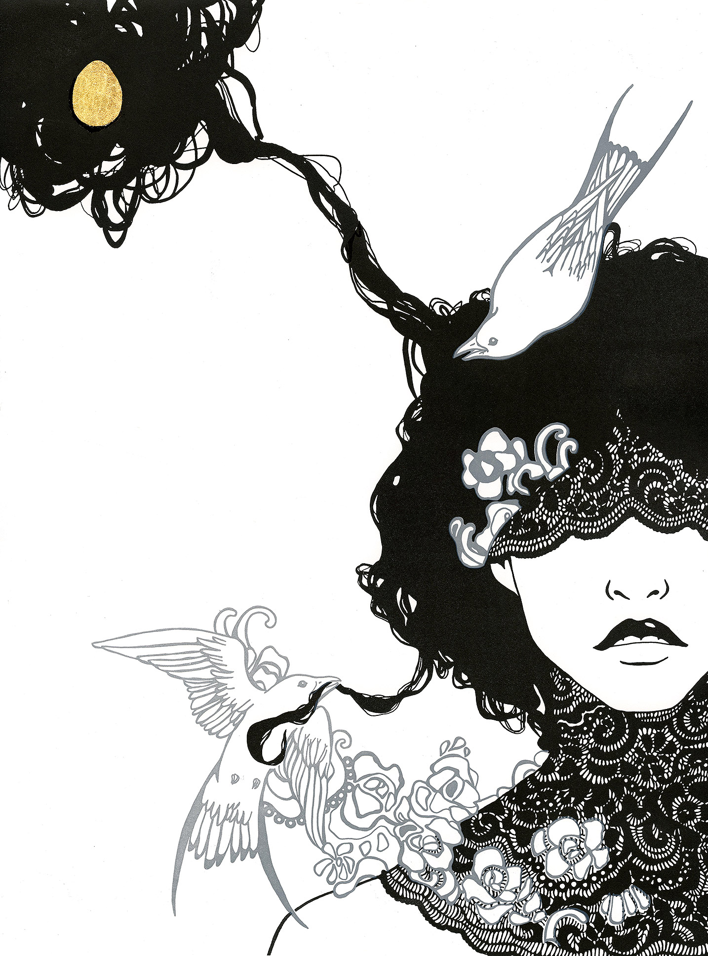
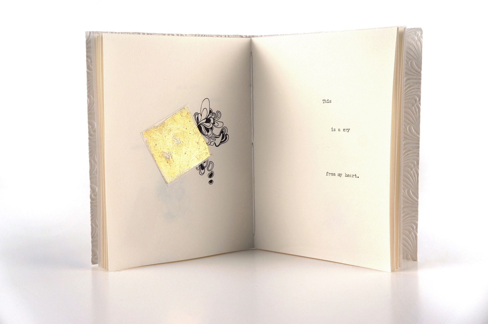
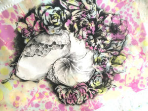
CONCEPTUAL BOOK DESIGN
ABOUT THE PROCESS
Books combine text, image, and craft in a way that few other objects do. I approach books text first. It is the least flexible of the three elements as legibility is key. For illustration and binding I like the style, materials, and physicality of the book to compliment the content. The experience should be cohesive, where each element enhances the other and the sum is greater than the parts.
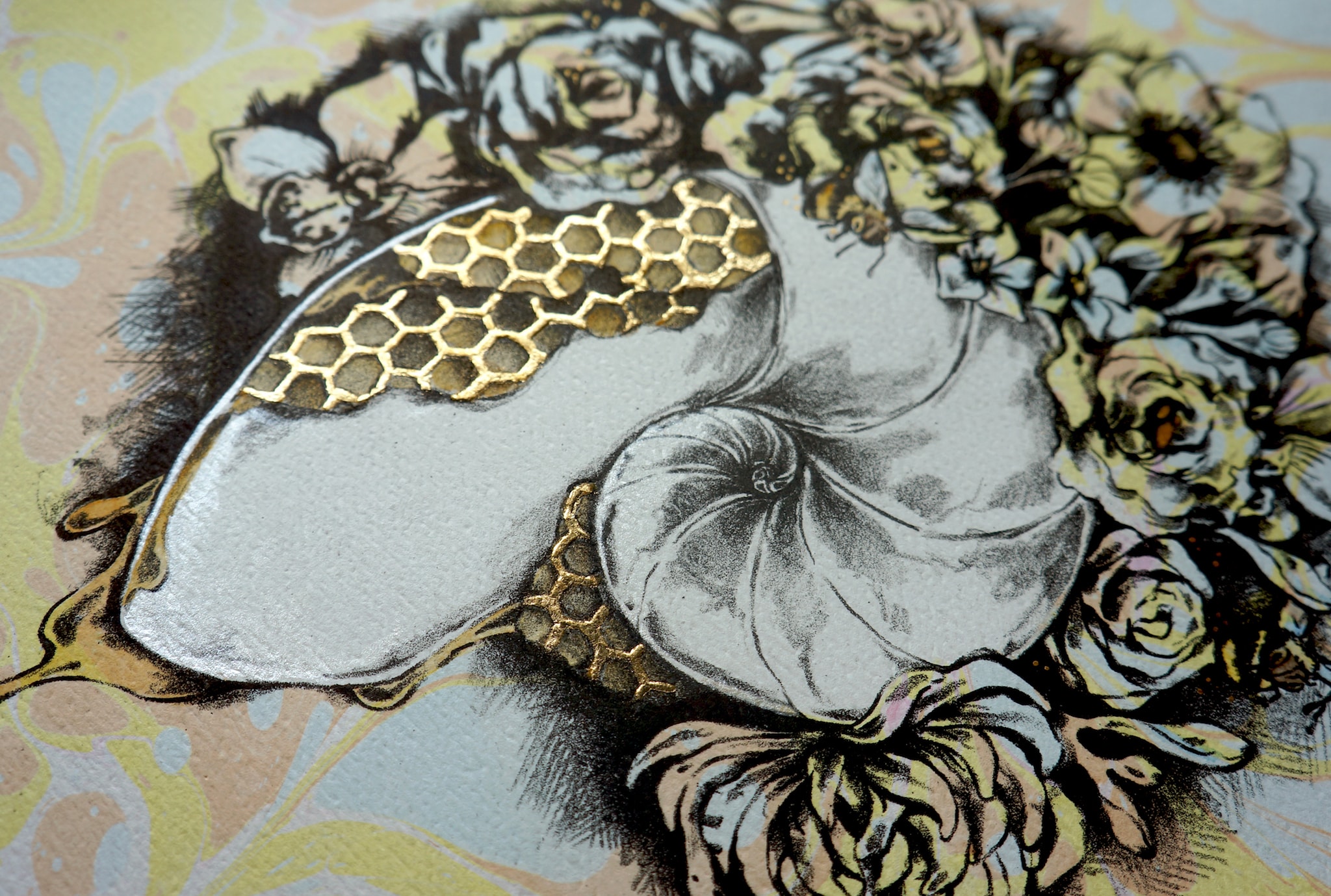
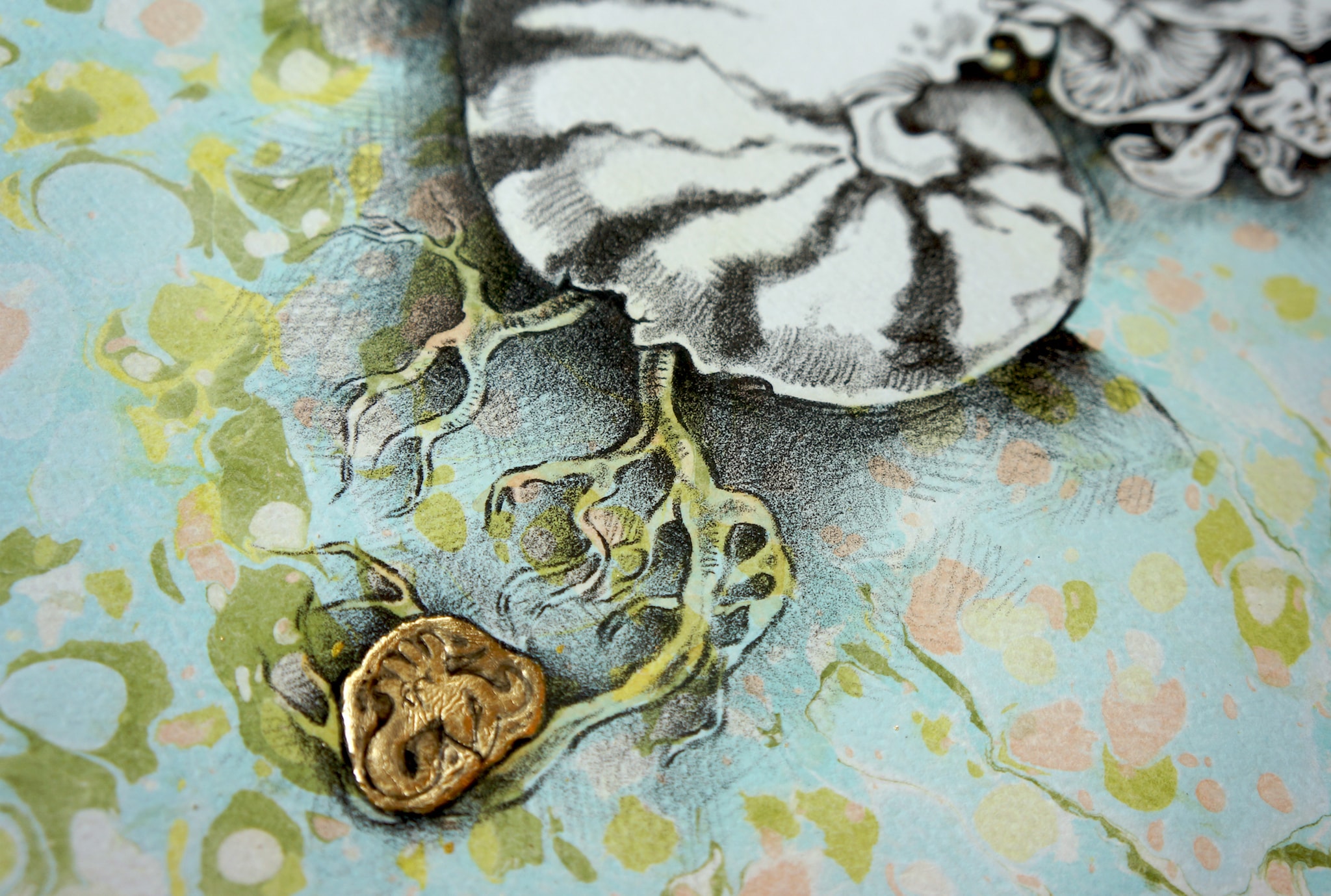
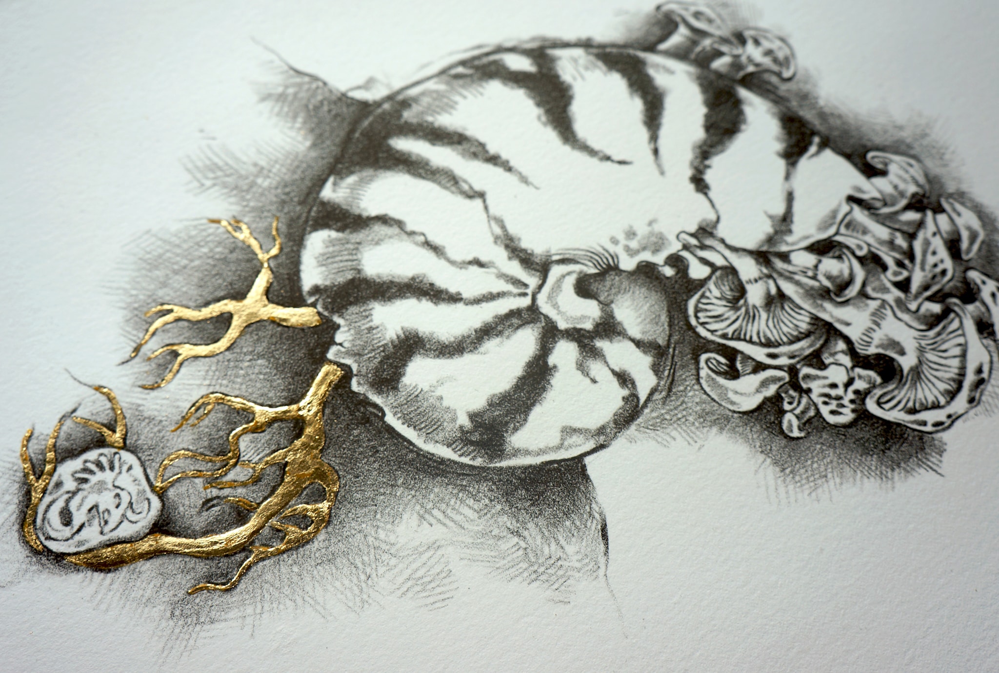
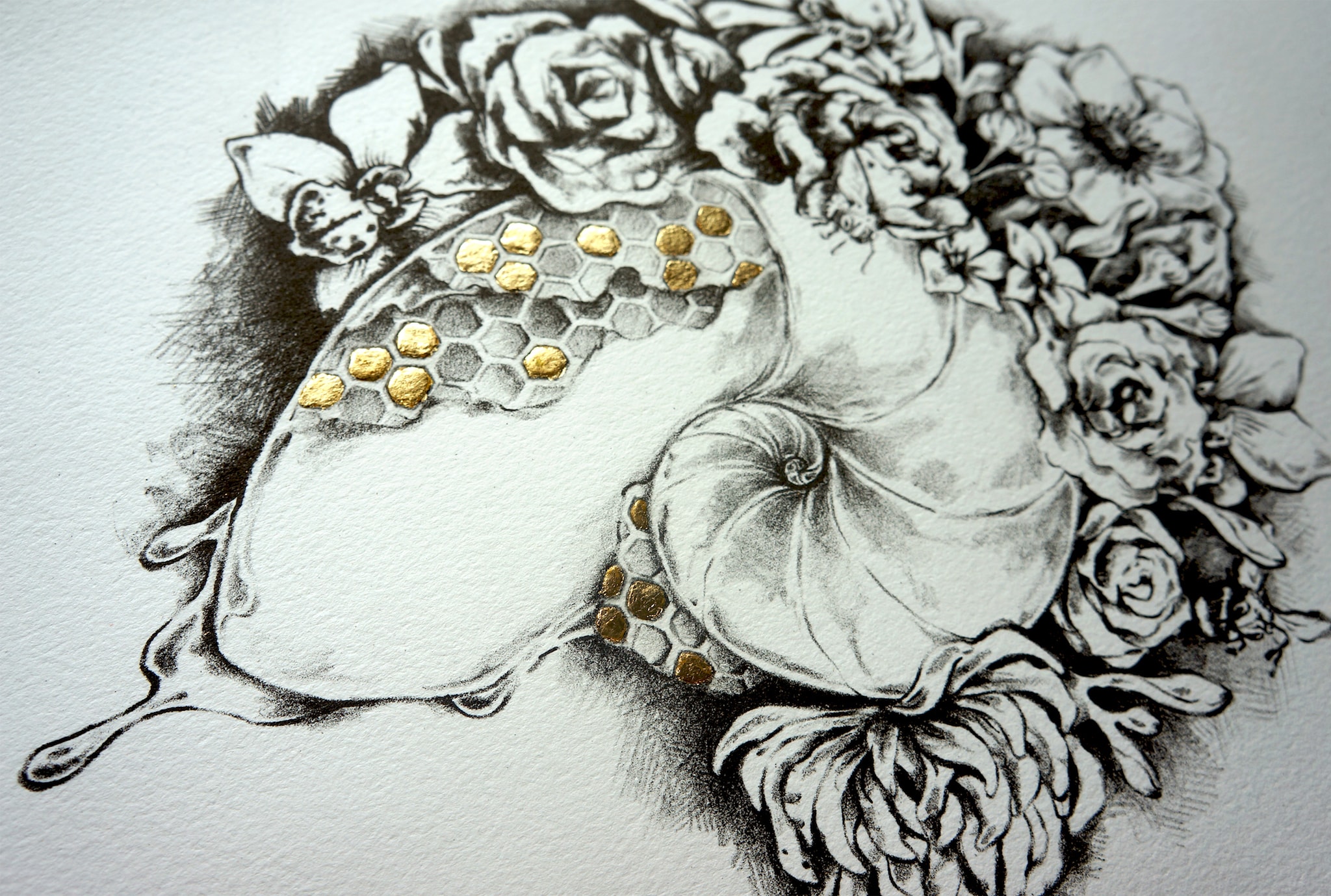
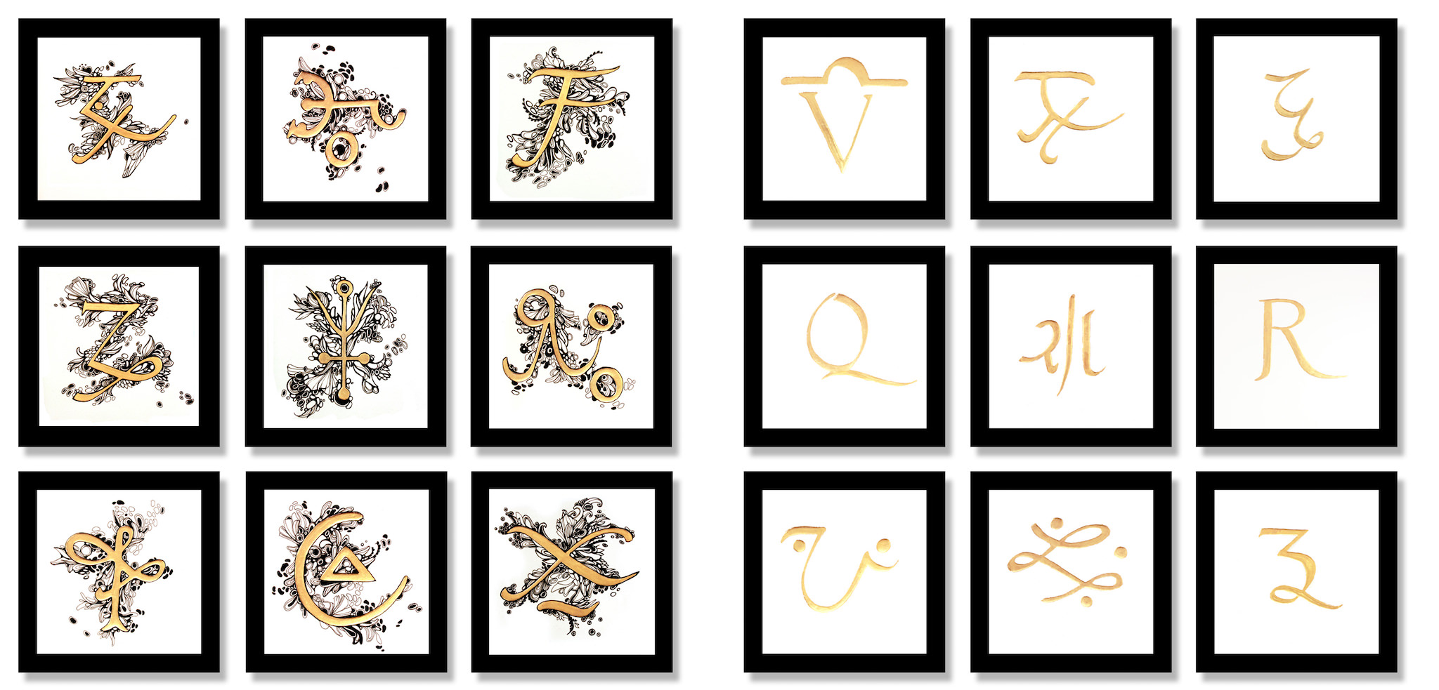
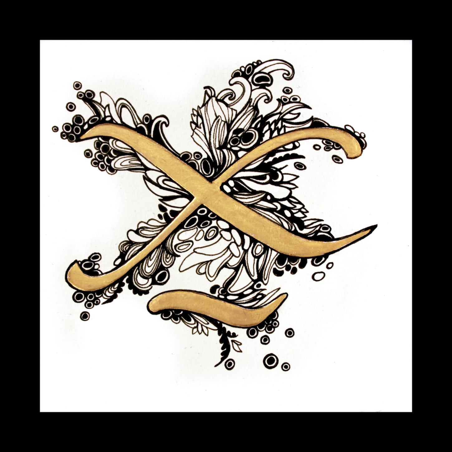
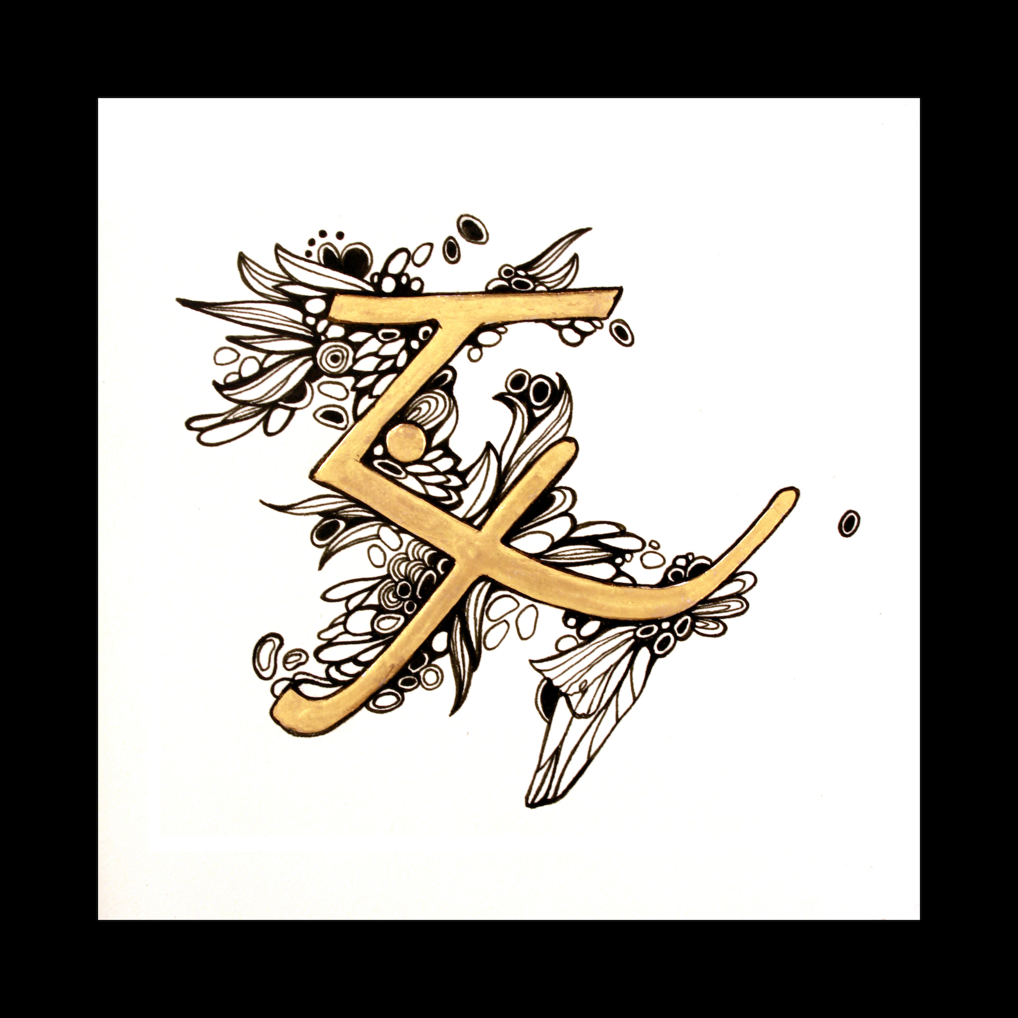
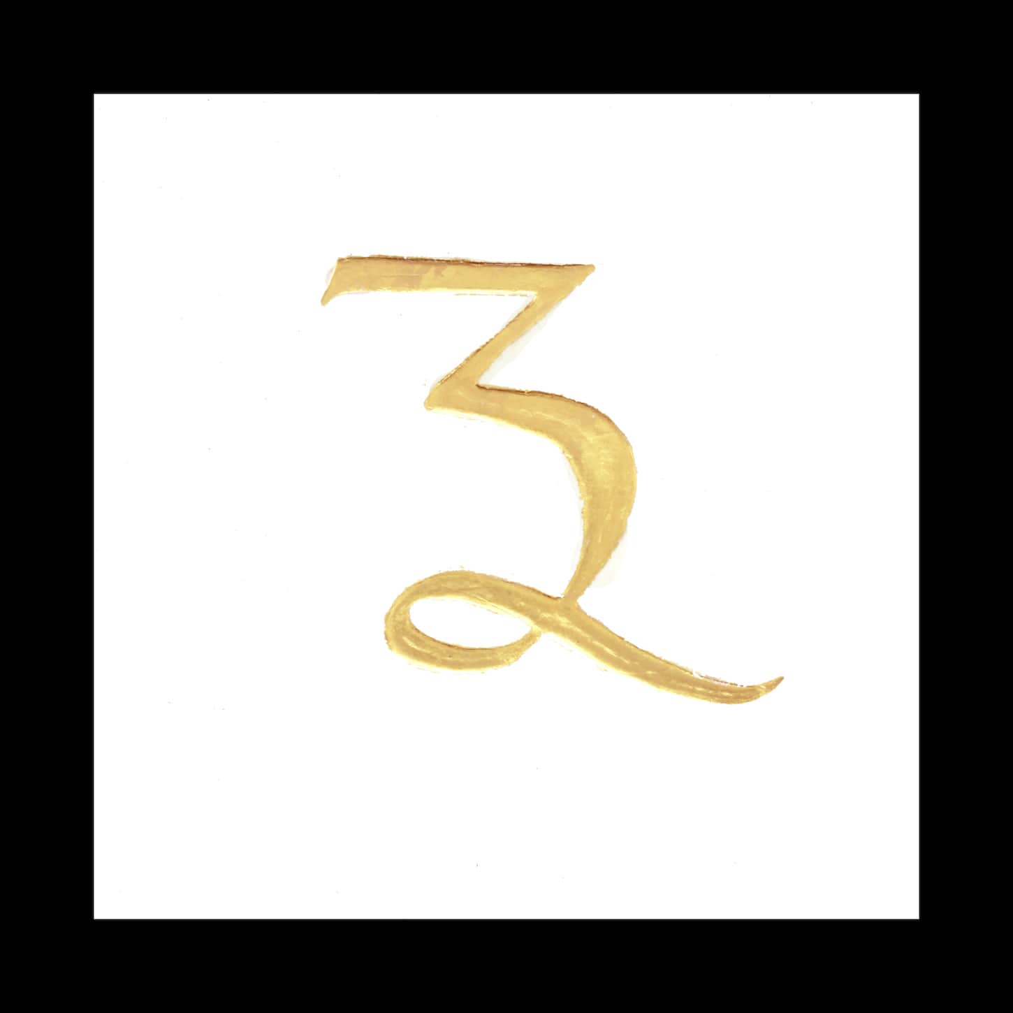
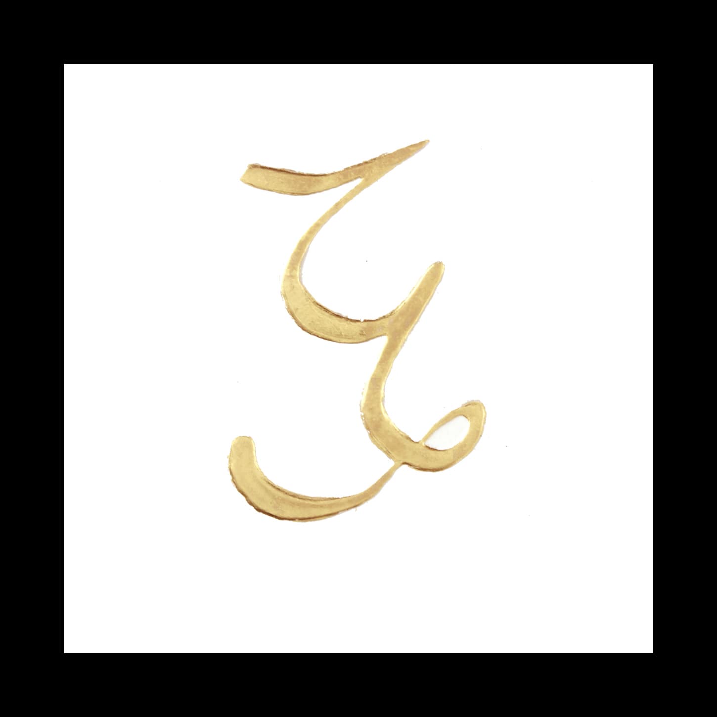
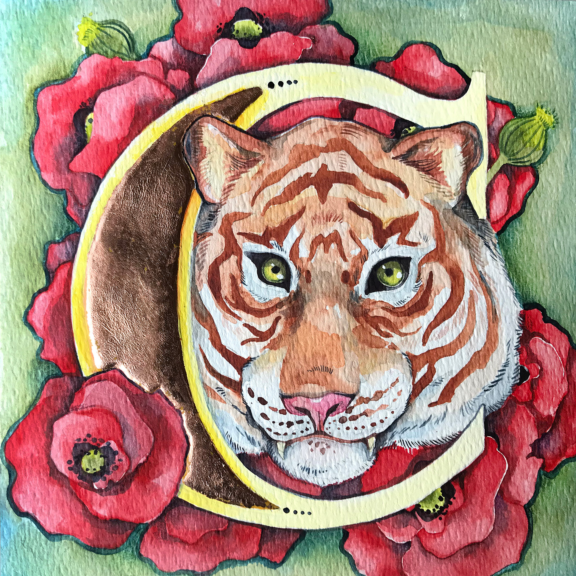
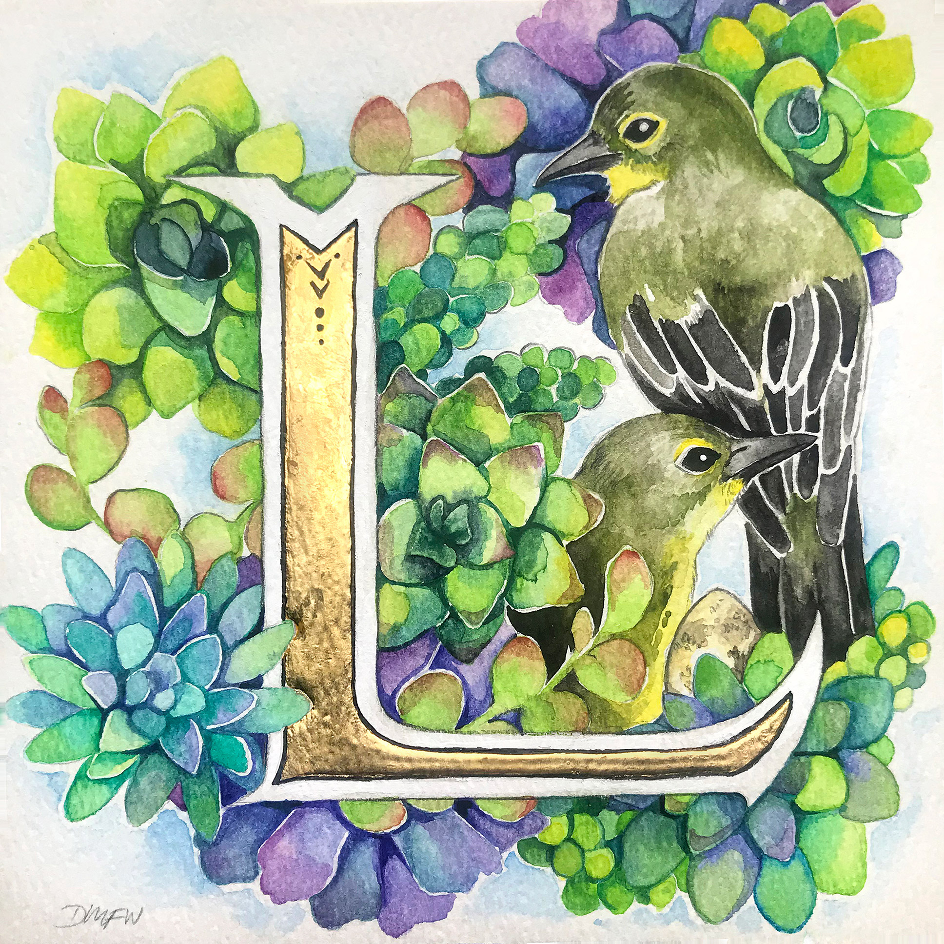
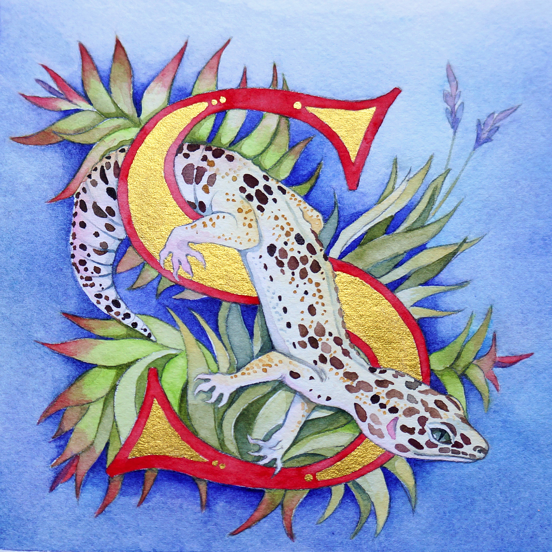
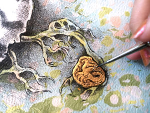
GILDING
ABOUT THE PROCESS
Gilding has a long history within the book arts because it has such a powerful effect on the viewer. It is also a craft I find incredibly challenging. Mixing and applying a traditional plaster base for gilding is a difficult process to learn, but worthwhile for the focal point it can add to a design. I have experimented with many ways to apply gold to a design including traditional raised gilding, powdered shell gold, and more modern metallic pigments.
RELATED BLOGS & TUTORIALS
Gilding 101
I’ve been incorporating gold into my work for a while, but I’ve never really figured out the most efficient application method. I’ve decided to try
The Perfect Marbling Mask
You may remember a previous post where I started using a technique to mask out parts of my lithographs so I could water marble the
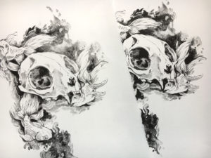
Plate Litho | Take Two
With only a week left in my print class I wanted to squeeze in just ONE more print. Originally I wanted to make a color