
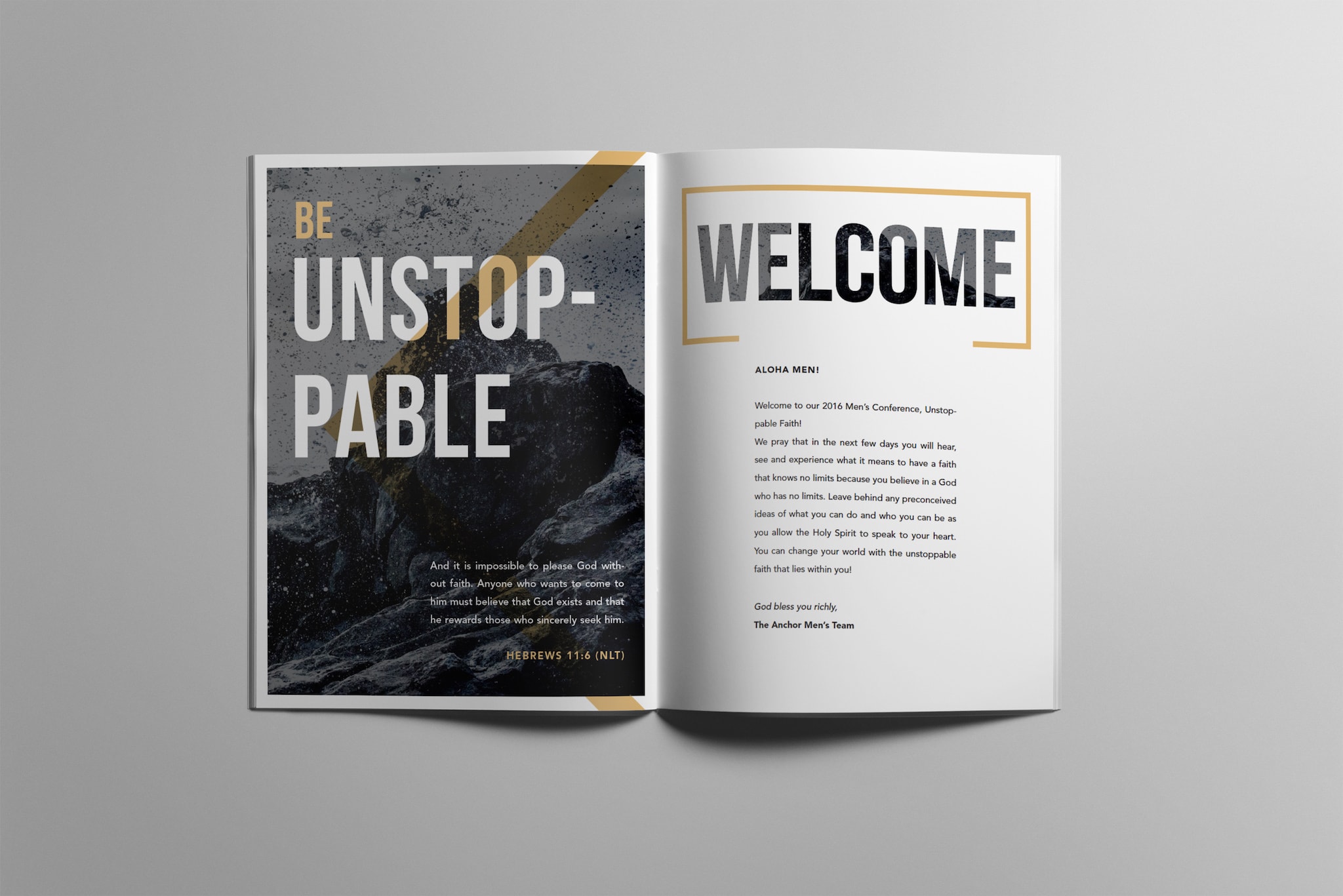
DESIGN
DESIGN IS ABOUT CLEAR COMMUNICATION. In my personal work I can be as obscure as I choose, but with my commercial design work economy, clarity, and impact are most important. In my graphic design practice I have had an opportunity to tackle a wide range of challenges including digital interface design, packaging, web development, infographic design, publication layout, and branding. My true portfolio of design projects is extensive, and likely outweighs in volume my other work by a long shot. However, a lot of graphic design is ephemeral so I’ve only chosen a small selection of projects to showcase. I have prioritized projects that offered more freedom or had unique outcomes.
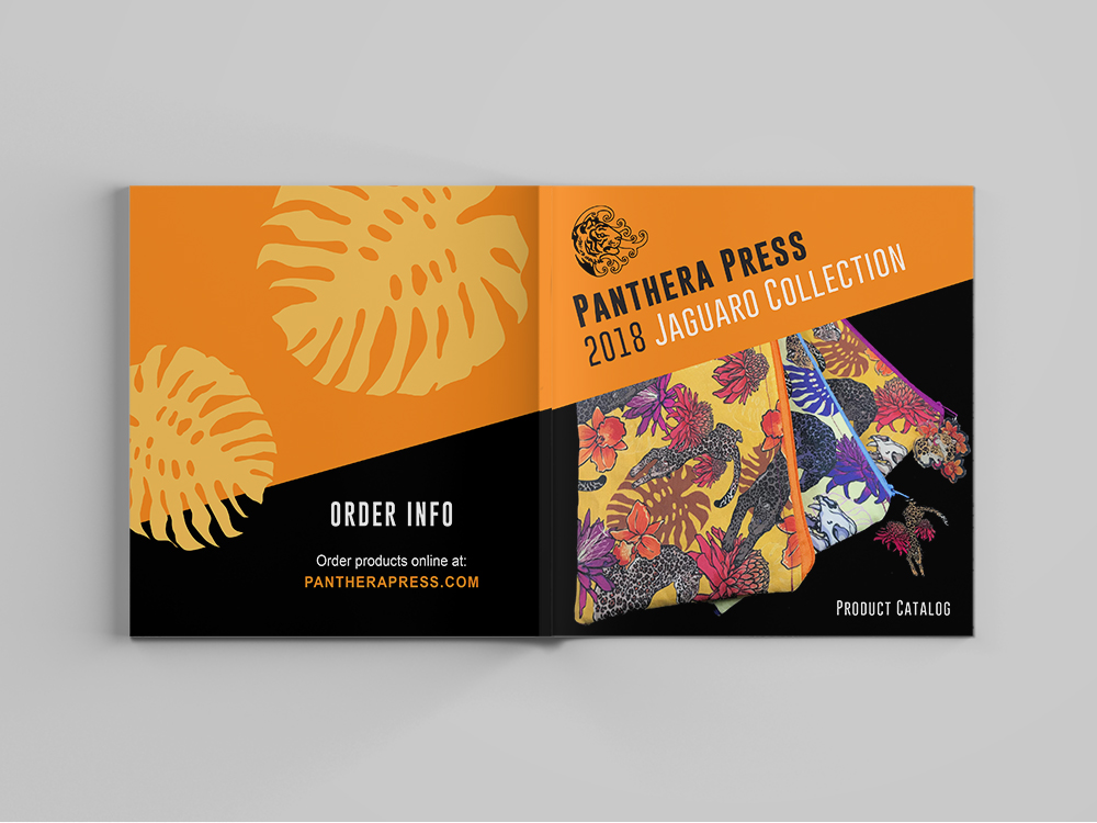
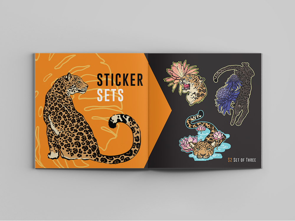
PACKAGING & LABELS
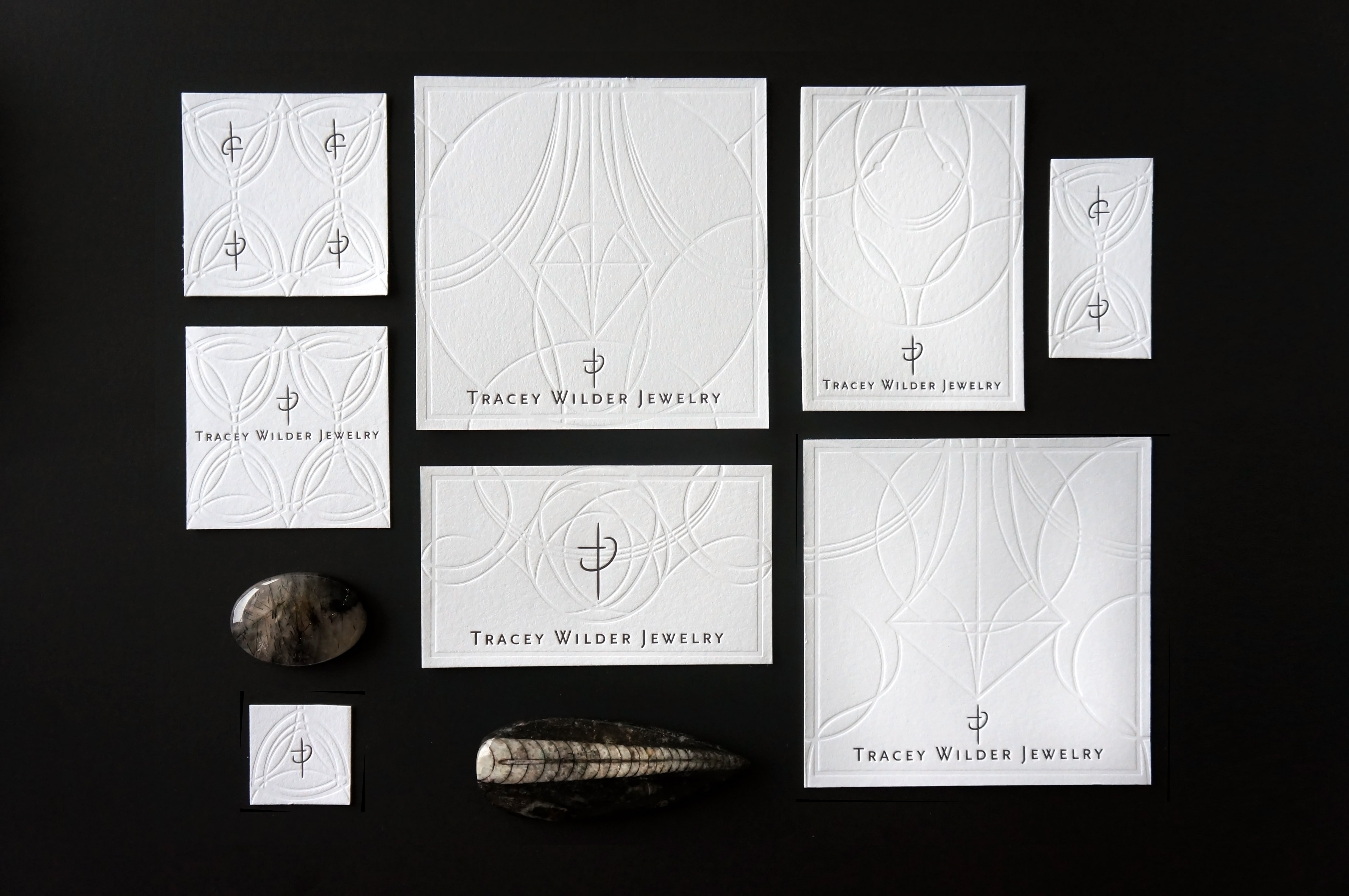
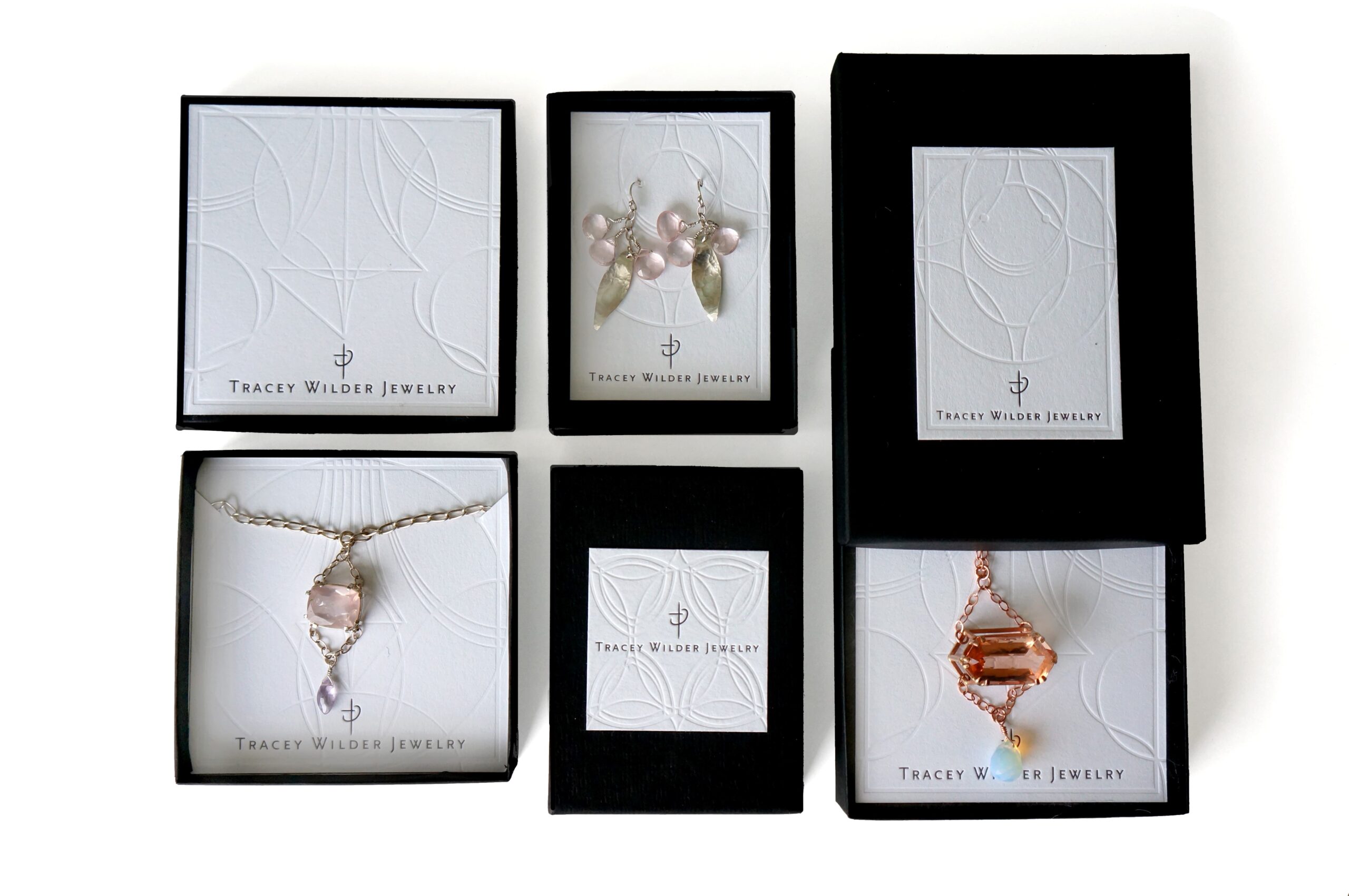
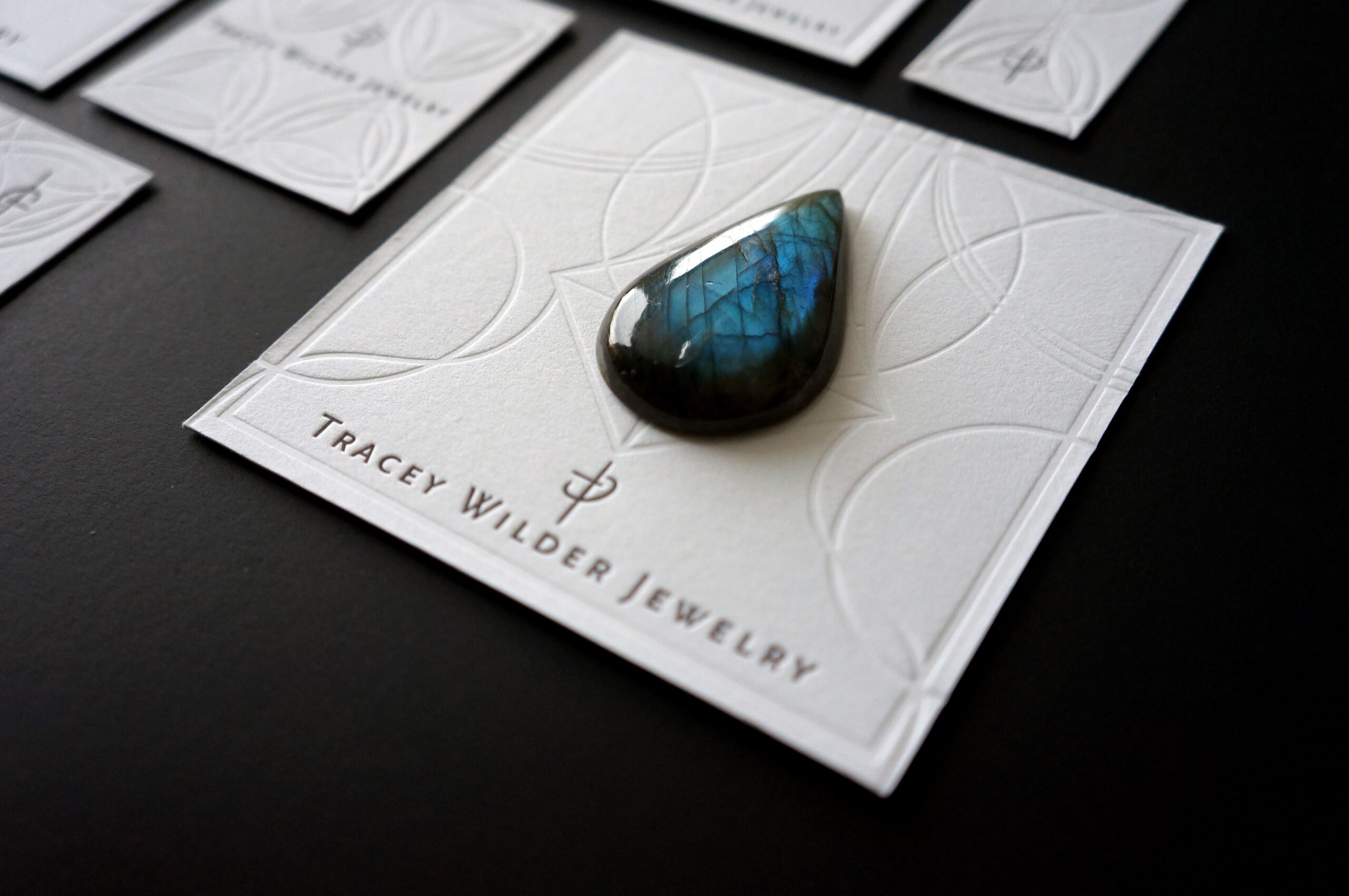
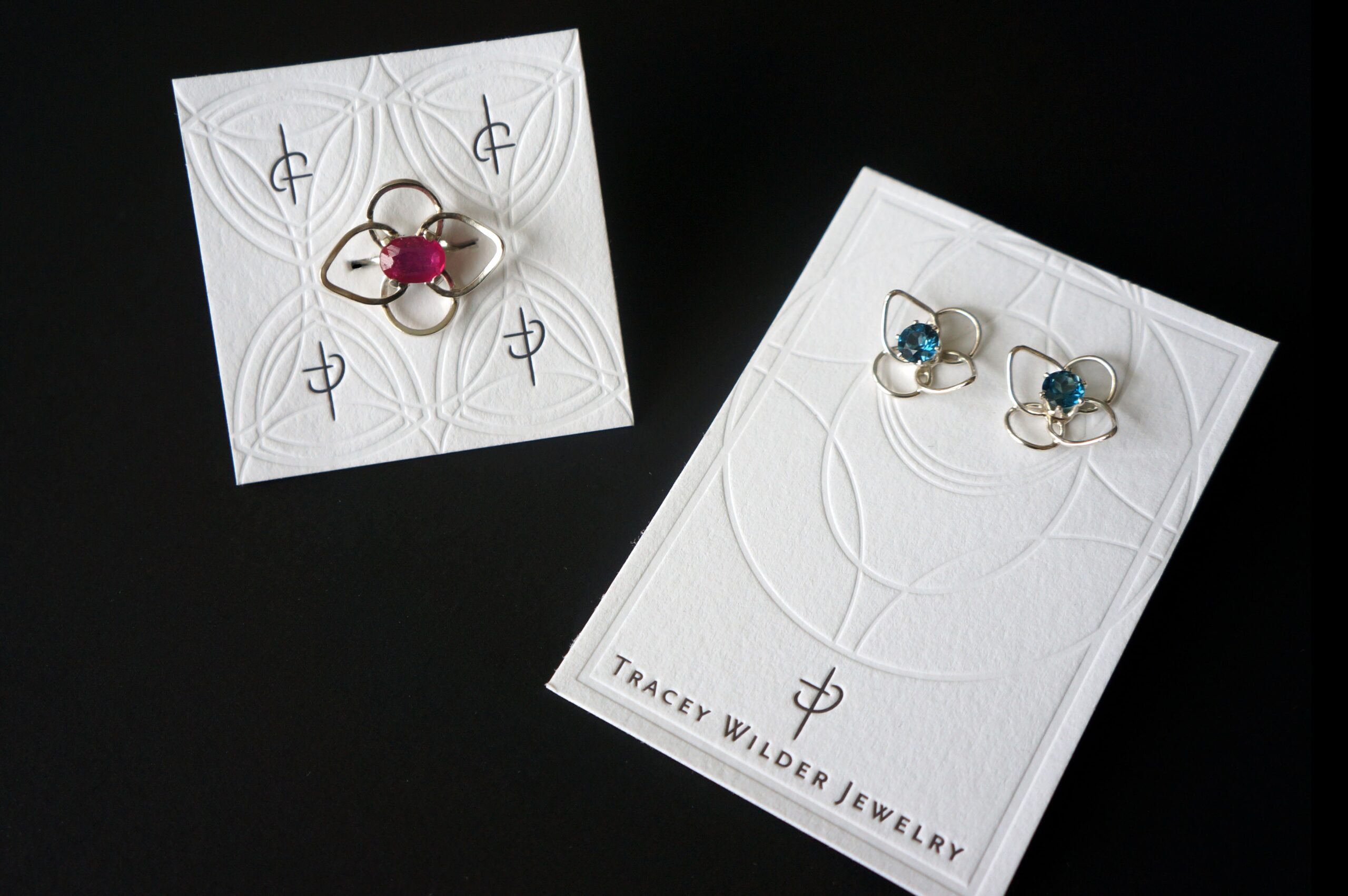
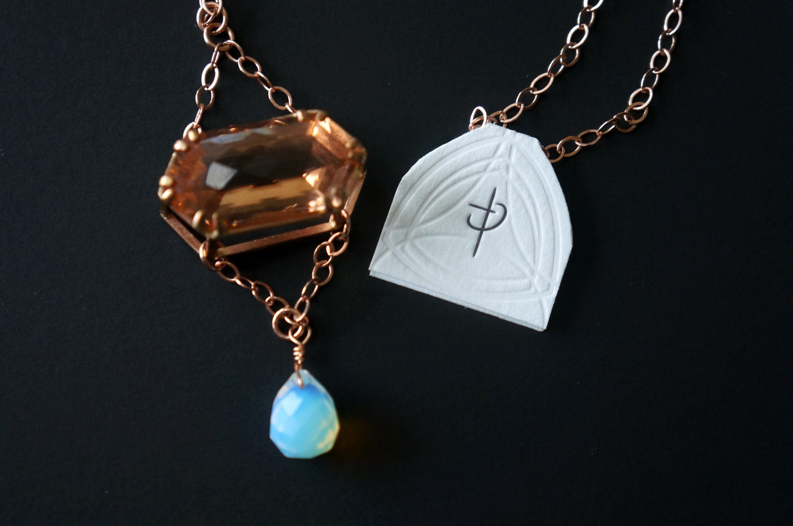
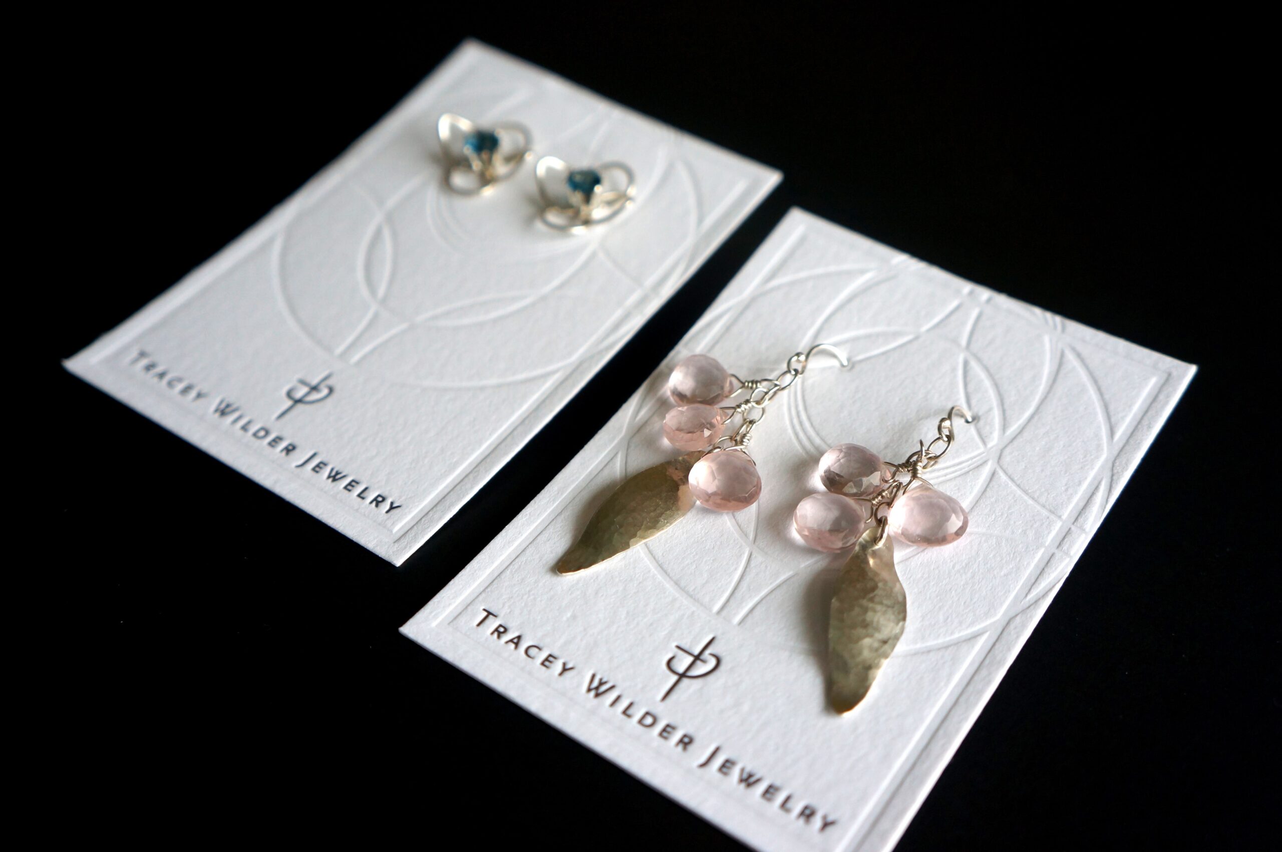
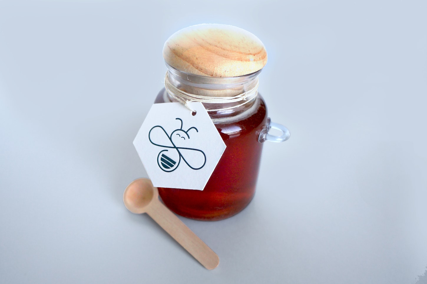
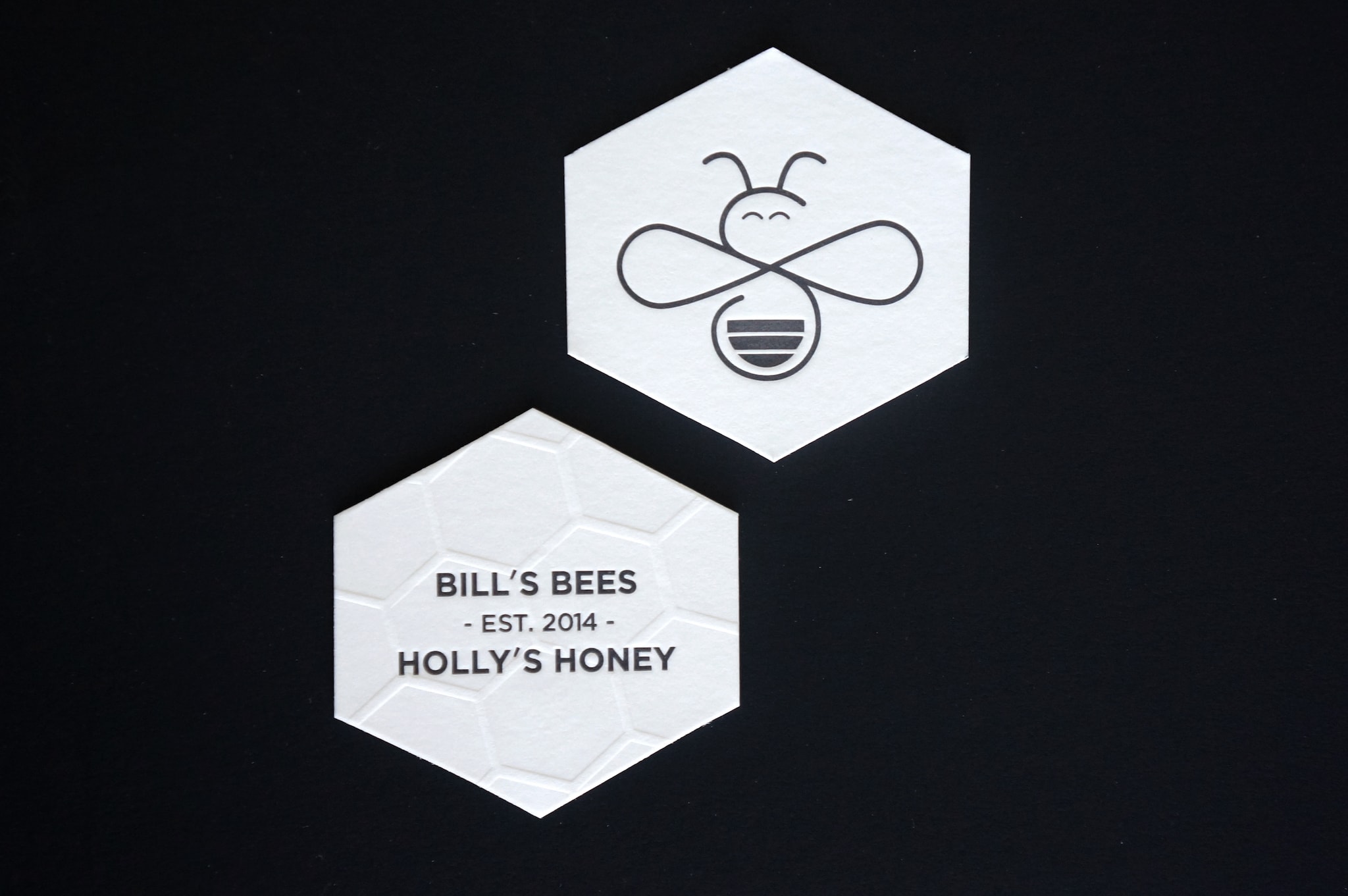
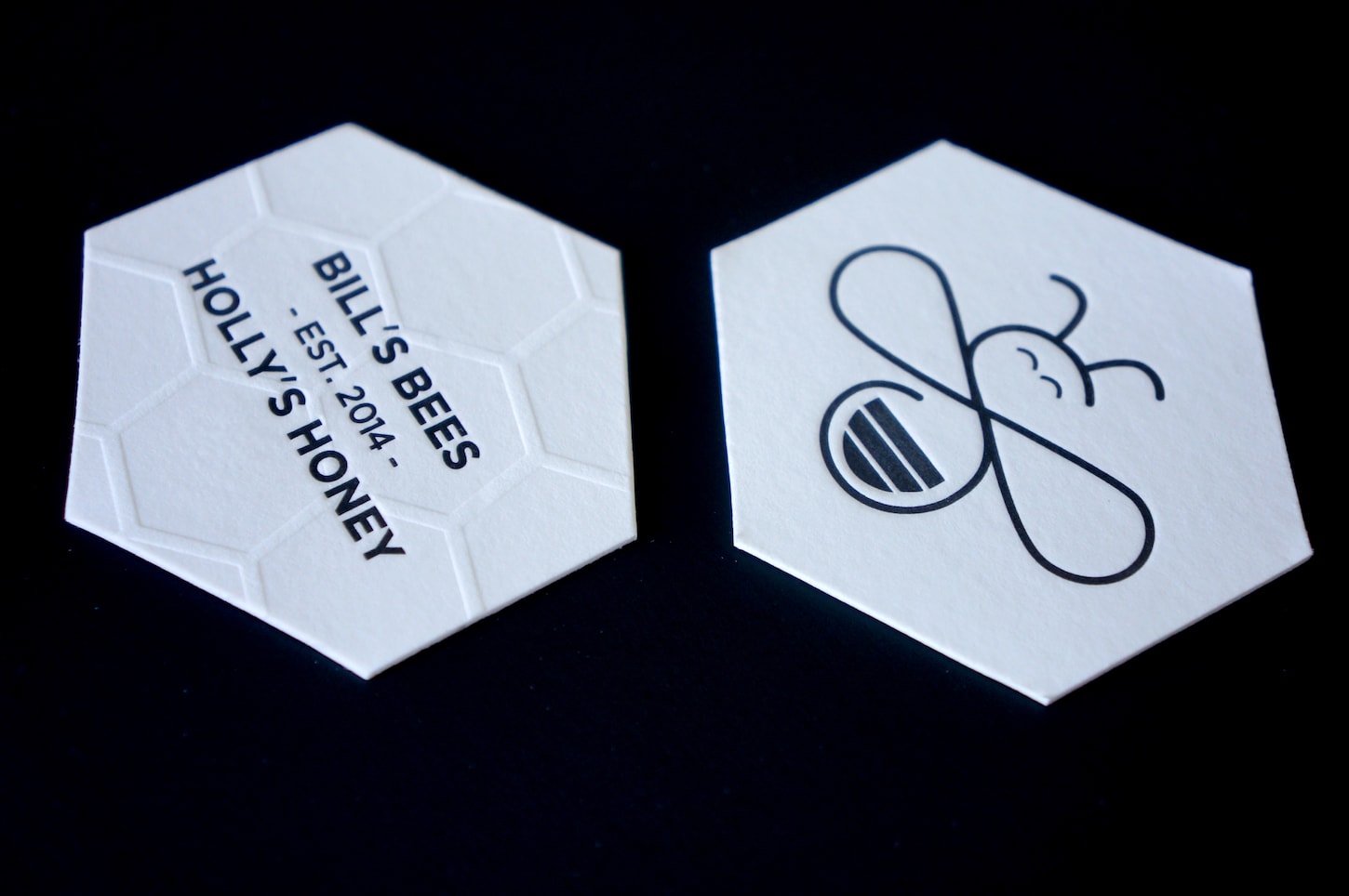
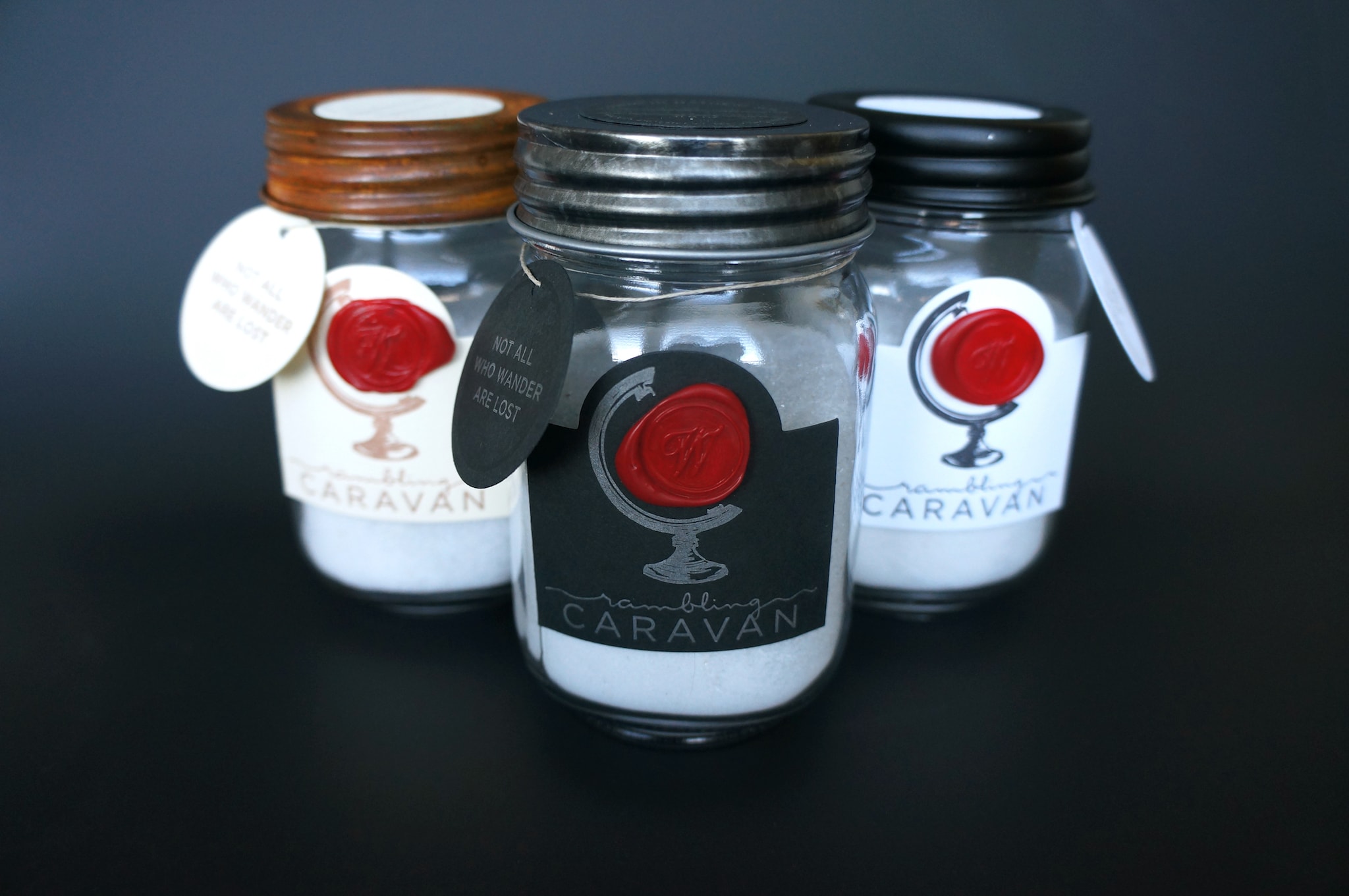
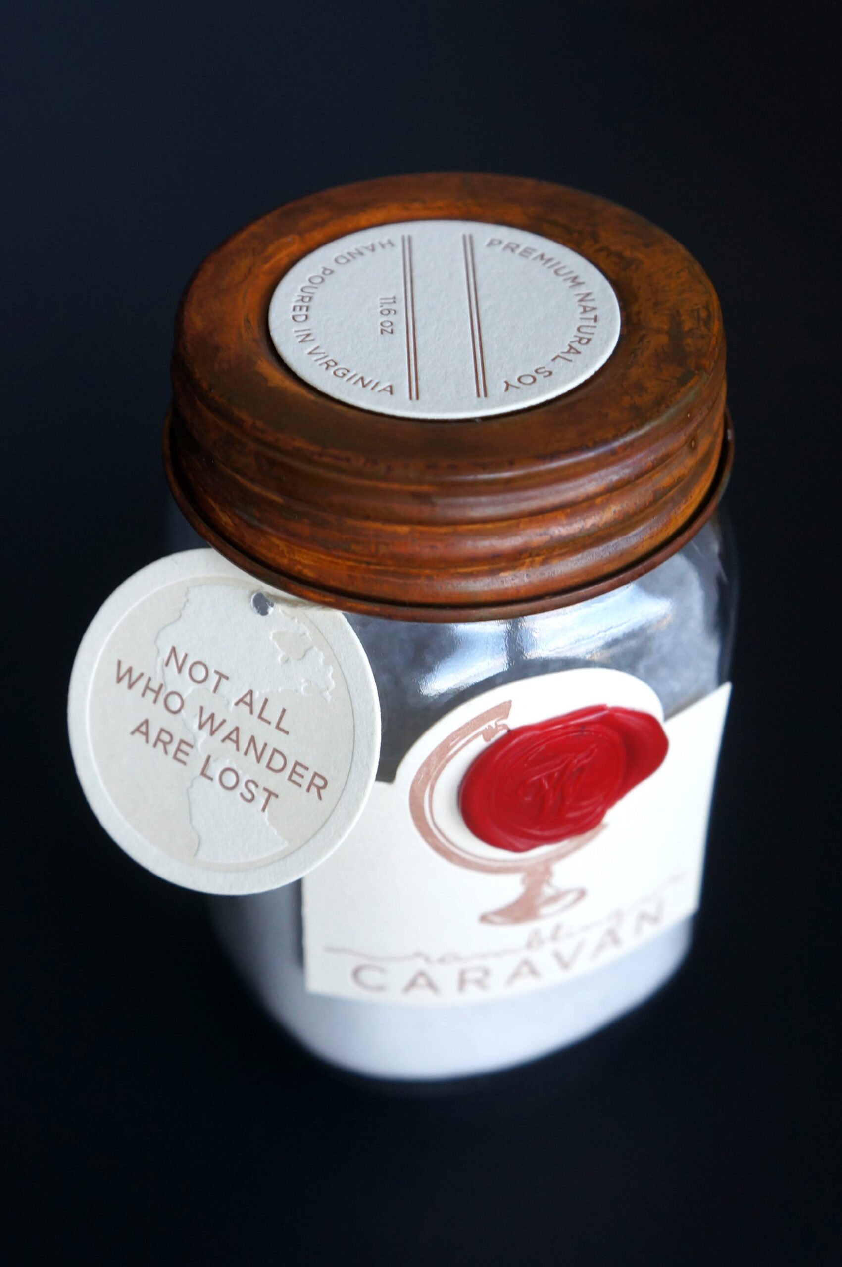
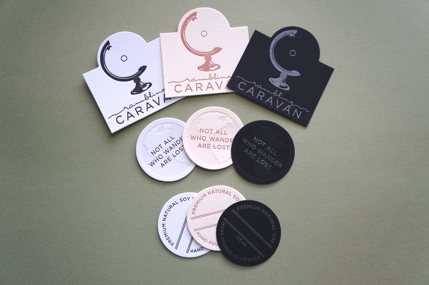
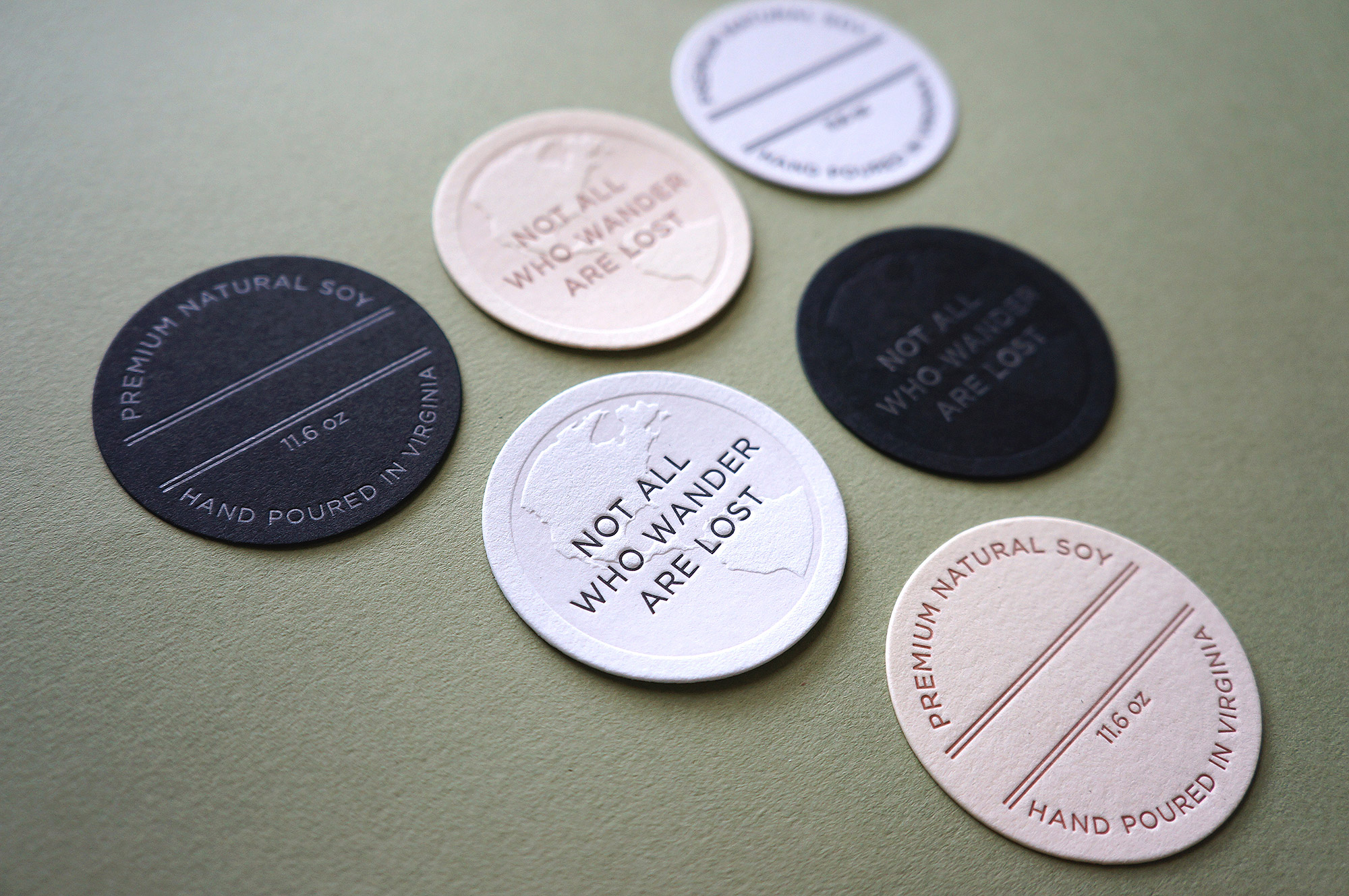
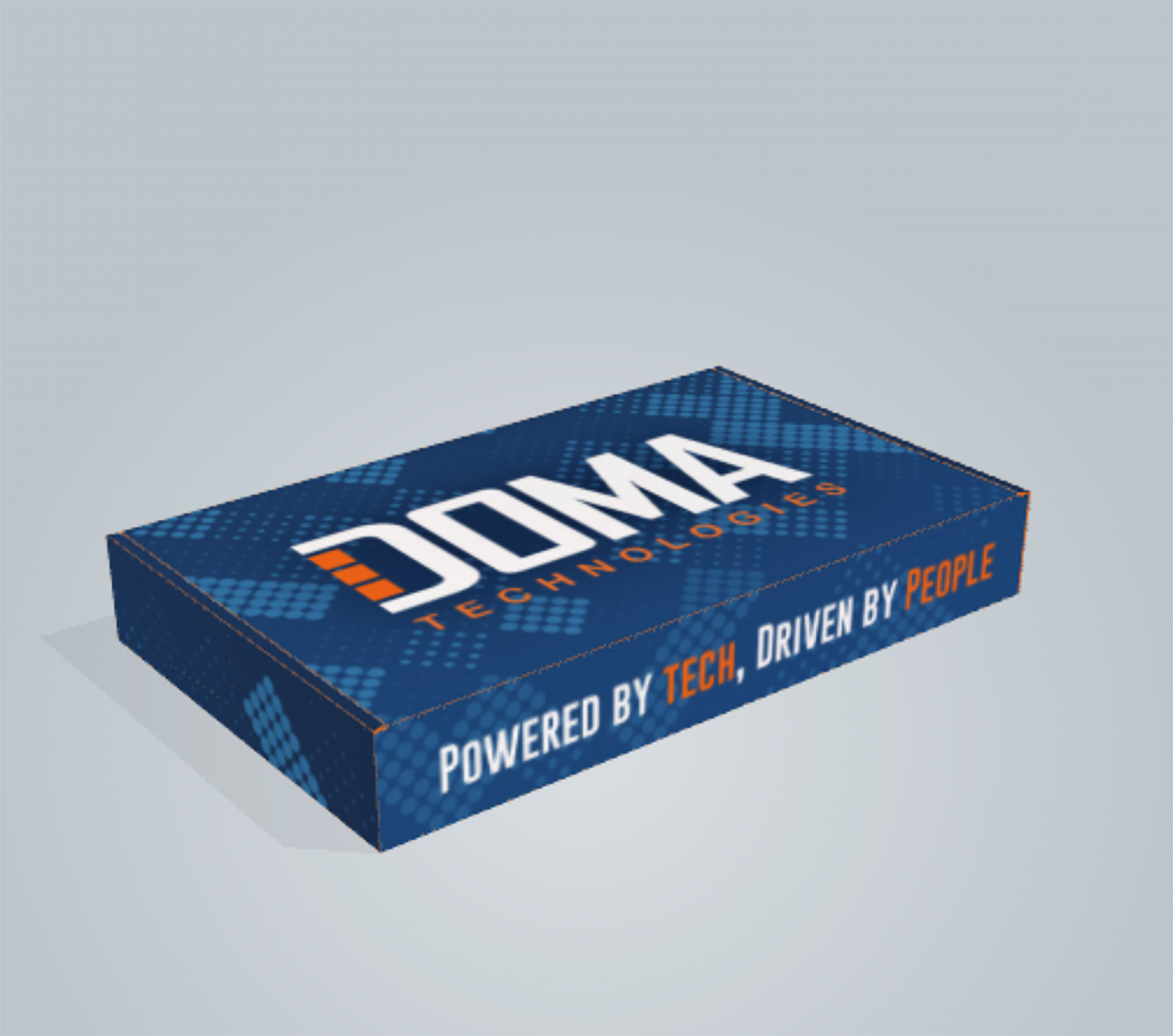
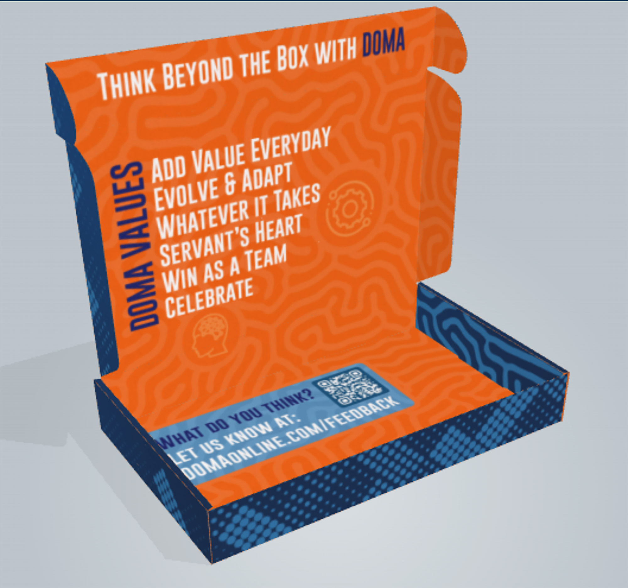
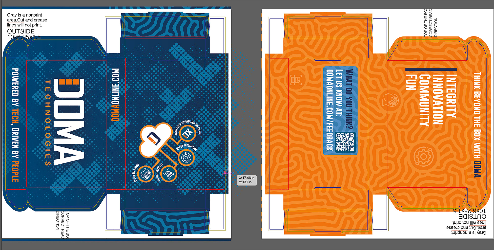
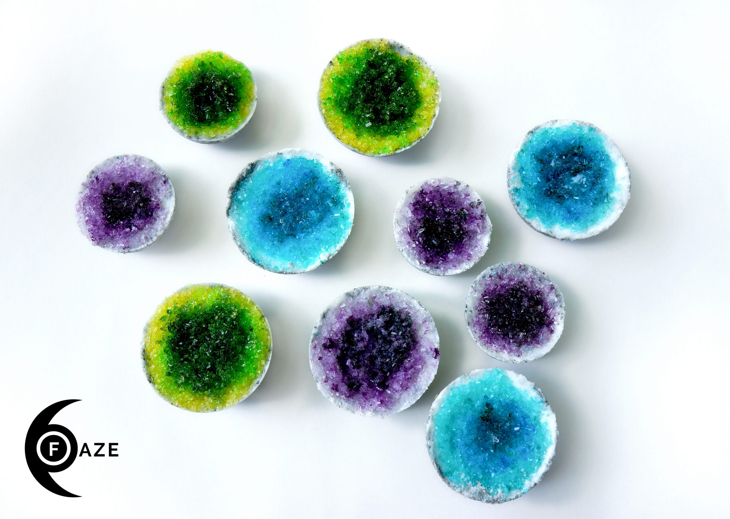
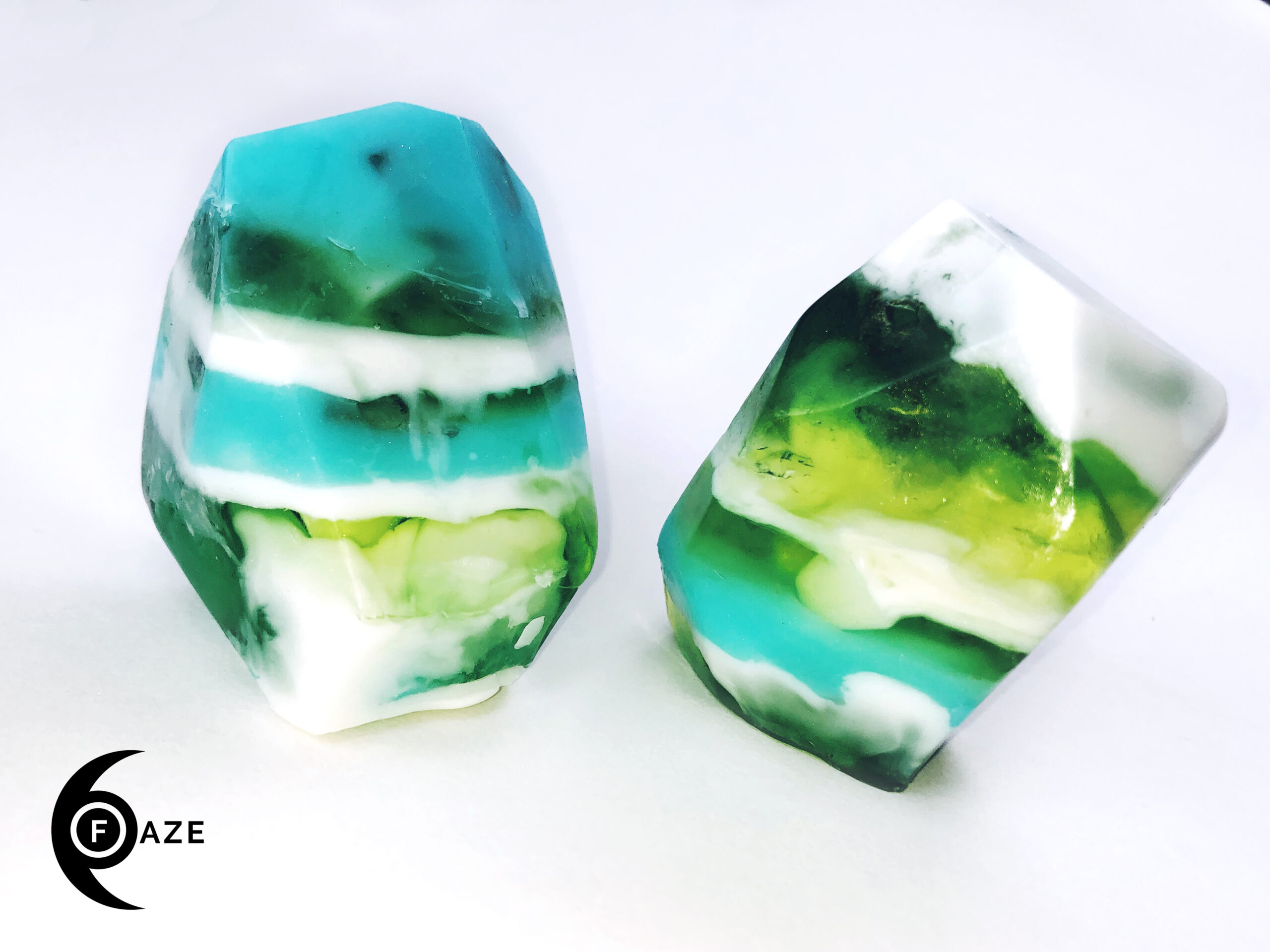
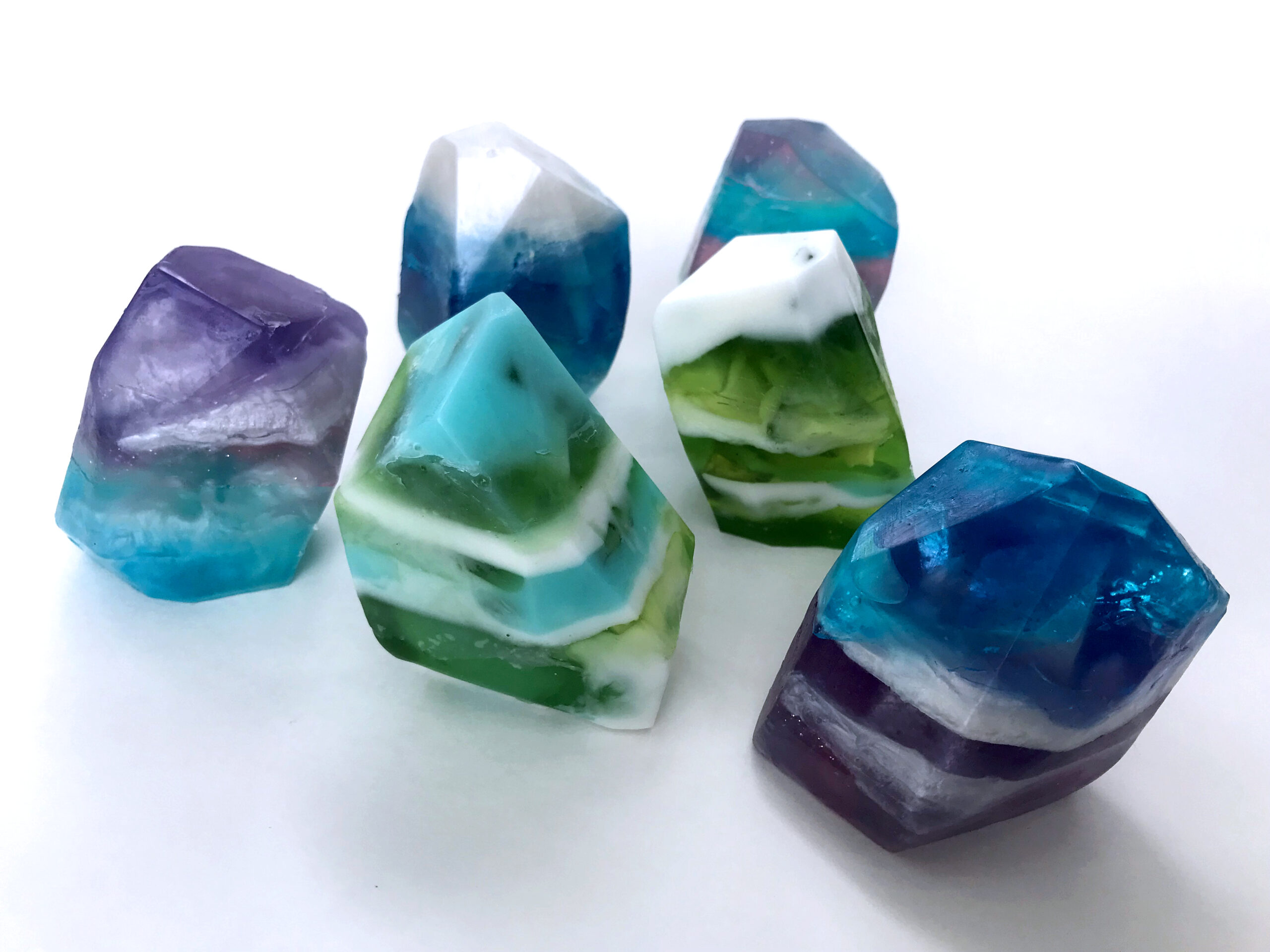
Package design is the one type of work I get to do the least of, and yet I love the challenge of it. Thinking about how an object will be viewed in 3 dimensions allows you to curate a tactile experience and sense of wonder for the recipient of your package. In the letterpress examples below, I also did the printing and assembly of the final products.
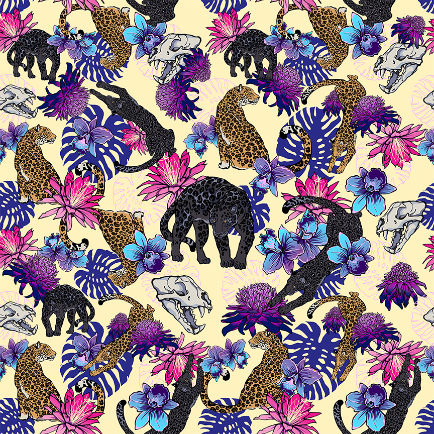
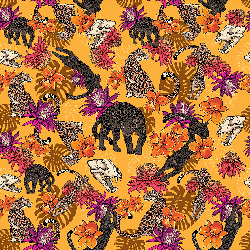
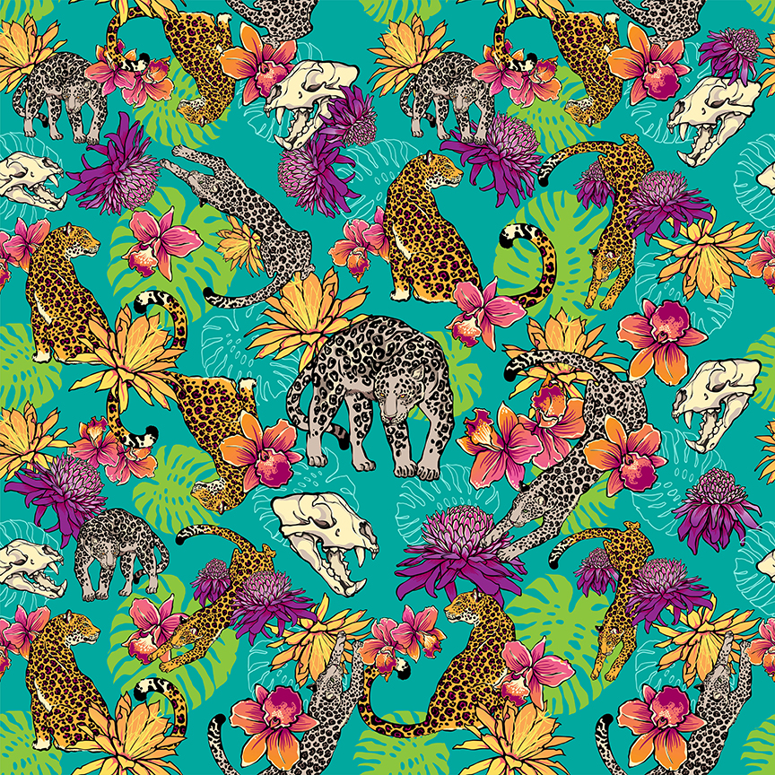
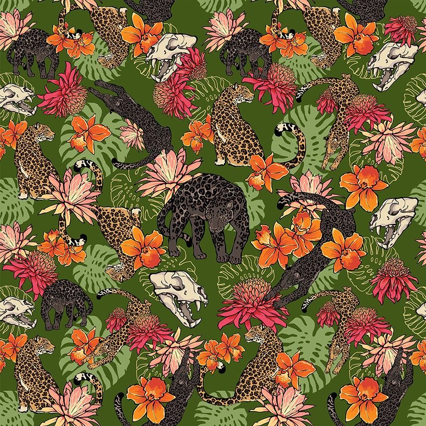
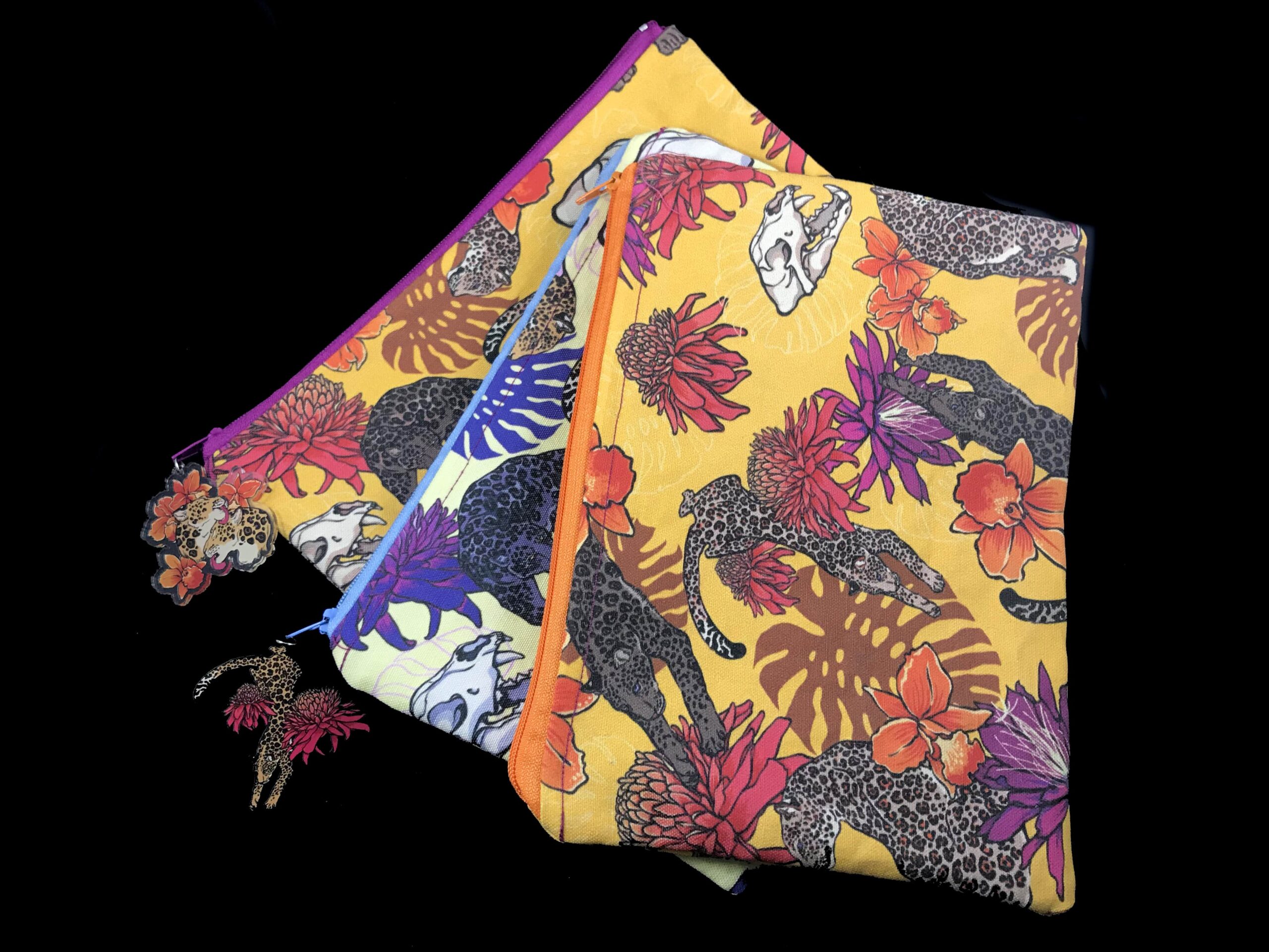
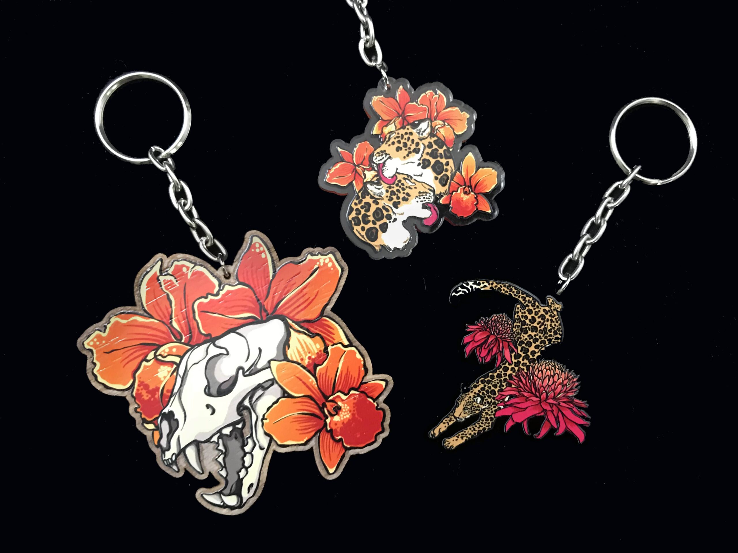
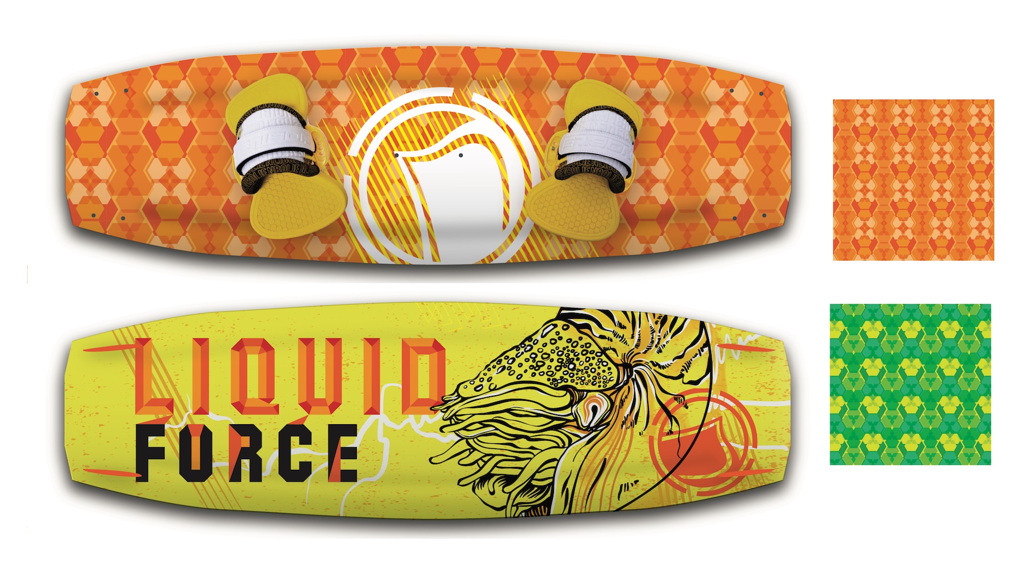
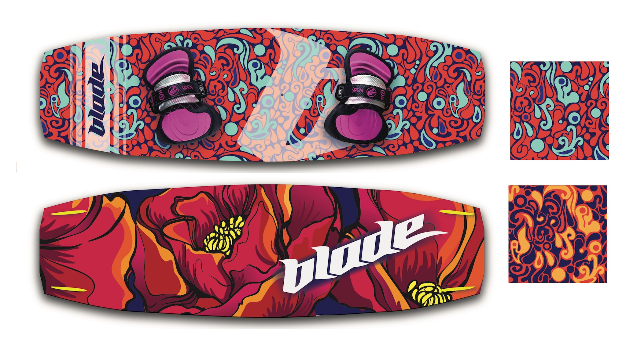
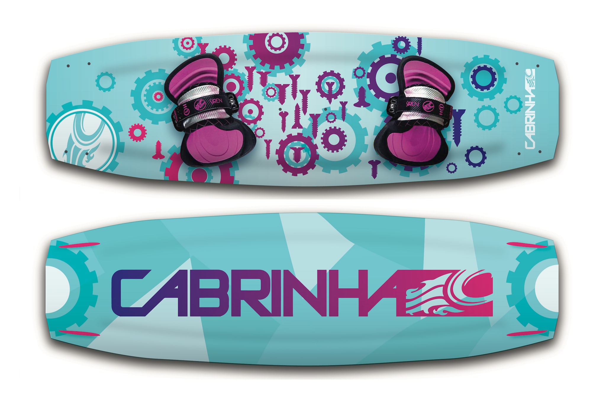
REPEAT PATTERN DESIGN
Repeat pattern design allows me to combine digital illustration with design in a novel way. There is something magical about seeing a digital image become an endless swatch of fabric or product design. These works are personal projects and were not designed for commercial clients.
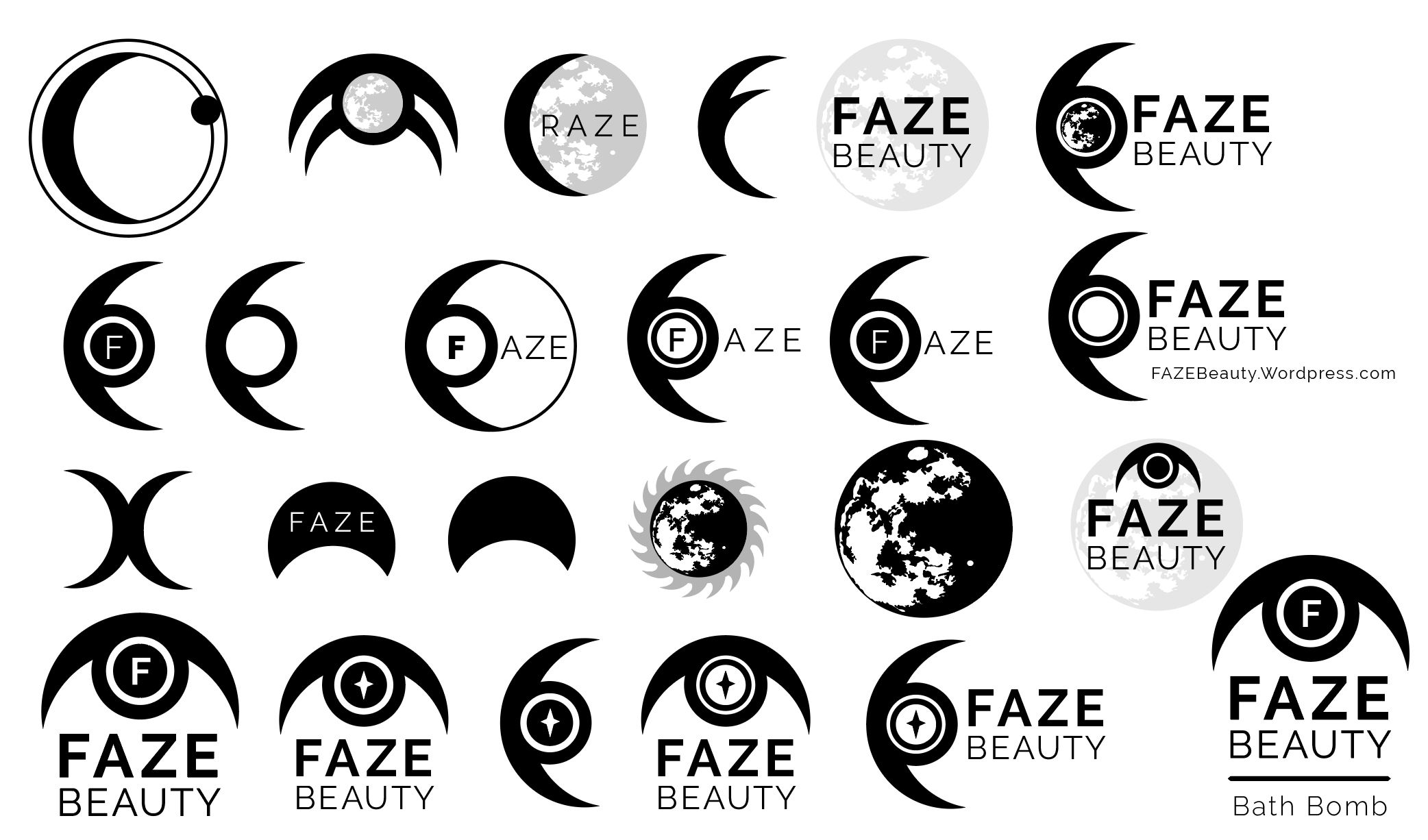
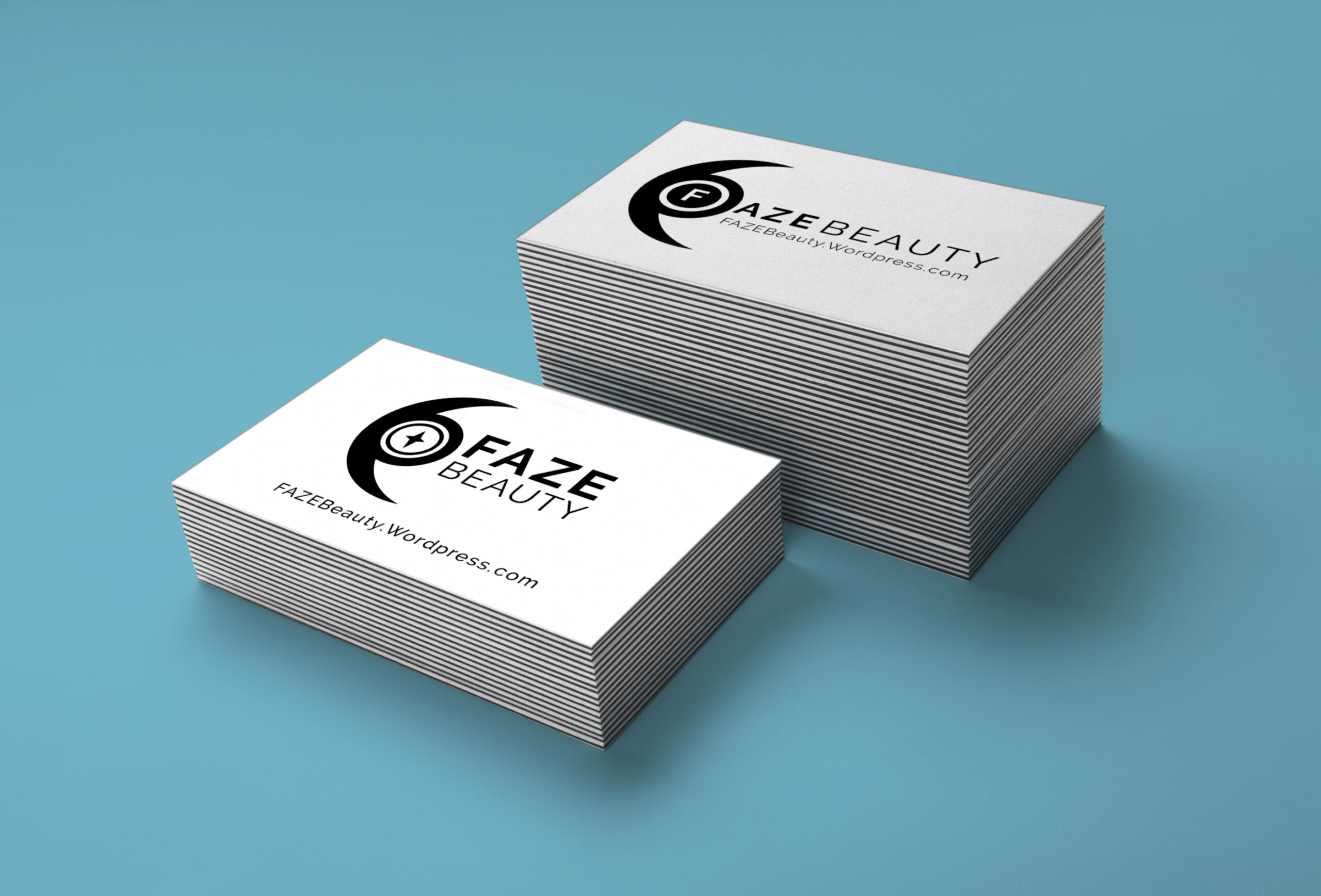
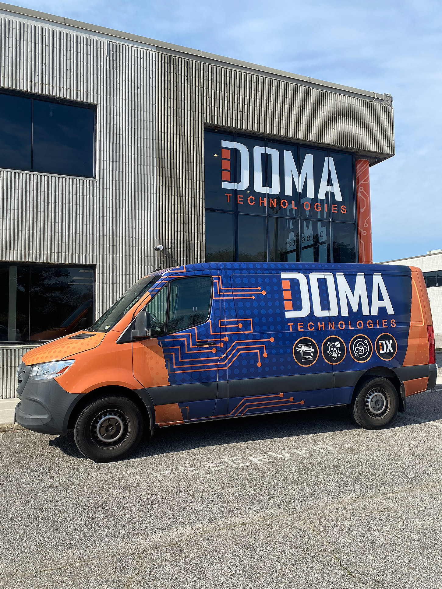
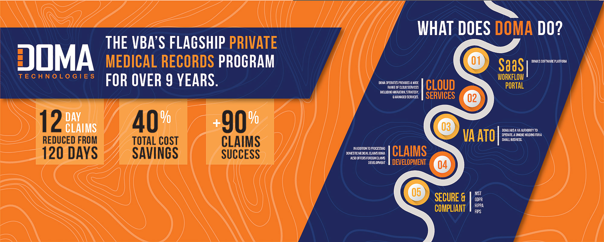
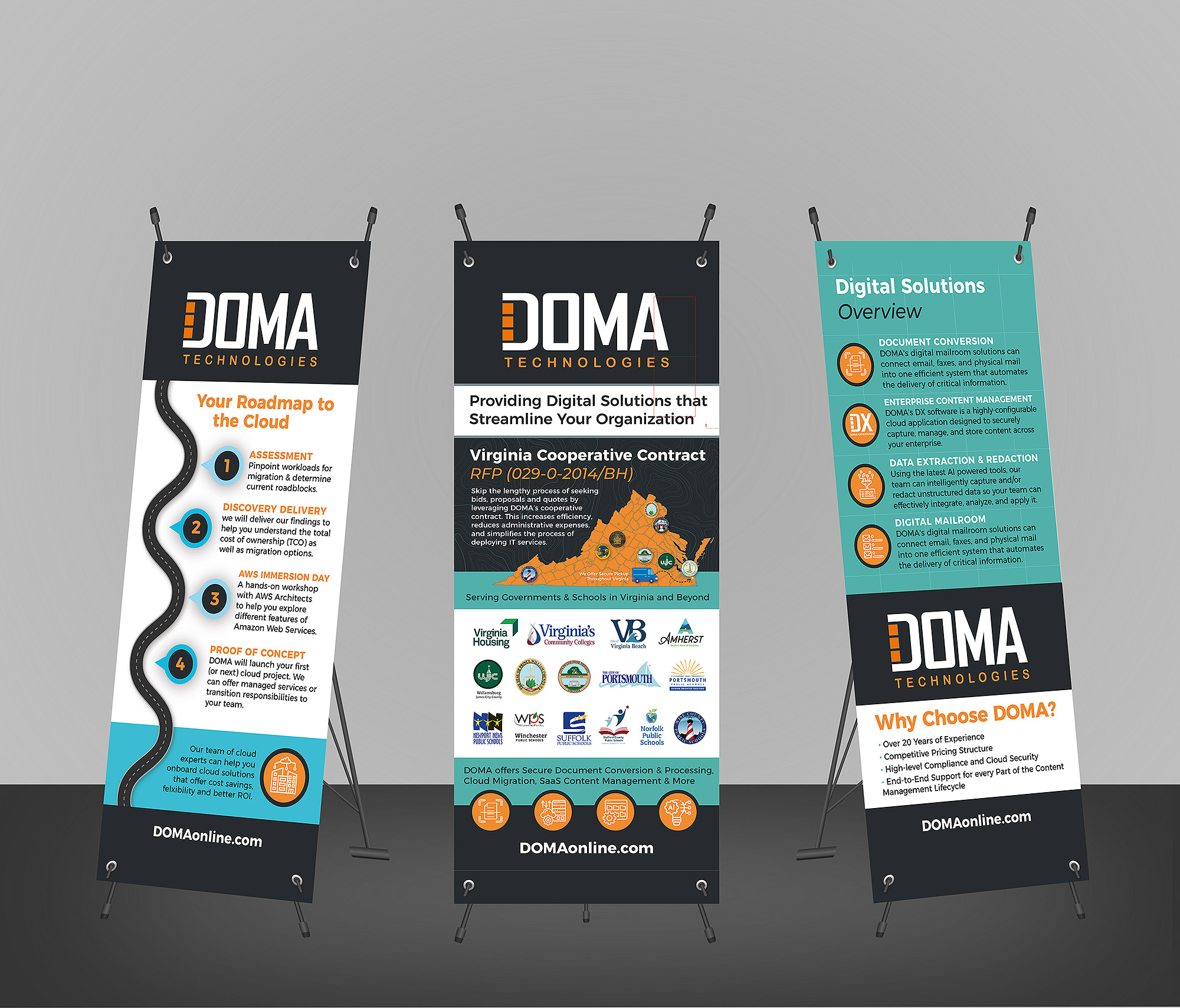
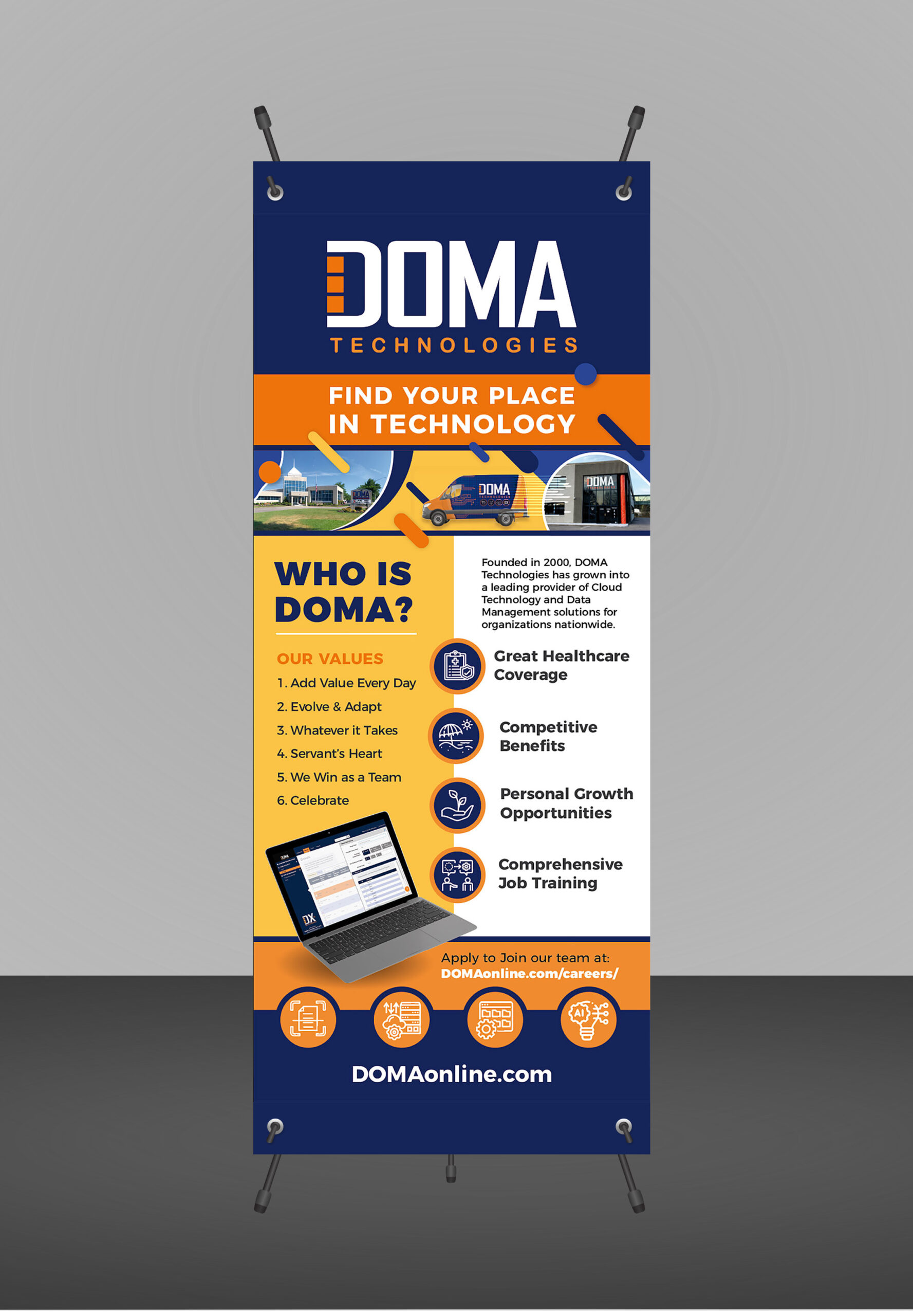
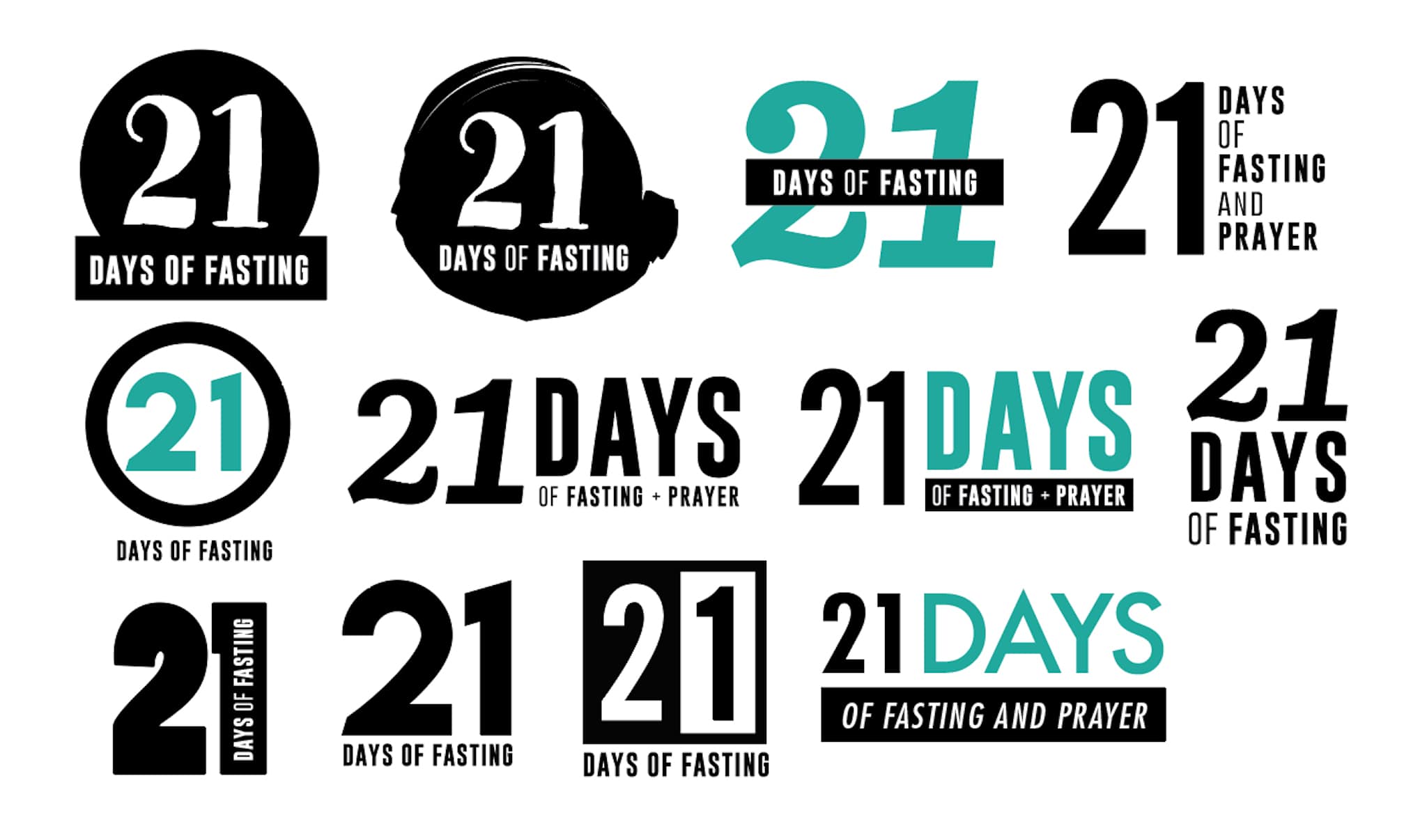
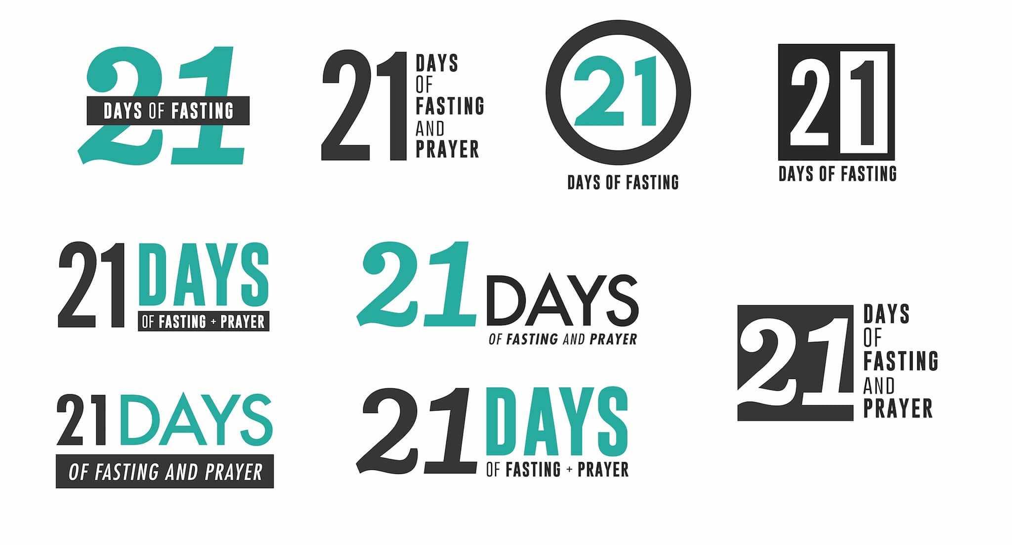
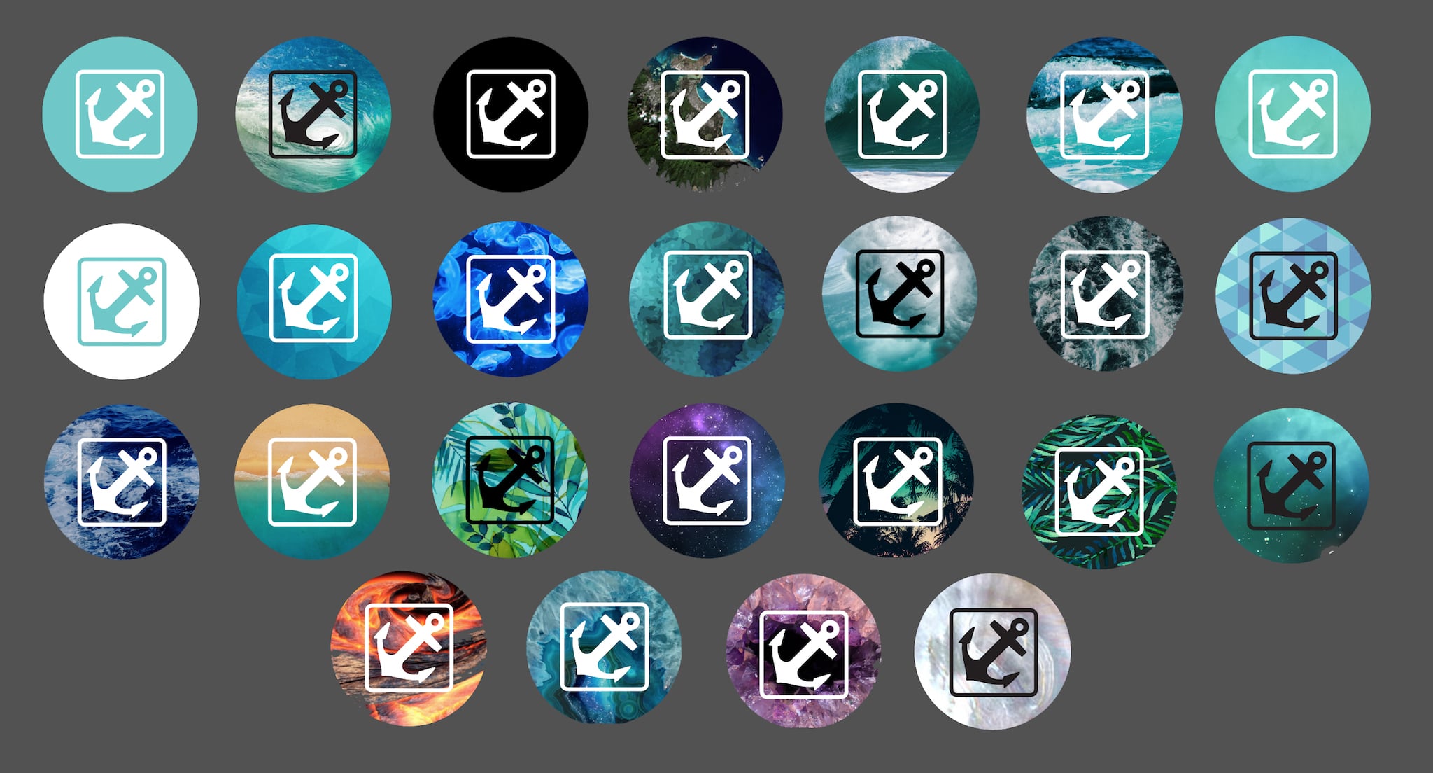
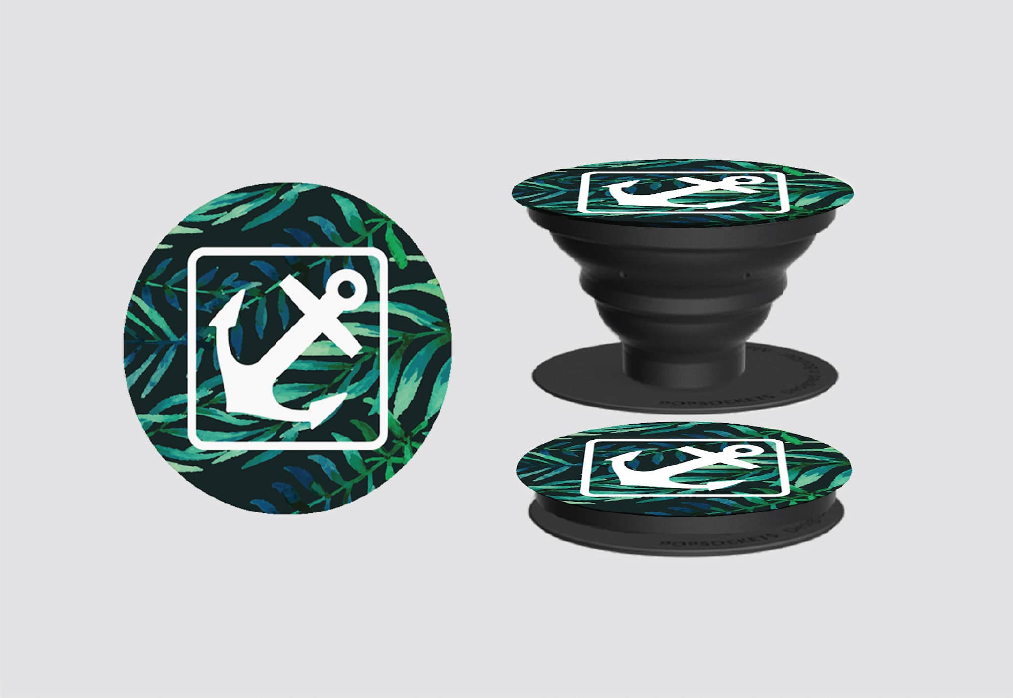
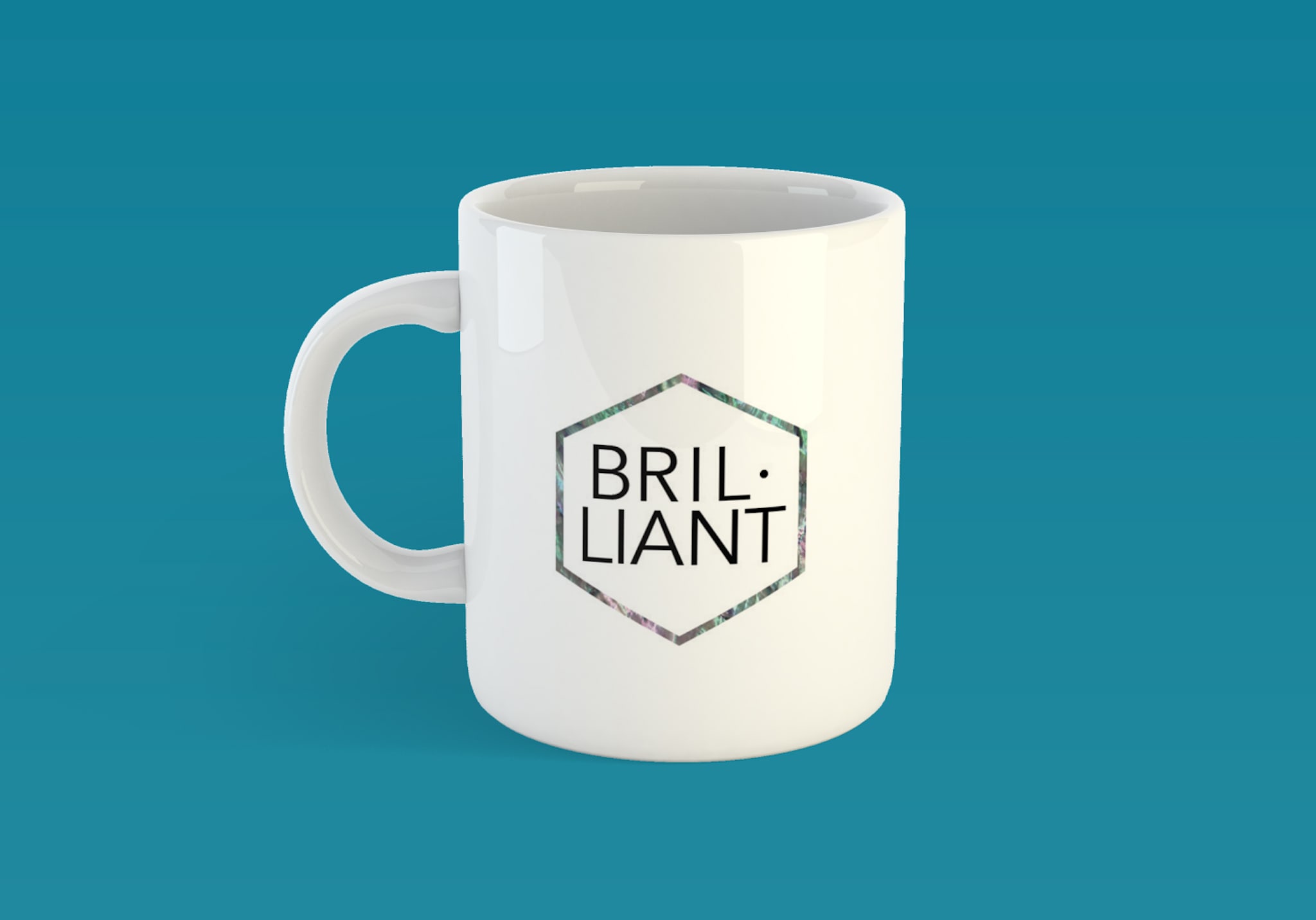
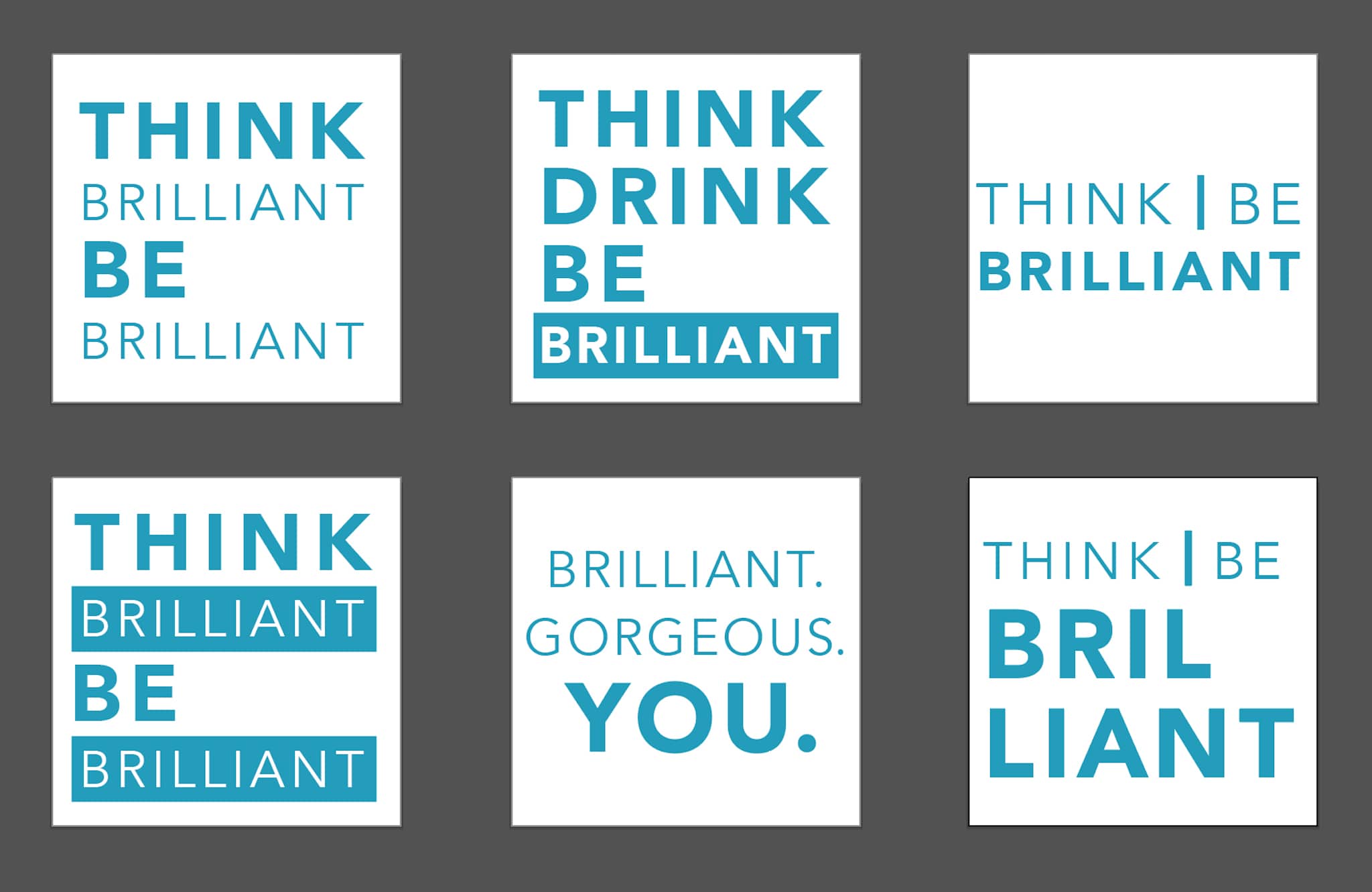
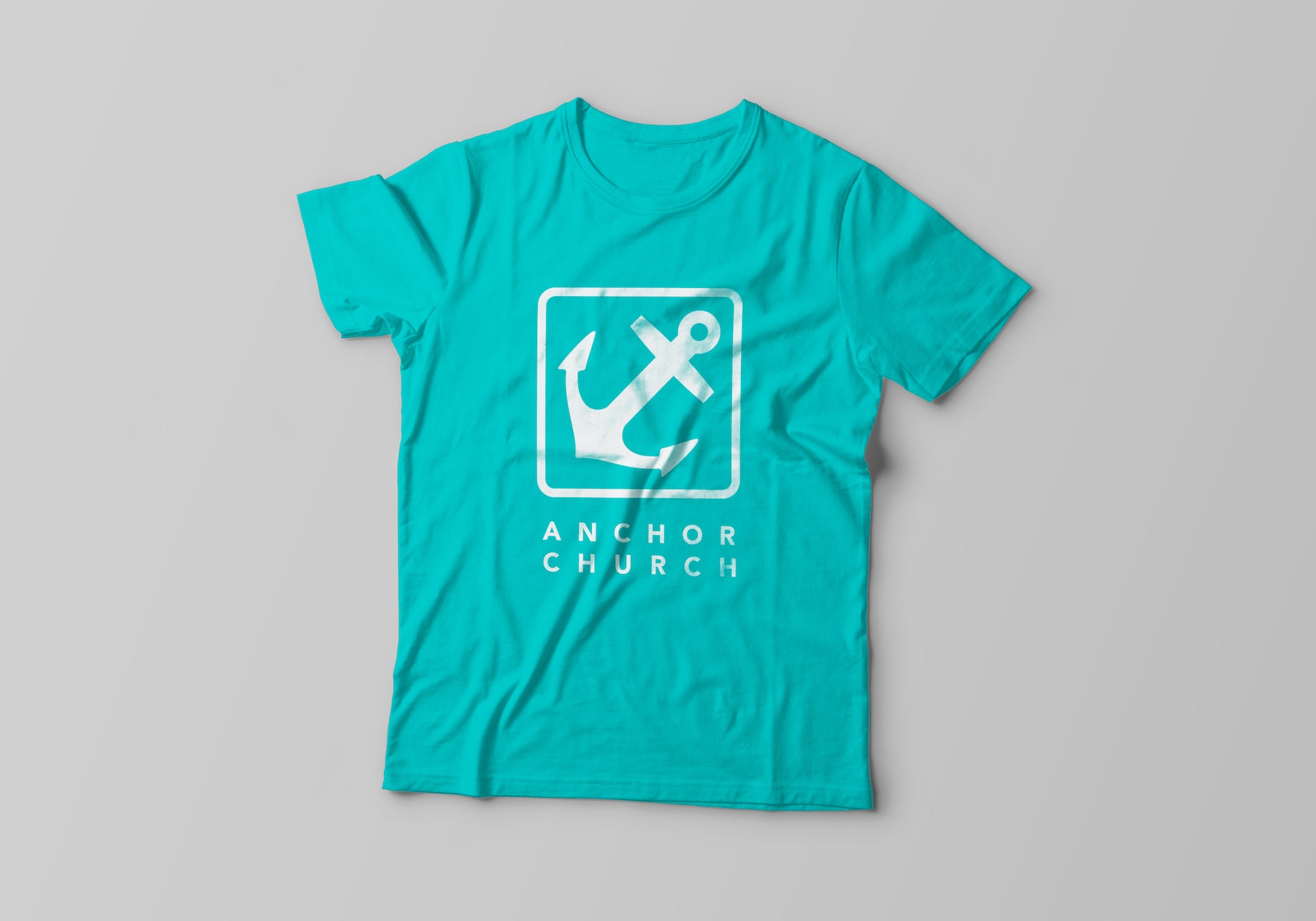
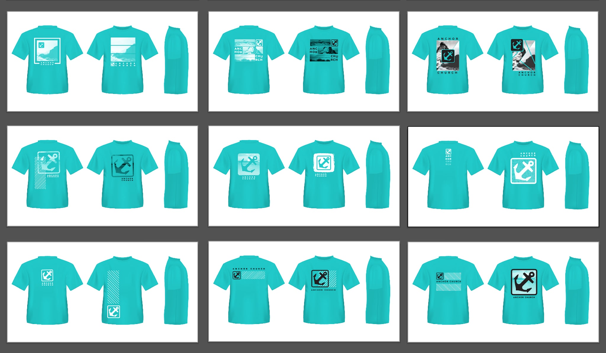
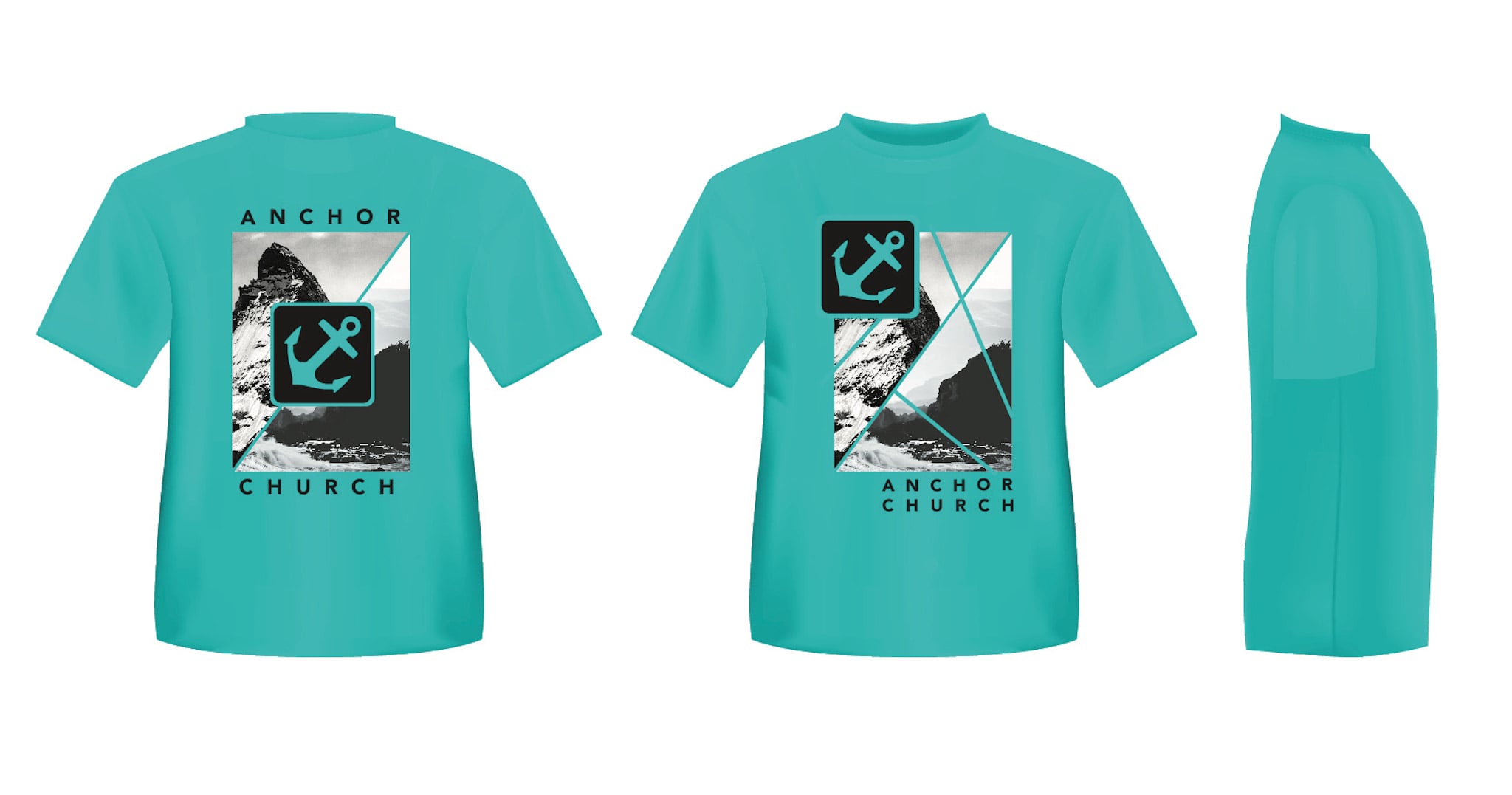
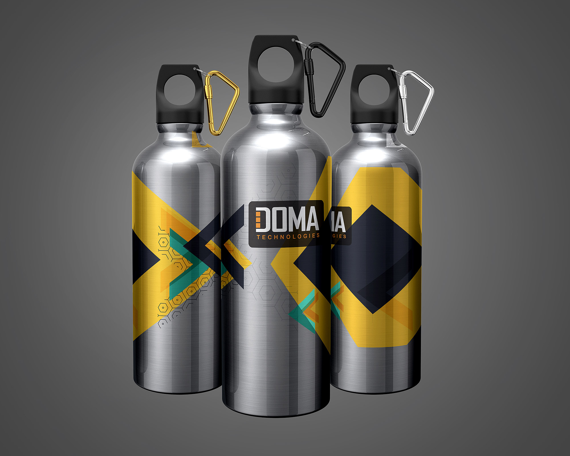
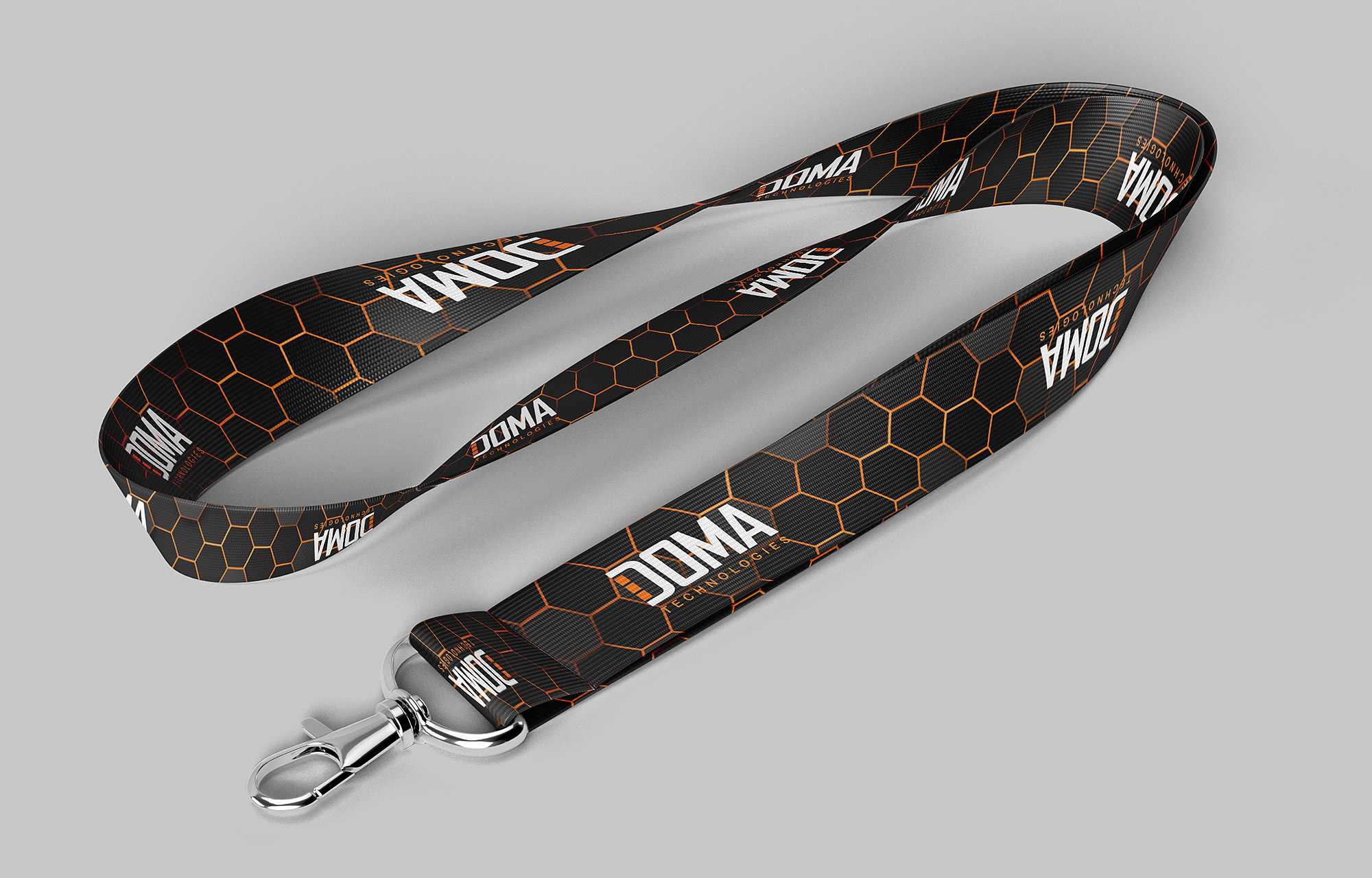
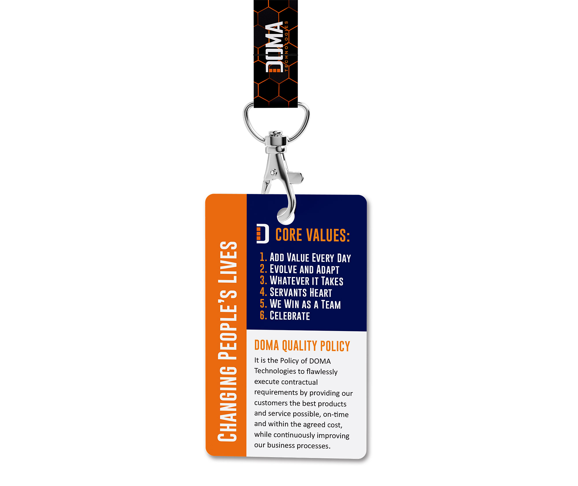
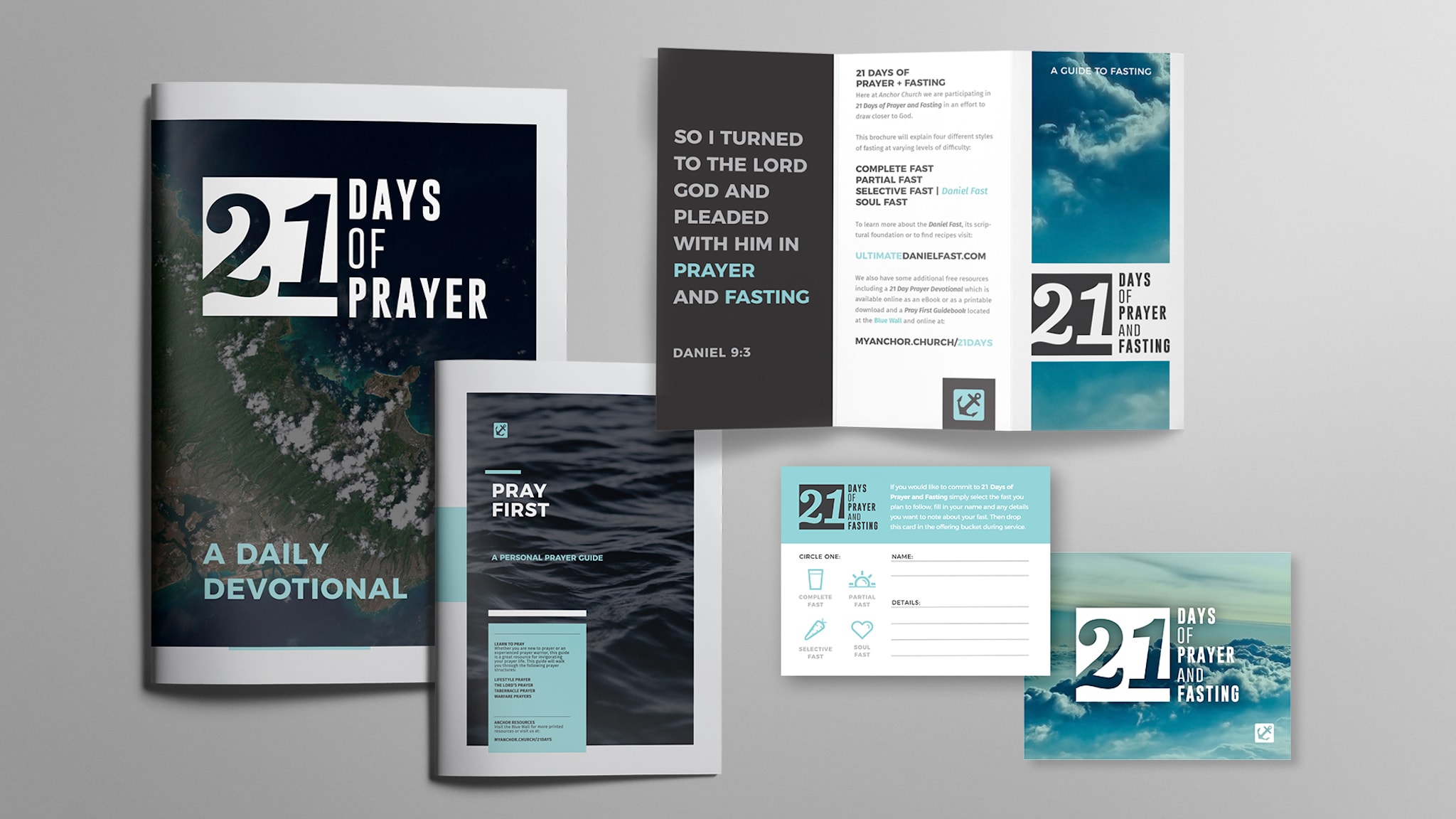
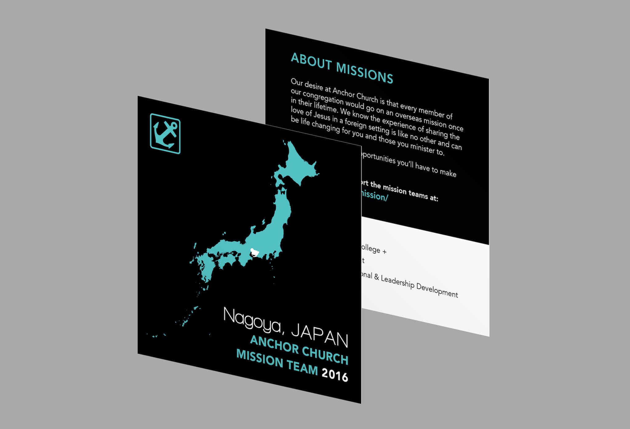
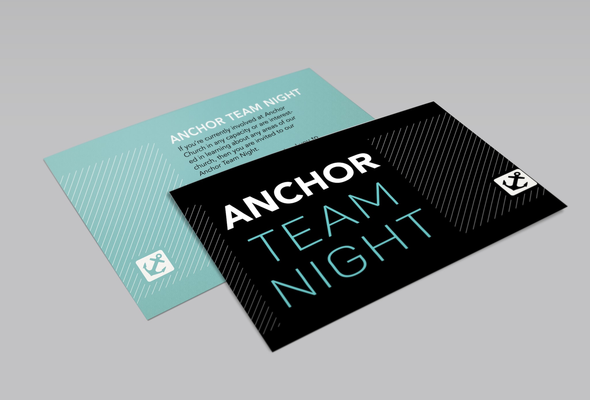
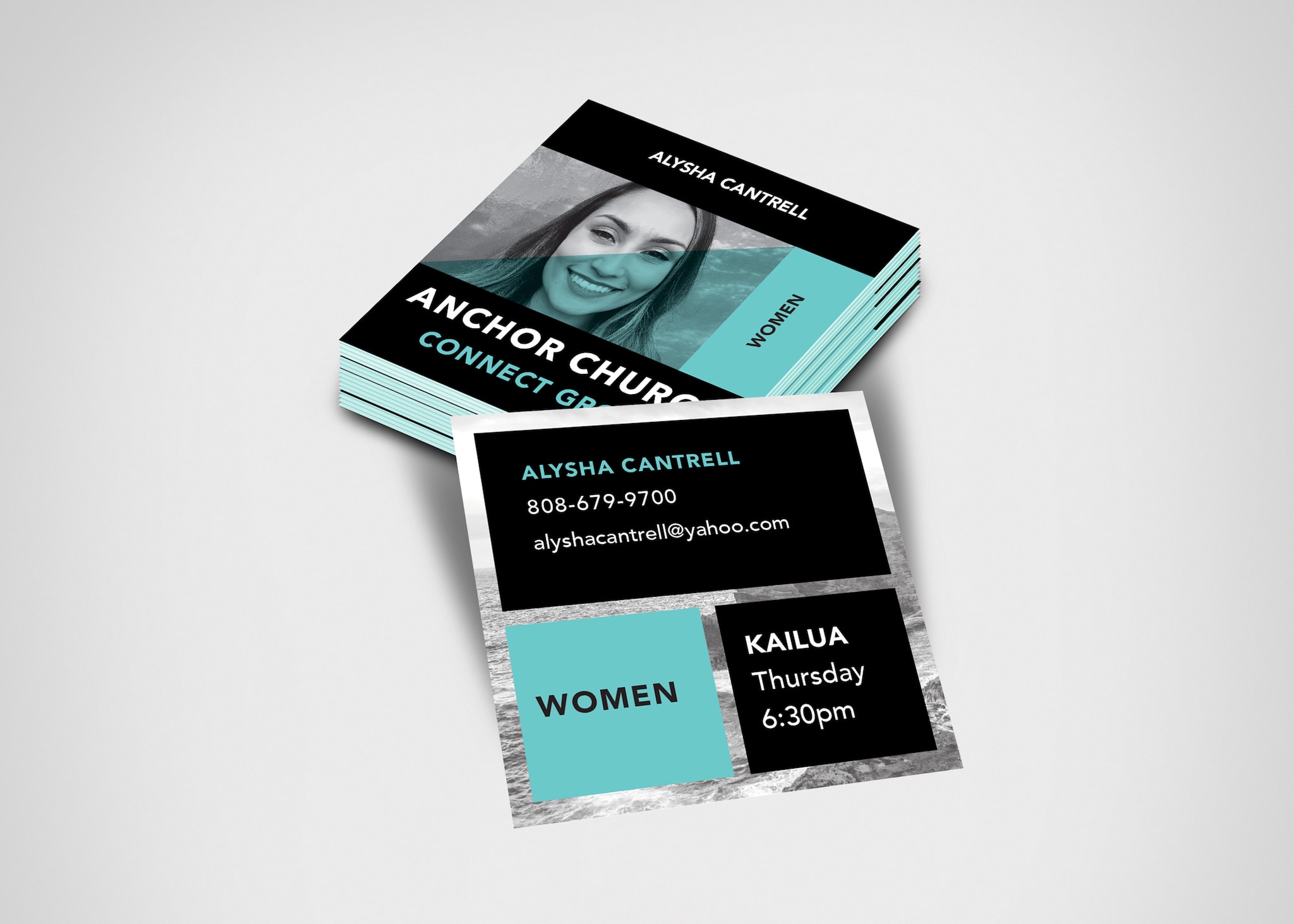
BRANDING & SIGNAGE