
Revisting Yupo Paper on a Bigger Scale
Project Overview:

A previous blog post brought me an interesting opportunity with the Yupo paper company. I was given the chance to tour the factory and see how the paper was made, and ultimately was commissioned to create some larger work for their Chesapeake, VA headquarters.
You can see that post and a similar one below:
Although Yupo is a Japanese brand, unbeknownst to me, one of their factories is one city over from where I live. After seeing some of my work on Yupo, they wanted to get some new paintings for their atrium that had a distinctly local flair. For this new commission, they were looking for work on a much larger scale than I had previously created with this medium. So I decided to revisit working with Yupo and alcohol ink on a grand scale to create a series of works focused on the Chesapeake Bay. After providing a variety of sketches, some sample pieces, and a proposal, they decided on a continuous scene of the Chesapeake Bay split into four 4’x3′ panels. The final design changed with some input from the sketch below, but you get the idea. I conducted extensive research to verify that all the species depicted were native to the area, even if in some cases I made them appear a bit more vibrant than they are in nature.

Materials and Settings


The Settings
Let’s cut to the chase. If you want a starting point for laser cutting Yupo paper, you can try my settings here:
Heavy Yupo (I ususally go for the heavier weights):
Speed: 510
Power: Full
Yupo Medium (I cut this on my sticky Seklema mat but the settings will work without that):
Speed: 466
Power: 60


MATERIALS OVERVIEW
- I’ve used a couple of different types of alcohol ink, but I really prefer the Tim Holtz bottles and colors personally.
- Ultra Mega Double Stick tape – once you stick this… it’s stuck just be aware. I sliced off pieces from the roll using an x-acto knife.
- Foam core – I used Foam Core from the Dollar Tree but I peeled the black paper off because it wasn’t super well attached and I didn’t know if it was acid-free.
- Acrylic Markers – I just used a cheap set. It works alright in some instances, but they aren’t always as opaque as I want them to be over the alcohol ink.
- Yupo Paper
- Brush Pen – I love these Pentel brush pens, but be aware that some versions won’t stick very well to the Yupo over the ink (they have different types of ink in them). This gray one is the perfect one. I have used this specific pen over and over for probably 15+ years and it’s my go to for inking.
NAVIGATE POSTS
Helpful Links
Latest Posts
Posts by Category
Explore Posts By Tags
Acrylic Adobe Illustrator Alcohol Ink Baby Room Beginner Post Book Binding BuyTheFile Christmas Felt freefiles Gifts Gilding Glowforge Holiday Journal Kaleidoscope Laser Cutting Notebook Resin Rubber Stamp Settings Sign Stamping Yupo Yupo Paper
Get Your Own Glowforge Laser
If you have found this post helpful and would like to purchase a Glowforge of your own you can receive a discount using my referral link when you are ready to purchase:
Sign Up to Blog Newsletter
A Preview of The Final Pieces
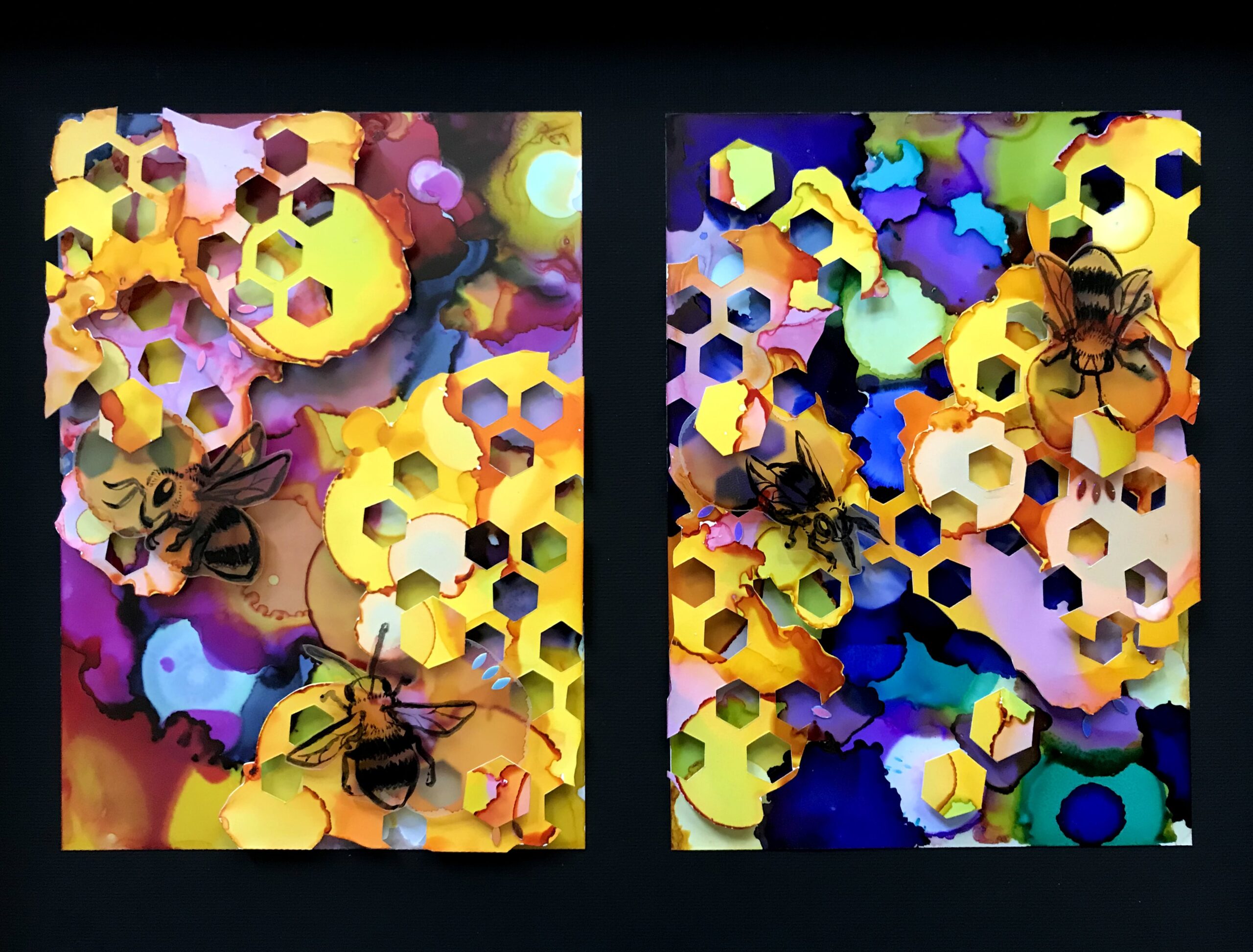
Sometimes, looking at the final result helps you get a better idea of where I’m going. I want to discuss the process for creating these layered pieces. Some of these are almost 5′ long, and others are on a much smaller scale. All of them incorporate a combination of hand-cut and laser-cut pieces that are layered together three-dimensionally. When you see abstract shapes with intricately cut negative spaces, such as the coral, vines, and radial shapes, you can assume they are laser cut. With the bolder, larger pieces, I typically hand-cut because it’s faster than trying to create a vector cutting shape in Illustrator. All of the laser-cut shapes are hand-drawn – no stock art is used. I draw each and every shape in Adobe Illustrator before converting it to a vector and cutting it on my laser. Anything that’s a one-off (such as all the animals) or is too large to fit in my laser bed gets hand-cut.
A Quick Video of the Painting Techniques I Use
This is not an extremely in-depth video, but it shows a quick overview of how I work with Yupo paper. Hopefully, this will provide some context for the written explanations, which include more detailed steps.
The Process - Style One
In order to determine how I wanted to approach the larger-scale works I was creating as a commission for Yupo paper, I decided to start by making three smaller sample works. This was also an opportunity to showcase different framing styles and decide what looked most interesting.
The first technique was the most straightforward – painting everything on one layer/sheet. I started with a simple sketch and then used that to guide how I painted the background. This is important because Yupo paper resists the ink, meaning it sits on the surface of the paper and doesn’t absorb into the sheet. This is what makes the colors so vibrant. Yupo is made from polypropylene, a recyclable form of plastic; it will never absorb pigment like canvas, wood, or cotton/pulp-based paper does.
If you go back to add more detail, the alcohol in the ink will dissolve/move the ink that is already there. You cannot layer with watercolor or alcohol ink because they become reconstituted the second you touch the paper with the wet media again. By completing the main subject last, I have more control over the edges of it and can prevent the background from flooding in and ruining the foreground. It is easy to “erase” areas or add interesting marks by painting with pure alcohol. This allows me to create some crisp edges towards the end of the painting process.


Alcohol ink and yupi lend themselves to a much looser style of painting than other mediums. At any second your pigment might move or react with the one next to it (until it dries or you wet it again anyway). Although I have done some paintings without finishing them with an ink outline, I prefer the definition that ink offers. I used a brush pen to ink all of these pieces. Ink work also allows you to get a true black into the work for contrast and to draw the eye.

Because this piece was a single layer, I thought it might look nice floating in a clear acrylic frame.

This type of framing also allows for backlighting, which is pretty fun. To achieve that, I just ran a sticky strip of RGB LEDs behind the painting. Plug and play, very easy. I’ve shown how to do this in previous posts, so won’t cover it here.

Here are two additional examples of painting on a single layer. In the butterfly/sea life pieces, I created a loose background and then drew in some interesting shapes as I saw fit. This is how I first started with Yupo, and it remains a very approachable way of getting started with the medium. These works are much smaller than the others (5×7) so it’s easier to create interest with large drops vs small drops of pigment. As the work gets bigger, it creates more of a pointillism effect.

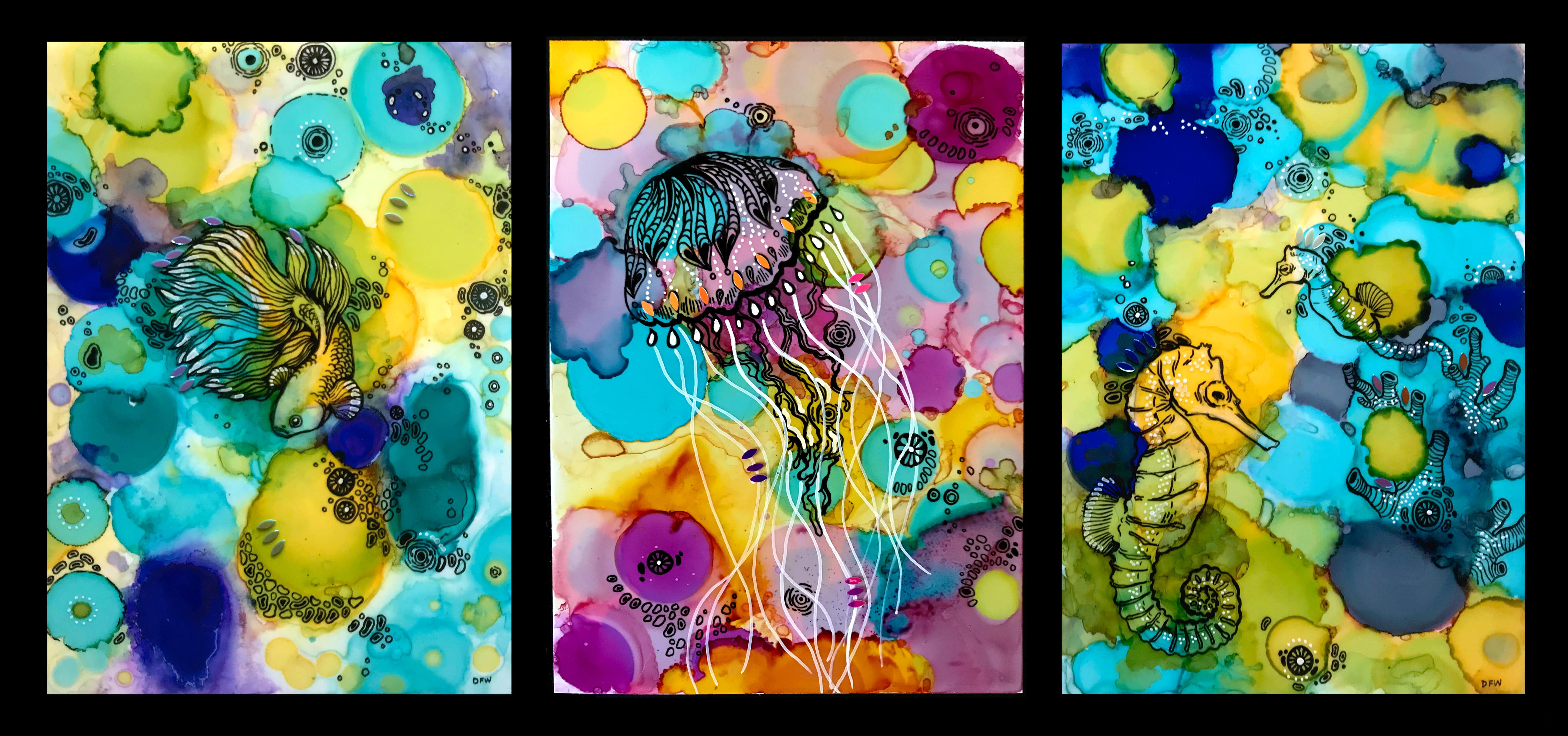
With the landscape below, I used line work to define the main subject, but did my best to sculpt the softer areas of the background without black. I also made use of white alcohol ink for the clouds which you don’t see in the other things I’ve made. White out pens can be used to create interesting white line work as well to contract the black.

Style Two - Layered
The method of painting here is pretty much the same as the one I covered above. The difference here is how I assembled the final pieces. I created loose impressions of different subjects and then inked them to define their details. With my layered pieces, I sometimes work from front to back, where I create a variety of objects (animals, plants, rocky structures) and then play with them to form a composition. Finally, I create an abstract background that provides contrast. You can watch a quick timelapse of the process below as well:
The Process in Still Images:


To make my more abstract cut out pieces I create abstract background and then cut random shapes and sizes on my laser. I have a wide variety of shapes and colors, so I can add them into the composition where they fit best. I have a library of abstract aquatic/vegetation shapes that I use. I like to add new designs as I create subsequent pieces, but often re-use shapes at different scales.


With this eel piece, as I was moving around the parts, I decided I didn’t like the original background and created a new one. Once I feel good about the composition, I use foam tape or foam board to layer and stick down the individual cutouts.


I tried a fun lighting technique for this as well, where I ran a strip of LEDs along the inner edge of the frame. It wasn’t quite as striking as the backlit example, so I decided not to do this for the larger pieces. The LEDs also didn’t look the best when you saw the inside of the frame at an angle, and needed me to put a diffuser channel over them so the dots of light weren’t so harsh and the strips were better hidden.

Comparing the Sample Pieces
As I worked through these three pieces, one of the main things I was comparing was the framing. As shown above I tried one sandwiched in between clear acrylic with standoffs. For both layered pieces, I compared framing in a shadowbox (the eel) and mounting on a black panel that sat in a cradle mount frame. In the end, the client decided on the shadowbox version, which was also my favorite. The added background panel I used in the shadowbox version and deep frame added a lot of interest to the final work.


Moving on to the Large Scale Works
After doing the sample work, I was a lot more confident in my ability to scale up. The only challenge with scaling up is that the dots formed by the alcohol ink become smaller in scale, so it can be difficult to create good contrast between the foreground and background. There is a risk of compositions being too busy and overwhelming. Using a brush or a spray bottle of alcohol, sometimes I blended larger areas of color to combat the pointillism effect and add more interest.


To lay out my larger works, I used a painter’s tape to define the borders of the composition. Once I had a good idea of what creatures were going to go where, I worked on the backgrounds. This commission consisted of four frames that were meant to be windows into the same scene. I created the background and arranged the sea life to suggest that the scene was going from the deeper ocean to the shallows.


Once I was ready to layer the parts and stick them down. I would trace them onto the foam core, cut the basic shapes out roughly with an X-Acto (smaller than the tracing so you couldn’t see them from the front), and apply double-stick tape on both sides of the foam. Then, after sticking the drawings to the foam core, I could just peel and stick them down. Sometimes I needed to add additional layers of foam to add different areas of depth. The effect is hard to photograph but adds a ton of interest in person.


And finally, here are all four pieces in a continuous scene. All the framing was done by a local frame shop – Ray Skinner Frames in Virginia Beach.

FINAL THOUGHTS
You can see in the images below that there are a lot of interesting ways to play with these techniques. I like to combine hand-cut animals with laser-cut flora and corals to add interest. The use of black helps define the most important subjects and shapes as well as ground the very vibrant subjects. In the circular painting with the discus fish, I tried another technique where I used paint pens to define the line work edges instead of black. This is something I’ll try in other designs going forward as well.
Where to Get the Materials:
The two Amazon links below are affiliate links. They don’t cost you more, but they do help me keep creating content. I got my Yupo paper on a roll directly from the company because this was a commission for their Chesapeake headquarters, but you can buy it online as well. For the alcohol inks, they are more affordable if you buy them in sets. I’ve linked one set below, but I probably have 50 different colors at least by now, and just buy them in sets or as individual colors as I need them.
Yupo Paper
Alcohol Inks
Double Stick Tape
Acrylic Paint Pens
Brush Pen
Great Vendors for Beautiful Laser Materials: None of these are affiliate links! I purchase materials from all of these vendors because I like their products:
Woodcraft – Exotic Veneers, 1/8″ wood
Johnsons Plastics Plus – Rowmark Acrylic, Saddle Faux leather (laser safe), Finished plywood, Flexibrass etc. Veneers (with and without 3M)
Craft Closet – Shell veneer, acrylic (Glitter for days), wood, colorboard
Cerulean Tides- So many gorgeous acrylics, glue, 3m sheets, and more
Smokey Hills – Wood, Plywood, Basic Acrylics, Patternply in Acrylic and Wood(beautiful pattern printed boards), Now they also carry leather and a thin flex material
Custom Made Better – So many fun different materials and they also release tutorials for learning new techniques
Get 50% off your first Wish.com order with my code: mfvjgnw | I buy lots of odds and ends here, so if you need some small item and don’t mind waiting, this can be a fun shop to check out.
Obligatory Glowforge Discount Code Plug
If you found this post helpful and you plan to buy a Glowforge you can use my code (https://glowforge.us/r/QHDONFXB) for a discount of $125 off the Basic, $250 of the Plus, or $500 of the Pro:
Sign Up for Blog Posts Updates
And finally, if you’d like to be updated on posts like these in the future you can sign up for my email list. You will only receive an email if there is new content, and only once weekly in that case:
This is a truly inspiring piece of art! I love Yupo, but I’d never lasered it. This is definitely something I’ll be doing, thanks to you. Fantastic tutorial and walk-thru.
Definitely give it a try. It won’t allow quite as much fine detail as card stock (as it tries to melt a bit when you cut), but it is such a fun paper to work with and the fact that it is waterproof may give it unique uses when paired with other media.