If you’ve been working with text on your laser cutter, cnc, or vinyl plotter you’ve probably struggled with HOW to actually cut the text in the simplest, most effective way. Up until today I was stuck with two options – engraving the text (slow), or setting it to outlines and complete cutting/scoring the outer shape of it (not good for small text, and not always what one is looking for).
Well, there is a third option – Monoline type. The issue is that although single line typefaces exist, Illustrator doesn’t read them that way – it will always treat them like a vectorized shape if you set them to outlines.
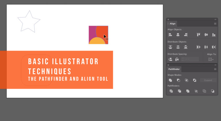
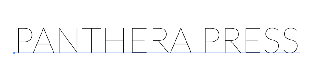
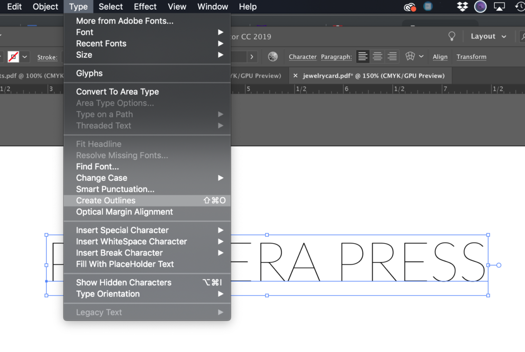
In illustrator if you want text to cut out as you’ve created it, you would create your text and then go to Type>Create Outlines
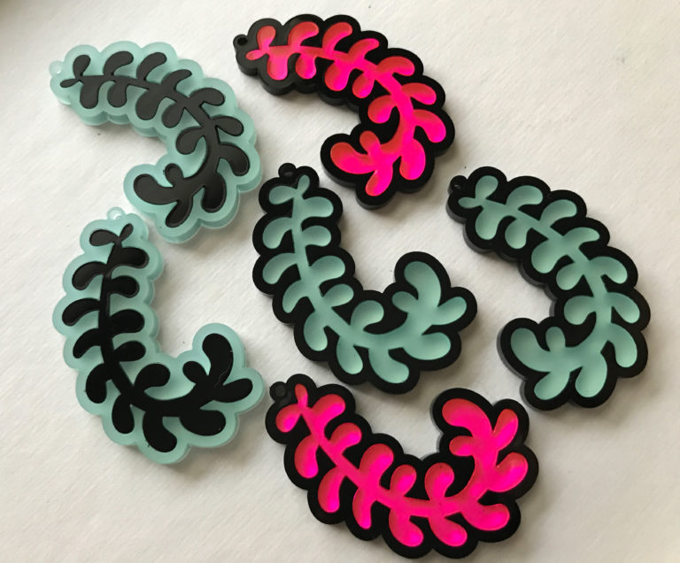
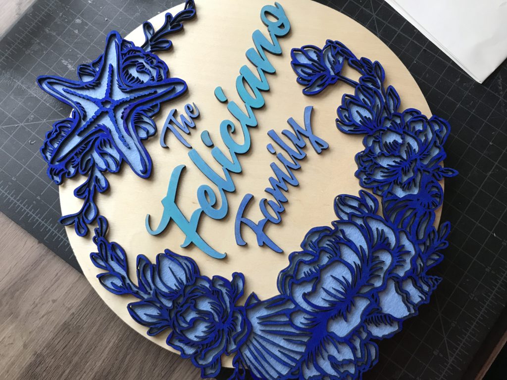
Now the above technique will work great if you’re trying to produce something like the product below. When you want your text to look EXACTLY like it does in illustrator, this is the method you want to use.
However, if you’re just trying to score some quick text for a jig, a ruler, etc. and don’t want to wait an eternity for the text to engrave – then you will want monoline type. Monoline type is text that is created with a single line or path. If you need to score/engrave in a lot of text (like full paragraphs) and it doesn’t have to be flourishy monoline type can seriously speed up your process. After some research, I’ve discovered two different ways of achieving this.
OPTION ONE: RASTER, LIVE TRACE
It is important you choose a thin type like Lato for this process. The advantage of this method is even though your choices are narrow, you will still have some control over what typeface you work with. You just have to keep trying until you find thin, simple typefaces that work with this technique.
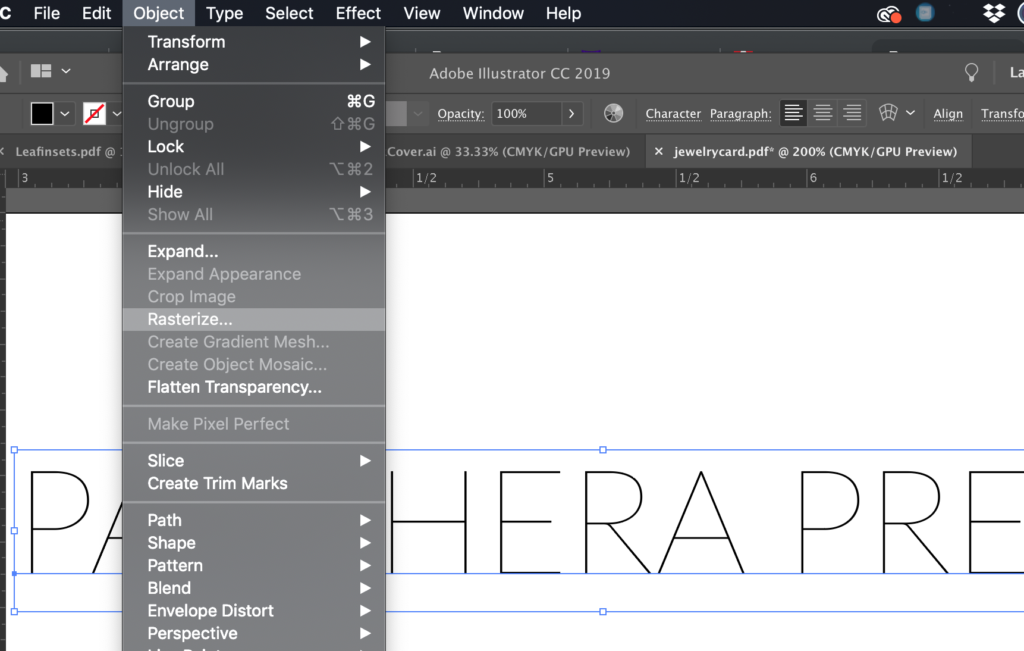
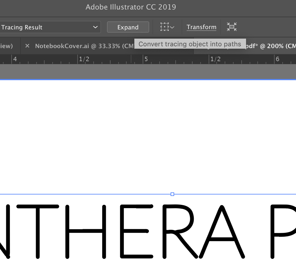
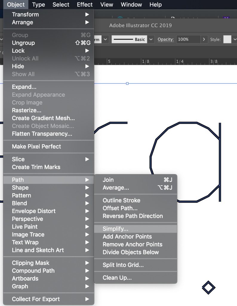
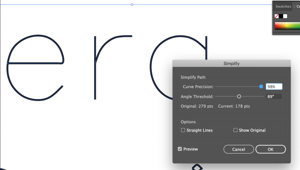
For this method, you need to take your text, finalize it, and then convert it to a raster graphic. Go to Object > Rasterize and then click ok, the settings shouldn’t matter too much as long as you keep the resolution at 300.
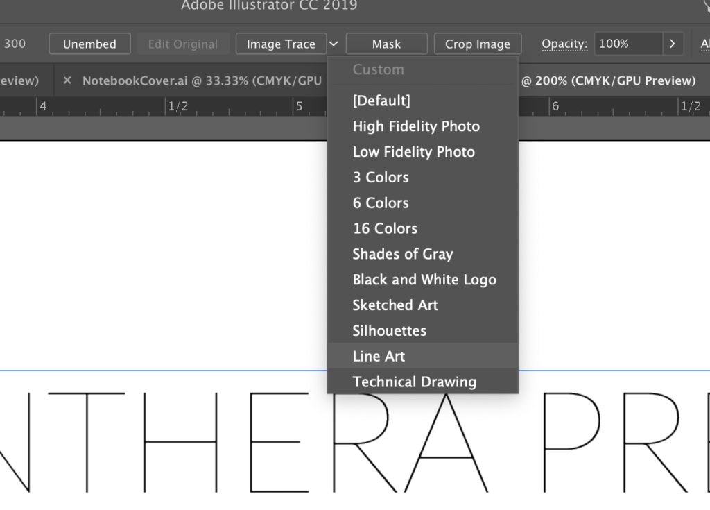
Next, select Image Trace Lineart
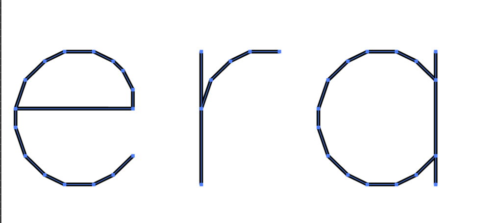
After you have the image traced as lineart, click expand in your upper toolbar to turn it into vectors.
You now have monoline versions of your type.
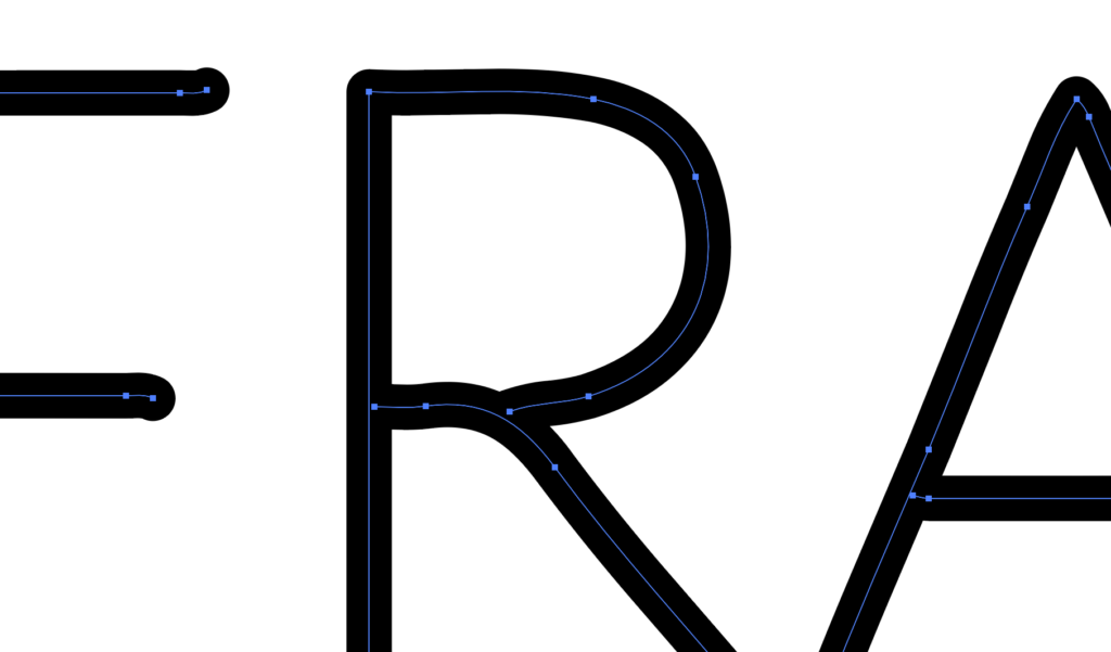
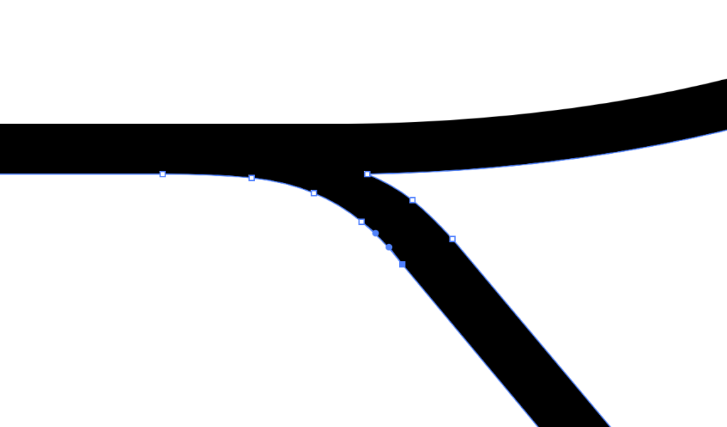
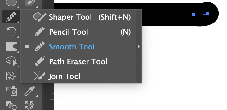
Sometimes you’ll get wonky areas. You can clean these up with the direct selection tool (white arrow), remove anchor point and convert anchor point tool, or the smooth tool which is in the tool menu behind the pencil. Just run the smooth tool over any bumpy areas in the path to clean it up.
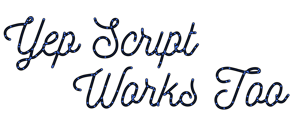
Also yes. As long as the type is simple and thin, script will work too. It does get a little squidgy looking but you can smooth it out, or just keep it at a small size and it won’t be noticeable. Generally, you want monoline type because you have A LOT of type and it’ll take too long to engrave. In those situations the type is usually a smaller size and thus some lumps will be overlooked.
OPTION 2: Monoline Script
If you don’t like that method – there is a second one, that will require a lot less cleanup. With this method however, you will not get to select your typeface and will have a bit less control over the placement/flow of the typography.
I learned this technique from another blog. This person created an Illustrator script which you can download to do this technique – visit this forum post started by Jongware to download the script he made. Hopefully he won’t mind if I also post it here for download (he did offer it up as a free item after all, and I DO NOT make any money from this post).
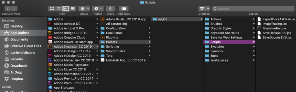
Now first things first. You want to install the script. Yes. you can just run it once and throw it away, but if you plan on ever using this a second time you might as well do it the right way. After downloading the file go into your applications folder and find Illustrator. Then navigate to Adobe Illustrator > Presets > en_US > Scripts. Simply drag the file in, and it will be installed.
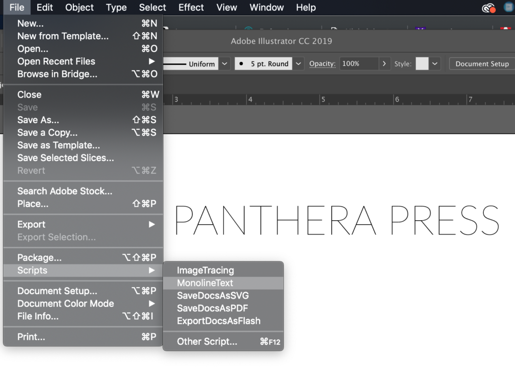
Next open Illustrator (if it was already open you might need to restart it for the script to appear). Go to File > Scripts > MonolineScript
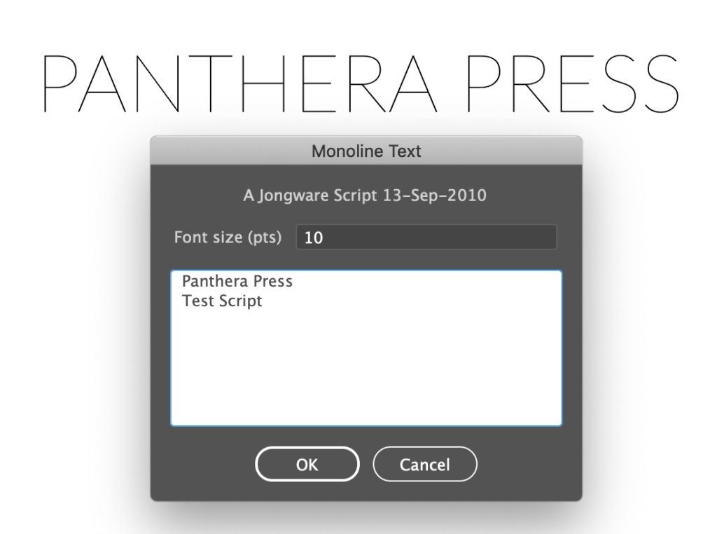
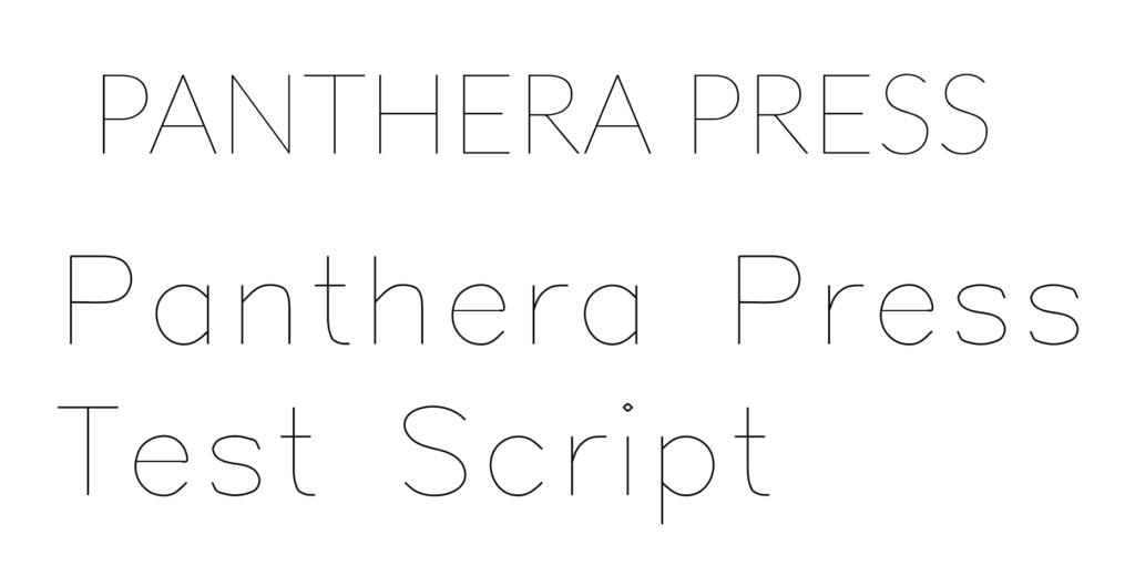
After selecting MonolineText a small window will pop up. Type in your text and select your size. Then click ok.
The script can be edited by re-selecting it and then navigating back through File > Scripts > Monolinetext. However if you ungroup it or manipulate it too much in Illustrator this will not work and you’ll have to run the script from scratch to make an edit. Anything you apply to the text (a color or brush stroke for example) will disappear if you run the script again to edit it.
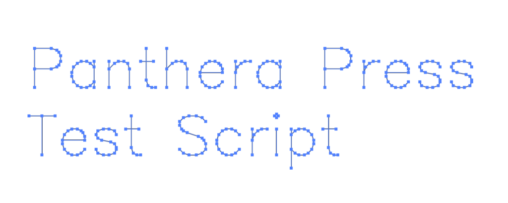
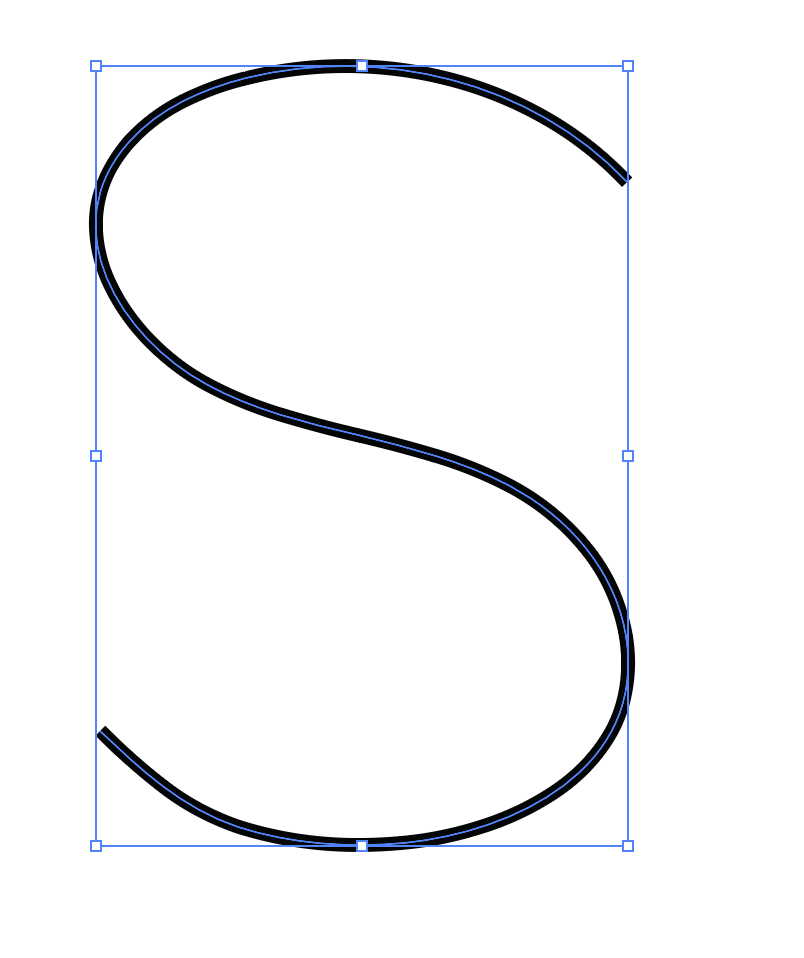
Now you may notice the text is a bit boxy. This is pretty easy to fix.
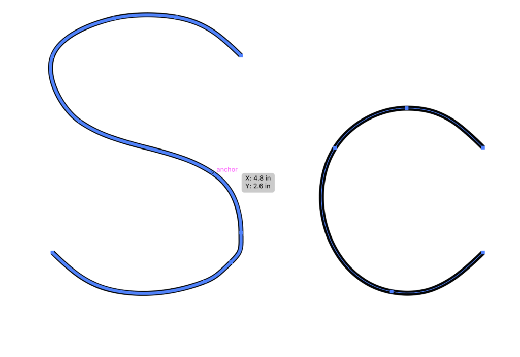
You can also use the smooth tool to clean up any odd areas that are left over after you simply the path. Below you can compare the S before and after using the smooth tool.
BONUS
Bam. Done. You now have very simple monoline text for laser cutting (or cnc cutting, or pen plotter drawing etc.)
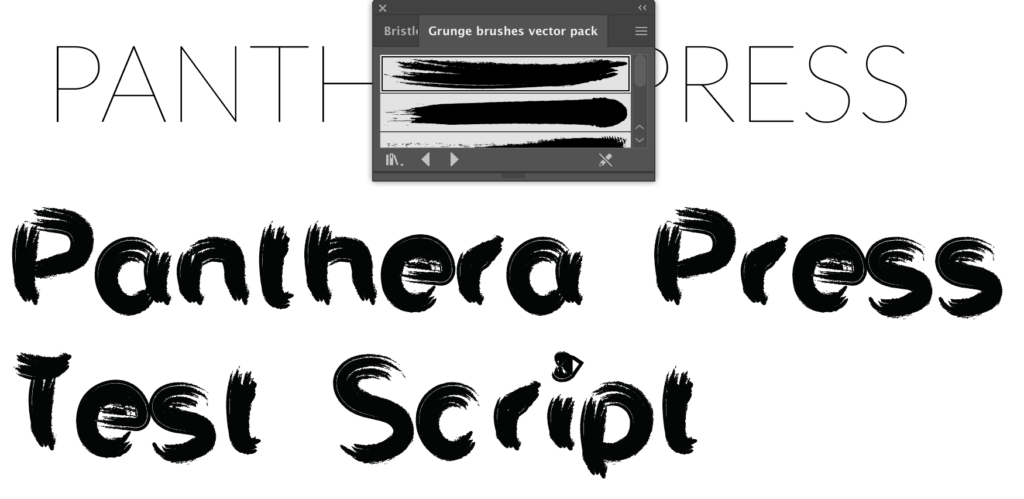
As a little bonus. Something really cool you can do with monoline text is apply a decorative stroke to it. You can then expand the design and laser cut that as well. To expand just grab the stroked design you’ve made (like below) and go to Object > Path > Outline Stroke. Use your magic wand tool to grab the boxy clear shapes around the type and then go to your Pathfinder panel and unite the design.
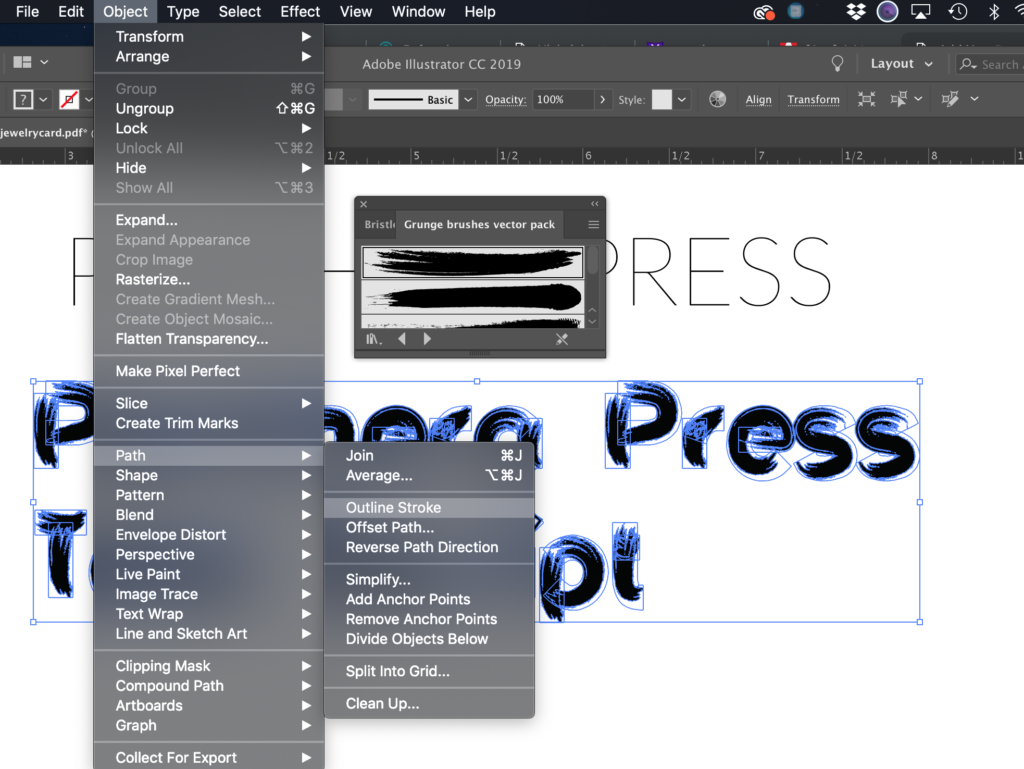
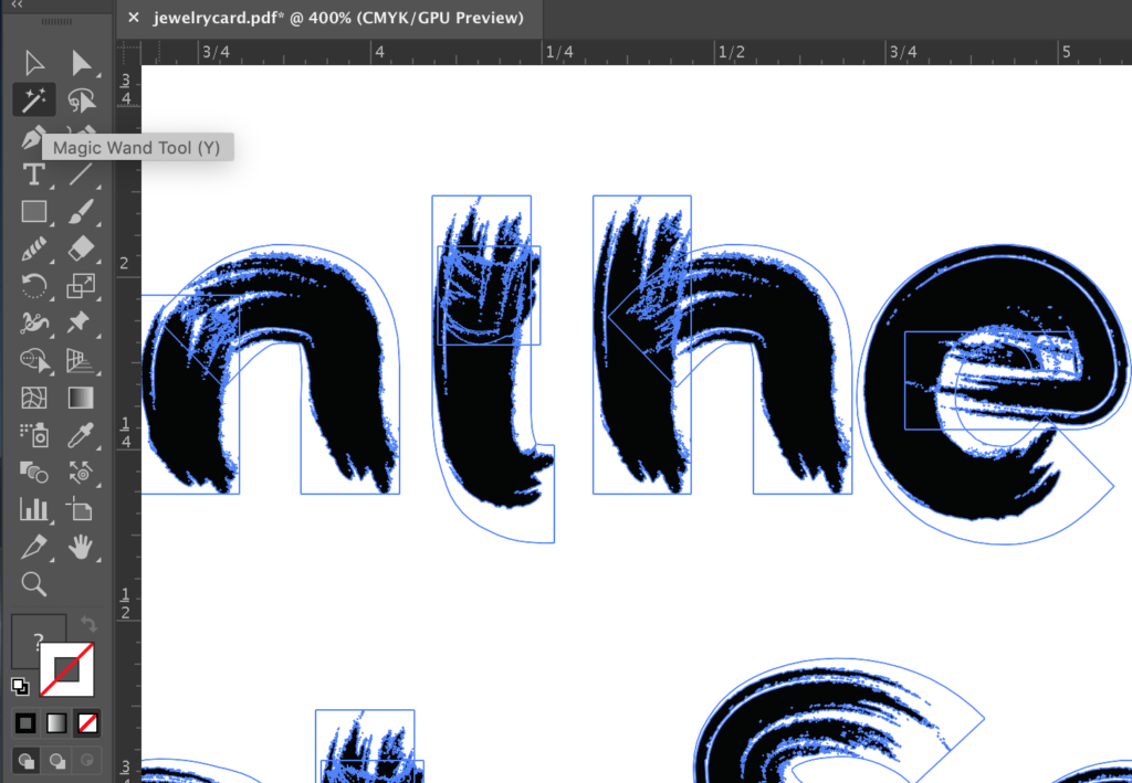

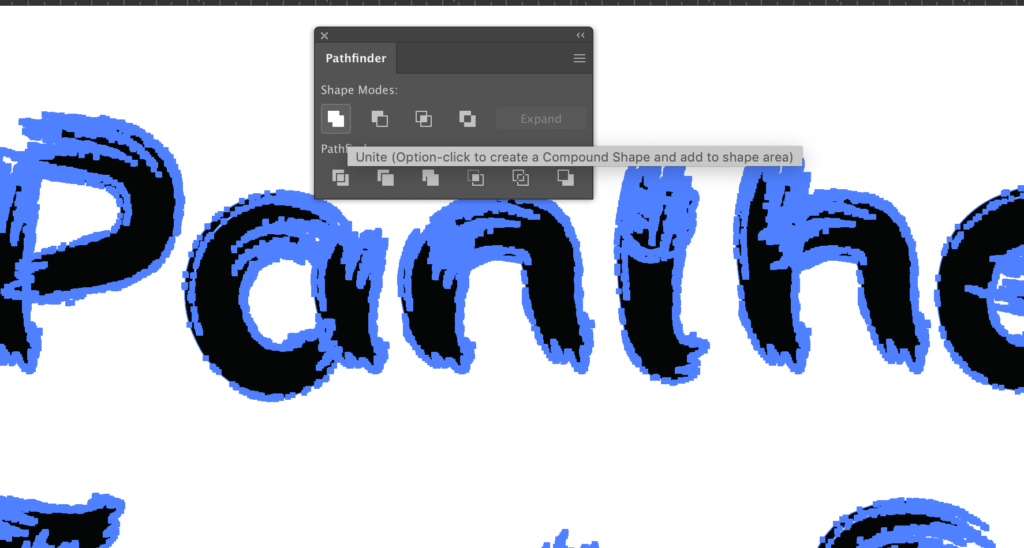
If you do NOT unite the design and try to cut it, you will get a bunch of pieces cutting over top of eachother. You could definitely engrave this as well. This brushy text in particular isn’t designed for cutting (it will probably turn out awful or catch fire with all those teeny areas that would need to be cut). This design would however probably engrave nicely.
LIKE WHAT YOU SEE?
Obligatory code plug. If you found this post helpful and you plan to buy a Glowforge you can use my code for a discount: https://glowforge.us/r/QHDONFXB
And finally, if you’d like to be updated on posts like these int he future you can sign up for my email list. You will only receive an email if there is new content, and only once weekly in that case: