
Designing a Layered Depth Map
Project Overview:
I generally do my best to make all my projects accessible to beginners, but this one is a big more advanced. Ideally, you will have a good understanding of the pen tool and how to work with vectors without breaking them. There is no way around it – making a layered map requires a lot of manual cleanup and without a good understanding of Illustrator’s vector tools you may struggle to perfect your file. If you’re up for the challenge though, I’m sharing pretty much every step of the process to get you on your way to making vector maps.
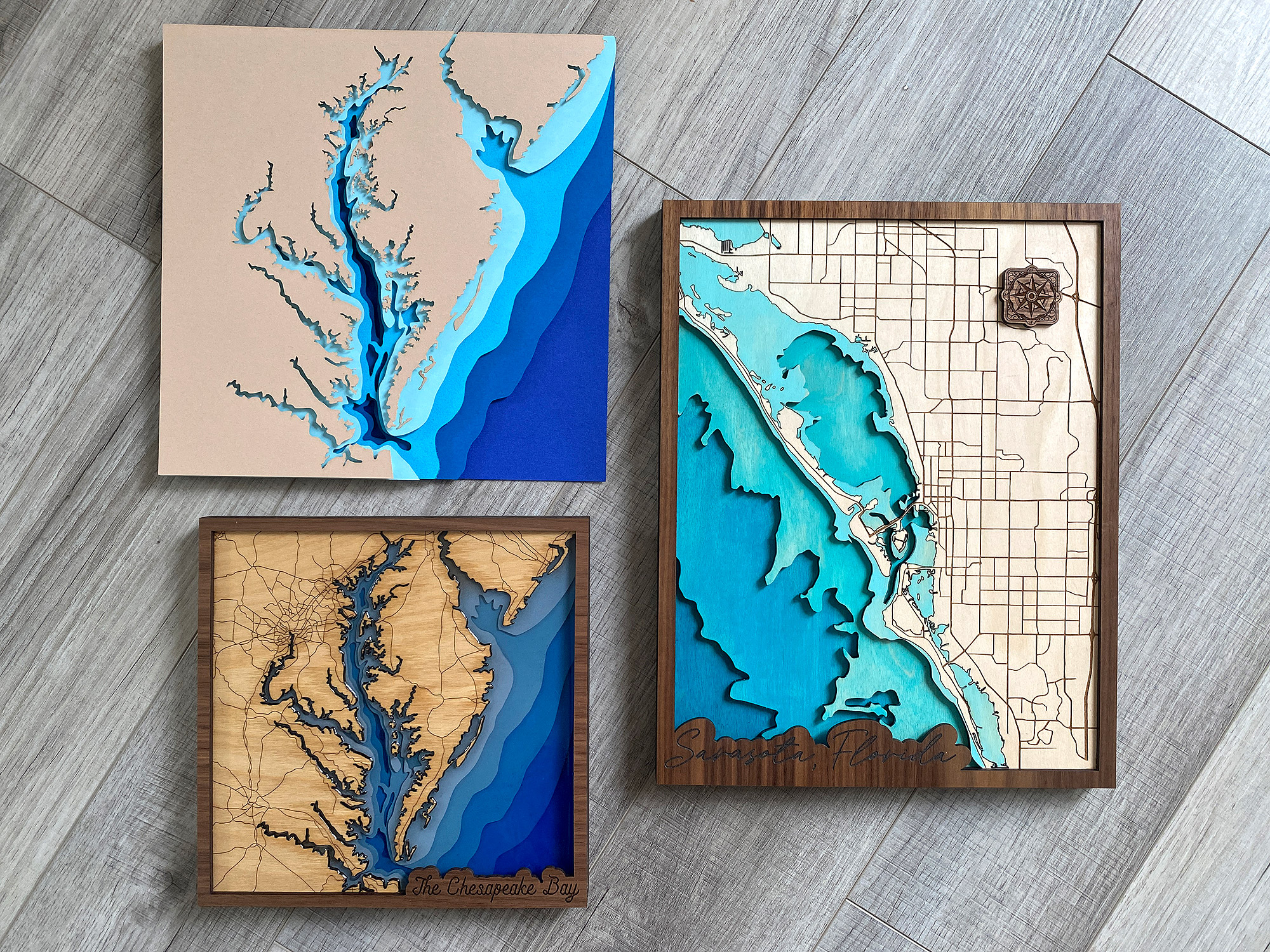
Buy The Sarasota, Florida File
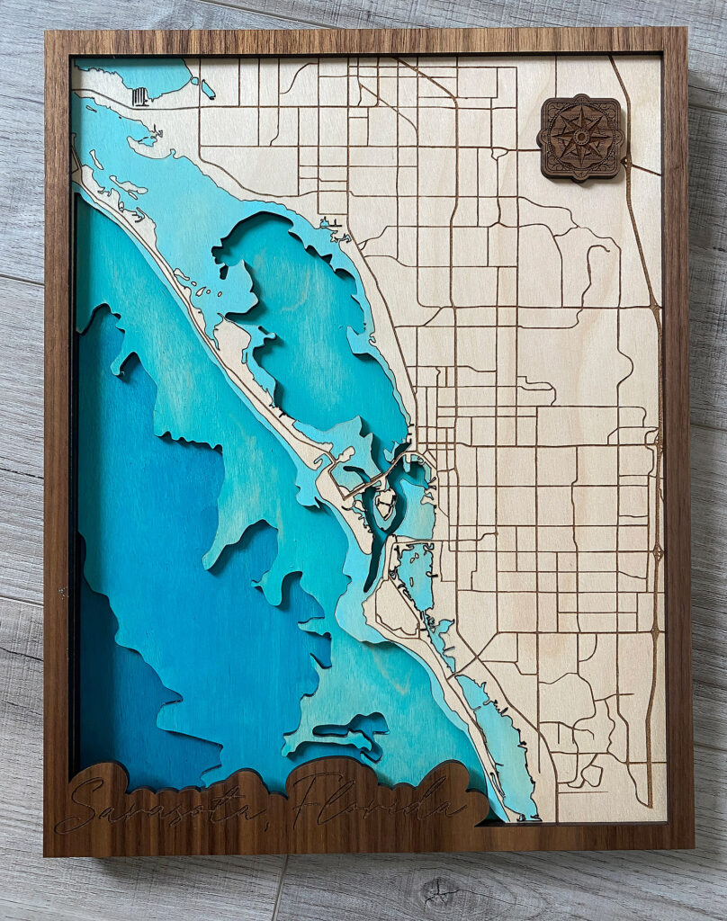
Buy the completed layered depth map and make your own Sarasota, Florida map:
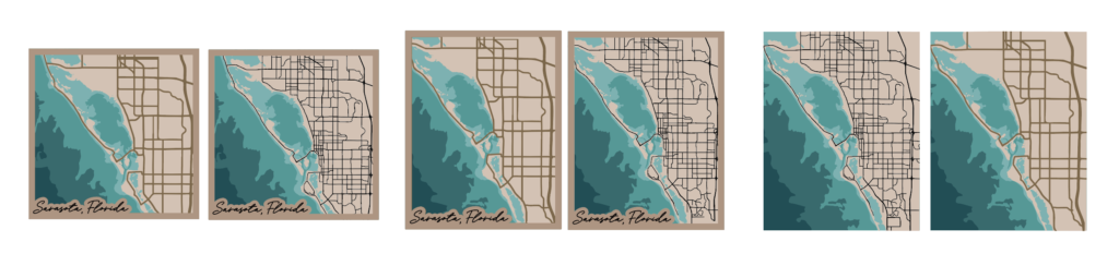
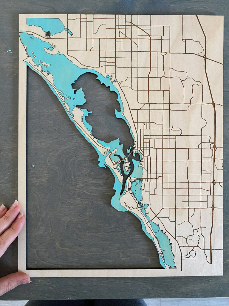
This file is PACKED with options. This file features:
- A built in keyhole hanger option that can be cut directly into the bottom two layers
- 4 different ways to create your top layer
- Engrave OR cut your roads (simplified road option optimal for cutting)
- Borderless map option and one with a frame (great for pouring resin!)
- 12×12″ square or 11×14″ rectangle layout
- Score lines to assist with painting and lineup on each layer
- SVG & PDF files for download
About the Materials
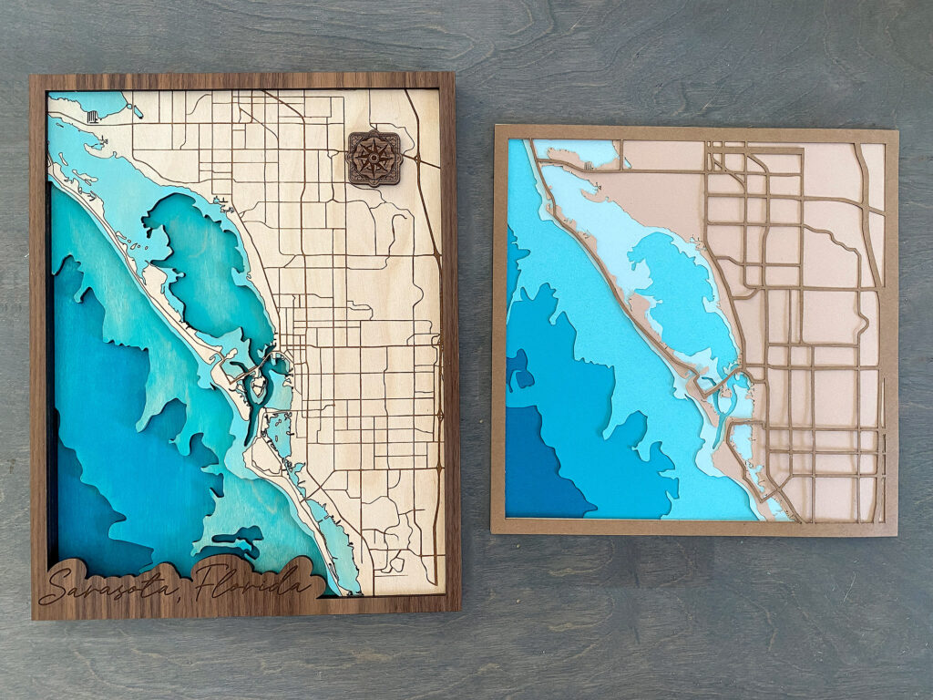
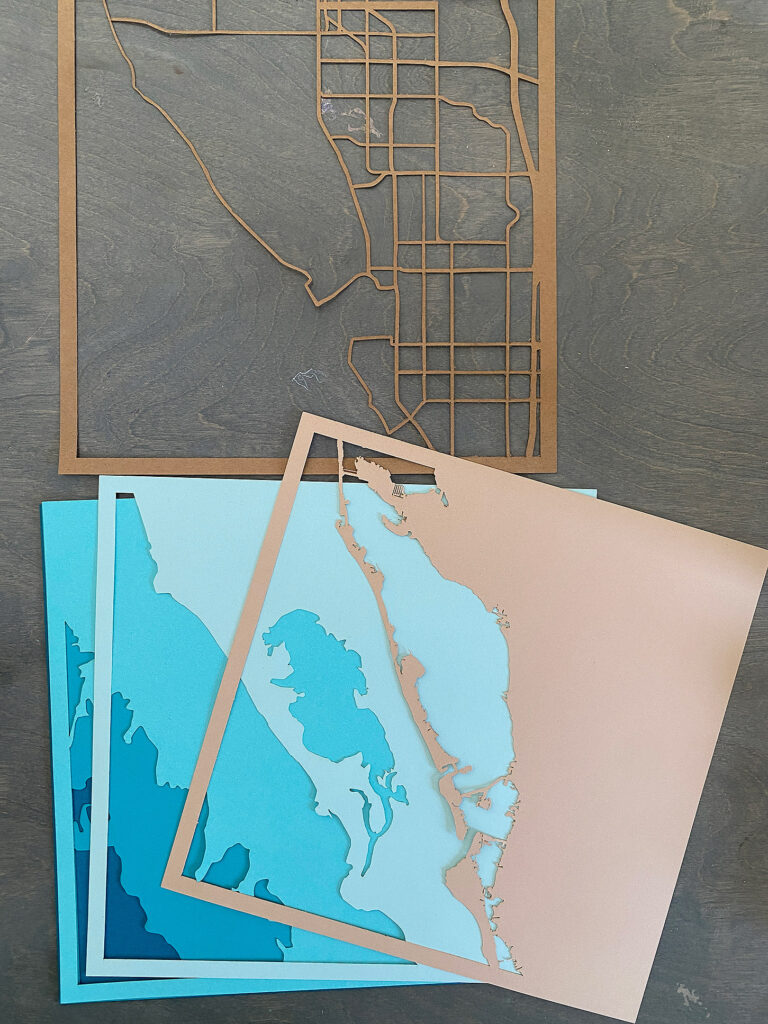
You can make your map from whatever materials you want. Your only consideration will be the thickness vs the level of detail. Thicker materials (like 1/4″ and up) will require the laser to run slower and with more power. This means that it may burn up the edges when trying to cut super small details. Thinner materials may be able to hold more detail. I cut two versions of my map – one from paper, and one from 1/8″ wood as I figured these would be the most commonly used items. Beyond that you just need a way to color your map, and glue it together.
MATERIALS OVERVIEW
- 1/8 material (masked) of your choice – You will need 4-6 sheets to complete this project depending on how you cut my map (you may more or less depending on how you design your own file). I used white birch with an mdf core because it cuts great every time.
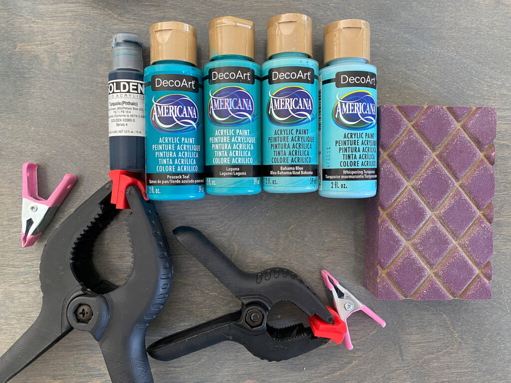
- Wood glue & clamps
- Paint/stain or you can cut the layers from colored acrylic – feel free to color your material before or after cutting
Video Walkthrough of My Sarasota, FL File
Even if you don’t plan to buy the file, this video may be helpful because it shows you all the final features I’ve built into the file (such as score lines to help guide your paint and glue).
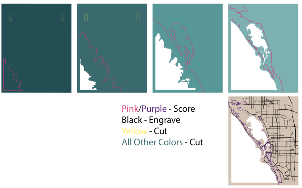
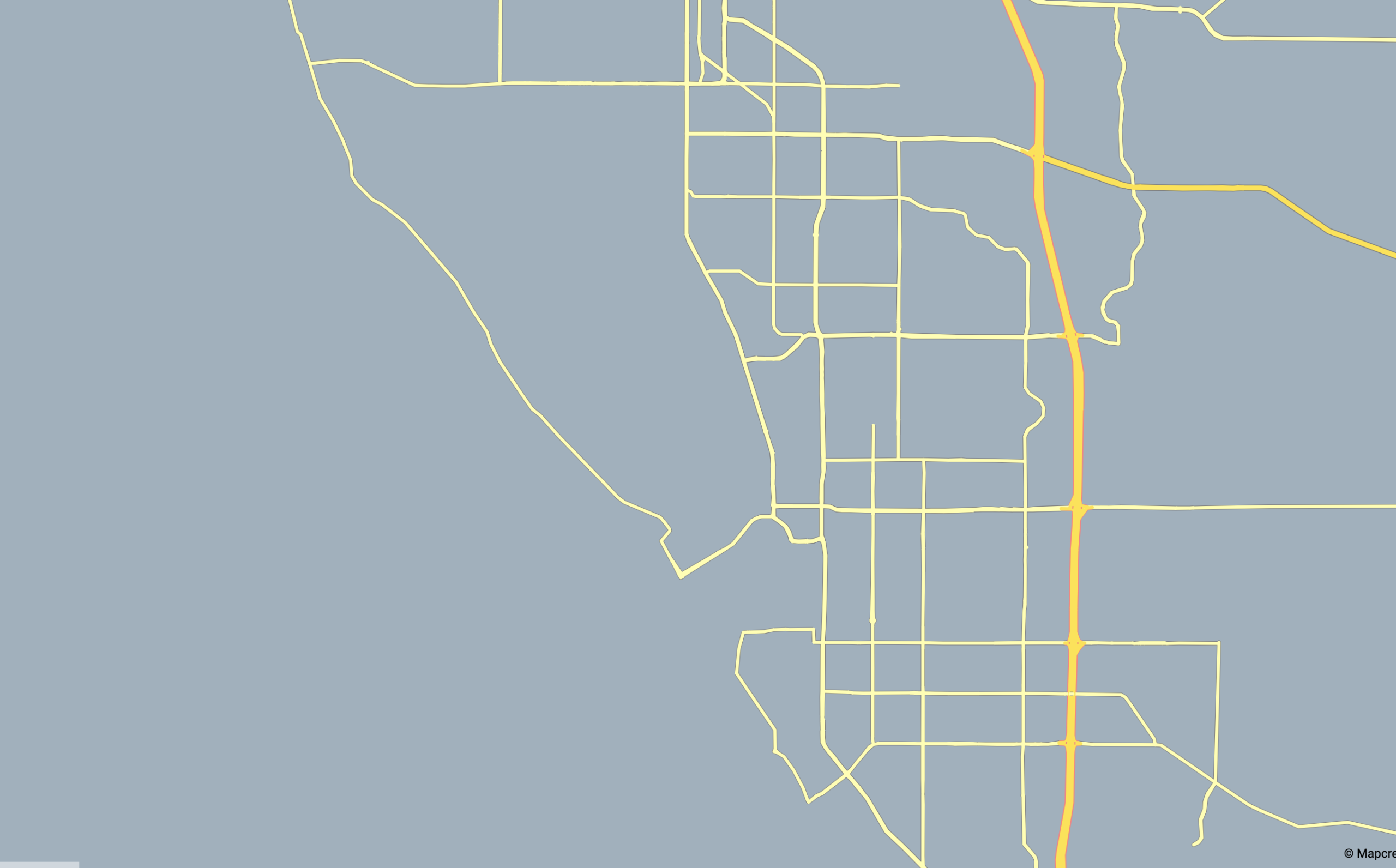
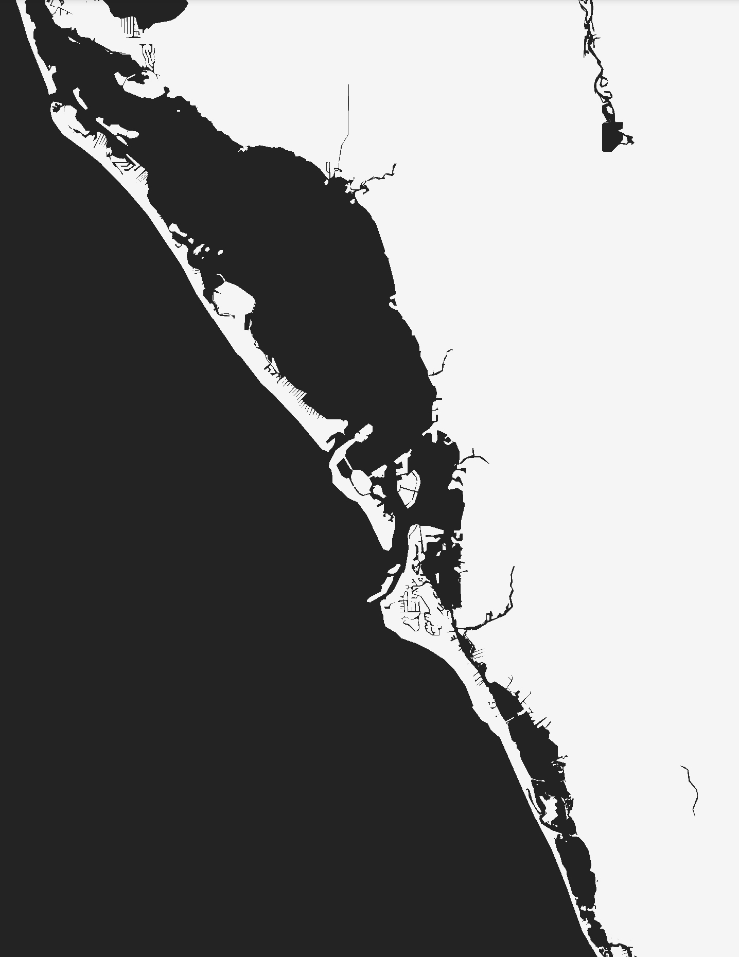
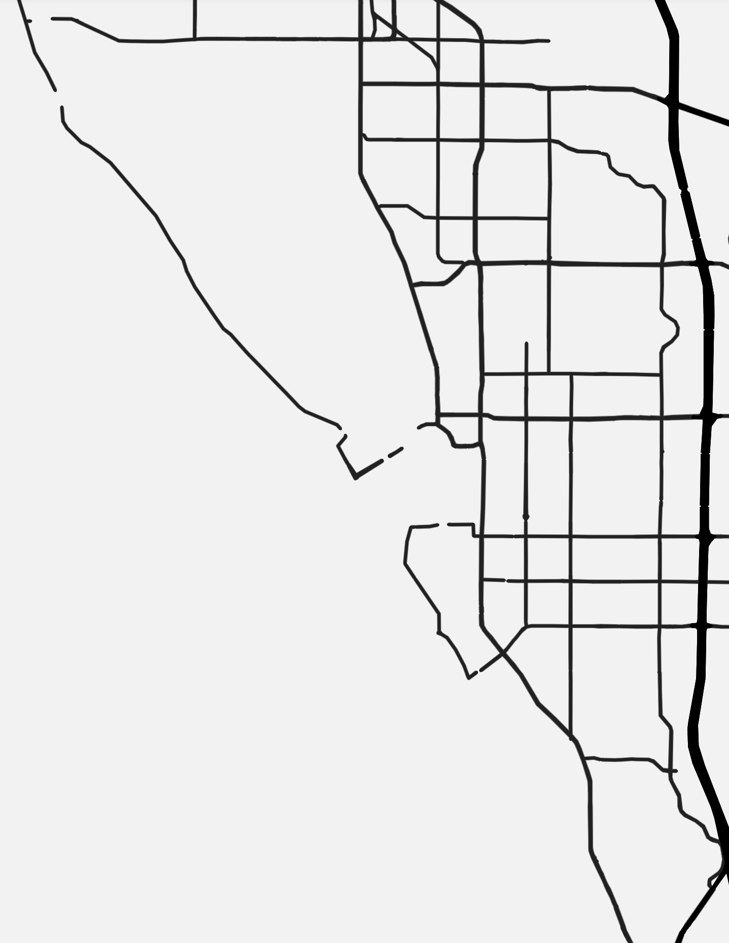
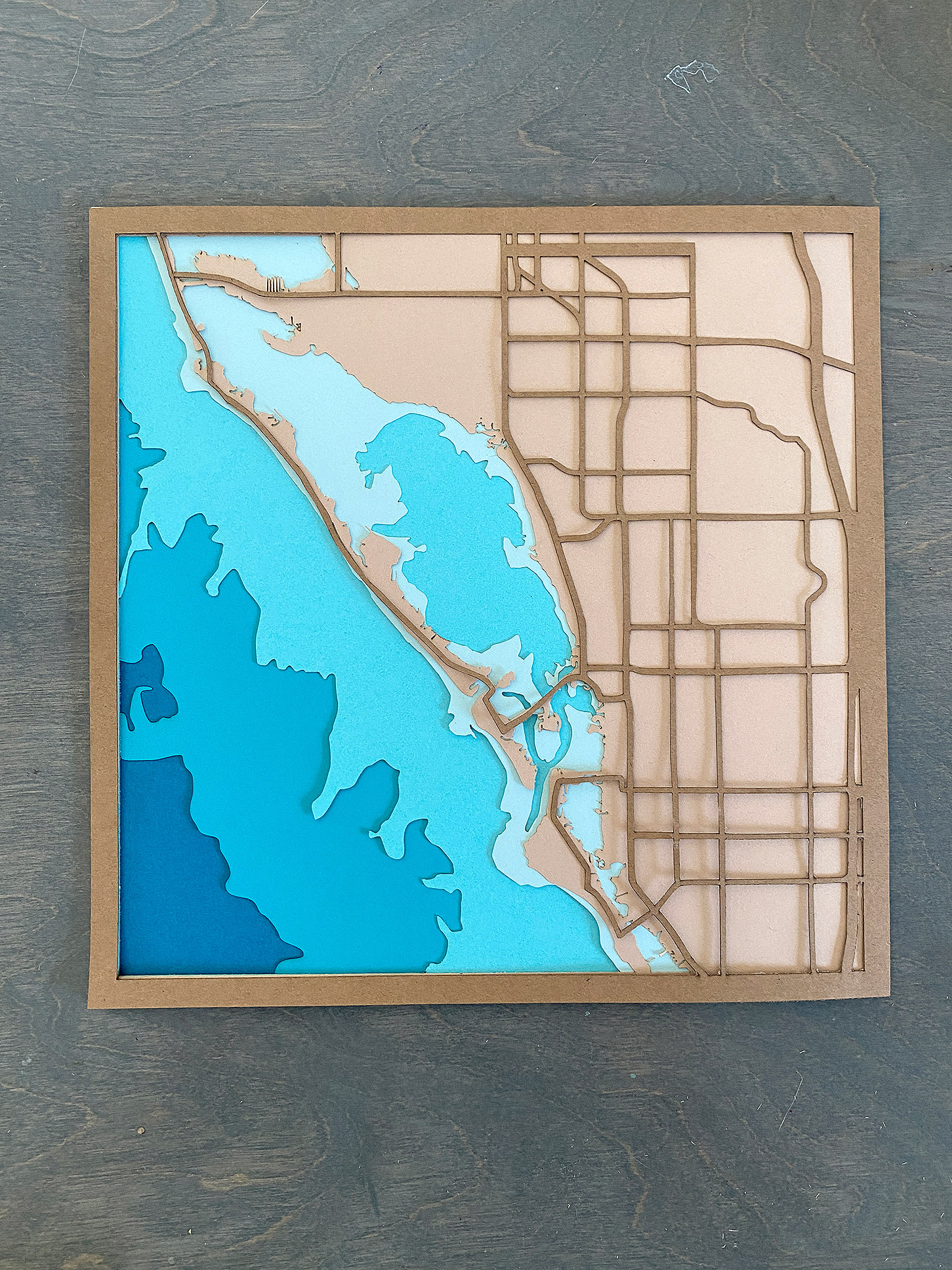
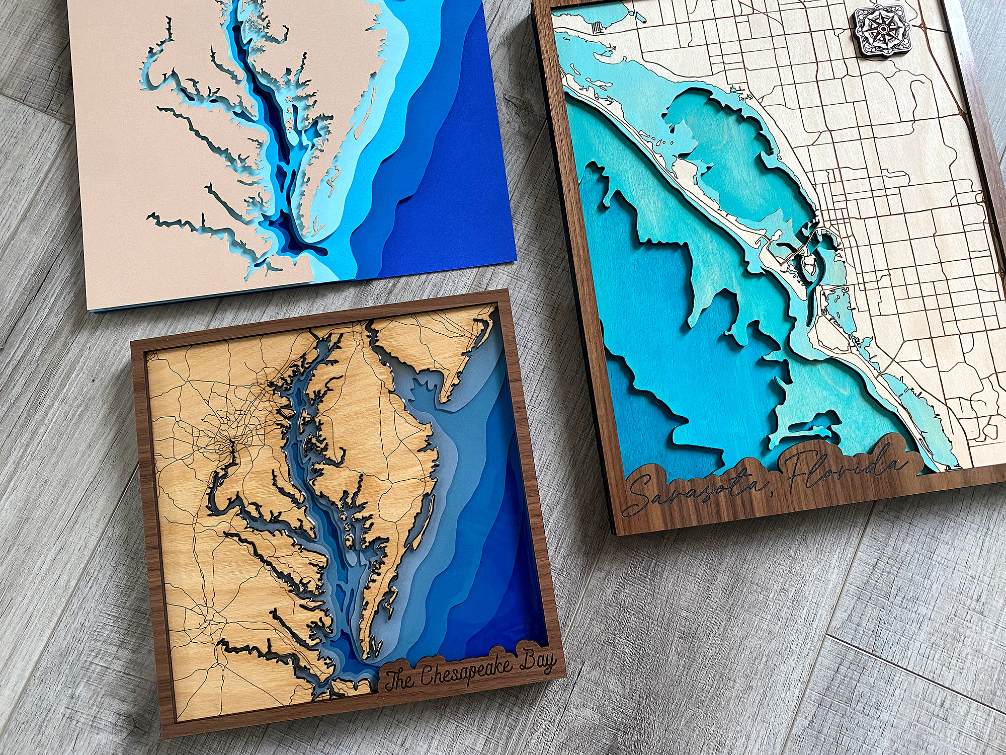
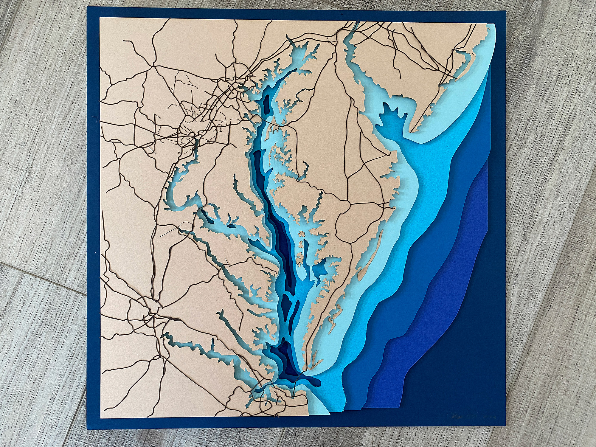
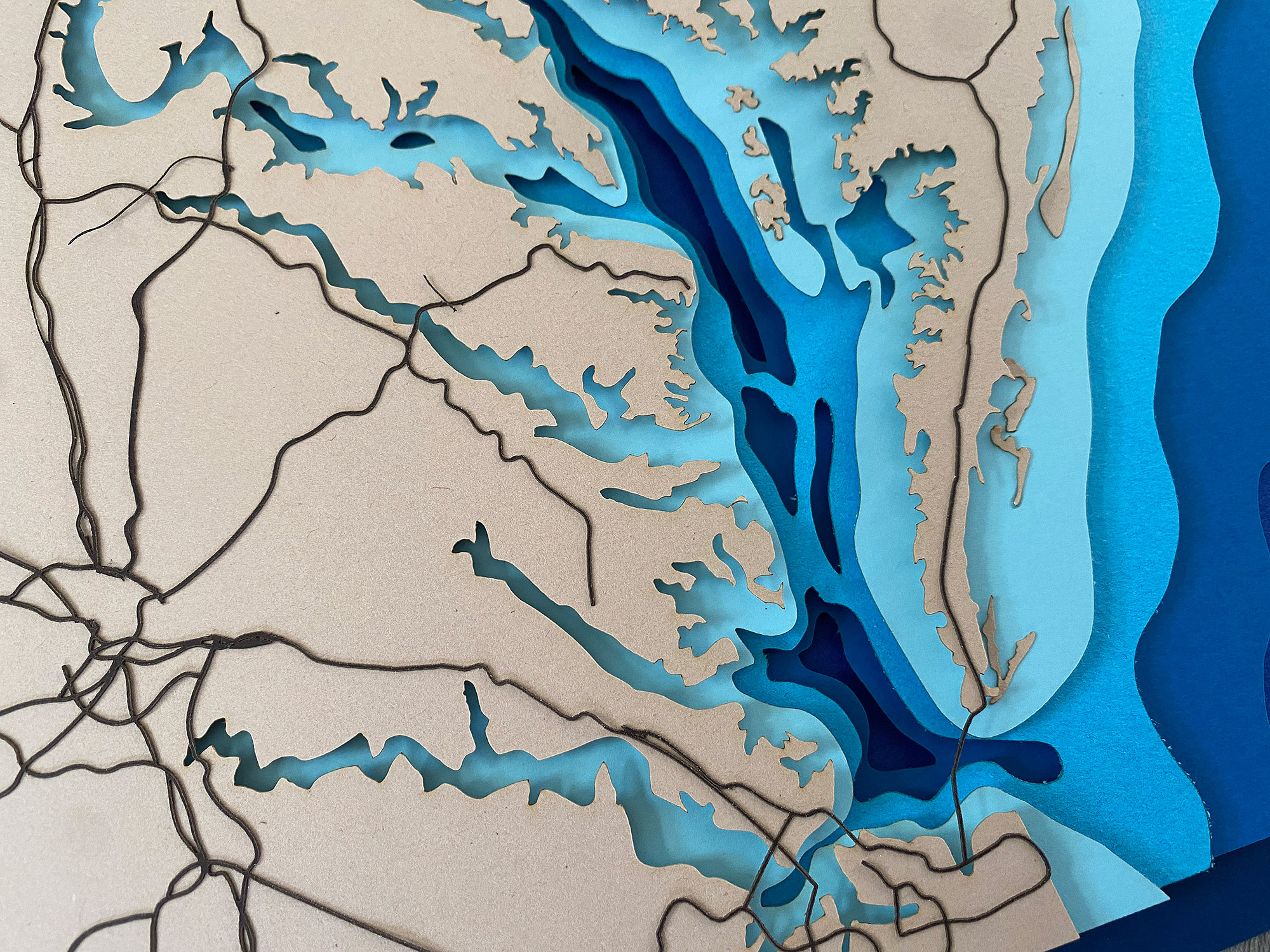
File Preview:
NAVIGATE POSTS
Helpful Links
Latest Posts
Posts by Category
Explore Posts By Tags
Acrylic Adobe Illustrator Alcohol Ink Baby Room Beginner Post Book Binding BuyTheFile Christmas Felt freefiles Gifts Gilding Glowforge Holiday Jewelry Journal Kaleidoscope LED Notebook Resin Rubber Stamp Settings Sign Stamping Yupo
Get Your Own Glowforge Laser
If you have found this post helpful and would like to purchase a Glowforge of your own you can receive a discount using my referral link when you are ready to purchase:
Sign Up to Blog Newsletter
Creating Your Own Map File | Adobe Illustrator
I have created multiple videos for this project. Below you can watch the design process of the basic file from start to finish. This video does not show how I did the final Sarasota Border or my cleanup (I’ll show a bit of that later). It’s a long one, but I think I have a few techniques/ideas that may be unique to my workflow so it may be worth a watch even if you’ve seen other methods.
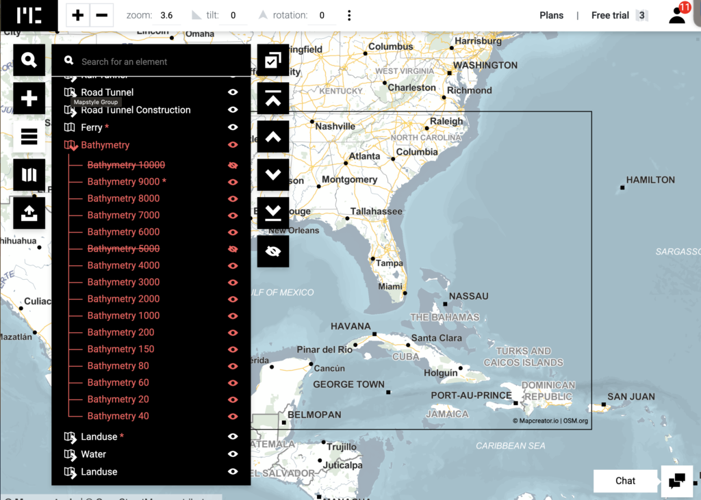
Places to Find Maps:
Mapstyle
Mapcreator
Open Street Maps
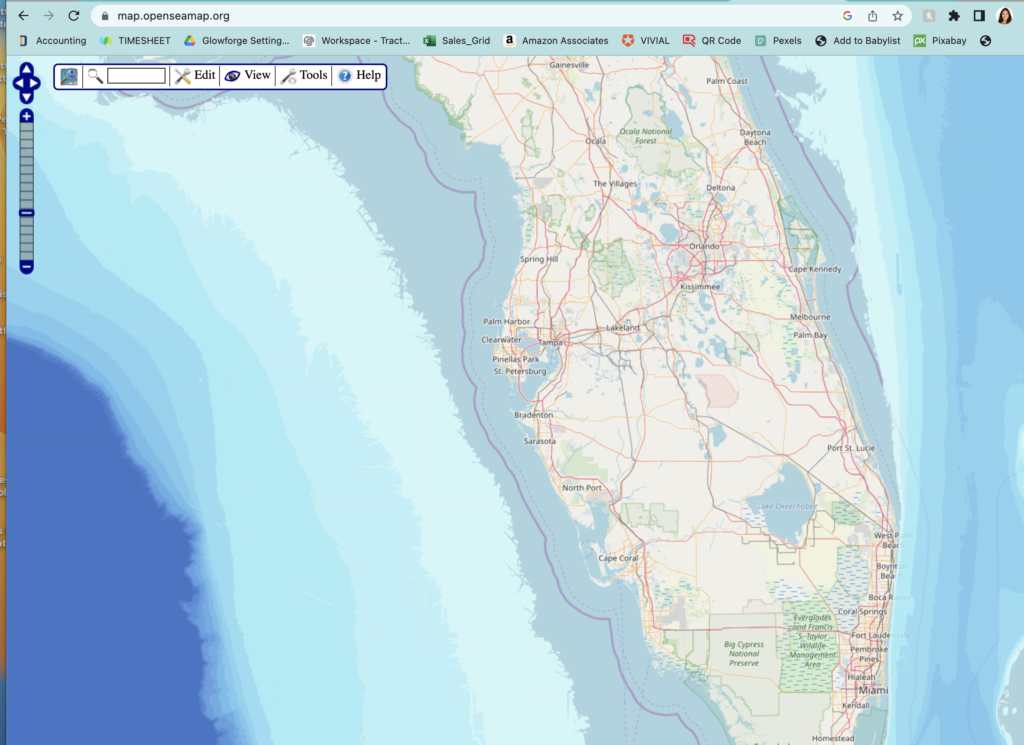
Open Seas Maps
Snazzy Maps
Where to find Water Depths:
Additional Tutorials by other makers, some of them use other software programs but they may help you understand some additional concepts:
This is How I Made it (Project ONE) – He uses Inkscape and Image Vectorizer, so if you use those programs his videos are a good idea as well
This is How I Made it (Project TWO) – This project he makes a layered map with water depths
3D Map Instructable (This is also where I got the JSON style I mention in the video that works on both Snazzy Maps & Google’s Mapstyle)
Notes/Tips on Creating Your Own File
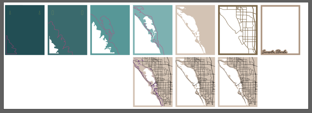
The basic overview of how I made my map is as follows:
DESIGN
- Find maps for both the land and water (depth) and take screenshots (focus on trying to take multiple screenshots with just ONE element each for your map – for examples roads, parks, the land, etc.). The more you separate this stuff out, the easier it will be. You will want to look for open source map data if you can. Be sure to educate yourself on the usage rights for any platforms you use to gather your data.
- Edit the Screenshots in Photoshop to make them high contrast and black and white. You can erase any unnecessary elements at this time such as tiny lakes or rivers you don’t want in the final design.*
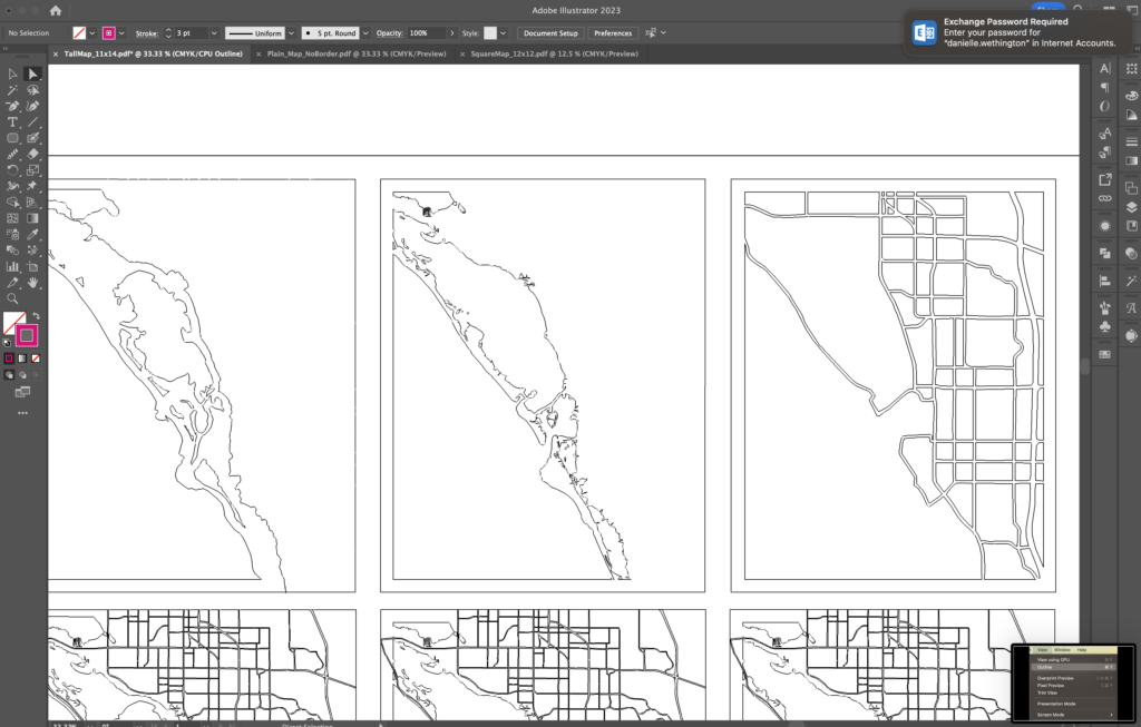
- Vectorize each of your images/layers. This is the bulk of the work and what is shown in the video. This step may require a combination of manually tracing areas with the pencil or pen tool, live tracing large areas and using the blob brush to add or remove things.
- Clean up stray points and lines, smooth rough areas, simplify areas that have too many nodes, close any open paths, remove hidden objects (this is the most advanced part, and typically requires you really understand things like clipping masks or how the Pathfinder works)
- Add any additional features to the map – like borders, score lines of previous layers for assembly placement, text, decorative frames, keyholes for hanging
- Organize the file for production by setting the colors for scoring/cutting/engraving and ensuring everything is correctly sized
- Test. I suggest prototyping your file by cutting it from paper first, this is faster and will save you money if you find stray cuts or the file has errors. Correct any errors, reload, and repeat until your file seems ready for the final cuts
- Prep Final Materials. Mask one side of your wood or prepare your acrylic for cutting. Choose your paint colors, make sure you have glue, clamps, etc.
- Move onto the final cuts. I personally like to complete the most complicated layer first – so for me that meant scoring, painting, and then engraving the top layer with the roads
- Cut all additional layers, peeling away the masking from the paint areas
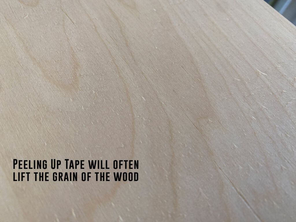
- Lightly sand any areas where the grain raises up and then paint/stain
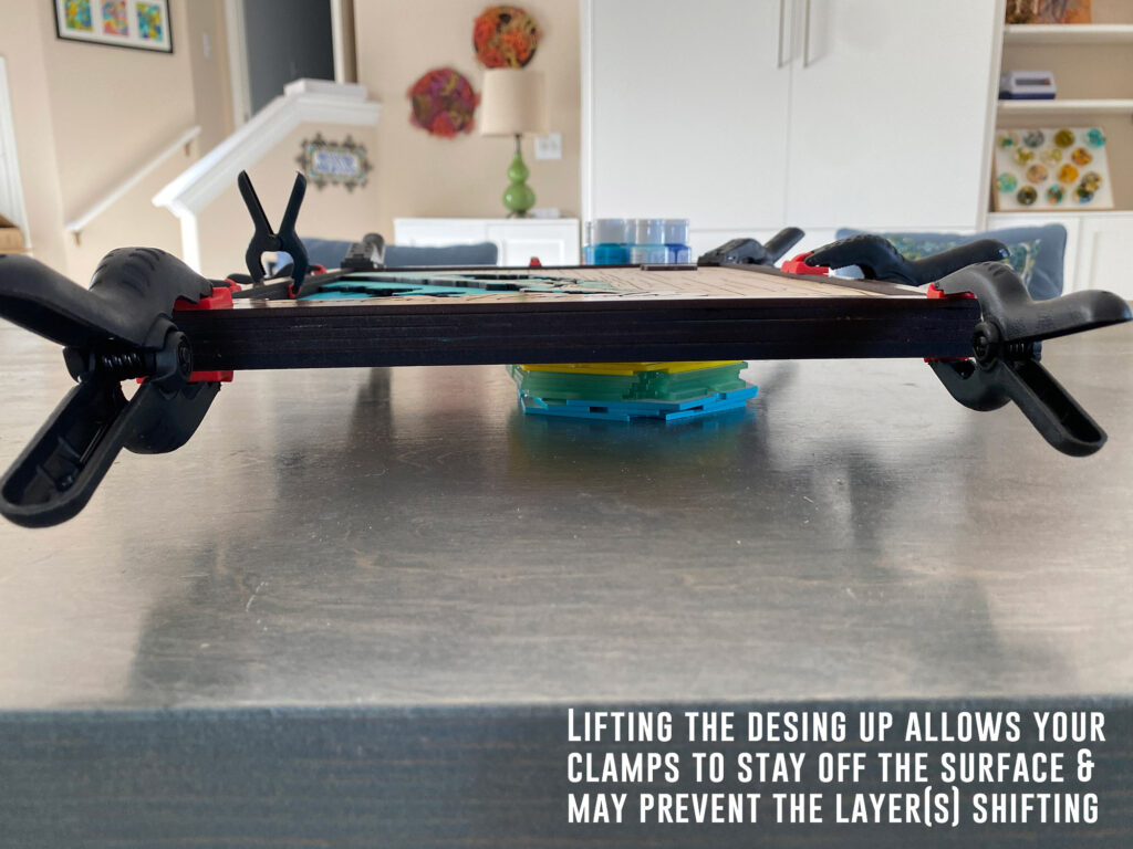
- Peel remaining masking once the paint is dry and then glue up one layer at a time to prevent shifting
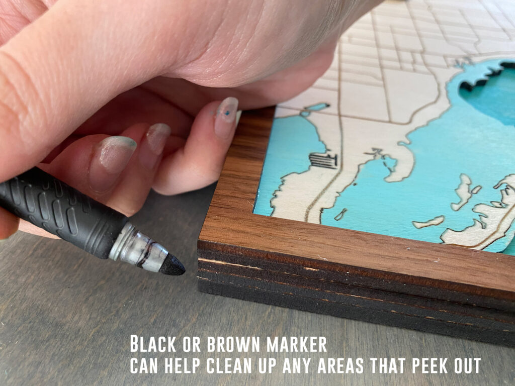
- Clean up any glue from the edges and use a marker or alcohol ink to cover any mistakes along the edges
- Clear coat if desired. Sign your work, wipe down or sand any areas that need it.
Do any of the map platforms you listed have water depth information?
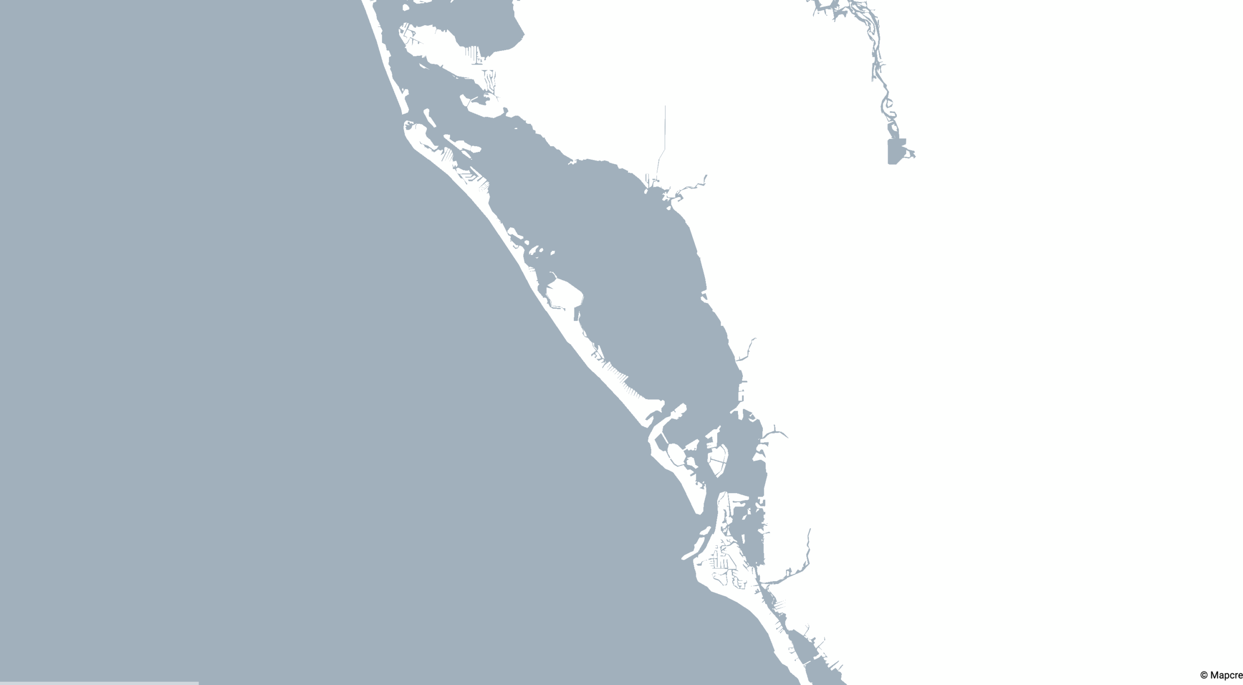
Kinda… You may notice that in some of these map programs you can view some bathymetric information. The problem is none of these open source programs showed depths closer to shore. This made them basically useless for our purposes. I didn’t see anything showing inland depths either. This is why I used the NOAA charts. In one of the additional instructional videos above by other creators (first one). He gets a bit more in depth about using the NOAA platform and other map display platforms, but I found hand tracing from the PDF charts to be the fastest, easiest way to get the depth data. If you have a tablet – using the pencil tool is lighting fast and really just the easiest way to make the file uniquely yours.
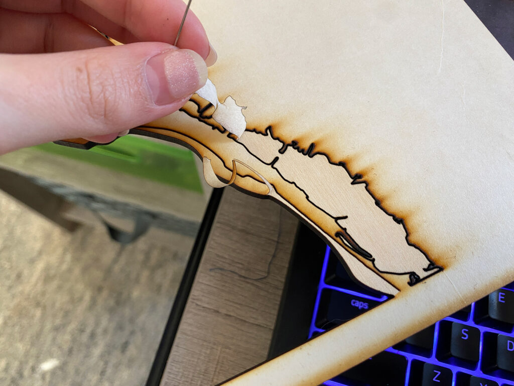
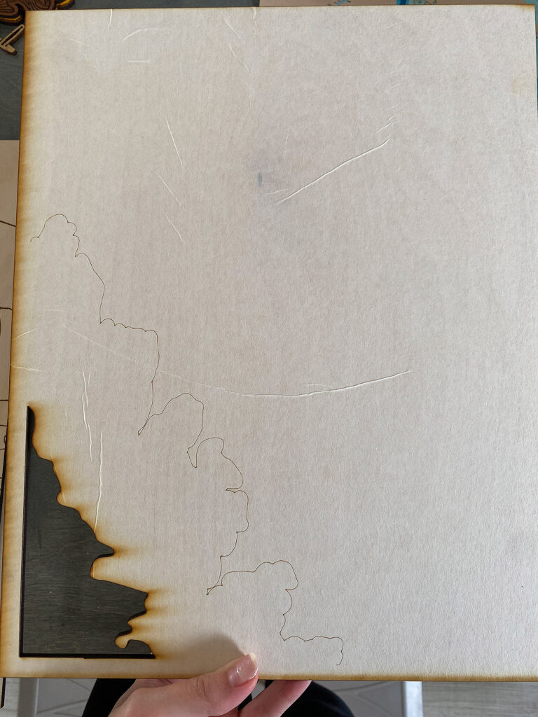
A TIP FOR CLEAN UP:
When cleaning up your file I recommend spending some time going over everything in Outlines. You go to View > Outlines and will change the view to the simple one you see below showing only the paths in your file. This will allow you find stray points and delete them. Just be careful not to break open any paths that need to remain closed. I removed any islands I felt would be too small to cut and looked for stray nodes (there are always a few). You can also use the smooth tool to clean up and really node heavy or jagged lines or use the simplify function to reduce nodes (it’s located in the menu under Object > Path > Simplify).
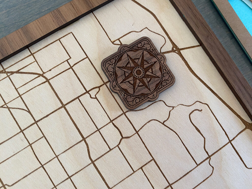
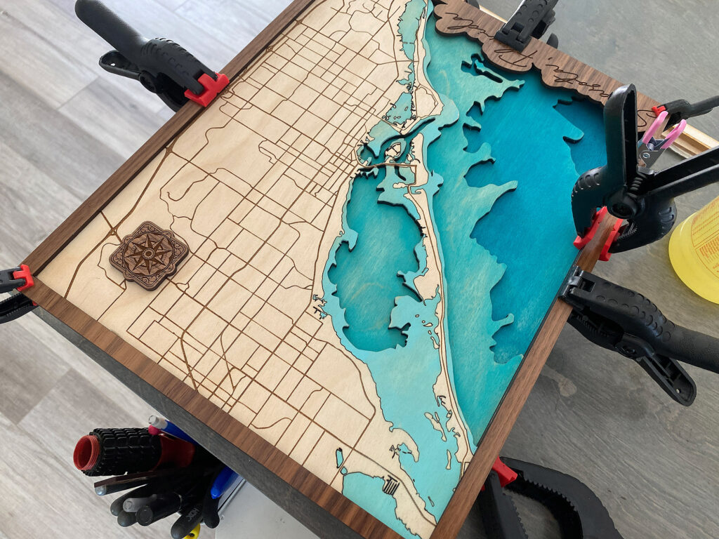
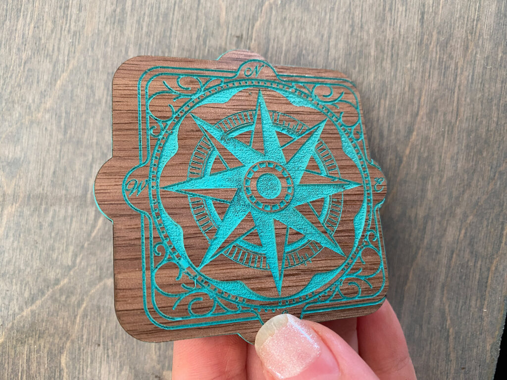
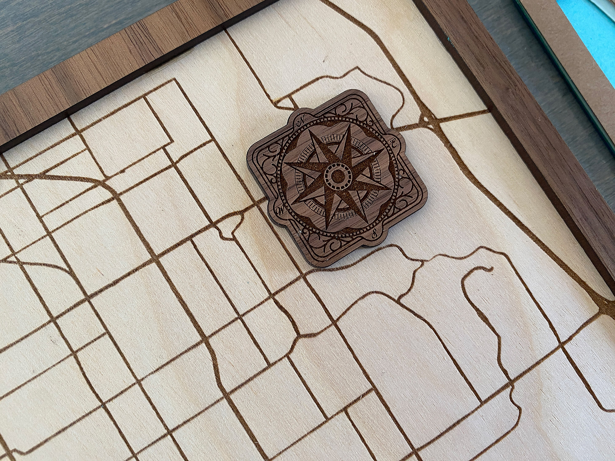
A NOTE ON ADDITIONAL DETAILS: If you’re interested in the compass rose I show in my final map (which is a gift for someone), I didn’t make it. You can however get tons of them from any vector stock image website such as Freepik.com. It is not included in my file because it is not my design, but I thought I’d mention it since I’m sure some people will want to add one.
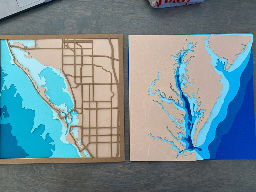
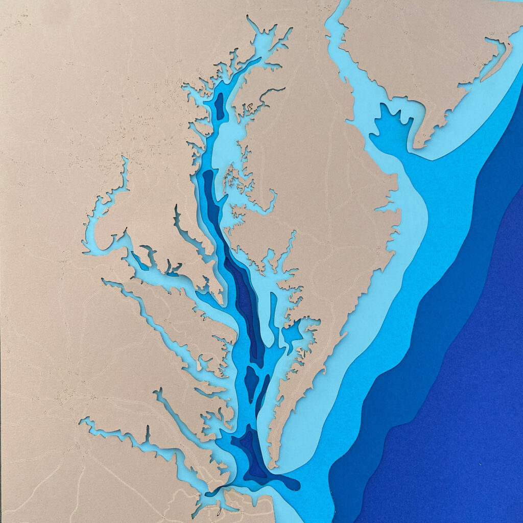
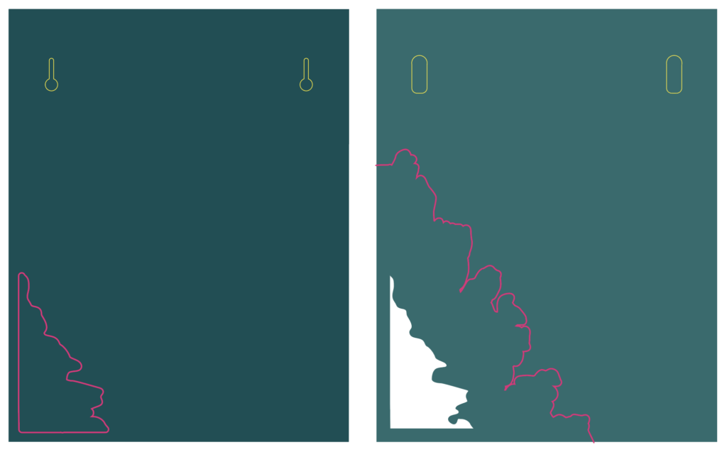
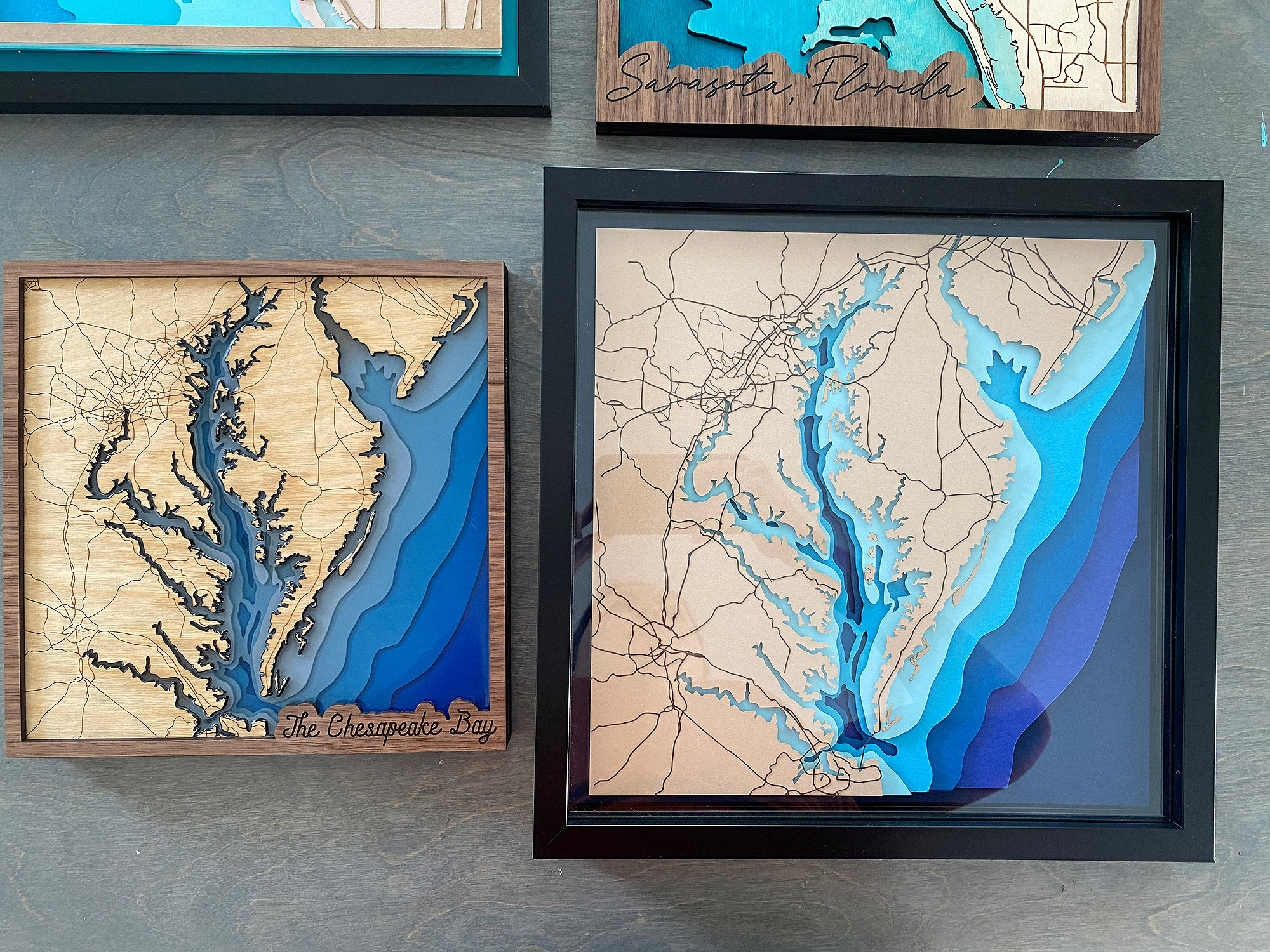
PAPER PROTOTYPING: As you’re working on your file and feel you’re getting close to the end, I recommend cutting it from paper before jumping right to wood. This is faster and will allow you to catch any major issues. The only thing is you won’t want to test your engraves on paper – paper tends to engrave slightly lighter than the base color and it won’t be super visible (thus not worth the laser time). This tends to be true of scoring most of the time as well. It just doesn’t look great (which you can see in my Chesapeake Bay file that I tested below). Engraves take so long I’m usually willing to just risk it on a “final” prototype.
See how the engrave/score is barely visible? Yeah not really easy to troubleshoot what you cannot see. Upping the power doesn’t really work here, you get to a point where you’re just creating a fire hazard, not marking the paper.
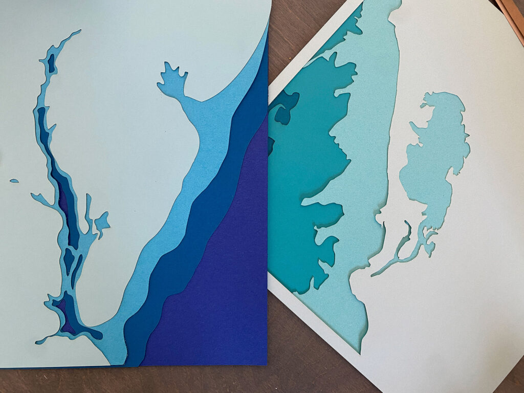
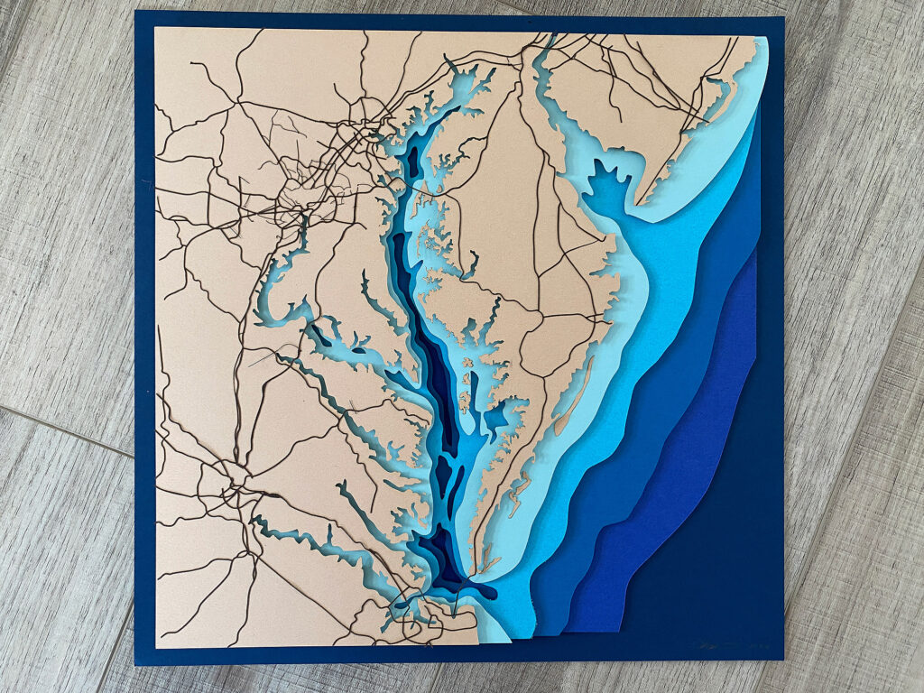
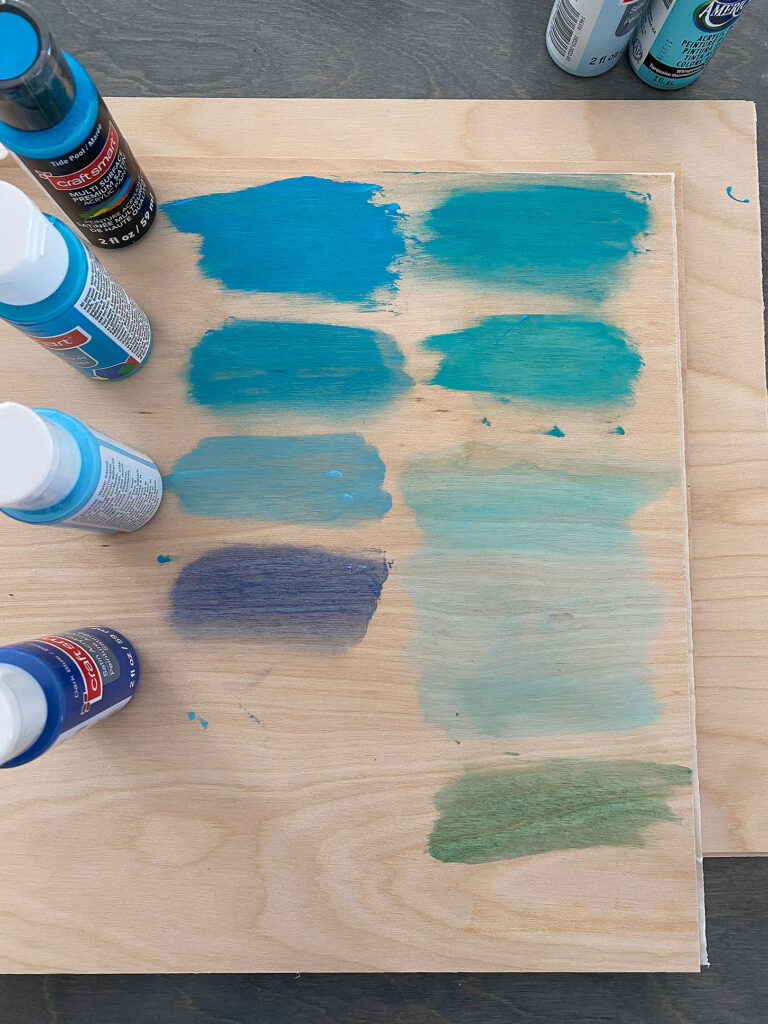
Your selection of blues is up to you! I just went with what was available at my local craft store. I used Recollections 12″ scrapbook paper. I chose a more tropical set of green/blues for the Florida design and then deeper, more classic blues for the Chesapeake Bay.

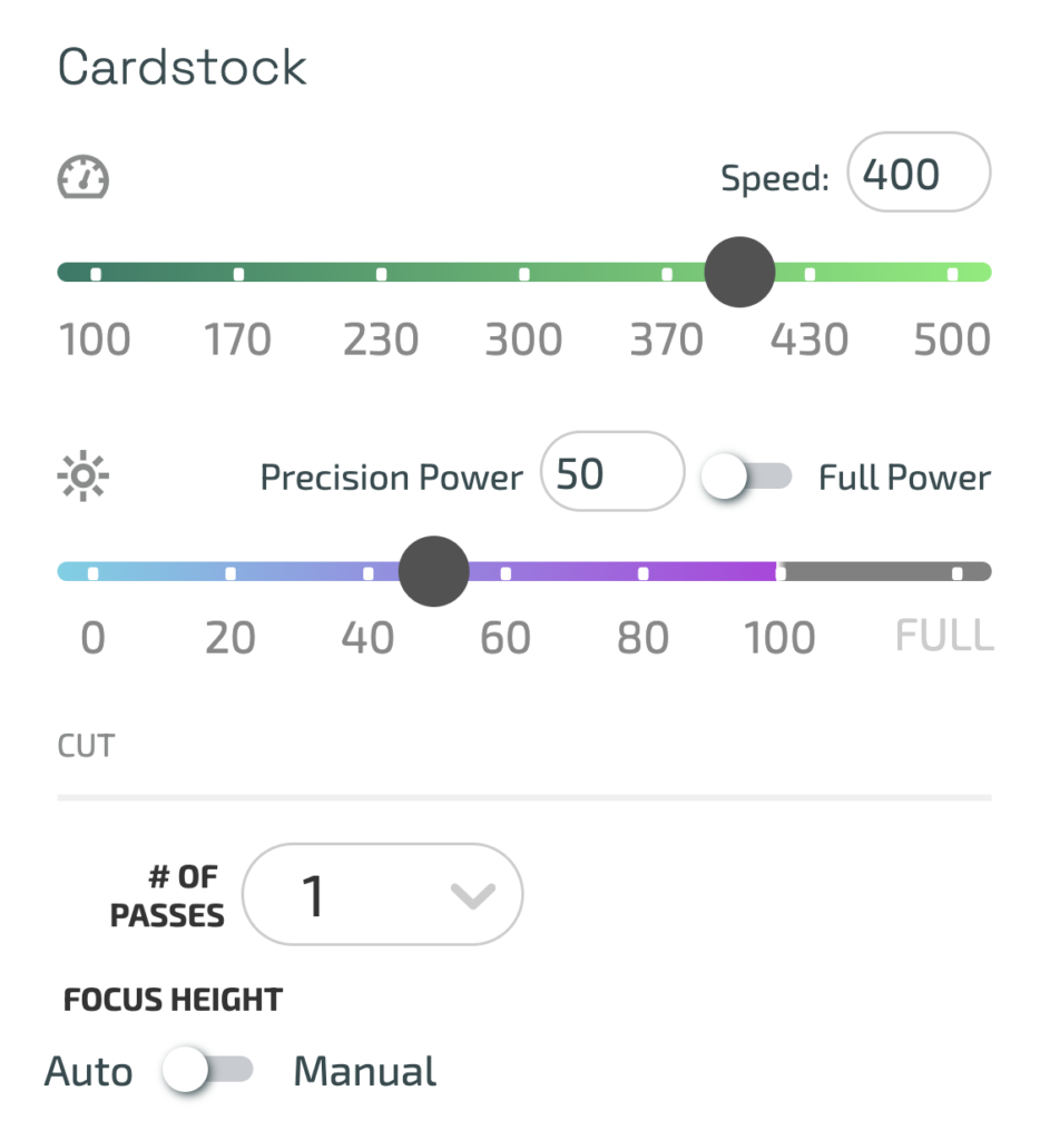
Glowforge Settings for Paper
Every paper is a bit different, but this is what I went with for the card stock which was moderately heavy.
Speed: 400
Power: 50
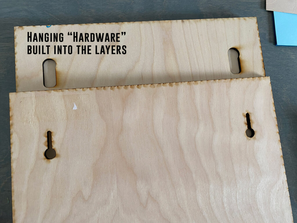
HANGING THE SIGN:
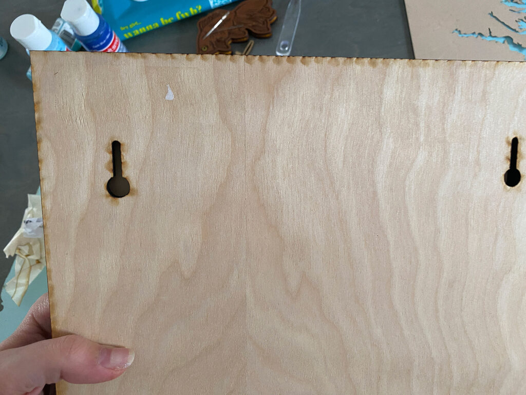
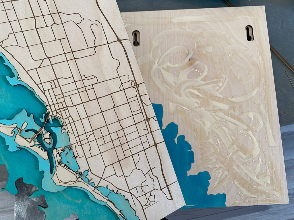
For my file I added keyhole hangers to the bottom two layers. This basically makes the sign “self hangable” without needing an additional frame or hardware. It will also allow it to hang flush and is more secure than screwing something in. You can see the second to bottom layer has a larger open shape, and then the very bottom layer has a “keyhole” that allows you to slip it onto a flat head nail and rest securely without the sign falling off. If the end recipient doesn’t want to hang it, no big deal, they can prop it up on a stand and the keyholes aren’t obtrusive.
GLUE/PAINT AREAS:
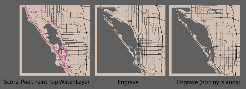
In pink below you can see I created an offset score line. This allowed me to know where to paint and then afterwards where to put my glue. This saved me a lot of time because I didn’t need to completely paint the whole layer or guess. I just peeled the masking off the paint areas and added my pigment, then later removed the rest of the masking to glue. This would be especially helpful for spray painting. It’s not a necessary step, but I thought it added a lot of functionality to my file. I made the score areas by copying the layer that would go on top, lining it up on top, creating a negative offset (Object > Path > Offset Path > -.01 Offset) and then using the direct selection tool (white arrow) to select and delete the outer edges of the shape. There is no need to score the whole rectangle just just main dividing line between the layers.
Making the Sign
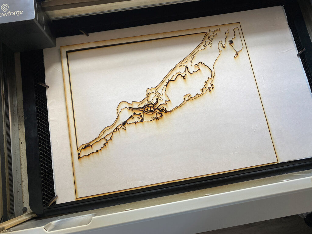
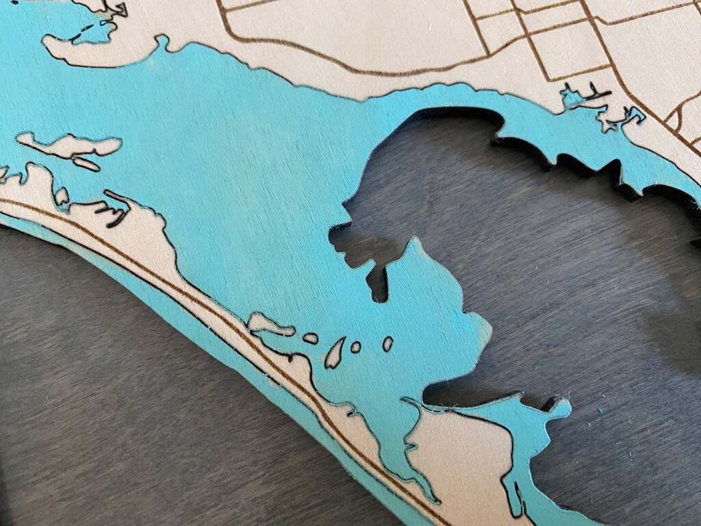
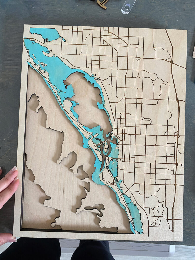
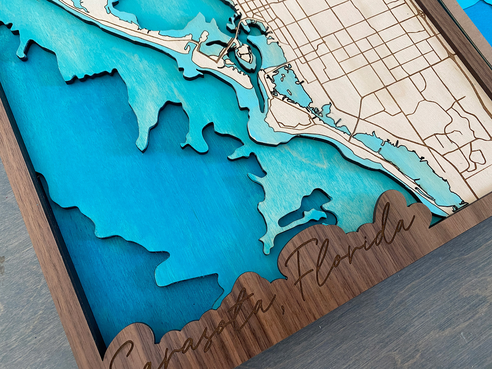
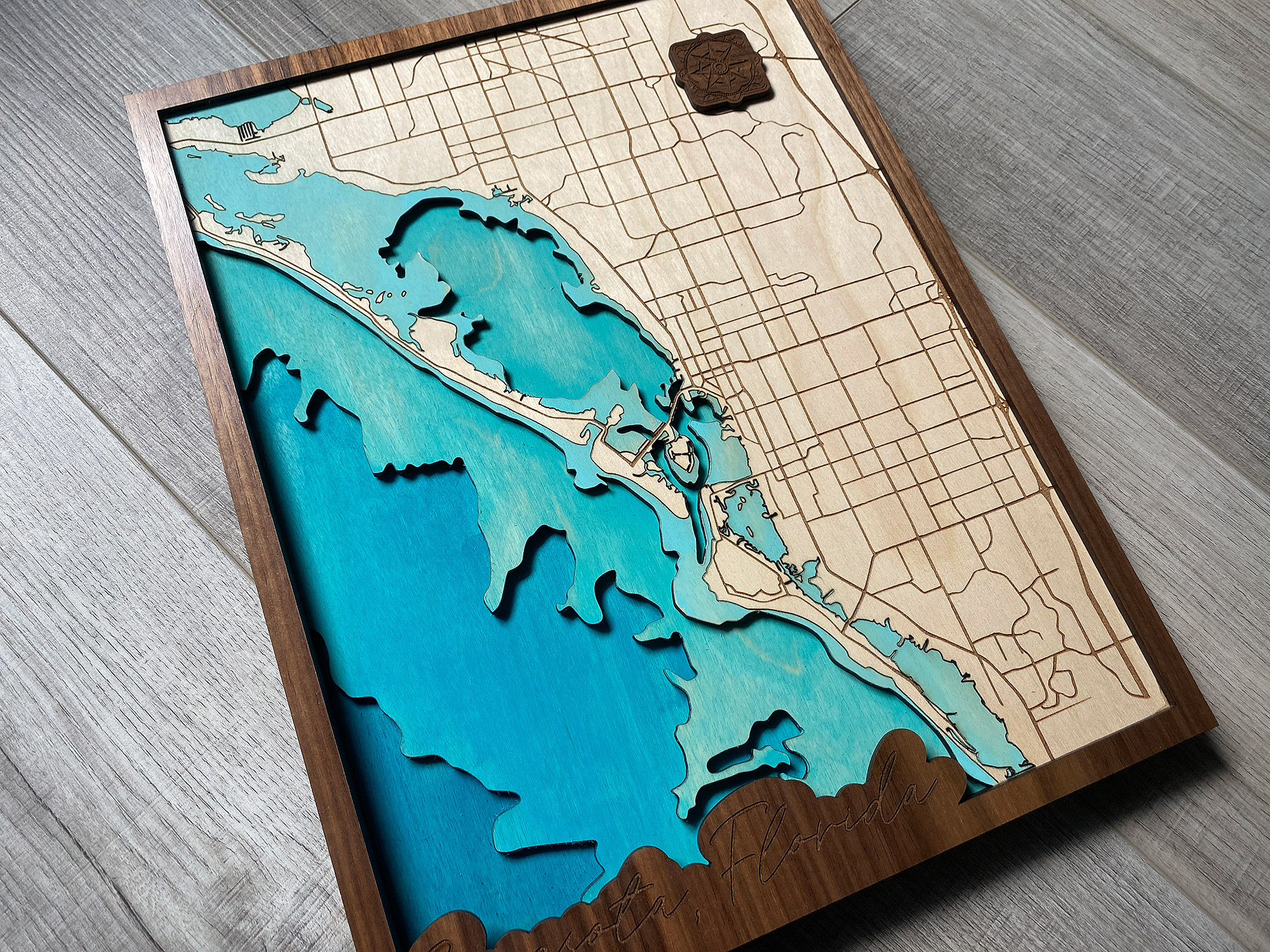
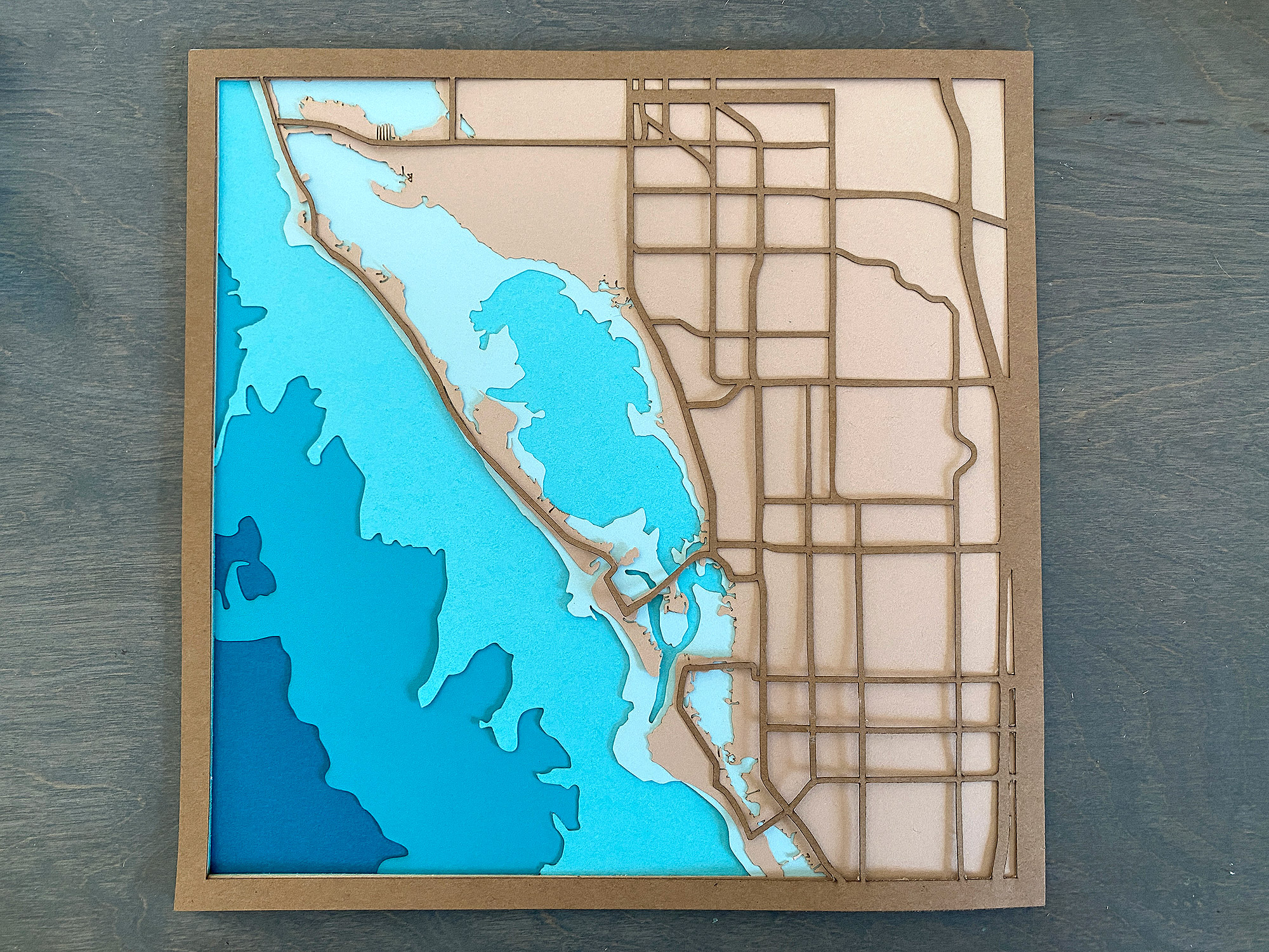
So, the Sarasota coastline has a LOT of little islands. At the scale I was planning to cut this (a teeny bit under 11×14″ as the Glowforge requires me to slightly size down for it to cut) there was a zero percent change I wanted to be chasing around those little burnt up scrap pieces. So Instead I combined the top layer (land) and the first layer of water and SCORED the coastline instead of cutting it. This allowed me to peel away the water area and paint it without losing the detail of those little islands. My file also has a version of the land with the tiny islands deleted. Some of these were smaller than a grain of rice, so this really seemed like the only way to show them in my final product. In my file I did include three options though – one created with the score/paint/engrave method I show below, one with the tiny islands (if you’re cutting from paper on a mat they’ll probably survive the laser), and one with the tiny islands removed.
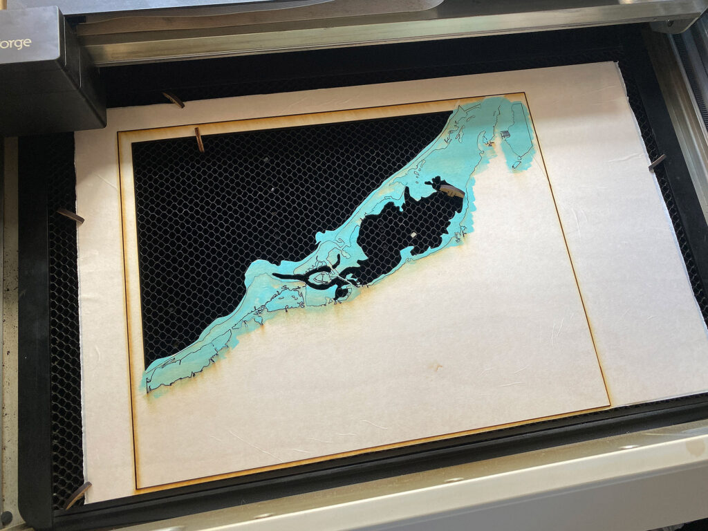
! NOTE: You’ll notice below I pinned my board in and did not do the road engraving yet. I did this because I didn’t want to accidentally get paint in my engraved roads. Instead I scored and cut, then I just lifted out my map, painted the water and then put it back into the “frame” which was pinned in place. Without changing anything in the Glowforge interface I ran both my score (again) and my engrave. I ran the score again at a lower power because a little bit of paint got into my score lines and I wanted to “burn” it away so it looked cleaner. This wasn’t necessary, but just a little thing I did that adds to that attention to detail.
STAINING THE WOOD WITH ACRYLIC:
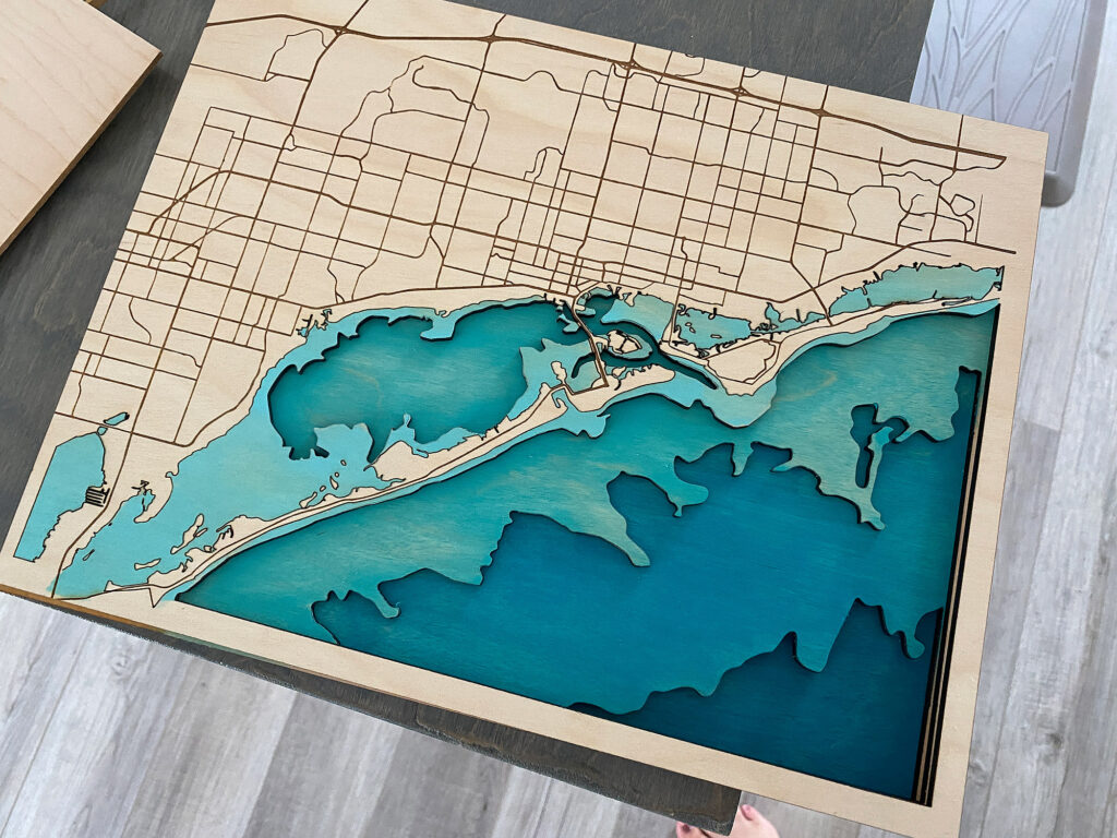
I used the “baby wipe method” to paint my water on each layer (There are tons of Youtube videos about this, so I won’t go too deep). Essentially you just dip a baby wipe in your paint and rub it in like a stain. The little bit of water and oil in the wipe helps it glide around and the cloth lifts some of the paint off. This method allows you to still see some of the grain which is really nice. It’s also SUPER fast and dries really quick. The more/harder you rub the lighter the finish. I tested all the acrylic colors I bought on the back of one of my sheets since it’ll be hidden by glue later. I just used cheap paints from the craft store which work great for this technique. You can also brush on the paint and just not wipe it away. That works fine as well, but I thought that but of transparency looks nice.
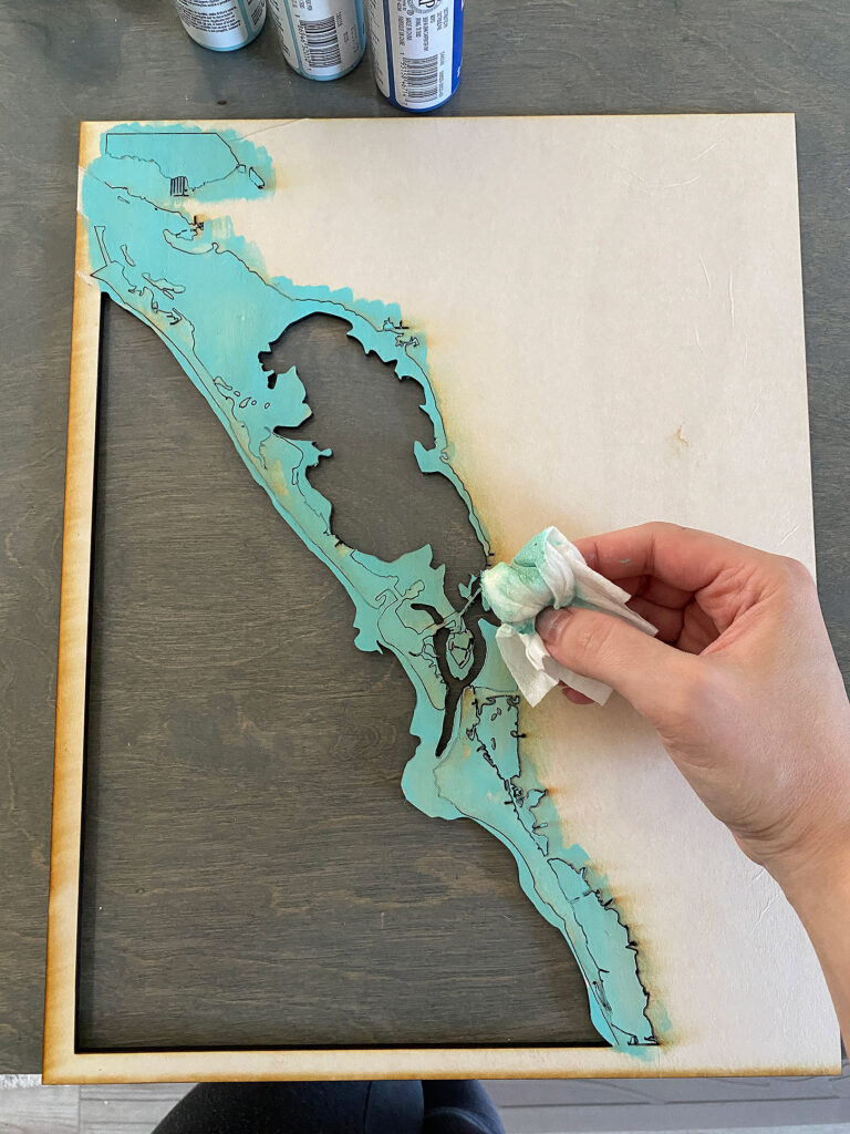
Below you can see where the paint got into the score lines. I think I used too strong of a setting for them honestly, and they were to deep to wipe out the paint. I decided to run the score function again when I ran the engrave to try and remove some of that paint that filled in which did work pretty well.
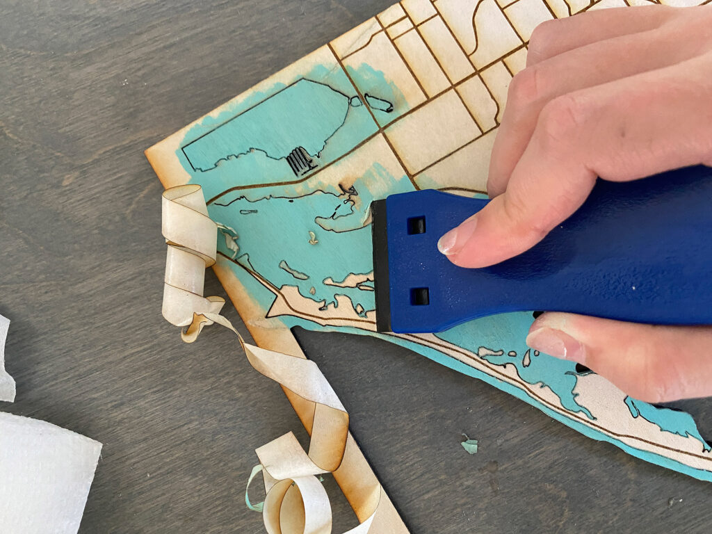
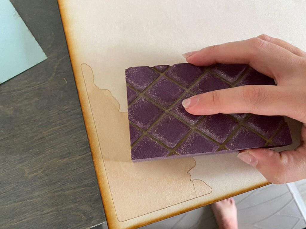
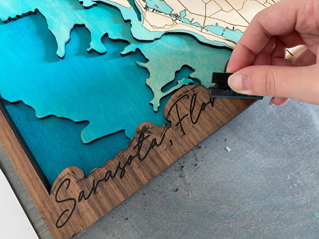
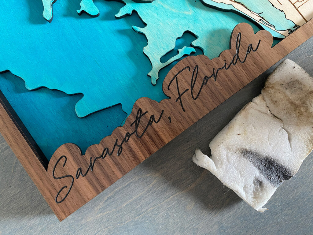
Afterwards I removed all the masking with a plastic razor blade and lightly sanded with a sanding block to remove any rough areas.
CUTTING THE REST OF THE LAYERS:
After completing the most complicated top layer of the map, I proceeded to cut and score all the remaining water layers. I cut each layer and scored the masking to make painting and gluing easier. The score line was set to just cut through the masking so I had a good guide for painting. It’s important to note that I offset this line slightly so it wouldn’t show when the layers were all stacked up.
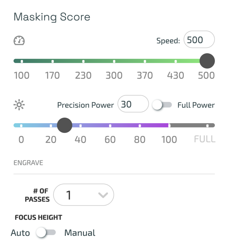
Glowforge Settings for Scoring the Masking
These settings will make a nice, light score that cuts through the masking. You can see it on the wood, but it’s not super deep or distracting.
Speed: 500
Power: 30
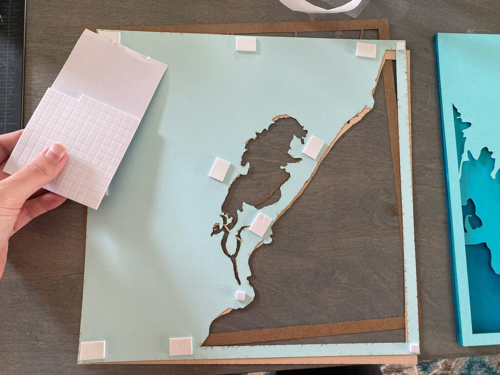
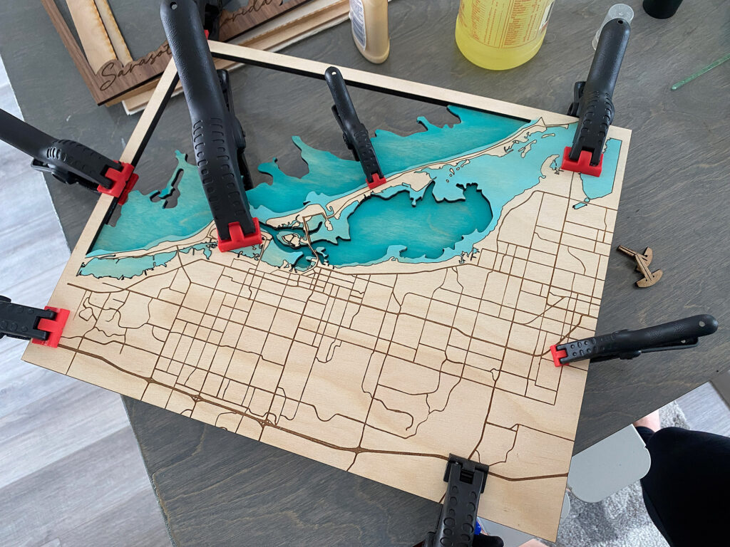
THE GLUE UP:
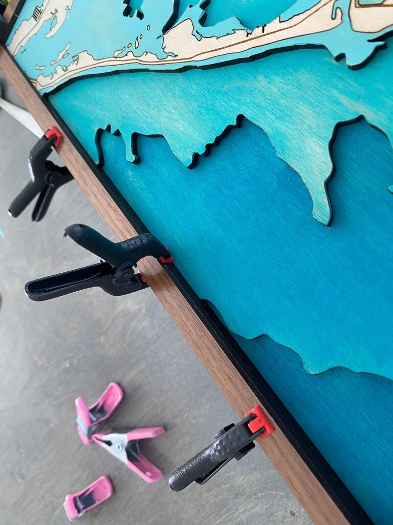
After I had finalized the painting/staining of each layer and everything was dry I began the glue up. I did each layer one at a time to minimize any risk of shifting.
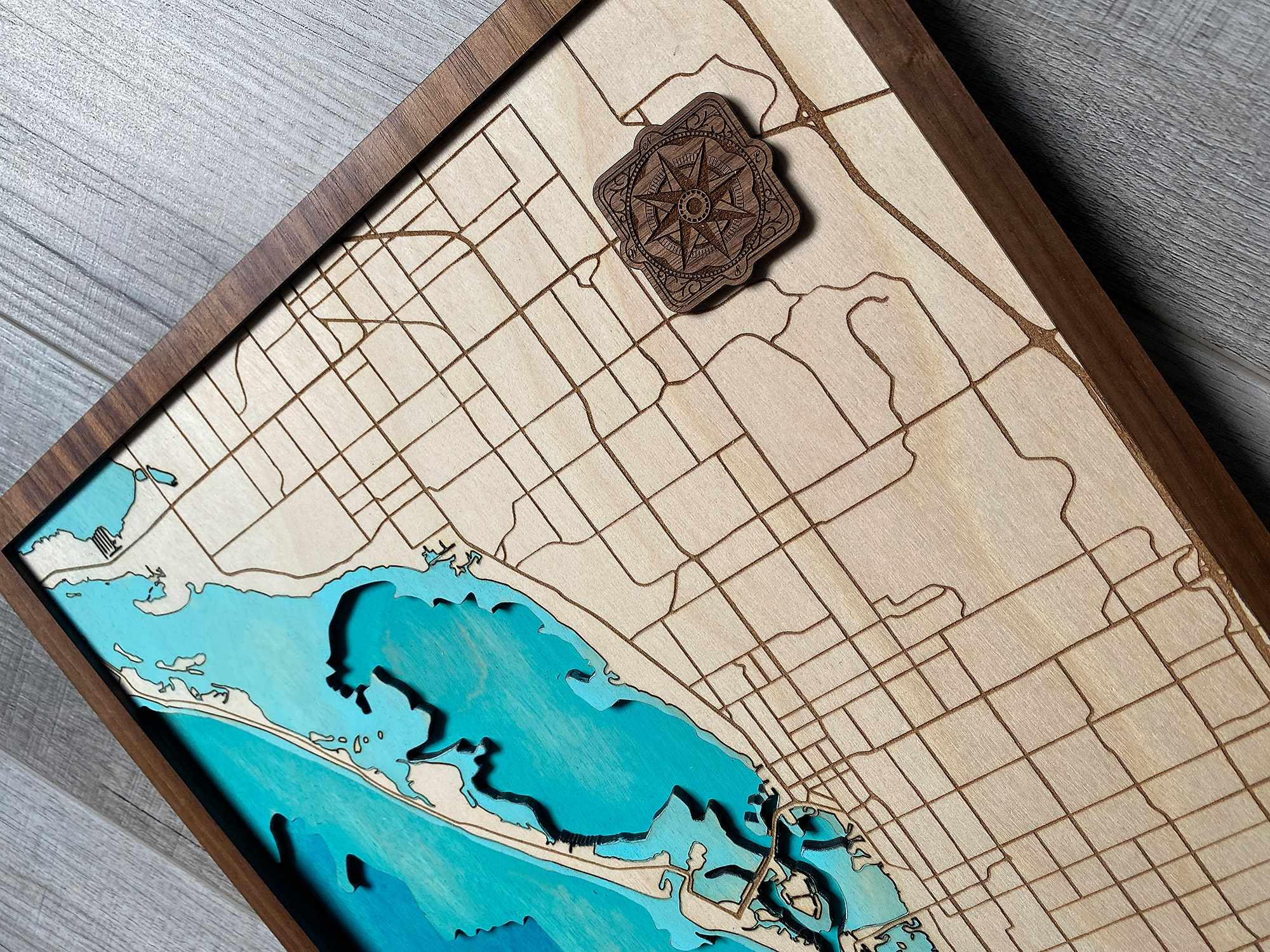
I cut my top frame layer and my compass rose from some pre-finished walnut for contrast. I felt it matched the color of the engrave and added a nice look to the final piece.
TIP:
Pre-finished (slick coated) materials like this walnut are great for paint filling, because you can let the paint mostly dry in the engrave and still remove the pain from the slick surface with a microfiber cloth and some cleaner. I’ve used a dupe for Glowforge proofgrade medium walnut plywood. For some reason this compass rose cut oddly (it didn’t look like this in the interface so maybe the print head got bumped).
After everything was dry I had a nice finalized map! The only thing I might adjust is the engraves on the walnut – they looked good in person but seem a bit light in photos, so I decided to do a paint fill. I used the technique shown in my paint fill post. Since the walnut is already finished I just filled it, let it try and gently scraped away the excess.
FINAL THOUGHTS
This was definitely a fun challenge. I believe in all honesty the hardest part is obtaining the map dat itself. Researching and finding the right depths isn’t always easy, especially if you’re trying to map a less common place. The Illustrator skills you gain from a project like this, however, are invaluable. You get a really good understanding of cleaning up vectors and using the Pathfinder panel to make offsets, score lines, etc.
Where to Get the Materials:
Get 50% off your first Wish.com order with my code: mfvjgnw | I buy lots of odds and ends here, so if you need some small item and don’t mind waiting, this can be a fun shop to check out.
Black Diamond Pigments – These are some killer resin pigments.
The Amazon links below are typically affiliate links. They don’t cost you more but they do help me keep creating content.
- Ecobirch from Smokey Hills, this is a highly affordable product and easy to work with. I also got my white birch with mdf core from them
- Walnut plywood (Laserbits) from Johnson Plastics Plus. This is pricier but I use it ALL THE TIME. It’s one of my favorite materials
Great Vendors for Beautiful materials: None of these are affiliate links! I purchase materials from all of these vendors because I like their products:
Woodcraft – Exotic Veneers, 1/8″ wood
Johnsons Plastics Plus – Rowmark Acrylic, Saddle Faux leather (laser safe), Finished plywood, Flexibrass etc. Veneers (with and without 3M)
Craft Closet – Shell veneer, acrylic (Glitter for days), wood, colorboard
Cerulean Tides- So many gorgeous acrylics
Smokey Hills – Wood, Plywood, Basic Acrylics, Patternply in Acyrlic and Wood(beautiful pattern printed boards)
Custom Made Better – So many fun different materials and they also release tutorials for learning new techniques
Obligatory Glowforge Discount Code Plug
If you found this post helpful and you plan to buy a Glowforge you can use my code (https://glowforge.us/r/QHDONFXB) for a discount of $125 off the Basic, $250 of the Plus, or $500 of the Pro:
Sign Up for Blog Posts Updates
And finally, if you’d like to be updated on posts like these in the future you can sign up for my email list. You will only receive an email if there is new content, and only once weekly in that case: